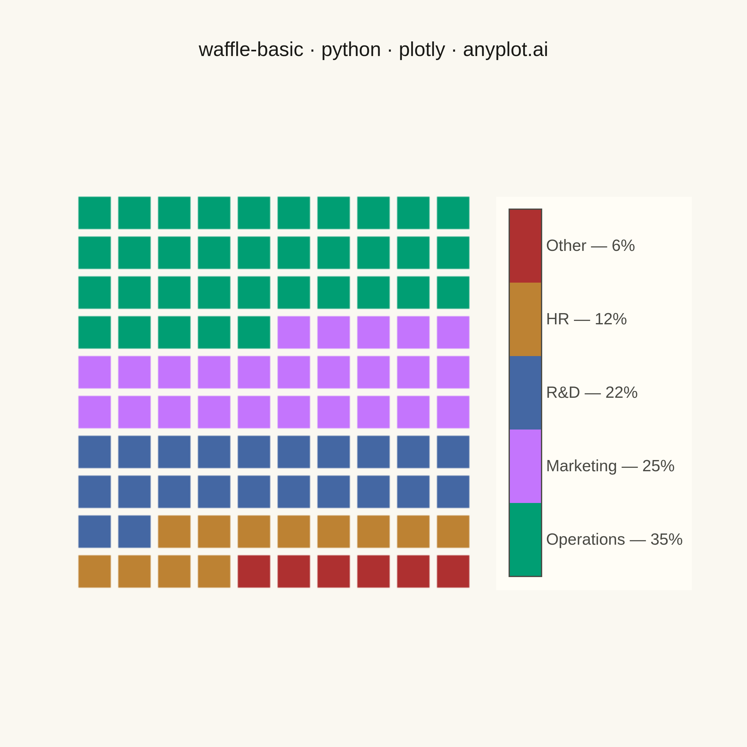
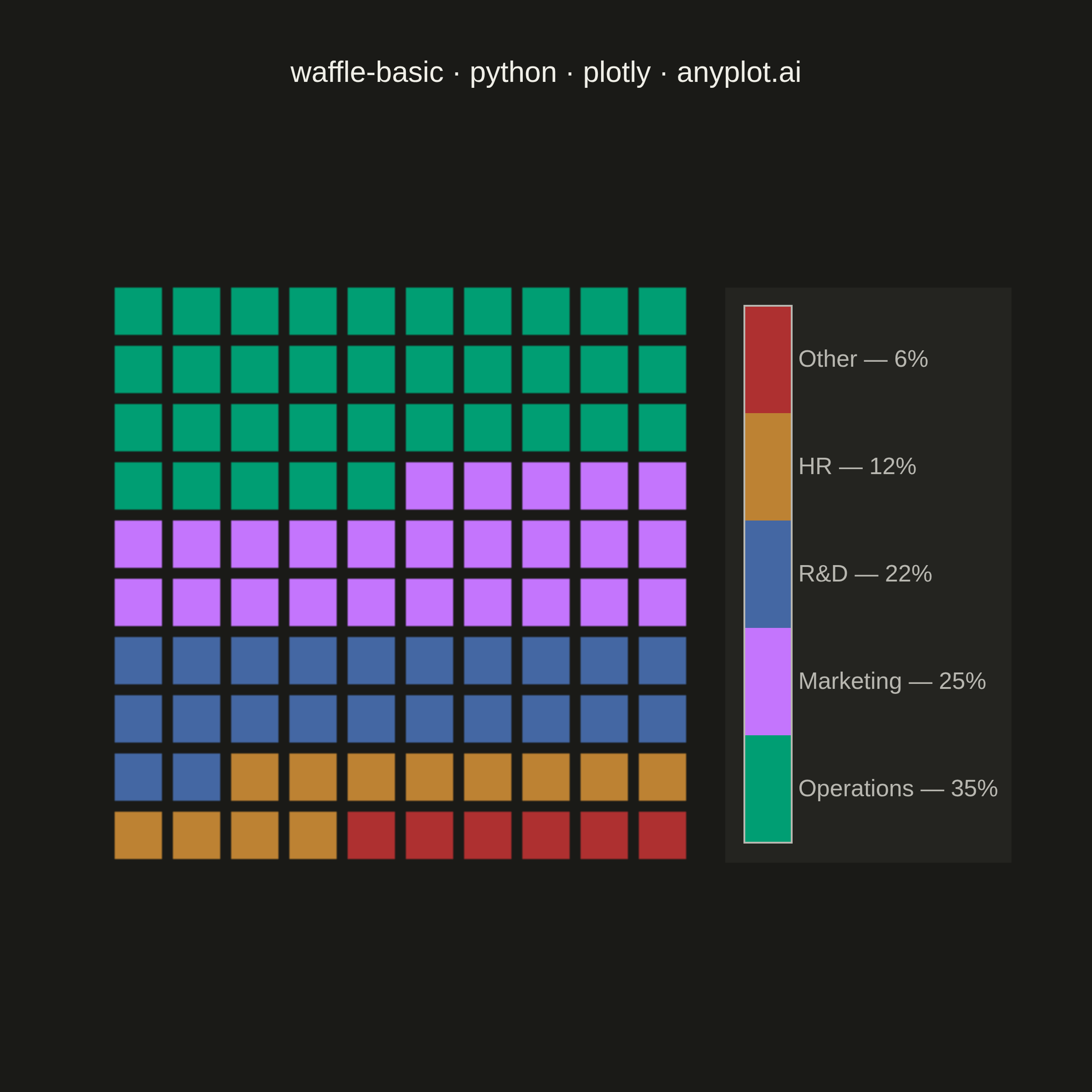
A waffle chart displays proportions using a grid of equal-sized squares where colored squares represent parts of a whole. Each square typically represents 1% of the total, making it easy to count and compare values visually. It provides an intuitive alternative to pie charts, offering more accurate perception of proportions.
""" anyplot.ai
waffle-basic: Basic Waffle Chart
Library: plotly 6.9.0 | Python 3.13.14
Quality: 91/100 | Updated: 2026-07-26
"""

import os

import numpy as np
import plotly.graph_objects as go


# Theme tokens (see prompts/default-style-guide.md "Background" + "Theme-adaptive Chrome")
THEME = os.getenv("ANYPLOT_THEME", "light")
PAGE_BG = "#FAF8F1" if THEME == "light" else "#1A1A17"
ELEVATED_BG = "#FFFDF6" if THEME == "light" else "#242420"
INK = "#1A1A17" if THEME == "light" else "#F0EFE8"
INK_SOFT = "#4A4A44" if THEME == "light" else "#B8B7B0"

# Imprint palette - first series ALWAYS #009E73
IMPRINT = ["#009E73", "#C475FD", "#4467A3", "#BD8233", "#AE3030"]

# Data - budget allocation across spending categories
categories = ["Operations", "Marketing", "R&D", "HR", "Other"]
values = [35, 25, 22, 12, 6]  # Percentages (sum to 100)
n_categories = len(categories)

# Build a 10x10 waffle grid (100 squares, each = 1%), filled bottom-up, left-to-right
grid_size = 10
total_squares = grid_size * grid_size
category_idx = np.repeat(np.arange(n_categories), values)
waffle_matrix = category_idx.reshape(grid_size, grid_size)[::-1]

# Hover metadata mirrors the grid so each square reports its own category and share
category_names = np.array(categories)[waffle_matrix]
category_values = np.array(values)[waffle_matrix]

# Single Heatmap trace (not 100+ scatter traces) with a hand-built discrete
# colorscale - each category occupies an equal band so cell colors stay flat,
# and the vertical colorbar doubles as a labeled legend (unrotated tick text,
# one row per category, so nothing crowds or clips at the canvas edge).
discrete_colorscale = []
for idx, color in enumerate(IMPRINT[:n_categories]):
    discrete_colorscale.append([idx / n_categories, color])
    discrete_colorscale.append([(idx + 1) / n_categories, color])

fig = go.Figure(
    go.Heatmap(
        z=waffle_matrix,
        zmin=-0.5,
        zmax=n_categories - 0.5,
        colorscale=discrete_colorscale,
        xgap=6,
        ygap=6,
        text=category_names,
        customdata=category_values,
        hovertemplate="<b>%{text}</b><br>%{customdata}% of total<extra></extra>",
        showscale=True,
        colorbar={
            "thickness": 26,
            "len": 0.7,
            "x": 1.06,
            "xanchor": "left",
            "y": 0.5,
            "yanchor": "middle",
            "tickmode": "array",
            "tickvals": list(range(n_categories)),
            "ticktext": [f"{cat} — {val}%" for cat, val in zip(categories, values, strict=True)],
            "ticks": "",
            "outlinewidth": 1,
            "outlinecolor": INK_SOFT,
            "tickfont": {"size": 13, "color": INK_SOFT},
            "bgcolor": ELEVATED_BG,
        },
    )
)

# Layout
fig.update_layout(
    autosize=False,
    title={
        "text": "waffle-basic · python · plotly · anyplot.ai",
        "font": {"size": 16, "color": INK},
        "x": 0.5,
        "xanchor": "center",
    },
    xaxis={"visible": False, "range": [-0.5, grid_size - 0.5], "scaleanchor": "y", "scaleratio": 1},
    yaxis={"visible": False, "range": [-0.5, grid_size - 0.5]},
    paper_bgcolor=PAGE_BG,
    plot_bgcolor=PAGE_BG,
    margin={"l": 60, "r": 220, "t": 90, "b": 60},
)

# Save outputs
fig.write_image(f"plot-{THEME}.png", width=600, height=600, scale=4)
fig.write_html(f"plot-{THEME}.html", include_plotlyjs="cdn")
Runnable source as JSON, for any HTTP client: https://api.anyplot.ai/specs/waffle-basic/plotly/code. Any spec id and library id listed in llms-full.txt fit the same URL shape; every URL below is complete and callable.
{
  "spec_id": "waffle-basic",
  "language": "python",
  "library": "plotly",
  "page": "https://anyplot.ai/waffle-basic/python/plotly",
  "hub": "https://anyplot.ai/waffle-basic",
  "code_json": "https://api.anyplot.ai/specs/waffle-basic/plotly/code",
  "spec_json": "https://api.anyplot.ai/specs/waffle-basic",
  "render_light_png": "https://storage.googleapis.com/anyplot-images/plots/waffle-basic/python/plotly/plot-light.png",
  "render_dark_png": "https://storage.googleapis.com/anyplot-images/plots/waffle-basic/python/plotly/plot-dark.png",
  "interactive_light_html": "https://storage.googleapis.com/anyplot-images/plots/waffle-basic/python/plotly/plot-light.html",
  "interactive_dark_html": "https://storage.googleapis.com/anyplot-images/plots/waffle-basic/python/plotly/plot-dark.html",
  "quality_score": 91.0,
  "license": "MIT",
  "guide": "https://anyplot.ai/llms.txt"
}
Part of Basic Waffle Chart on anyplot.ai.