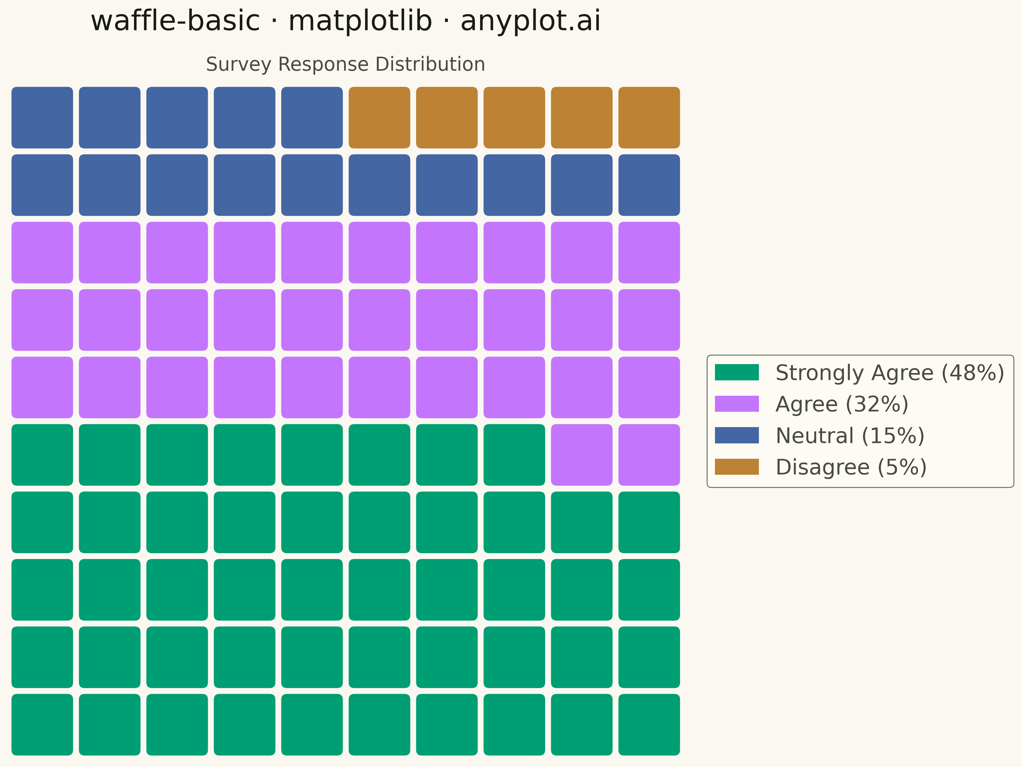
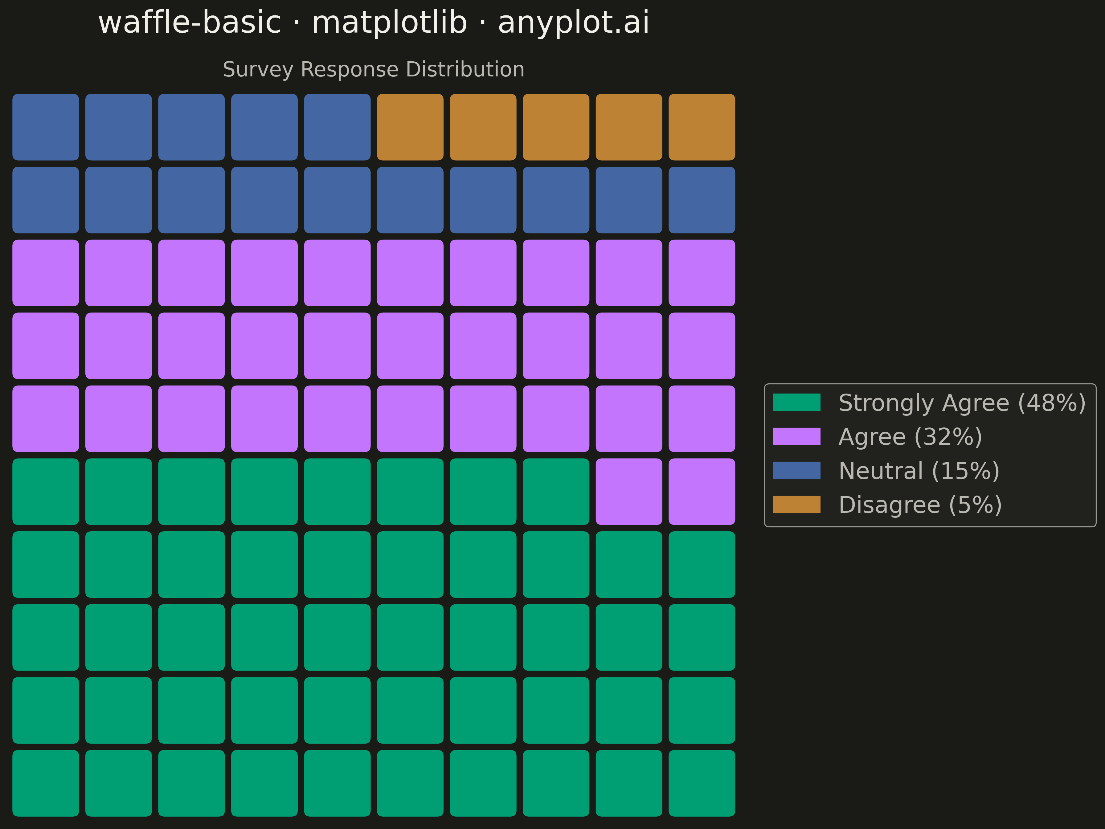
A waffle chart displays proportions using a grid of equal-sized squares where colored squares represent parts of a whole. Each square typically represents 1% of the total, making it easy to count and compare values visually. It provides an intuitive alternative to pie charts, offering more accurate perception of proportions.
""" anyplot.ai
waffle-basic: Basic Waffle Chart
Library: matplotlib 3.10.9 | Python 3.13.13
Quality: 91/100 | Updated: 2026-05-05
"""

import os

import matplotlib.patches as mpatches
import matplotlib.pyplot as plt
import numpy as np


# Theme tokens
THEME = os.getenv("ANYPLOT_THEME", "light")
PAGE_BG = "#FAF8F1" if THEME == "light" else "#1A1A17"
ELEVATED_BG = "#FFFDF6" if THEME == "light" else "#242420"
INK = "#1A1A17" if THEME == "light" else "#F0EFE8"
INK_SOFT = "#4A4A44" if THEME == "light" else "#B8B7B0"

# Okabe-Ito palette (canonical order)
IMPRINT = ["#009E73", "#C475FD", "#4467A3", "#BD8233"]

# Data - Survey responses (sums to 100%)
categories = ["Strongly Agree", "Agree", "Neutral", "Disagree"]
values = [48, 32, 15, 5]

# Create 10x10 grid (100 squares, each = 1%)
grid_size = 10
total_squares = grid_size * grid_size

# Build grid data - fill squares by category
grid = np.zeros(total_squares, dtype=int)
start_idx = 0
for i, val in enumerate(values):
    grid[start_idx : start_idx + val] = i
    start_idx += val

# Reshape to 10x10 grid
grid = grid.reshape((grid_size, grid_size))

# Create plot (4800x2700 px)
fig, ax = plt.subplots(figsize=(16, 9), facecolor=PAGE_BG)
ax.set_facecolor(PAGE_BG)

# Draw squares
square_size = 0.9  # Slightly smaller than 1 for gaps
for row in range(grid_size):
    for col in range(grid_size):
        category_idx = grid[row, col]
        rect = mpatches.FancyBboxPatch(
            (col + 0.05, row + 0.05),
            square_size,
            square_size,
            boxstyle="round,pad=0.02,rounding_size=0.1",
            facecolor=IMPRINT[category_idx],
            edgecolor=PAGE_BG,
            linewidth=1.5,
        )
        ax.add_patch(rect)

# Set axis limits and remove axes
ax.set_xlim(0, grid_size)
ax.set_ylim(0, grid_size)
ax.set_aspect("equal")
ax.axis("off")

# Create legend with percentage labels
legend_patches = [
    mpatches.Patch(color=IMPRINT[i], label=f"{categories[i]} ({values[i]}%)") for i in range(len(categories))
]
leg = ax.legend(
    handles=legend_patches, loc="center left", bbox_to_anchor=(1.02, 0.5), fontsize=18, frameon=True, fancybox=True
)
if leg:
    leg.get_frame().set_facecolor(ELEVATED_BG)
    leg.get_frame().set_edgecolor(INK_SOFT)
    leg.get_frame().set_linewidth(0.8)
    plt.setp(leg.get_texts(), color=INK_SOFT)

# Title and subtitle
ax.text(
    0.5,
    1.08,
    "waffle-basic · matplotlib · anyplot.ai",
    transform=ax.transAxes,
    fontsize=24,
    fontweight="medium",
    color=INK,
    ha="center",
)
ax.text(0.5, 1.02, "Survey Response Distribution", transform=ax.transAxes, fontsize=16, color=INK_SOFT, ha="center")

plt.tight_layout()
plt.savefig(f"plot-{THEME}.png", dpi=300, bbox_inches="tight", facecolor=PAGE_BG)
Runnable source as JSON, for any HTTP client: https://api.anyplot.ai/specs/waffle-basic/matplotlib/code. Any spec id and library id listed in llms-full.txt fit the same URL shape; every URL below is complete and callable.
{
  "spec_id": "waffle-basic",
  "language": "python",
  "library": "matplotlib",
  "page": "https://anyplot.ai/waffle-basic/python/matplotlib",
  "hub": "https://anyplot.ai/waffle-basic",
  "code_json": "https://api.anyplot.ai/specs/waffle-basic/matplotlib/code",
  "spec_json": "https://api.anyplot.ai/specs/waffle-basic",
  "render_light_png": "https://storage.googleapis.com/anyplot-images/plots/waffle-basic/python/matplotlib/plot-light.png",
  "render_dark_png": "https://storage.googleapis.com/anyplot-images/plots/waffle-basic/python/matplotlib/plot-dark.png",
  "quality_score": 91.0,
  "license": "MIT",
  "guide": "https://anyplot.ai/llms.txt"
}
Part of Basic Waffle Chart on anyplot.ai.