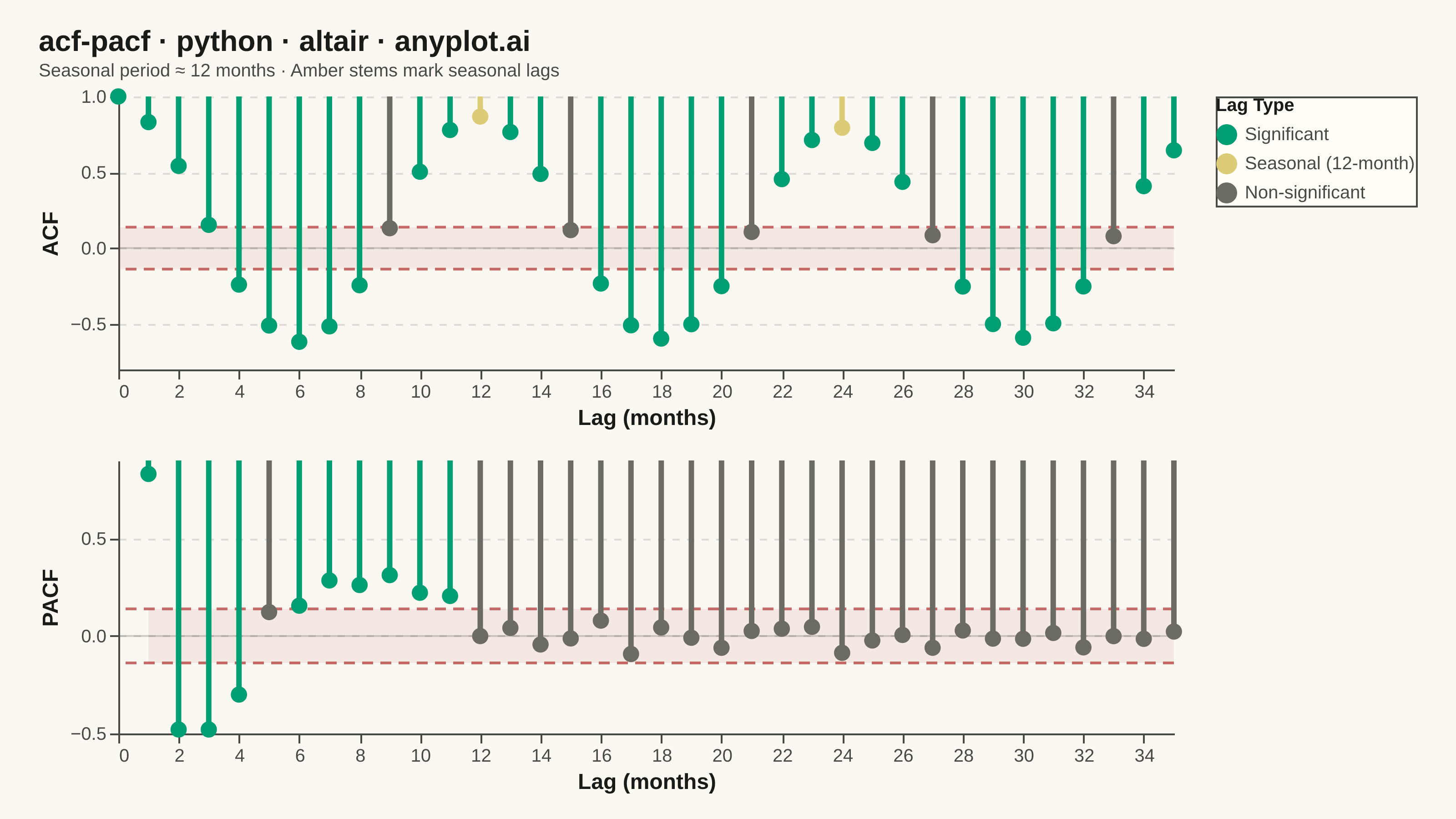
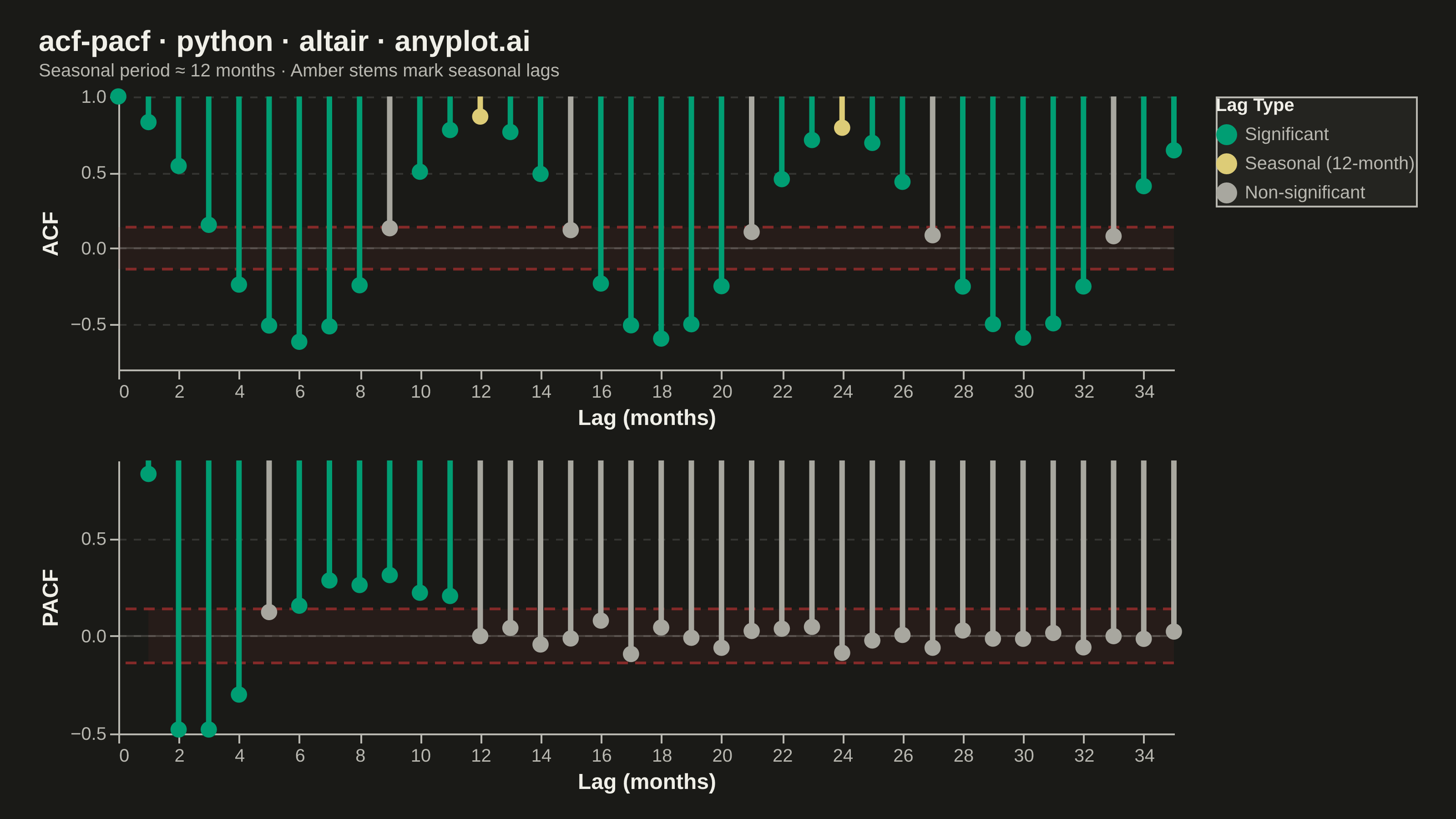
Displays the autocorrelation function (ACF) and partial autocorrelation function (PACF) of a time series as vertical stem/bar plots arranged in two vertically stacked subplots. Each lag is represented by a vertical line from zero to the correlation value, with horizontal dashed lines indicating 95% confidence bounds. These plots are essential for identifying the order of AR and MA components in ARIMA modeling and for diagnosing residual independence.
""" anyplot.ai
acf-pacf: Autocorrelation and Partial Autocorrelation (ACF/PACF) Plot
Library: altair 6.2.1 | Python 3.13.13
Quality: 91/100 | Updated: 2026-06-10
"""

import os
import sys


# Remove script directory from sys.path to avoid importing local altair.py
_script_dir = os.path.dirname(os.path.abspath(__file__))
if _script_dir in sys.path:
    sys.path.remove(_script_dir)
# Also strip the '' / '.' empty-string entry added when running from this dir
sys.path[:] = [p for p in sys.path if os.path.abspath(p or ".") != _script_dir]

import altair as alt
import numpy as np
import pandas as pd
from PIL import Image
from statsmodels.tsa.stattools import acf, pacf


# Theme tokens — Imprint palette, theme-adaptive chrome
THEME = os.getenv("ANYPLOT_THEME", "light")
PAGE_BG = "#FAF8F1" if THEME == "light" else "#1A1A17"
ELEVATED_BG = "#FFFDF6" if THEME == "light" else "#242420"
INK = "#1A1A17" if THEME == "light" else "#F0EFE8"
INK_SOFT = "#4A4A44" if THEME == "light" else "#B8B7B0"
INK_MUTED = "#6B6A63" if THEME == "light" else "#A8A79F"

# Imprint palette — semantic assignments for this chart
SIGNIFICANT_COLOR = "#009E73"  # position 1, brand green → notable statistical finding
SEASONAL_COLOR = "#DDCC77"  # amber anchor → special periodic pattern
NONSIG_COLOR = INK_MUTED  # theme-adaptive muted → neutral/secondary lags
CI_COLOR = "#AE3030"  # matte red → confidence boundary

# Data — airline-style monthly passenger series with trend and seasonality
np.random.seed(42)
n = 200
t = np.arange(n)
passengers = 100 + 0.05 * t + 10 * np.sin(2 * np.pi * t / 12) + np.random.normal(0, 2, n)

# Compute ACF and PACF
n_lags = 35
acf_values = acf(passengers, nlags=n_lags, fft=True)
pacf_values = pacf(passengers, nlags=n_lags, method="ywm")
ci_bound = 1.96 / np.sqrt(n)

# Build dataframes with semantic category labels
acf_df = pd.DataFrame({"lag": np.arange(len(acf_values)), "value": acf_values})
acf_df["category"] = "Non-significant"
acf_df.loc[acf_df["value"].abs() > ci_bound, "category"] = "Significant"
acf_df.loc[(acf_df["lag"] % 12 == 0) & (acf_df["lag"] > 0), "category"] = "Seasonal (12-month)"

pacf_df = pd.DataFrame({"lag": np.arange(1, len(pacf_values)), "value": pacf_values[1:]})
pacf_df["category"] = "Non-significant"
pacf_df.loc[pacf_df["value"].abs() > ci_bound, "category"] = "Significant"

ci_rect_acf = pd.DataFrame({"upper": [ci_bound], "lower": [-ci_bound], "x0": [0], "x1": [n_lags]})
ci_rect_pacf = pd.DataFrame({"upper": [ci_bound], "lower": [-ci_bound], "x0": [1], "x1": [n_lags]})
ci_line_df = pd.DataFrame({"y": [ci_bound, -ci_bound]})
zero_df = pd.DataFrame({"y": [0]})

# Color scale — Imprint palette with semantic ordering
cat_scale = alt.Scale(
    domain=["Significant", "Seasonal (12-month)", "Non-significant"],
    range=[SIGNIFICANT_COLOR, SEASONAL_COLOR, NONSIG_COLOR],
)
cat_color = alt.Color("category:N", scale=cat_scale, legend=alt.Legend(title="Lag Type"))

# Hover selections for interactive HTML (empty=True → all fully opaque in static PNG)
sel_acf = alt.selection_point(name="sel_acf", fields=["lag"], on="pointerover", nearest=True, empty=True)
sel_pacf = alt.selection_point(name="sel_pacf", fields=["lag"], on="pointerover", nearest=True, empty=True)
fade_acf = alt.condition(sel_acf, alt.value(1.0), alt.value(0.3))
fade_pacf = alt.condition(sel_pacf, alt.value(1.0), alt.value(0.3))

# Shared x encoding
x_lag = alt.X("lag:Q", title="Lag (months)", axis=alt.Axis(labelFontSize=10, titleFontSize=12))

# Background layers — CI band, CI lines, zero baseline
ci_lines = (
    alt.Chart(ci_line_df)
    .mark_rule(strokeDash=[6, 4], strokeWidth=1.5, opacity=0.7)
    .encode(y="y:Q", color=alt.value(CI_COLOR))
)
zero_line = alt.Chart(zero_df).mark_rule(strokeWidth=1, opacity=0.25).encode(y="y:Q", color=alt.value(INK_SOFT))
ci_band_acf = (
    alt.Chart(ci_rect_acf)
    .mark_rect(opacity=0.08)
    .encode(x="x0:Q", x2="x1:Q", y="upper:Q", y2="lower:Q", color=alt.value(CI_COLOR))
)
ci_band_pacf = (
    alt.Chart(ci_rect_pacf)
    .mark_rect(opacity=0.08)
    .encode(x="x0:Q", x2="x1:Q", y="upper:Q", y2="lower:Q", color=alt.value(CI_COLOR))
)

# ACF panel — dots carry the nearest-point selection; stems share the condition
acf_dots = (
    alt.Chart(acf_df)
    .mark_circle(size=80)
    .encode(
        x="lag:Q",
        y="value:Q",
        color=cat_color,
        opacity=fade_acf,
        tooltip=[
            alt.Tooltip("lag:Q", title="Lag"),
            alt.Tooltip("value:Q", title="Correlation", format=".3f"),
            alt.Tooltip("category:N", title="Status"),
        ],
    )
    .add_params(sel_acf)
)
acf_stems = (
    alt.Chart(acf_df)
    .mark_rule(strokeWidth=3)
    .encode(
        x=x_lag,
        y=alt.Y("value:Q", title="ACF", axis=alt.Axis(labelFontSize=10, titleFontSize=12)),
        y2=alt.value(0),
        color=cat_color,
        opacity=fade_acf,
    )
)
acf_chart = (ci_band_acf + ci_lines + zero_line + acf_stems + acf_dots).properties(width=580, height=150)

# PACF panel
pacf_dots = (
    alt.Chart(pacf_df)
    .mark_circle(size=80)
    .encode(
        x="lag:Q",
        y="value:Q",
        color=cat_color,
        opacity=fade_pacf,
        tooltip=[
            alt.Tooltip("lag:Q", title="Lag"),
            alt.Tooltip("value:Q", title="Correlation", format=".3f"),
            alt.Tooltip("category:N", title="Status"),
        ],
    )
    .add_params(sel_pacf)
)
pacf_stems = (
    alt.Chart(pacf_df)
    .mark_rule(strokeWidth=3)
    .encode(
        x=x_lag,
        y=alt.Y("value:Q", title="PACF", axis=alt.Axis(labelFontSize=10, titleFontSize=12)),
        y2=alt.value(0),
        color=cat_color,
        opacity=fade_pacf,
    )
)
pacf_chart = (ci_band_pacf + ci_lines + zero_line + pacf_stems + pacf_dots).properties(width=580, height=150)

# Combined chart — theme-adaptive chrome configured globally
chart = (
    alt.vconcat(acf_chart, pacf_chart, spacing=15)
    .properties(
        background=PAGE_BG,
        title=alt.Title(
            text="acf-pacf · python · altair · anyplot.ai",
            subtitle="Seasonal period ≈ 12 months · Amber stems mark seasonal lags",
            fontSize=16,
            subtitleFontSize=10,
            color=INK,
            subtitleColor=INK_SOFT,
        ),
    )
    .configure_view(strokeWidth=0, fill=PAGE_BG)
    .configure_axis(
        grid=False,
        domainColor=INK_SOFT,
        tickColor=INK_SOFT,
        labelColor=INK_SOFT,
        titleColor=INK,
        labelFontSize=10,
        titleFontSize=12,
    )
    .configure_axisY(grid=True, gridOpacity=0.12, gridDash=[4, 4], gridColor=INK)
    .configure_legend(
        fillColor=ELEVATED_BG,
        strokeColor=INK_SOFT,
        labelColor=INK_SOFT,
        titleColor=INK,
        labelFontSize=10,
        titleFontSize=10,
    )
)

# Save PNG and HTML, then pad PNG to exact 3200×1800 target
TW, TH = 3200, 1800
chart.save(f"plot-{THEME}.png", scale_factor=4.0)
chart.save(f"plot-{THEME}.html")

_img = Image.open(f"plot-{THEME}.png").convert("RGB")
_w, _h = _img.size
if _w > TW or _h > TH:
    raise SystemExit(
        f"altair vl-convert produced {_w}×{_h}, exceeds target {TW}×{TH}. "
        f"Shrink chart .properties(width=, height=) values and re-render."
    )
if _w < TW or _h < TH:
    _canvas = Image.new("RGB", (TW, TH), PAGE_BG)
    _canvas.paste(_img, ((TW - _w) // 2, (TH - _h) // 2))
    _canvas.save(f"plot-{THEME}.png")
Runnable source as JSON, for any HTTP client: https://api.anyplot.ai/specs/acf-pacf/altair/code. Any spec id and library id listed in llms-full.txt fit the same URL shape; every URL below is complete and callable.
{
  "spec_id": "acf-pacf",
  "language": "python",
  "library": "altair",
  "page": "https://anyplot.ai/acf-pacf/python/altair",
  "hub": "https://anyplot.ai/acf-pacf",
  "code_json": "https://api.anyplot.ai/specs/acf-pacf/altair/code",
  "spec_json": "https://api.anyplot.ai/specs/acf-pacf",
  "render_light_png": "https://storage.googleapis.com/anyplot-images/plots/acf-pacf/python/altair/plot-light.png",
  "render_dark_png": "https://storage.googleapis.com/anyplot-images/plots/acf-pacf/python/altair/plot-dark.png",
  "interactive_light_html": "https://storage.googleapis.com/anyplot-images/plots/acf-pacf/python/altair/plot-light.html",
  "interactive_dark_html": "https://storage.googleapis.com/anyplot-images/plots/acf-pacf/python/altair/plot-dark.html",
  "quality_score": 91.0,
  "license": "MIT",
  "guide": "https://anyplot.ai/llms.txt"
}
Part of Autocorrelation and Partial Autocorrelation (ACF/PACF) Plot on anyplot.ai.