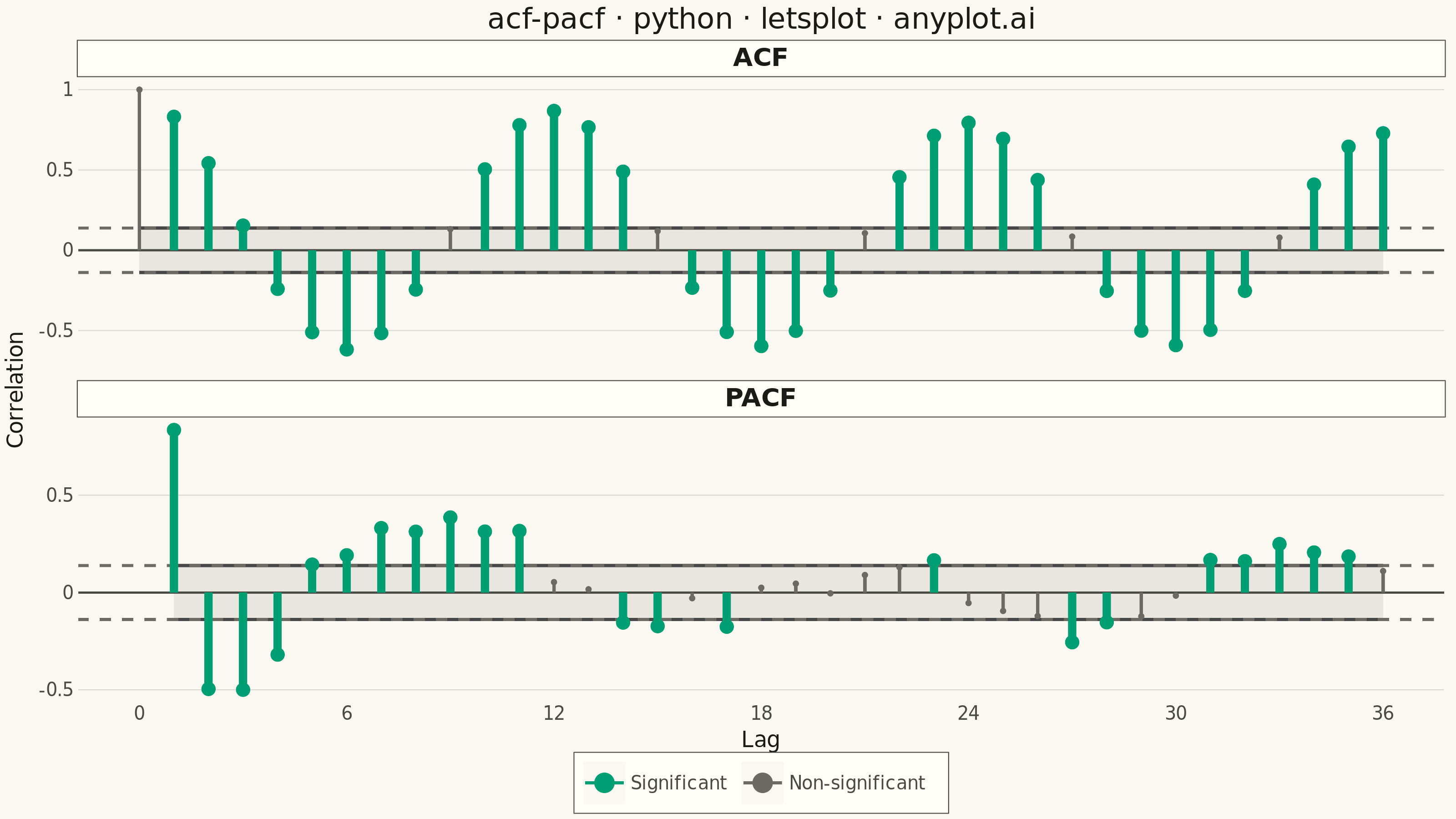
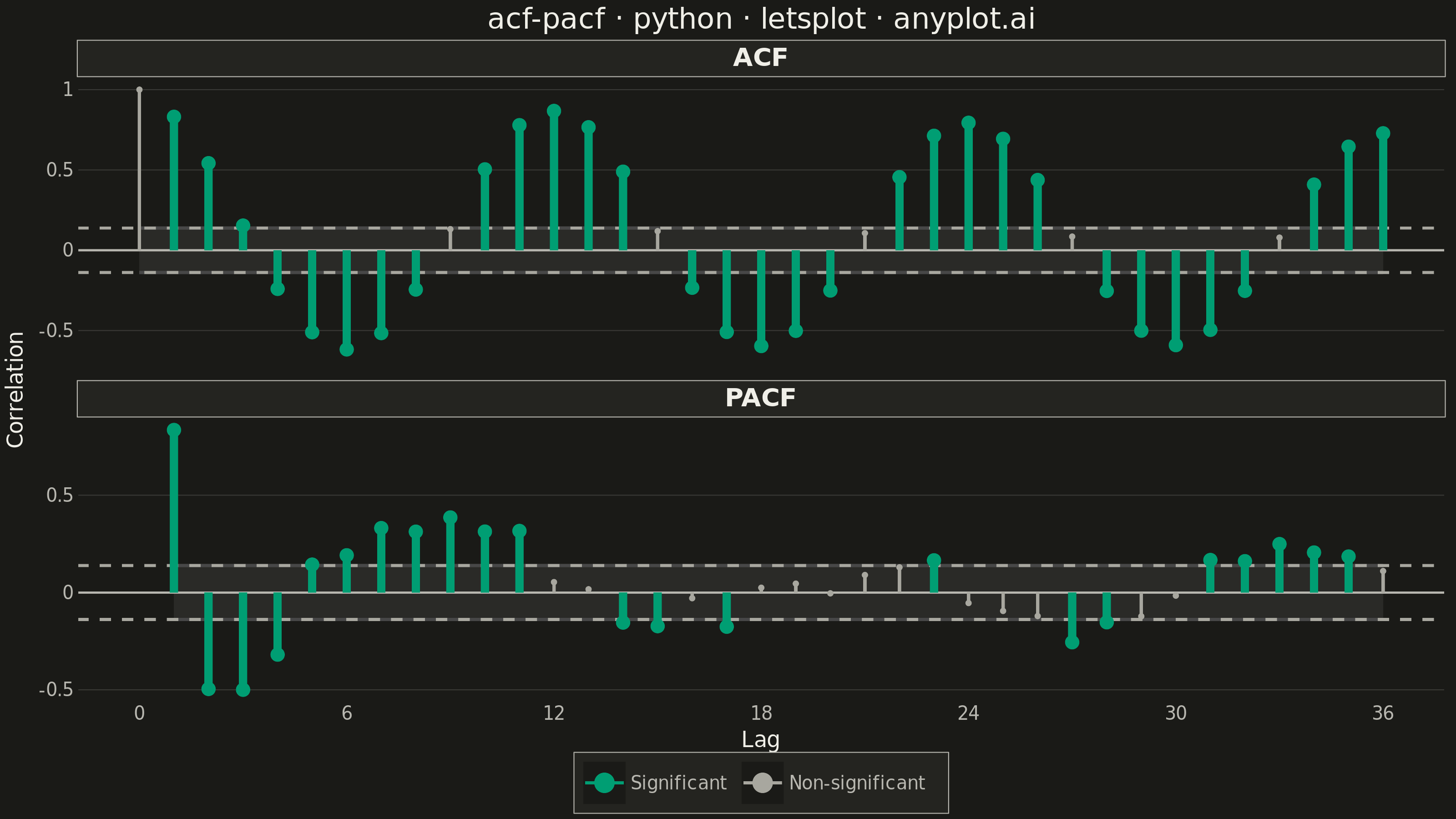
Displays the autocorrelation function (ACF) and partial autocorrelation function (PACF) of a time series as vertical stem/bar plots arranged in two vertically stacked subplots. Each lag is represented by a vertical line from zero to the correlation value, with horizontal dashed lines indicating 95% confidence bounds. These plots are essential for identifying the order of AR and MA components in ARIMA modeling and for diagnosing residual independence.
""" anyplot.ai
acf-pacf: Autocorrelation and Partial Autocorrelation (ACF/PACF) Plot
Library: letsplot 4.10.1 | Python 3.13.13
Quality: 89/100 | Updated: 2026-06-10
"""

import os

import numpy as np
import pandas as pd
from lets_plot import (
    LetsPlot,
    aes,
    element_blank,
    element_line,
    element_rect,
    element_text,
    facet_wrap,
    geom_hline,
    geom_point,
    geom_ribbon,
    geom_segment,
    ggplot,
    ggsave,
    ggsize,
    labs,
    scale_color_manual,
    scale_x_continuous,
    theme,
    theme_minimal,
)
from statsmodels.tsa.stattools import acf, pacf


LetsPlot.setup_html()

# Theme tokens — Imprint palette
THEME = os.getenv("ANYPLOT_THEME", "light")
PAGE_BG = "#FAF8F1" if THEME == "light" else "#1A1A17"
ELEVATED_BG = "#FFFDF6" if THEME == "light" else "#242420"
INK = "#1A1A17" if THEME == "light" else "#F0EFE8"
INK_SOFT = "#4A4A44" if THEME == "light" else "#B8B7B0"
INK_MUTED = "#6B6A63" if THEME == "light" else "#A8A79F"
GRID = "rgba(26,26,23,0.15)" if THEME == "light" else "rgba(240,239,232,0.15)"
BRAND = "#009E73"  # Imprint position 1 — always first series

# Data — monthly airline-style passenger series with trend and seasonality
np.random.seed(42)
n = 200
t = np.arange(n)
series = 100 + 0.05 * t + 10 * np.sin(2 * np.pi * t / 12) + np.random.normal(0, 2, n)

n_lags = 36
acf_vals = acf(series, nlags=n_lags)
pacf_vals = pacf(series, nlags=n_lags)
ci = 1.96 / np.sqrt(n)

acf_df = pd.DataFrame({"lag": np.arange(n_lags + 1), "value": acf_vals, "zero": 0.0, "panel": "ACF"})
acf_df["sig"] = (acf_df["lag"] > 0) & (acf_df["value"].abs() > ci)

pacf_df = pd.DataFrame({"lag": np.arange(1, n_lags + 1), "value": pacf_vals[1:], "zero": 0.0, "panel": "PACF"})
pacf_df["sig"] = pacf_df["value"].abs() > ci

df = pd.concat([acf_df, pacf_df], ignore_index=True)
df["label"] = df["sig"].map({True: "Significant", False: "Non-significant"})

# CI band columns — semi-transparent shaded confidence zone behind the stems
df["ci_ymin"] = -ci
df["ci_ymax"] = ci

# Separate datasets for visual hierarchy — significant stems are drawn thicker
sig_df = df[df["sig"]].copy()
nonsig_df = df[~df["sig"]].copy()

color_order = ["Significant", "Non-significant"]
color_values = [BRAND, INK_MUTED]

# Plot — faceted ACF / PACF panels; theme_minimal() as lets-plot built-in base preset
plot = (
    ggplot(df, aes(x="lag", y="value"))
    + geom_ribbon(aes(x="lag", ymin="ci_ymin", ymax="ci_ymax"), fill=INK_SOFT, alpha=0.1)
    + geom_hline(yintercept=0, color=INK_SOFT, size=0.5)
    + geom_hline(yintercept=ci, color=INK_MUTED, size=0.7, linetype="dashed")
    + geom_hline(yintercept=-ci, color=INK_MUTED, size=0.7, linetype="dashed")
    + geom_segment(aes(x="lag", y="zero", xend="lag", yend="value", color="label"), data=nonsig_df, size=0.8)
    + geom_segment(aes(x="lag", y="zero", xend="lag", yend="value", color="label"), data=sig_df, size=2.0)
    + geom_point(aes(x="lag", y="value", color="label"), data=nonsig_df, size=1.5)
    + geom_point(aes(x="lag", y="value", color="label"), data=sig_df, size=3.5)
    + scale_color_manual(values=color_values, limits=color_order, name="")
    + scale_x_continuous(breaks=list(range(0, n_lags + 1, 6)))
    + facet_wrap("panel", ncol=1, scales="free_y")
    + labs(x="Lag", y="Correlation", title="acf-pacf · python · letsplot · anyplot.ai")
    + theme_minimal()
    + theme(
        plot_background=element_rect(fill=PAGE_BG, color=PAGE_BG),
        panel_background=element_rect(fill=PAGE_BG, color=PAGE_BG),
        panel_border=element_blank(),
        strip_background=element_rect(fill=ELEVATED_BG, color=INK_SOFT, size=0.5),
        strip_text=element_text(color=INK, size=14, face="bold"),
        panel_grid_major_x=element_blank(),
        panel_grid_minor=element_blank(),
        panel_grid_major_y=element_line(color=GRID, size=0.5),
        axis_title=element_text(color=INK, size=12),
        axis_text=element_text(color=INK_SOFT, size=10),
        axis_line=element_line(color=INK_SOFT, size=0.5),
        plot_title=element_text(color=INK, size=16, hjust=0.5),
        legend_background=element_rect(fill=ELEVATED_BG, color=INK_SOFT, size=0.5),
        legend_text=element_text(color=INK_SOFT, size=10),
        legend_title=element_blank(),
        legend_position="bottom",
    )
    + ggsize(800, 450)
)

ggsave(plot, f"plot-{THEME}.png", path=".", scale=4)
ggsave(plot, f"plot-{THEME}.html", path=".")
Runnable source as JSON, for any HTTP client: https://api.anyplot.ai/specs/acf-pacf/letsplot/code. Any spec id and library id listed in llms-full.txt fit the same URL shape; every URL below is complete and callable.
{
  "spec_id": "acf-pacf",
  "language": "python",
  "library": "letsplot",
  "page": "https://anyplot.ai/acf-pacf/python/letsplot",
  "hub": "https://anyplot.ai/acf-pacf",
  "code_json": "https://api.anyplot.ai/specs/acf-pacf/letsplot/code",
  "spec_json": "https://api.anyplot.ai/specs/acf-pacf",
  "render_light_png": "https://storage.googleapis.com/anyplot-images/plots/acf-pacf/python/letsplot/plot-light.png",
  "render_dark_png": "https://storage.googleapis.com/anyplot-images/plots/acf-pacf/python/letsplot/plot-dark.png",
  "interactive_light_html": "https://storage.googleapis.com/anyplot-images/plots/acf-pacf/python/letsplot/plot-light.html",
  "interactive_dark_html": "https://storage.googleapis.com/anyplot-images/plots/acf-pacf/python/letsplot/plot-dark.html",
  "quality_score": 89.0,
  "license": "MIT",
  "guide": "https://anyplot.ai/llms.txt"
}
Part of Autocorrelation and Partial Autocorrelation (ACF/PACF) Plot on anyplot.ai.