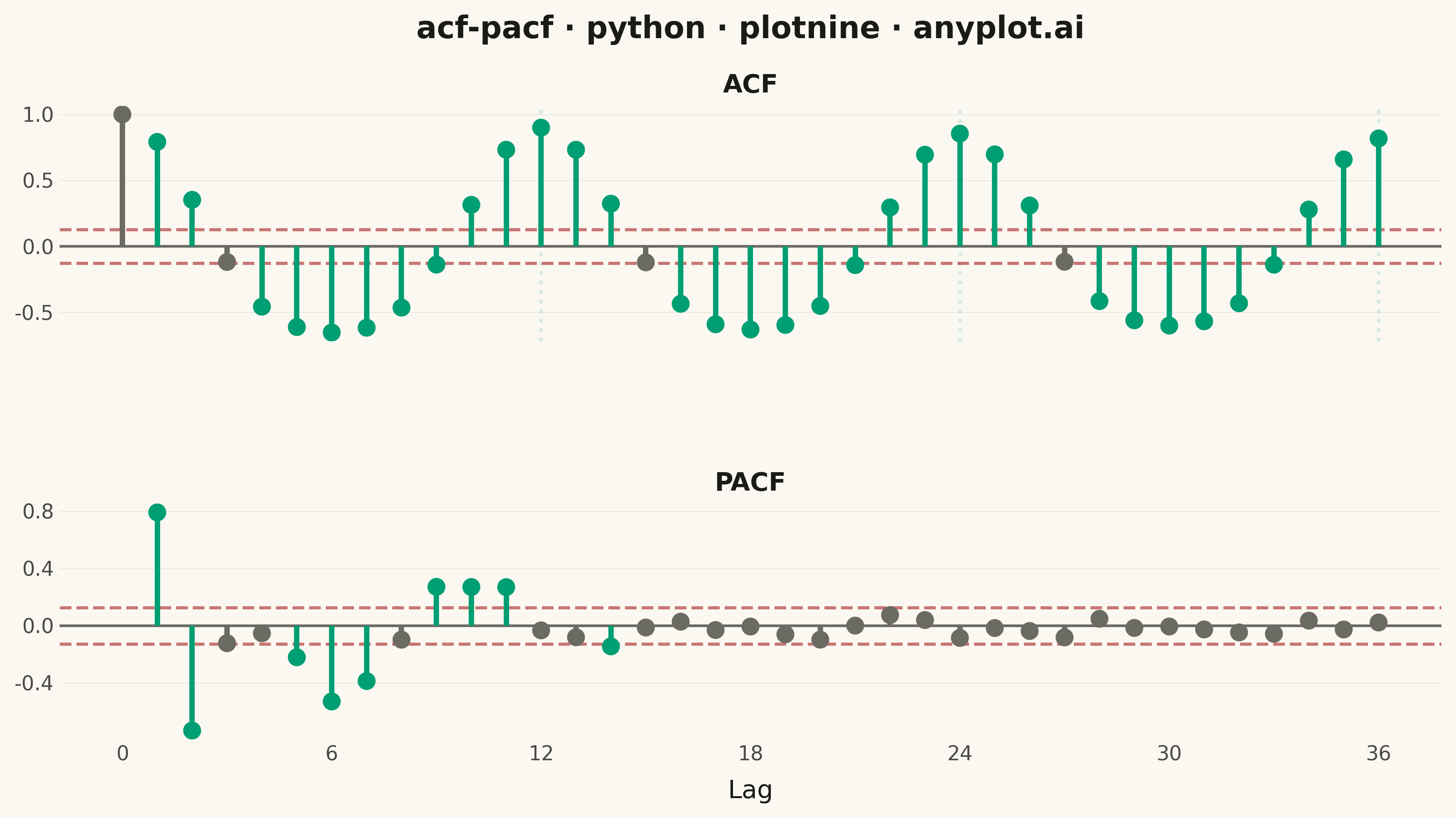
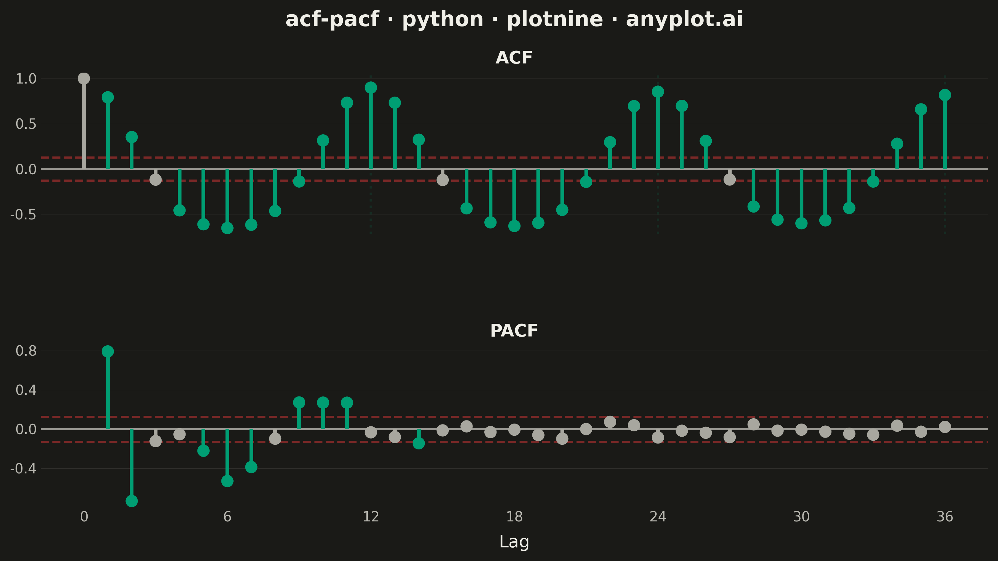
Displays the autocorrelation function (ACF) and partial autocorrelation function (PACF) of a time series as vertical stem/bar plots arranged in two vertically stacked subplots. Each lag is represented by a vertical line from zero to the correlation value, with horizontal dashed lines indicating 95% confidence bounds. These plots are essential for identifying the order of AR and MA components in ARIMA modeling and for diagnosing residual independence.
""" anyplot.ai
acf-pacf: Autocorrelation and Partial Autocorrelation (ACF/PACF) Plot
Library: plotnine 0.15.5 | Python 3.13.13
Quality: 91/100 | Updated: 2026-06-10
"""

import os
import sys

import numpy as np
import pandas as pd


# Work around naming conflict with plotnine.py script and plotnine package
script_dir = os.path.dirname(os.path.abspath(__file__))
if script_dir in sys.path:
    sys.path.remove(script_dir)
if "" in sys.path:
    sys.path.remove("")
if "." in sys.path:
    sys.path.remove(".")

from plotnine import (
    aes,
    element_blank,
    element_line,
    element_rect,
    element_text,
    facet_wrap,
    geom_hline,
    geom_point,
    geom_segment,
    geom_vline,
    ggplot,
    guides,
    labs,
    scale_color_manual,
    scale_x_continuous,
    scale_y_continuous,
    theme,
    theme_minimal,
)
from statsmodels.tsa.stattools import acf, pacf


# Theme tokens — Imprint palette, theme-adaptive chrome
THEME = os.getenv("ANYPLOT_THEME", "light")
PAGE_BG = "#FAF8F1" if THEME == "light" else "#1A1A17"
ELEVATED_BG = "#FFFDF6" if THEME == "light" else "#242420"
INK = "#1A1A17" if THEME == "light" else "#F0EFE8"
INK_SOFT = "#4A4A44" if THEME == "light" else "#B8B7B0"
INK_MUTED = "#6B6A63" if THEME == "light" else "#A8A79F"

# Imprint palette positions used
BRAND = "#009E73"  # position 1 — significant lags (brand green, first series)
ALARM = "#AE3030"  # position 5 — confidence bounds (semantic: alert/threshold)

# Data — simulated monthly temperature with seasonality and AR(1) component
np.random.seed(42)
n_obs = 240
time = np.arange(n_obs)
seasonal = 12 * np.sin(2 * np.pi * time / 12) + 4 * np.cos(2 * np.pi * time / 6)
ar_component = np.zeros(n_obs)
for t in range(1, n_obs):
    ar_component[t] = 0.4 * ar_component[t - 1] + np.random.normal(0, 2)
temperature = seasonal + ar_component

# Compute ACF and PACF
n_lags = 36
acf_values = acf(temperature, nlags=n_lags, fft=True)
pacf_values = pacf(temperature, nlags=n_lags, method="ywm")
confidence_bound = 1.96 / np.sqrt(n_obs)

# Build long-format DataFrame for faceting
acf_df = pd.DataFrame({"lag": np.arange(len(acf_values)), "correlation": acf_values, "panel": "ACF"})
pacf_df = pd.DataFrame({"lag": np.arange(1, len(pacf_values)), "correlation": pacf_values[1:], "panel": "PACF"})
df = pd.concat([acf_df, pacf_df], ignore_index=True)
df["panel"] = pd.Categorical(df["panel"], categories=["ACF", "PACF"], ordered=True)

# Mark significance: lags outside confidence bounds
df["significant"] = np.where(np.abs(df["correlation"]) > confidence_bound, "Significant", "Non-significant")
# Lag 0 in ACF is always 1.0 by definition — not a meaningful significant lag
df.loc[(df["panel"] == "ACF") & (df["lag"] == 0), "significant"] = "Non-significant"

# Seasonal lag markers restricted to ACF panel — period-12 structure at lags 12, 24, 36
seasonal_ann_df = pd.DataFrame(
    {
        "xintercept": [12, 24, 36],
        "panel": pd.Categorical(["ACF", "ACF", "ACF"], categories=["ACF", "PACF"], ordered=True),
    }
)

# Title — 41 chars, within 67-char baseline, no font scaling needed
title = "acf-pacf · python · plotnine · anyplot.ai"

# Plot — strip labels "ACF" / "PACF" serve as per-panel y-axis identifiers per spec
plot = (
    ggplot(df, aes(x="lag", y="correlation", color="significant"))
    + geom_hline(yintercept=0, color=INK_SOFT, size=0.6, alpha=0.8)
    + geom_vline(
        data=seasonal_ann_df, mapping=aes(xintercept="xintercept"), color=BRAND, alpha=0.14, size=0.8, linetype="dotted"
    )
    + geom_hline(yintercept=confidence_bound, linetype="dashed", color=ALARM, size=0.7, alpha=0.65)
    + geom_hline(yintercept=-confidence_bound, linetype="dashed", color=ALARM, size=0.7, alpha=0.65)
    + geom_segment(aes(x="lag", xend="lag", y=0, yend="correlation"), size=1.2)
    + geom_point(size=3.0)
    + scale_color_manual(values={"Significant": BRAND, "Non-significant": INK_MUTED})
    + guides(color="none")
    + facet_wrap("~panel", ncol=1, scales="free_y")
    + scale_x_continuous(breaks=list(range(0, n_lags + 1, 6)))
    + scale_y_continuous(expand=(0.04, 0))
    + labs(x="Lag", y="", title=title)
    + theme_minimal()
    + theme(
        figure_size=(8, 4.5),
        plot_background=element_rect(fill=PAGE_BG, color=PAGE_BG),
        panel_background=element_rect(fill=PAGE_BG),
        panel_grid_major_x=element_blank(),
        panel_grid_minor_x=element_blank(),
        panel_grid_major_y=element_line(color=INK, size=0.2, alpha=0.12),
        panel_grid_minor_y=element_blank(),
        axis_title_x=element_text(color=INK, size=10),
        axis_title_y=element_blank(),
        axis_text=element_text(color=INK_SOFT, size=8),
        plot_title=element_text(color=INK, size=12, face="bold"),
        strip_background=element_rect(fill=PAGE_BG, color="none"),
        strip_text=element_text(color=INK, size=10, face="bold"),
        panel_spacing_y=0.08,
    )
)

# Save — canvas: 8×4.5 in × 400 dpi = 3200×1800 px
plot.save(f"plot-{THEME}.png", dpi=400, width=8, height=4.5, units="in", verbose=False)
Runnable source as JSON, for any HTTP client: https://api.anyplot.ai/specs/acf-pacf/plotnine/code. Any spec id and library id listed in llms-full.txt fit the same URL shape; every URL below is complete and callable.
{
  "spec_id": "acf-pacf",
  "language": "python",
  "library": "plotnine",
  "page": "https://anyplot.ai/acf-pacf/python/plotnine",
  "hub": "https://anyplot.ai/acf-pacf",
  "code_json": "https://api.anyplot.ai/specs/acf-pacf/plotnine/code",
  "spec_json": "https://api.anyplot.ai/specs/acf-pacf",
  "render_light_png": "https://storage.googleapis.com/anyplot-images/plots/acf-pacf/python/plotnine/plot-light.png",
  "render_dark_png": "https://storage.googleapis.com/anyplot-images/plots/acf-pacf/python/plotnine/plot-dark.png",
  "quality_score": 91.0,
  "license": "MIT",
  "guide": "https://anyplot.ai/llms.txt"
}
Part of Autocorrelation and Partial Autocorrelation (ACF/PACF) Plot on anyplot.ai.