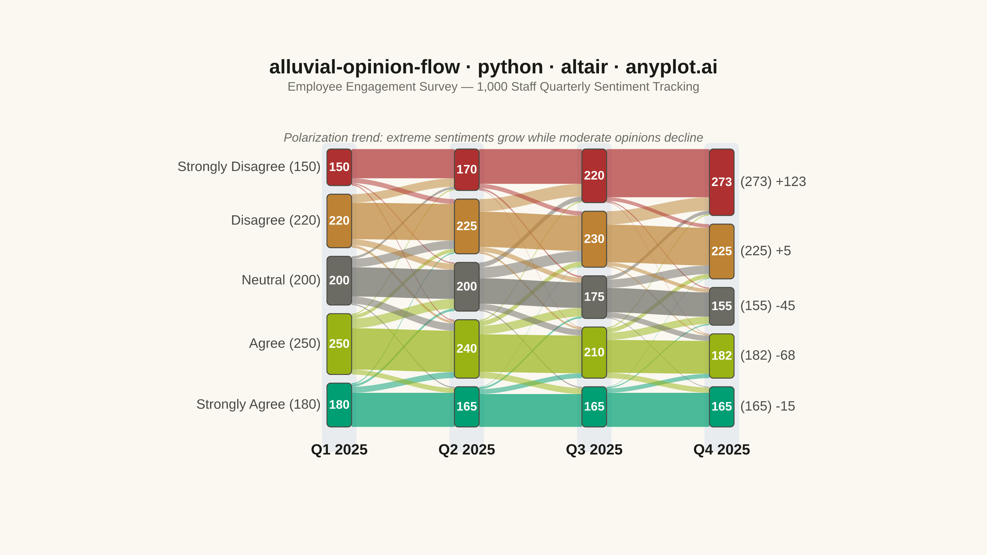
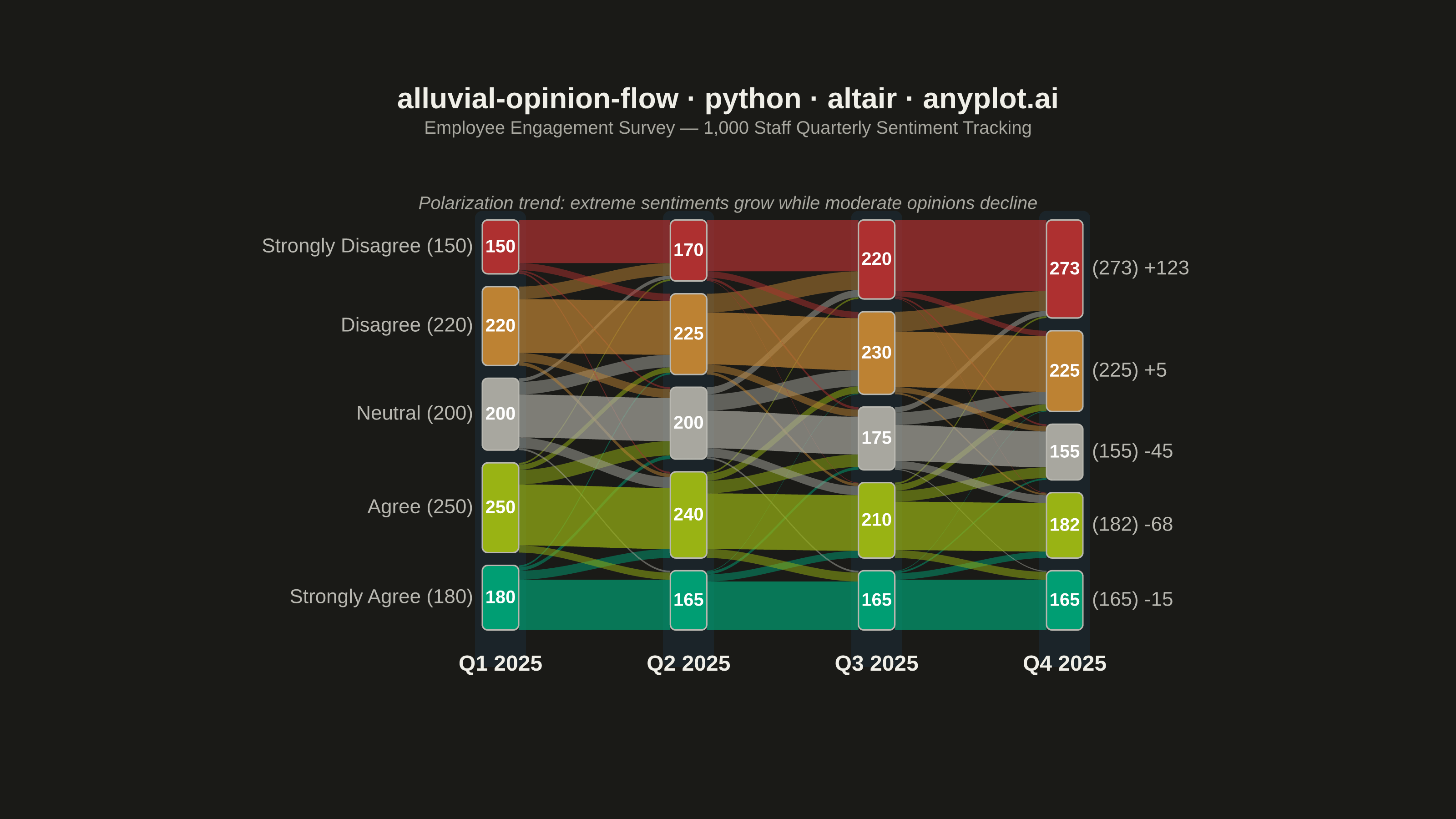
An alluvial/Sankey-style diagram showing how opinions or group memberships shift between survey waves or time periods. Flows connect the same response categories across columns, revealing patterns of opinion change, stability, and polarization. Unlike a basic alluvial diagram, this variant emphasizes distinguishing stable respondents from net changers and displays respondent totals per category at each wave.
""" anyplot.ai
alluvial-opinion-flow: Opinion Flow Diagram
Library: altair 6.1.0 | Python 3.13.13
Quality: 92/100 | Updated: 2026-05-30
"""

import os

import altair as alt
import numpy as np
import pandas as pd
from PIL import Image


# Theme tokens
THEME = os.getenv("ANYPLOT_THEME", "light")
PAGE_BG = "#FAF8F1" if THEME == "light" else "#1A1A17"
ELEVATED_BG = "#FFFDF6" if THEME == "light" else "#242420"
INK = "#1A1A17" if THEME == "light" else "#F0EFE8"
INK_SOFT = "#4A4A44" if THEME == "light" else "#B8B7B0"
INK_MUTED = "#6B6A63" if THEME == "light" else "#A8A79F"

# Imprint palette — semantic mapping: positive→green, negative→red, neutral→muted anchor
CATEGORY_COLORS = {
    "Strongly Agree": "#009E73",  # Imprint green (positive anchor)
    "Agree": "#99B314",  # Imprint lime (mildly positive)
    "Neutral": INK_MUTED,  # theme-adaptive muted anchor
    "Disagree": "#BD8233",  # Imprint ochre (mildly negative)
    "Strongly Disagree": "#AE3030",  # Imprint matte red (negative anchor)
}

# Wave-column background band — theme-adaptive
BAND_COLOR = "#DDE5EE" if THEME == "light" else "#1C2B36"

np.random.seed(42)

# Data — employee engagement survey: 1,000 staff tracked across 4 quarterly waves
categories = ["Strongly Agree", "Agree", "Neutral", "Disagree", "Strongly Disagree"]
waves = ["Q1 2025", "Q2 2025", "Q3 2025", "Q4 2025"]
n_cats = len(categories)
initial_counts = [180, 250, 200, 220, 150]

transitions = [
    np.array(
        [[140, 25, 10, 5, 0], [20, 170, 40, 15, 5], [5, 30, 120, 35, 10], [0, 10, 25, 150, 35], [0, 5, 5, 20, 120]]
    ),
    np.array([[135, 20, 8, 2, 0], [25, 155, 35, 20, 5], [5, 25, 105, 45, 20], [0, 8, 20, 145, 52], [0, 2, 7, 18, 143]]),
    np.array([[140, 18, 5, 2, 0], [22, 135, 30, 18, 5], [3, 22, 100, 35, 15], [0, 5, 15, 155, 55], [0, 2, 5, 15, 198]]),
]

wave_totals = [dict(zip(categories, initial_counts, strict=True))]
for trans in transitions:
    wave_totals.append(dict(zip(categories, trans.sum(axis=0).tolist(), strict=True)))

# Layout — coordinate space matches view dimensions (620 × 320 CSS px)
view_w = 620
view_h = 320
top_margin = 42  # space for wave-column headers inside view
bottom_margin = 22  # space for trend annotation
left_margin = 185  # space for left side-labels
right_margin = 125  # space for right side-labels
node_w = 20
node_gap = 7
n_waves = len(waves)

avail_h = view_h - top_margin - bottom_margin
avail_w = view_w - left_margin - right_margin
x_pos = [left_margin + i * avail_w / (n_waves - 1) for i in range(n_waves)]

# Node positions for each wave
node_pos = {}
for wi in range(n_waves):
    total = sum(wave_totals[wi].values())
    usable = avail_h * 0.88 - node_gap * (n_cats - 1)
    cy = top_margin + (avail_h - usable - node_gap * (n_cats - 1)) / 2
    node_pos[wi] = {}
    for cat in categories:
        ct = wave_totals[wi][cat]
        nh = (ct / total) * usable
        node_pos[wi][cat] = {"y": cy, "h": nh, "x": x_pos[wi] - node_w / 2, "total": ct}
        cy += nh + node_gap

# Flow polygon data (smooth bezier-like curves)
src_off = {w: {c: node_pos[w][c]["y"] for c in categories} for w in range(n_waves)}
tgt_off = {w: {c: node_pos[w][c]["y"] for c in categories} for w in range(n_waves)}
flow_rows = []
ncp = 40

for ti, trans in enumerate(transitions):
    for si, sc in enumerate(categories):
        for tci, tc in enumerate(categories):
            val = int(trans[si, tci])
            if val == 0:
                continue
            sp = node_pos[ti][sc]
            tp = node_pos[ti + 1][tc]
            is_stable = si == tci
            sh = (val / wave_totals[ti][sc]) * sp["h"]
            th = (val / wave_totals[ti + 1][tc]) * tp["h"]
            syt = src_off[ti][sc]
            syb = syt + sh
            tyt = tgt_off[ti + 1][tc]
            tyb = tyt + th
            src_off[ti][sc] += sh
            tgt_off[ti + 1][tc] += th
            xs = x_pos[ti] + node_w / 2
            xe = x_pos[ti + 1] - node_w / 2
            fid = f"w{ti}_{sc}_{tc}"
            pts = []
            for i in range(ncp):
                t = i / (ncp - 1)
                s = t * t * (3 - 2 * t)
                pts.append((xs + t * (xe - xs), syt + s * (tyt - syt)))
            for i in range(ncp - 1, -1, -1):
                t = i / (ncp - 1)
                s = t * t * (3 - 2 * t)
                pts.append((xs + t * (xe - xs), syb + s * (tyb - syb)))
            for pi, (px, py) in enumerate(pts):
                flow_rows.append(
                    {
                        "fid": fid,
                        "src": sc,
                        "tgt": tc,
                        "name": sc,
                        "val": val,
                        "x": px,
                        "y": py,
                        "ord": pi,
                        "stable": is_stable,
                    }
                )

flows_df = pd.DataFrame(flow_rows)

# Node rectangle data
node_rows = []
for wi in range(n_waves):
    for cat in categories:
        p = node_pos[wi][cat]
        node_rows.append(
            {
                "name": cat,
                "wave": waves[wi],
                "wave_idx": wi,
                "x": p["x"],
                "y": p["y"],
                "x2": p["x"] + node_w,
                "y2": p["y"] + p["h"],
                "cx": p["x"] + node_w / 2,
                "cy": p["y"] + p["h"] / 2,
                "total": p["total"],
            }
        )
nodes_df = pd.DataFrame(node_rows)

xs = alt.Scale(domain=[0, view_w])
ys = alt.Scale(domain=[0, view_h])
cdom = list(CATEGORY_COLORS.keys())
crange = list(CATEGORY_COLORS.values())

hover = alt.selection_point(fields=["name"], on="pointerover")

stable_flows = (
    alt.Chart(flows_df)
    .transform_filter("datum.stable")
    .mark_line(filled=True, strokeWidth=0)
    .encode(
        x=alt.X("x:Q", scale=xs, axis=None),
        y=alt.Y("y:Q", scale=ys, axis=None),
        color=alt.Color("src:N", scale=alt.Scale(domain=cdom, range=crange), legend=None),
        detail="fid:N",
        order="ord:Q",
        opacity=alt.condition(hover, alt.value(0.70), alt.value(0.55)),
        tooltip=[alt.Tooltip("src:N", title="Category"), alt.Tooltip("val:Q", title="Stable respondents")],
    )
)

change_flows = (
    alt.Chart(flows_df)
    .transform_filter("!datum.stable")
    .mark_line(filled=True, strokeWidth=0)
    .encode(
        x=alt.X("x:Q", scale=xs, axis=None),
        y=alt.Y("y:Q", scale=ys, axis=None),
        color=alt.Color("src:N", scale=alt.Scale(domain=cdom, range=crange), legend=None),
        detail="fid:N",
        order="ord:Q",
        opacity=alt.condition(hover, alt.value(0.50), alt.value(0.30)),
        tooltip=[
            alt.Tooltip("src:N", title="From"),
            alt.Tooltip("tgt:N", title="To"),
            alt.Tooltip("val:Q", title="Respondents"),
        ],
    )
)

nodes_layer = (
    alt.Chart(nodes_df)
    .mark_rect(stroke=INK_SOFT, strokeWidth=0.8, cornerRadius=3)
    .encode(
        x=alt.X("x:Q", scale=xs),
        y=alt.Y("y:Q", scale=ys),
        x2="x2:Q",
        y2="y2:Q",
        color=alt.Color(
            "name:N",
            scale=alt.Scale(domain=cdom, range=crange),
            legend=alt.Legend(
                title="Sentiment",
                orient="bottom",
                direction="horizontal",
                titleFontSize=12,
                labelFontSize=11,
                titlePadding=6,
                symbolSize=200,
                padding=4,
            ),
        ),
        tooltip=[
            alt.Tooltip("wave:N", title="Quarter"),
            alt.Tooltip("name:N", title="Sentiment"),
            alt.Tooltip("total:Q", title="Respondents"),
        ],
    )
    .add_params(hover)
)

count_labels = (
    alt.Chart(nodes_df)
    .transform_filter(alt.datum.y2 - alt.datum.y >= 8)
    .transform_calculate(lbl="'' + datum.total")
    .mark_text(fontSize=10, fontWeight="bold", color="#FFFFFF", baseline="middle", align="center")
    .encode(x=alt.X("cx:Q", scale=xs), y=alt.Y("cy:Q", scale=ys), text="lbl:N")
)

# Left labels: category name + Q1 count
label_rows = []
for _, row in nodes_df.iterrows():
    yc = (row["y"] + row["y2"]) / 2
    if row["wave_idx"] == 0:
        label_rows.append({"x": row["x"] - 5, "y": yc, "text": f"{row['name']} ({int(row['total'])})", "side": "left"})
    elif row["wave_idx"] == n_waves - 1:
        cat = row["name"]
        delta = wave_totals[n_waves - 1][cat] - wave_totals[0][cat]
        sign = "+" if delta >= 0 else ""
        label_rows.append(
            {"x": row["x2"] + 5, "y": yc, "text": f"({int(row['total'])}) {sign}{delta}", "side": "right"}
        )
labels_df = pd.DataFrame(label_rows)

left_labels = (
    alt.Chart(labels_df)
    .transform_filter(alt.datum.side == "left")
    .mark_text(fontSize=11, color=INK_SOFT, align="right", baseline="middle")
    .encode(x=alt.X("x:Q", scale=xs), y=alt.Y("y:Q", scale=ys), text="text:N")
)

right_labels = (
    alt.Chart(labels_df)
    .transform_filter(alt.datum.side == "right")
    .mark_text(fontSize=11, color=INK_SOFT, align="left", baseline="middle")
    .encode(x=alt.X("x:Q", scale=xs), y=alt.Y("y:Q", scale=ys), text="text:N")
)

# Wave-column headers — positioned just above the node area inside the view
hdr_y = top_margin - 10
hdr_data = pd.DataFrame([{"x": x_pos[i], "y": hdr_y, "text": waves[i]} for i in range(n_waves)])
wave_headers = (
    alt.Chart(hdr_data)
    .mark_text(fontSize=12, fontWeight="bold", color=INK, baseline="bottom", align="center")
    .encode(x=alt.X("x:Q", scale=xs), y=alt.Y("y:Q", scale=ys), text="text:N")
)

# Trend annotation — bottom of view
max_y = max(node_pos[w][c]["y"] + node_pos[w][c]["h"] for w in range(n_waves) for c in categories)
trend_y = max_y + 14
trend_data = pd.DataFrame(
    [
        {
            "x": view_w / 2,
            "y": trend_y,
            "text": "Polarization trend: extreme sentiments grow while moderate opinions decline",
        }
    ]
)
trend_ann = (
    alt.Chart(trend_data)
    .mark_text(fontSize=10, fontStyle="italic", color=INK_MUTED, baseline="top", align="center")
    .encode(x=alt.X("x:Q", scale=xs), y=alt.Y("y:Q", scale=ys), text="text:N")
)

# Subtle column background bands
bw = 14
band_data = pd.DataFrame(
    [{"x": x_pos[i] - bw, "x2": x_pos[i] + bw, "y": top_margin - 5, "y2": max_y + 5} for i in range(n_waves)]
)
wave_bands = (
    alt.Chart(band_data)
    .mark_rect(color=BAND_COLOR, opacity=0.6, cornerRadius=4)
    .encode(x=alt.X("x:Q", scale=xs, axis=None), x2="x2:Q", y=alt.Y("y:Q", scale=ys, axis=None), y2="y2:Q")
)

title_str = "alluvial-opinion-flow · python · altair · anyplot.ai"
n_chars = len(title_str)
ratio = 67 / n_chars if n_chars > 67 else 1.0
title_fs = max(11, round(16 * ratio))

chart = (
    alt.layer(
        wave_bands,
        change_flows,
        stable_flows,
        nodes_layer,
        count_labels,
        left_labels,
        right_labels,
        wave_headers,
        trend_ann,
    )
    .properties(
        width=620,
        height=320,
        background=PAGE_BG,
        title=alt.Title(
            text=title_str,
            subtitle="Employee Engagement Survey — 1,000 Staff Quarterly Sentiment Tracking",
            fontSize=title_fs,
            subtitleFontSize=10,
            subtitleColor=INK_MUTED,
            anchor="middle",
            color=INK,
            offset=8,
        ),
    )
    .configure_view(strokeWidth=0, fill=PAGE_BG)
    .configure_legend(fillColor=ELEVATED_BG, strokeColor=INK_SOFT, labelColor=INK_SOFT, titleColor=INK)
    .interactive()
)

# Save — canvas hard contract: 3200 × 1800 (landscape)
TW, TH = 3200, 1800
chart.save(f"plot-{THEME}.png", scale_factor=4.0)

_img = Image.open(f"plot-{THEME}.png").convert("RGB")
_w, _h = _img.size
if _w > TW or _h > TH:
    raise SystemExit(
        f"altair vl-convert produced {_w}×{_h}, exceeds target {TW}×{TH}. "
        f"Shrink chart .properties(width=, height=) values and re-render."
    )
if _w < TW or _h < TH:
    _canvas = Image.new("RGB", (TW, TH), PAGE_BG)
    _canvas.paste(_img, ((TW - _w) // 2, (TH - _h) // 2))
    _canvas.save(f"plot-{THEME}.png")

chart.save(f"plot-{THEME}.html")
Runnable source as JSON, for any HTTP client: https://api.anyplot.ai/specs/alluvial-opinion-flow/altair/code. Any spec id and library id listed in llms-full.txt fit the same URL shape; every URL below is complete and callable.
{
  "spec_id": "alluvial-opinion-flow",
  "language": "python",
  "library": "altair",
  "page": "https://anyplot.ai/alluvial-opinion-flow/python/altair",
  "hub": "https://anyplot.ai/alluvial-opinion-flow",
  "code_json": "https://api.anyplot.ai/specs/alluvial-opinion-flow/altair/code",
  "spec_json": "https://api.anyplot.ai/specs/alluvial-opinion-flow",
  "render_light_png": "https://storage.googleapis.com/anyplot-images/plots/alluvial-opinion-flow/python/altair/plot-light.png",
  "render_dark_png": "https://storage.googleapis.com/anyplot-images/plots/alluvial-opinion-flow/python/altair/plot-dark.png",
  "interactive_light_html": "https://storage.googleapis.com/anyplot-images/plots/alluvial-opinion-flow/python/altair/plot-light.html",
  "interactive_dark_html": "https://storage.googleapis.com/anyplot-images/plots/alluvial-opinion-flow/python/altair/plot-dark.html",
  "quality_score": 92.0,
  "license": "MIT",
  "guide": "https://anyplot.ai/llms.txt"
}
Part of Opinion Flow Diagram on anyplot.ai.