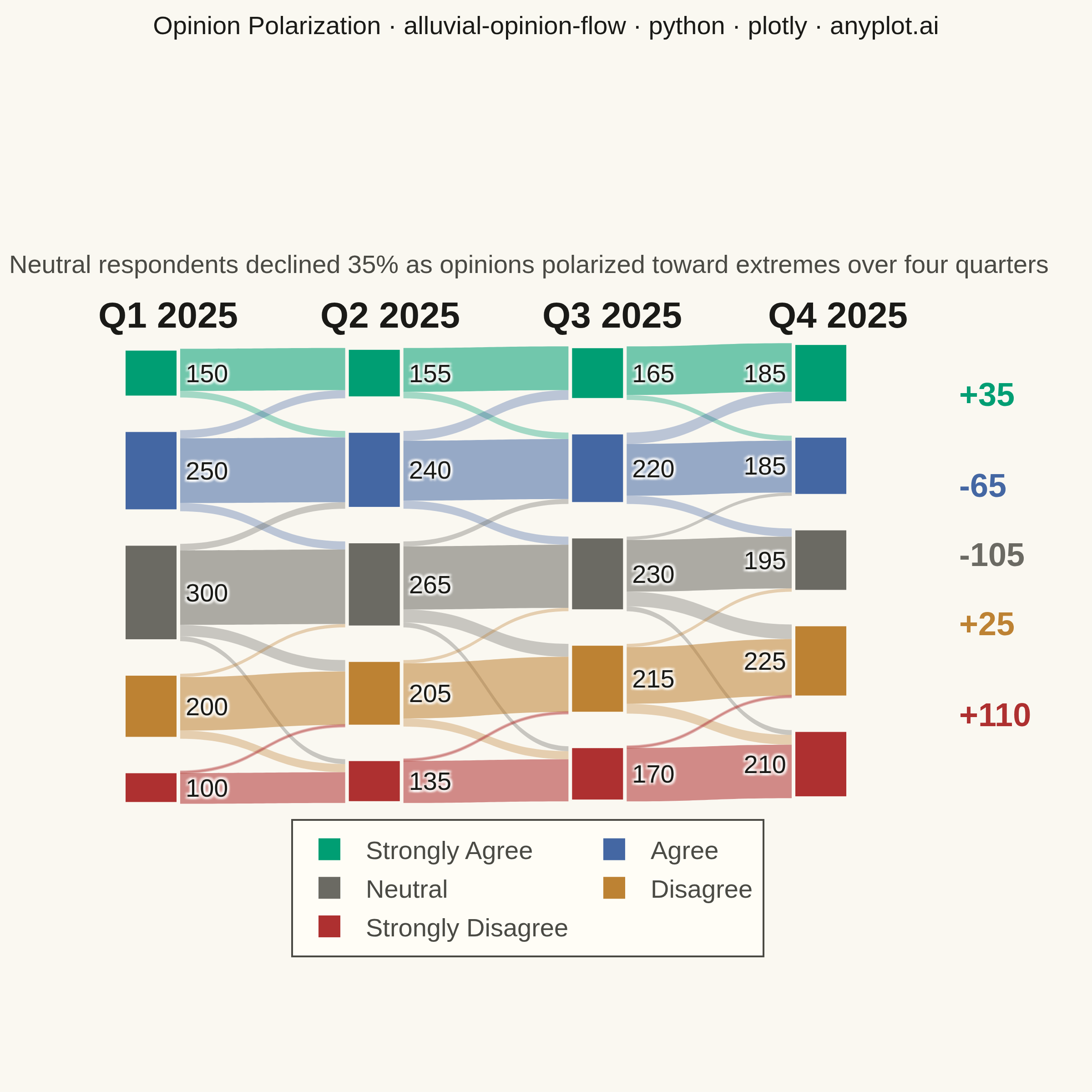
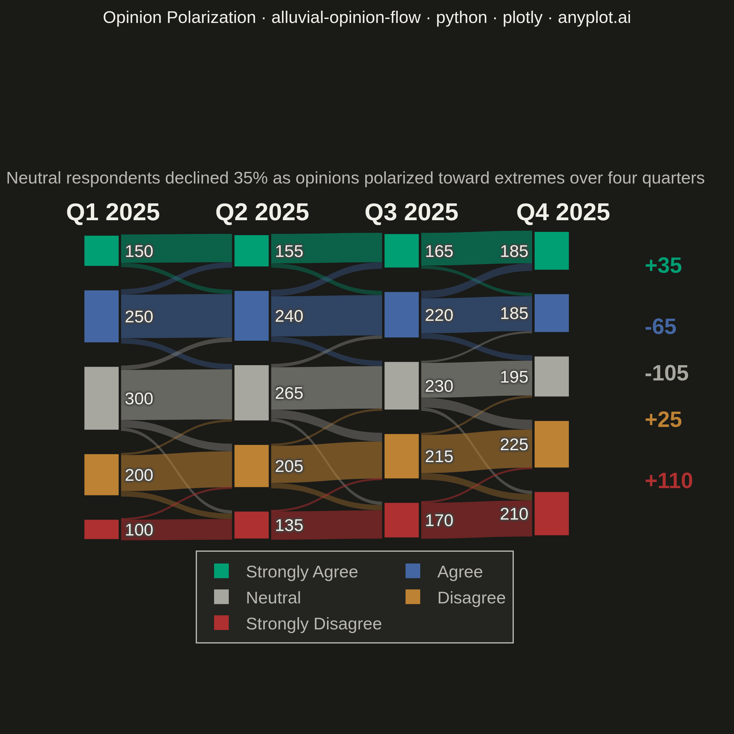
An alluvial/Sankey-style diagram showing how opinions or group memberships shift between survey waves or time periods. Flows connect the same response categories across columns, revealing patterns of opinion change, stability, and polarization. Unlike a basic alluvial diagram, this variant emphasizes distinguishing stable respondents from net changers and displays respondent totals per category at each wave.
""" anyplot.ai
alluvial-opinion-flow: Opinion Flow Diagram
Library: plotly 6.7.0 | Python 3.13.13
Quality: 90/100 | Updated: 2026-05-30
"""

import os

import plotly.graph_objects as go


# Theme tokens — Imprint palette, theme-adaptive chrome
THEME = os.getenv("ANYPLOT_THEME", "light")
PAGE_BG = "#FAF8F1" if THEME == "light" else "#1A1A17"
ELEVATED_BG = "#FFFDF6" if THEME == "light" else "#242420"
INK = "#1A1A17" if THEME == "light" else "#F0EFE8"
INK_SOFT = "#4A4A44" if THEME == "light" else "#B8B7B0"
INK_MUTED = "#6B6A63" if THEME == "light" else "#A8A79F"

# Opinion category colors — Imprint palette semantic exception (positive→green, negative→red)
cat_colors = {
    "Strongly Agree": "#009E73",  # brand green — strong positive
    "Agree": "#4467A3",  # blue — moderate positive
    "Neutral": INK_MUTED,  # theme-adaptive muted — neutral/rest anchor
    "Disagree": "#BD8233",  # ochre — mild negative
    "Strongly Disagree": "#AE3030",  # matte red — strong negative
}

# Data: 1000 respondents tracking opinions on public transit expansion across 4 quarterly waves
waves = ["Q1 2025", "Q2 2025", "Q3 2025", "Q4 2025"]
categories = ["Strongly Agree", "Agree", "Neutral", "Disagree", "Strongly Disagree"]
n_cats = len(categories)
n_waves = len(waves)

# Transition flows between consecutive waves: (source_cat_idx, target_cat_idx, count)
# Pattern: polarization — Neutral shrinks as extremes grow
transitions_w1_w2 = [
    (0, 0, 130),
    (0, 1, 20),
    (1, 0, 25),
    (1, 1, 200),
    (1, 2, 25),
    (2, 1, 20),
    (2, 2, 230),
    (2, 3, 35),
    (2, 4, 15),
    (3, 2, 10),
    (3, 3, 165),
    (3, 4, 25),
    (4, 3, 5),
    (4, 4, 95),
]
transitions_w2_w3 = [
    (0, 0, 135),
    (0, 1, 20),
    (1, 0, 30),
    (1, 1, 185),
    (1, 2, 25),
    (2, 1, 15),
    (2, 2, 195),
    (2, 3, 40),
    (2, 4, 15),
    (3, 2, 10),
    (3, 3, 170),
    (3, 4, 25),
    (4, 3, 5),
    (4, 4, 130),
]
transitions_w3_w4 = [
    (0, 0, 150),
    (0, 1, 15),
    (1, 0, 35),
    (1, 1, 160),
    (1, 2, 25),
    (2, 1, 10),
    (2, 2, 160),
    (2, 3, 45),
    (2, 4, 15),
    (3, 2, 10),
    (3, 3, 175),
    (3, 4, 30),
    (4, 3, 5),
    (4, 4, 165),
]
all_transitions = [transitions_w1_w2, transitions_w2_w3, transitions_w3_w4]

# Per-wave totals for node labels
wave_totals = [
    [150, 250, 300, 200, 100],
    [155, 240, 265, 205, 135],
    [165, 220, 230, 215, 170],
    [185, 185, 195, 225, 210],
]

# Build node arrays — y range [0.10, 0.90] on square canvas gives each node enough height
node_labels = []
node_colors = []
x_positions = []
y_positions = []

for w in range(n_waves):
    for c in range(n_cats):
        cat_name = categories[c]
        count = wave_totals[w][c]
        node_labels.append(str(count))
        node_colors.append(cat_colors[cat_name])
        x_positions.append(0.05 + (w / (n_waves - 1)) * 0.80)
        y_positions.append(0.10 + (c / (n_cats - 1)) * 0.80)

# Build link arrays
sources = []
targets = []
values = []
link_colors = []
link_customdata = []

for wave_idx, trans in enumerate(all_transitions):
    for src_cat, tgt_cat, count in trans:
        src_node = wave_idx * n_cats + src_cat
        tgt_node = (wave_idx + 1) * n_cats + tgt_cat
        sources.append(src_node)
        targets.append(tgt_node)
        values.append(count)

        is_stable = src_cat == tgt_cat
        hex_color = cat_colors[categories[src_cat]]
        r = int(hex_color[1:3], 16)
        g = int(hex_color[3:5], 16)
        b = int(hex_color[5:7], 16)
        opacity = 0.55 if is_stable else 0.35
        link_colors.append(f"rgba({r},{g},{b},{opacity})")

        link_customdata.append(
            [
                categories[src_cat],
                waves[wave_idx],
                categories[tgt_cat],
                waves[wave_idx + 1],
                "Stable" if is_stable else "Changed",
            ]
        )

# Plot
fig = go.Figure(
    data=[
        go.Sankey(
            arrangement="snap",
            textfont={"size": 14, "color": INK},
            node={
                "pad": 18,
                "thickness": 30,
                "line": {"color": PAGE_BG, "width": 2},
                "label": node_labels,
                "color": node_colors,
                "x": x_positions,
                "y": y_positions,
                "hovertemplate": "<b>%{label}</b><br>Respondents: %{value:,}<extra></extra>",
            },
            link={
                "source": sources,
                "target": targets,
                "value": values,
                "color": link_colors,
                "customdata": link_customdata,
                "hovertemplate": (
                    "<b>%{customdata[0]}</b> (%{customdata[1]})<br>"
                    "→ <b>%{customdata[2]}</b> (%{customdata[3]})<br>"
                    "Respondents: <b>%{value:,}</b><br>"
                    "Status: %{customdata[4]}<extra></extra>"
                ),
            },
        )
    ]
)

# Title — scaled fontsize for 75-char title (floor 11px, default 16px)
TITLE = "Opinion Polarization · alluvial-opinion-flow · python · plotly · anyplot.ai"
title_fontsize = max(11, round(16 * 67 / len(TITLE)))

# Subtitle annotation narrating the key insight
fig.add_annotation(
    x=0.5,
    y=1.18,
    xref="paper",
    yref="paper",
    text="Neutral respondents declined 35% as opinions polarized toward extremes over four quarters",
    showarrow=False,
    font={"size": 14, "color": INK_SOFT},
    xanchor="center",
)

# Wave column headers above nodes
wave_x_paper = [0.07, 0.335, 0.60, 0.87]
for i, wave in enumerate(waves):
    fig.add_annotation(
        x=wave_x_paper[i],
        y=1.08,
        xref="paper",
        yref="paper",
        text=f"<b>{wave}</b>",
        showarrow=False,
        font={"size": 20, "color": INK},
        xanchor="center",
    )

# Net change annotations on right side highlighting polarization trend
# Sankey y=0 is top, y=1 is bottom — invert to paper coordinates (y=0 bottom, y=1 top)
net_changes = [
    (categories[c], wave_totals[-1][c] - wave_totals[0][c], cat_colors[categories[c]]) for c in range(n_cats)
]

for c in range(n_cats):
    cat_name, delta, color = net_changes[c]
    sign = "+" if delta > 0 else ""
    node_y = 0.10 + (c / (n_cats - 1)) * 0.80
    paper_y = 1.0 - node_y
    fig.add_annotation(
        x=1.01,
        y=paper_y,
        xref="paper",
        yref="paper",
        text=f"<b>{sign}{delta}</b>",
        showarrow=False,
        font={"size": 18, "color": color},
        xanchor="left",
    )

# Legend via invisible scatter traces
for cat, color in cat_colors.items():
    fig.add_trace(
        go.Scatter(
            x=[None],
            y=[None],
            mode="markers",
            marker={"size": 16, "color": color, "symbol": "square"},
            name=cat,
            showlegend=True,
        )
    )

# Layout — square canvas (2400×2400) gives ample vertical space for 5 stacked category nodes
fig.update_layout(
    autosize=False,
    title={"text": TITLE, "font": {"size": title_fontsize, "color": INK}, "x": 0.5, "xanchor": "center", "y": 0.985},
    font={"size": 14, "color": INK},
    template="plotly_white",
    margin={"l": 60, "r": 80, "t": 180, "b": 170},
    paper_bgcolor=PAGE_BG,
    plot_bgcolor=PAGE_BG,
    legend={
        "orientation": "h",
        "yanchor": "top",
        "y": -0.08,
        "xanchor": "center",
        "x": 0.5,
        "font": {"size": 14, "color": INK_SOFT},
        "bgcolor": ELEVATED_BG,
        "bordercolor": INK_SOFT,
        "borderwidth": 1,
        "itemsizing": "constant",
    },
    xaxis={"visible": False},
    yaxis={"visible": False},
)

# Save — canvas: 600×600 × scale=4 → 2400×2400 px (square, 5 vertical categories benefit from equal h/w)
fig.write_image(f"plot-{THEME}.png", width=600, height=600, scale=4)
fig.write_html(f"plot-{THEME}.html", include_plotlyjs="cdn")
Runnable source as JSON, for any HTTP client: https://api.anyplot.ai/specs/alluvial-opinion-flow/plotly/code. Any spec id and library id listed in llms-full.txt fit the same URL shape; every URL below is complete and callable.
{
  "spec_id": "alluvial-opinion-flow",
  "language": "python",
  "library": "plotly",
  "page": "https://anyplot.ai/alluvial-opinion-flow/python/plotly",
  "hub": "https://anyplot.ai/alluvial-opinion-flow",
  "code_json": "https://api.anyplot.ai/specs/alluvial-opinion-flow/plotly/code",
  "spec_json": "https://api.anyplot.ai/specs/alluvial-opinion-flow",
  "render_light_png": "https://storage.googleapis.com/anyplot-images/plots/alluvial-opinion-flow/python/plotly/plot-light.png",
  "render_dark_png": "https://storage.googleapis.com/anyplot-images/plots/alluvial-opinion-flow/python/plotly/plot-dark.png",
  "interactive_light_html": "https://storage.googleapis.com/anyplot-images/plots/alluvial-opinion-flow/python/plotly/plot-light.html",
  "interactive_dark_html": "https://storage.googleapis.com/anyplot-images/plots/alluvial-opinion-flow/python/plotly/plot-dark.html",
  "quality_score": 90.0,
  "license": "MIT",
  "guide": "https://anyplot.ai/llms.txt"
}
Part of Opinion Flow Diagram on anyplot.ai.