The same plot in 14 other libraries — JavaScript: Chart.js, D3.js, Highcharts, MUI X Charts; Python: Altair, Bokeh, lets-plot, Matplotlib, Plotly, plotnine, Pygal, Seaborn; R: ggplot2; Julia: Makie.jl. Compare all 15 side by side: Horizontal Bar Chart in Python, R, Julia and JavaScript.
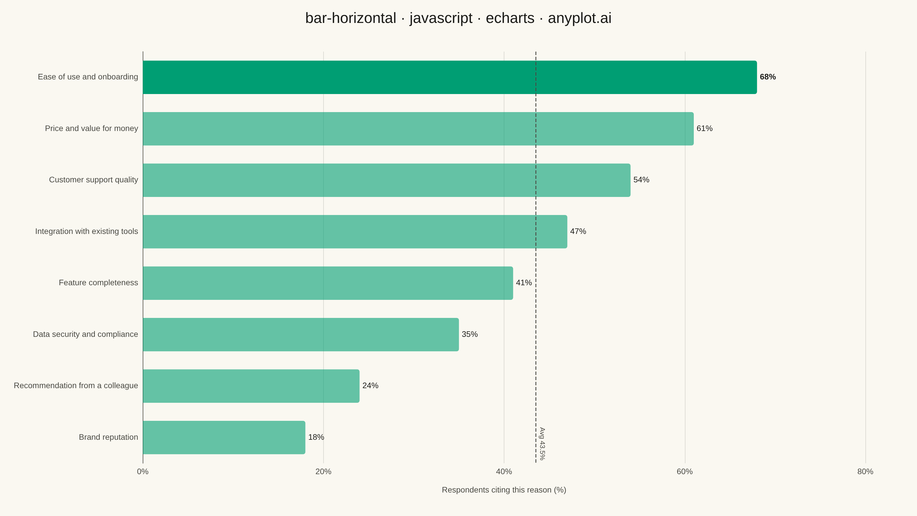
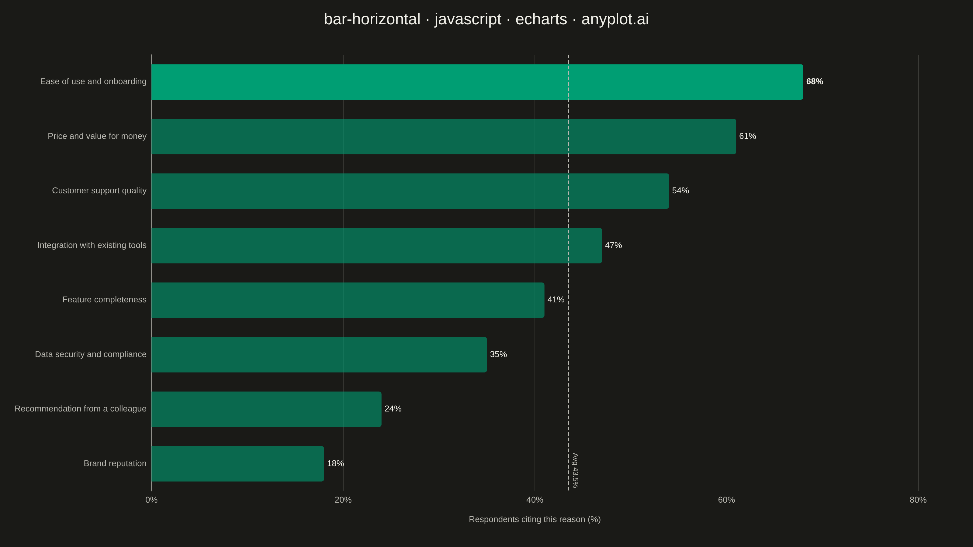
A horizontal bar chart displaying categorical data with rectangular bars extending horizontally from the y-axis. The length of each bar is proportional to the value it represents. This orientation is particularly effective when category names are long or numerous, as horizontal labels are easier to read than rotated vertical labels. Horizontal bar charts excel at rankings, comparisons, and survey results visualization.
// anyplot.ai
// bar-horizontal: Horizontal Bar Chart
// Library: echarts 6.1.0 | JavaScript 22.23.1
// Quality: 93/100 | Created: 2026-08-05

const t = window.ANYPLOT_TOKENS;

// --- Data (in-memory, deterministic) ----------------------------------------
// Survey: reasons customers cited for choosing a software subscription (n=500,
// multi-select, so shares don't sum to 100). Sorted descending for ranking.
const reasons = [
  "Ease of use and onboarding",
  "Price and value for money",
  "Customer support quality",
  "Integration with existing tools",
  "Feature completeness",
  "Data security and compliance",
  "Recommendation from a colleague",
  "Brand reputation",
];
const shares = [68, 61, 54, 47, 41, 35, 24, 18];

// Top-ranked reason (index 0, since shares are sorted descending) keeps
// full-strength brand green and a bold value label as the focal point; the
// rest are softened so the ranking hierarchy reads at a glance, not just
// from sort order.
const barData = shares.map((value, i) => ({
  value,
  itemStyle: {
    borderRadius: [0, 4, 4, 0],
    color: i === 0 ? t.palette[0] : `${t.palette[0]}99`,
  },
  label: i === 0 ? { fontWeight: 700 } : undefined,
}));

// --- Init --------------------------------------------------------------------
const chart = echarts.init(document.getElementById("container"));

// --- Option --------------------------------------------------------------------
chart.setOption({
  animation: false,
  color: t.palette,
  backgroundColor: "transparent",
  title: {
    text: "bar-horizontal · javascript · echarts · anyplot.ai",
    left: "center",
    textStyle: { color: t.ink, fontSize: 26, fontWeight: 500 },
  },
  grid: { left: 24, right: 90, top: 90, bottom: 70, containLabel: true },
  xAxis: {
    type: "value",
    name: "Respondents citing this reason (%)",
    nameLocation: "middle",
    nameGap: 40,
    nameTextStyle: { color: t.inkSoft, fontSize: 14 },
    max: 80,
    axisLabel: { color: t.inkSoft, fontSize: 14, formatter: "{value}%" },
    axisLine: { lineStyle: { color: t.inkSoft } },
    axisTick: { show: false },
    splitLine: { lineStyle: { color: t.grid } },
  },
  yAxis: {
    type: "category",
    data: reasons,
    inverse: true,
    axisLabel: { color: t.inkSoft, fontSize: 14 },
    axisLine: { lineStyle: { color: t.inkSoft } },
    axisTick: { show: false },
    splitLine: { show: false },
  },
  series: [
    {
      type: "bar",
      data: barData,
      barCategoryGap: "35%",
      label: {
        show: true,
        position: "right",
        formatter: "{c}%",
        color: t.ink,
        fontSize: 14,
      },
      // ECharts-distinctive touch: an auto-computed average markLine gives
      // viewers an at-a-glance benchmark beyond the raw ranking.
      markLine: {
        silent: true,
        symbol: "none",
        lineStyle: { color: t.inkSoft, type: "dashed", width: 1.5 },
        label: { formatter: "Avg {c}%", color: t.inkSoft, fontSize: 12, position: "insideEndTop" },
        data: [{ type: "average", name: "Average" }],
      },
    },
  ],
});
Runnable source as JSON, for any HTTP client: https://api.anyplot.ai/specs/bar-horizontal/echarts/code. Any spec id and library id listed in llms-full.txt fit the same URL shape; every URL below is complete and callable.
{
  "spec_id": "bar-horizontal",
  "language": "javascript",
  "library": "echarts",
  "page": "https://anyplot.ai/bar-horizontal/javascript/echarts",
  "hub": "https://anyplot.ai/bar-horizontal",
  "code_json": "https://api.anyplot.ai/specs/bar-horizontal/echarts/code",
  "spec_json": "https://api.anyplot.ai/specs/bar-horizontal",
  "render_light_png": "https://storage.googleapis.com/anyplot-images/plots/bar-horizontal/javascript/echarts/plot-light.png",
  "render_dark_png": "https://storage.googleapis.com/anyplot-images/plots/bar-horizontal/javascript/echarts/plot-dark.png",
  "interactive_light_html": "https://storage.googleapis.com/anyplot-images/plots/bar-horizontal/javascript/echarts/plot-light.html",
  "interactive_dark_html": "https://storage.googleapis.com/anyplot-images/plots/bar-horizontal/javascript/echarts/plot-dark.html",
  "quality_score": 93.0,
  "license": "MIT",
  "guide": "https://anyplot.ai/llms.txt"
}
Part of Horizontal Bar Chart on anyplot.ai.