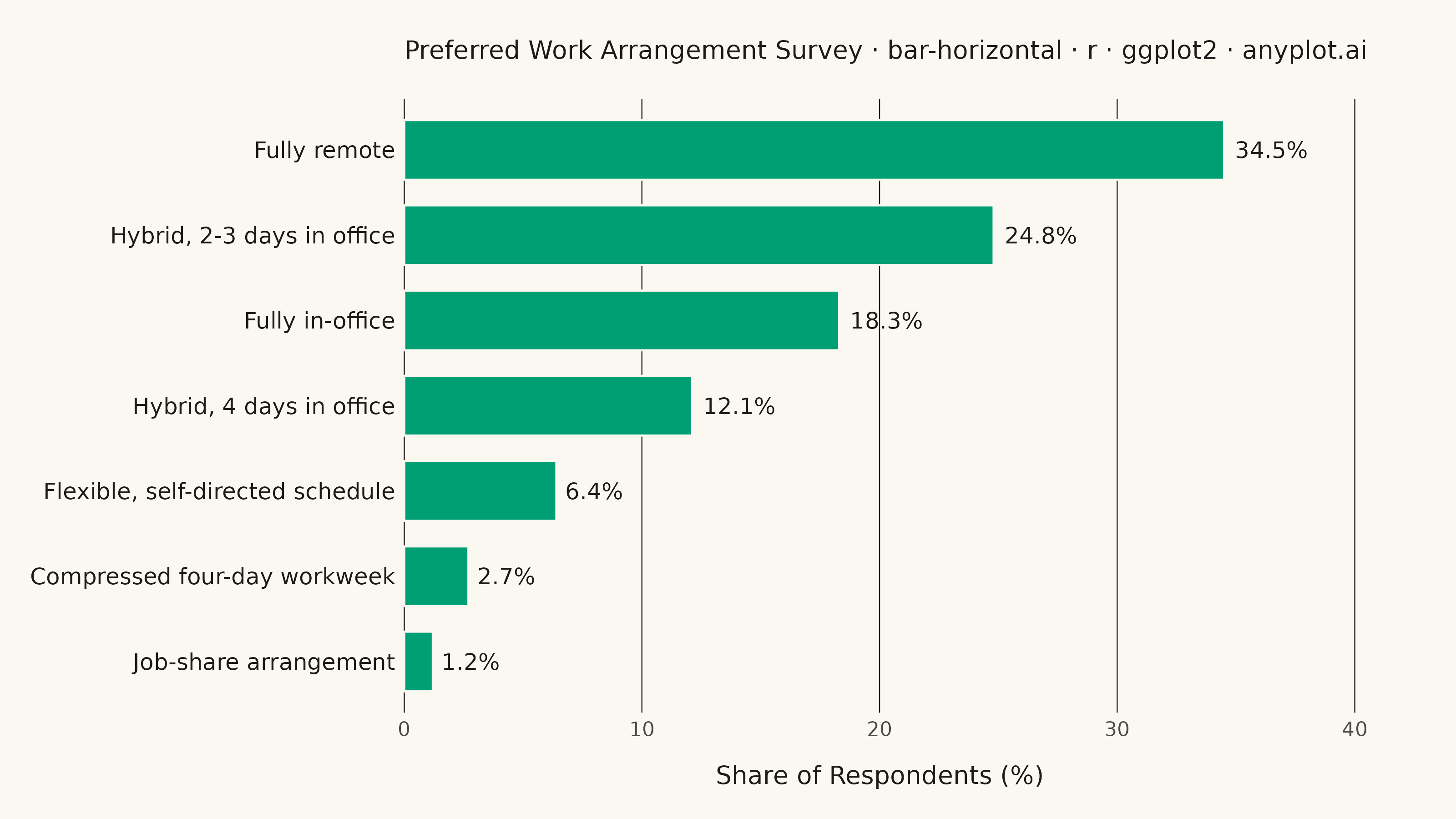
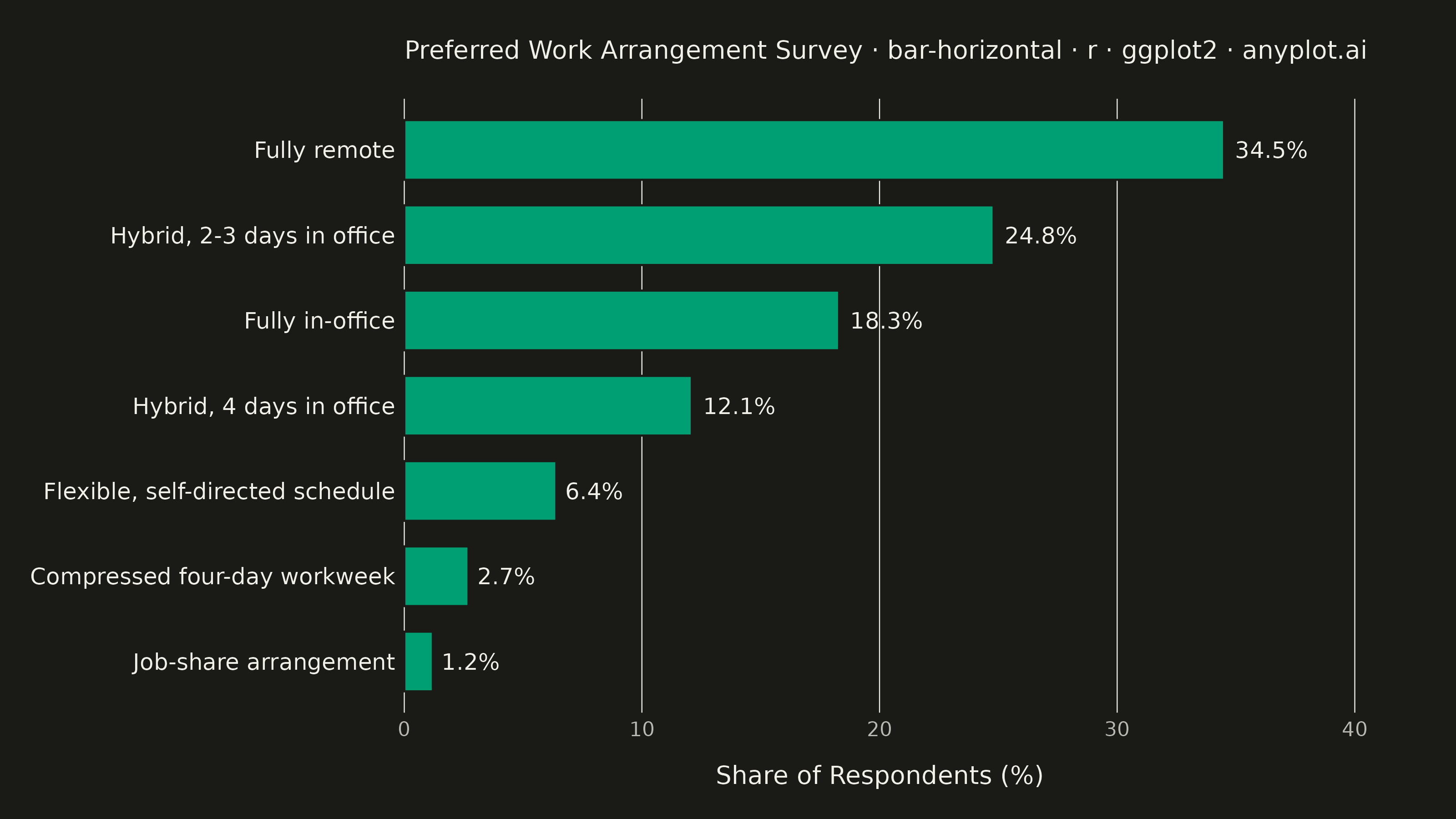
The same plot in 14 other libraries — Python: Altair, Bokeh, lets-plot, Matplotlib, Plotly, plotnine, Pygal, Seaborn; Julia: Makie.jl; JavaScript: Chart.js, D3.js, Apache ECharts, Highcharts, MUI X Charts. Compare all 15 side by side: Horizontal Bar Chart in Python, R, Julia and JavaScript.
A horizontal bar chart displaying categorical data with rectangular bars extending horizontally from the y-axis. The length of each bar is proportional to the value it represents. This orientation is particularly effective when category names are long or numerous, as horizontal labels are easier to read than rotated vertical labels. Horizontal bar charts excel at rankings, comparisons, and survey results visualization.
#' anyplot.ai
#' bar-horizontal: Horizontal Bar Chart
#' Library: ggplot2 3.5.1 | R 4.4.1
#' Quality: 88/100 | Created: 2026-08-05

library(ggplot2)
library(ragg)

set.seed(42)

# --- Theme tokens -----------------------------------------------------------
THEME       <- Sys.getenv("ANYPLOT_THEME", "light")
PAGE_BG     <- if (THEME == "light") "#FAF8F1" else "#1A1A17"
INK         <- if (THEME == "light") "#1A1A17" else "#F0EFE8"
INK_SOFT    <- if (THEME == "light") "#4A4A44" else "#B8B7B0"
IMPRINT_PALETTE <- c("#009E73", "#C475FD", "#4467A3", "#BD8233",
                     "#AE3030", "#2ABCCD", "#954477", "#99B314")
BRAND <- IMPRINT_PALETTE[1]  # ALWAYS first series

# --- Data ---------------------------------------------------------------
# Survey: "What best describes your current work arrangement?"
df <- tibble::tibble(
  arrangement = c(
    "Fully remote",
    "Hybrid, 2-3 days in office",
    "Fully in-office",
    "Hybrid, 4 days in office",
    "Flexible, self-directed schedule",
    "Compressed four-day workweek",
    "Job-share arrangement"
  ),
  share_pct = c(34.5, 24.8, 18.3, 12.1, 6.4, 2.7, 1.2)
)
df$is_top <- df$share_pct == max(df$share_pct)
label_gap <- max(df$share_pct) * 0.07

# --- Plot ---------------------------------------------------------------
plot_title <- "Preferred Work Arrangement Survey · bar-horizontal · r · ggplot2 · anyplot.ai"
title_n <- nchar(plot_title)
title_ratio <- if (title_n > 67) 67 / title_n else 1.0
title_fontsize <- max(8, round(12 * title_ratio))

p <- ggplot(df, aes(x = reorder(arrangement, share_pct), y = share_pct)) +
  geom_col(aes(linewidth = is_top), fill = BRAND, color = PAGE_BG, width = 0.7) +
  scale_linewidth_manual(values = c(`TRUE` = 1.1, `FALSE` = 0.4), guide = "none") +
  geom_text(
    aes(y = share_pct + label_gap, label = paste0(share_pct, "%"), fontface = ifelse(is_top, "bold", "plain")),
    hjust = 0, size = 3.2, color = INK
  ) +
  scale_y_continuous(expand = expansion(mult = c(0, 0.16))) +
  coord_flip(clip = "off") +
  labs(
    title = plot_title,
    x = NULL,
    y = "Share of Respondents (%)"
  ) +
  theme_minimal(base_size = 8) +
  theme(
    plot.background    = element_rect(fill = PAGE_BG, color = PAGE_BG),
    panel.background   = element_rect(fill = PAGE_BG, color = NA),
    panel.grid.major.y = element_blank(),
    panel.grid.major.x = element_line(color = INK, linewidth = 0.2),
    panel.grid.minor   = element_blank(),
    axis.ticks         = element_blank(),
    axis.title.x       = element_text(color = INK, size = 10, margin = margin(t = 10)),
    axis.text.x        = element_text(color = INK_SOFT, size = 8),
    axis.text.y        = element_text(color = INK, size = 9),
    plot.title         = element_text(color = INK, size = title_fontsize, margin = margin(b = 14)),
    plot.margin        = margin(t = 16, r = 40, b = 12, l = 12)
  )

# --- Save -----------------------------------------------------------------
ggsave(
  filename = sprintf("plot-%s.png", THEME),
  plot     = p,
  device   = ragg::agg_png,
  width    = 8,
  height   = 4.5,
  units    = "in",
  dpi      = 400
)
Runnable source as JSON, for any HTTP client: https://api.anyplot.ai/specs/bar-horizontal/ggplot2/code. Any spec id and library id listed in llms-full.txt fit the same URL shape; every URL below is complete and callable.
{
  "spec_id": "bar-horizontal",
  "language": "r",
  "library": "ggplot2",
  "page": "https://anyplot.ai/bar-horizontal/r/ggplot2",
  "hub": "https://anyplot.ai/bar-horizontal",
  "code_json": "https://api.anyplot.ai/specs/bar-horizontal/ggplot2/code",
  "spec_json": "https://api.anyplot.ai/specs/bar-horizontal",
  "render_light_png": "https://storage.googleapis.com/anyplot-images/plots/bar-horizontal/r/ggplot2/plot-light.png",
  "render_dark_png": "https://storage.googleapis.com/anyplot-images/plots/bar-horizontal/r/ggplot2/plot-dark.png",
  "quality_score": 88.0,
  "license": "MIT",
  "guide": "https://anyplot.ai/llms.txt"
}
Part of Horizontal Bar Chart on anyplot.ai.