The same plot in 14 other libraries — Python: Altair, Bokeh, lets-plot, Matplotlib, Plotly, plotnine, Pygal, Seaborn; R: ggplot2; JavaScript: Chart.js, D3.js, Apache ECharts, Highcharts, MUI X Charts. Compare all 15 side by side: Horizontal Bar Chart in Python, R, Julia and JavaScript.
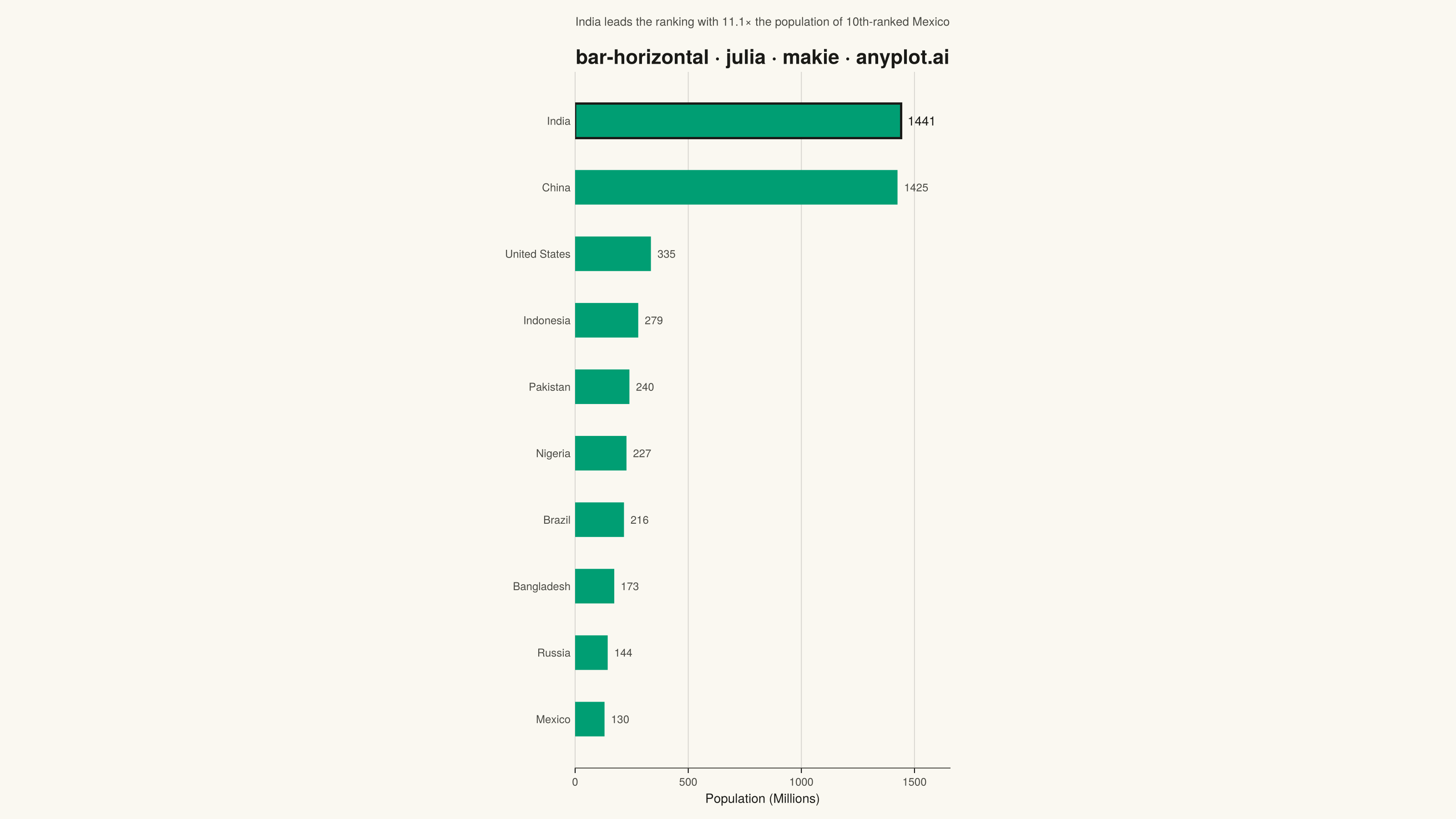
A horizontal bar chart displaying categorical data with rectangular bars extending horizontally from the y-axis. The length of each bar is proportional to the value it represents. This orientation is particularly effective when category names are long or numerous, as horizontal labels are easier to read than rotated vertical labels. Horizontal bar charts excel at rankings, comparisons, and survey results visualization.
# anyplot.ai
# bar-horizontal: Horizontal Bar Chart
# Library: makie 0.21.9 | Julia 1.11.9
# Quality: 94/100 | Created: 2026-08-05

using CairoMakie
using Colors

# --- Theme tokens -----------------------------------------------------------
const THEME    = get(ENV, "ANYPLOT_THEME", "light")
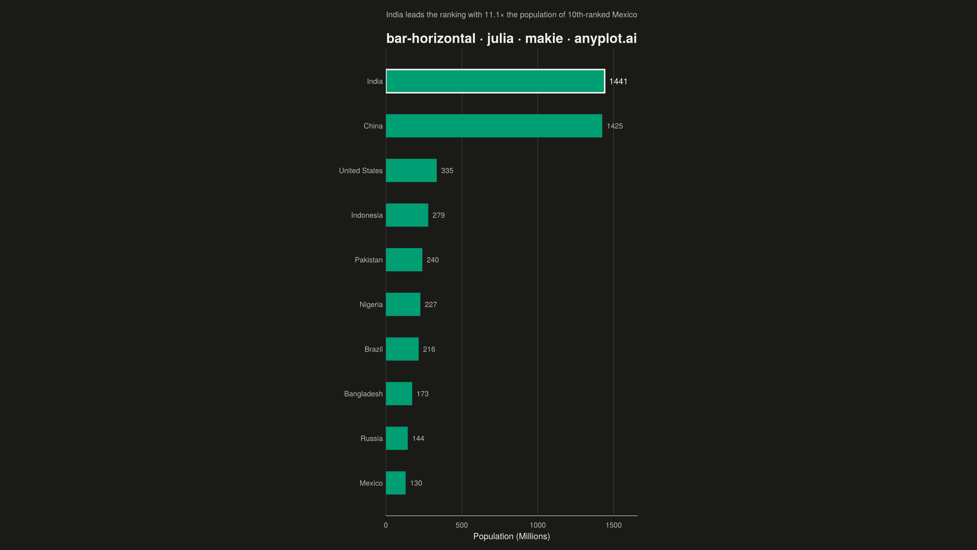
const PAGE_BG  = THEME == "light" ? colorant"#FAF8F1" : colorant"#1A1A17"
const INK      = THEME == "light" ? colorant"#1A1A17" : colorant"#F0EFE8"
const INK_SOFT = THEME == "light" ? colorant"#4A4A44" : colorant"#B8B7B0"

# Imprint palette position 1 — ALWAYS first (and here only) categorical series
const BRAND = colorant"#009E73"

# --- Data --------------------------------------------------------------------
# Most populous countries, 2024 estimate (millions), ranked largest to smallest.
countries  = ["India", "China", "United States", "Indonesia", "Pakistan",
              "Nigeria", "Brazil", "Bangladesh", "Russia", "Mexico"]
population = [1441.0, 1425.0, 335.0, 279.0, 240.0, 227.0, 216.0, 173.0, 144.0, 130.0]
n          = length(countries)

# Reverse so the largest value renders at the top of the y-axis (rank 1 on top).
plot_countries  = reverse(countries)
plot_population = reverse(population)

# Focal-point insight for the leading country, used by the subtitle annotation below.
leader_ratio = round(population[1] / population[end], digits = 1)

# --- Plot ----------------------------------------------------------------------
fig = Figure(
    size            = (1600, 900),
    fontsize        = 14,
    backgroundcolor = PAGE_BG,
)

# GridLayout composition: a dedicated subtitle row above the Axis carries the
# data-driven takeaway — a Makie-native alternative to a plain text annotation.
Label(
    fig[0, 1],
    "India leads the ranking with $(leader_ratio)× the population of 10th-ranked Mexico";
    fontsize = 13,
    color    = INK_SOFT,
    halign   = :center,
)

ax = Axis(
    fig[1, 1];
    title             = "bar-horizontal · julia · makie · anyplot.ai",
    titlesize         = 22,
    titlecolor        = INK,
    xlabel            = "Population (Millions)",
    xlabelsize        = 14,
    xlabelcolor       = INK,
    xticklabelsize    = 12,
    yticklabelsize    = 12,
    xticklabelcolor   = INK_SOFT,
    yticklabelcolor   = INK_SOFT,
    backgroundcolor   = PAGE_BG,
    topspinevisible   = false,
    rightspinevisible = false,
    leftspinevisible  = false,
    bottomspinecolor  = INK_SOFT,
    xgridcolor        = RGBAf(INK.r, INK.g, INK.b, 0.15),
    ygridvisible      = false,
    yticksvisible     = false,
    yticks            = (1:n, plot_countries),
)

barplot!(ax, 1:n-1, plot_population[1:n-1]; direction = :x, color = BRAND, width = 0.65)

# Outline the #1 country's bar to give the leader a deliberate focal point,
# without touching the single brand-green fill shared by every other bar.
barplot!(ax, [n], [plot_population[end]]; direction = :x, color = BRAND, width = 0.65,
         strokewidth = 2.5, strokecolor = INK)

# Value labels at the end of each bar; the leader's label is bolder (larger,
# full-ink) to match the outline emphasis above.
text!(ax, plot_population[1:n-1] .+ maximum(plot_population) * 0.02, 1:n-1;
      text = string.(round.(Int, plot_population[1:n-1])),
      align = (:left, :center), fontsize = 12, color = INK_SOFT)

text!(ax, [plot_population[end] + maximum(plot_population) * 0.02], [n];
      text = [string(round(Int, plot_population[end]))],
      align = (:left, :center), fontsize = 14, color = INK)

xlims!(ax, 0, maximum(plot_population) * 1.15)

# --- Save --------------------------------------------------------------------
save("plot-$(THEME).png", fig; px_per_unit = 2)
Runnable source as JSON, for any HTTP client: https://api.anyplot.ai/specs/bar-horizontal/makie/code. Any spec id and library id listed in llms-full.txt fit the same URL shape; every URL below is complete and callable.
{
  "spec_id": "bar-horizontal",
  "language": "julia",
  "library": "makie",
  "page": "https://anyplot.ai/bar-horizontal/julia/makie",
  "hub": "https://anyplot.ai/bar-horizontal",
  "code_json": "https://api.anyplot.ai/specs/bar-horizontal/makie/code",
  "spec_json": "https://api.anyplot.ai/specs/bar-horizontal",
  "render_light_png": "https://storage.googleapis.com/anyplot-images/plots/bar-horizontal/julia/makie/plot-light.png",
  "render_dark_png": "https://storage.googleapis.com/anyplot-images/plots/bar-horizontal/julia/makie/plot-dark.png",
  "quality_score": 94.0,
  "license": "MIT",
  "guide": "https://anyplot.ai/llms.txt"
}
Part of Horizontal Bar Chart on anyplot.ai.