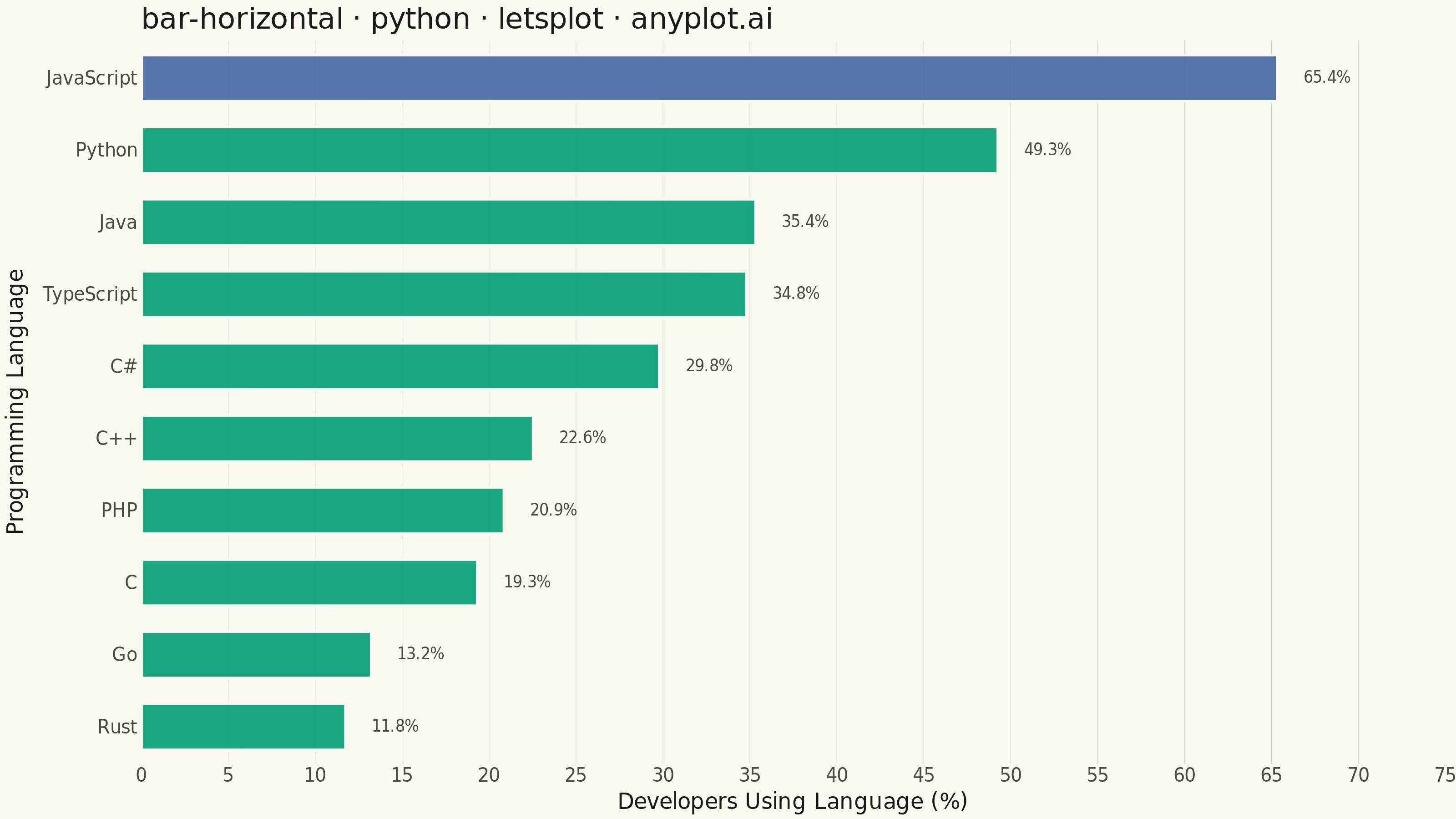
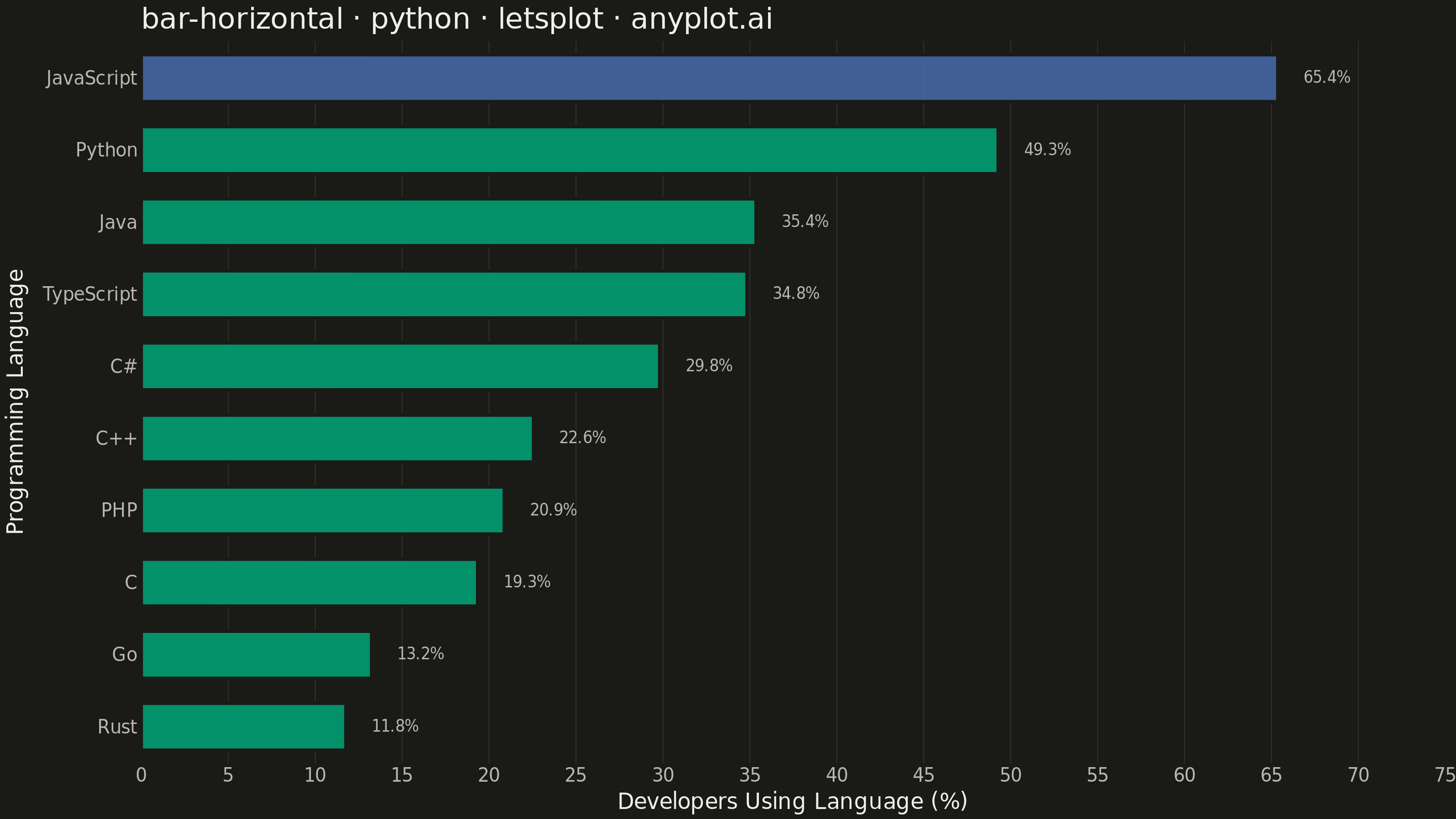
A horizontal bar chart displaying categorical data with rectangular bars extending horizontally from the y-axis. The length of each bar is proportional to the value it represents. This orientation is particularly effective when category names are long or numerous, as horizontal labels are easier to read than rotated vertical labels. Horizontal bar charts excel at rankings, comparisons, and survey results visualization.
""" anyplot.ai
bar-horizontal: Horizontal Bar Chart
Library: letsplot 4.11.0 | Python 3.13.14
Quality: 91/100 | Updated: 2026-08-05
"""

import os

import pandas as pd
from lets_plot import *


LetsPlot.setup_html()

# Theme tokens (see prompts/default-style-guide.md "Background" + "Theme-adaptive Chrome")
THEME = os.getenv("ANYPLOT_THEME", "light")
PAGE_BG = "#FAF8F1" if THEME == "light" else "#1A1A17"
INK = "#1A1A17" if THEME == "light" else "#F0EFE8"
INK_SOFT = "#4A4A44" if THEME == "light" else "#B8B7B0"
RULE = "rgba(26,26,23,0.15)" if THEME == "light" else "rgba(240,239,232,0.15)"
BRAND = "#009E73"  # Imprint palette position 1 — ALWAYS first series
HIGHLIGHT = "#4467A3"  # Imprint palette position 3 — draws the eye to the leader

# Data - programming language popularity survey (sorted ascending for easy ranking)
data = pd.DataFrame(
    {
        "language": ["Rust", "Go", "C", "PHP", "C++", "C#", "TypeScript", "Java", "Python", "JavaScript"],
        "developers": [11.76, 13.24, 19.34, 20.87, 22.55, 29.81, 34.83, 35.35, 49.28, 65.36],
    }
)
data["language"] = pd.Categorical(data["language"], categories=data["language"].tolist(), ordered=True)
data["is_leader"] = data["language"] == data.loc[data["developers"].idxmax(), "language"]
data["value_label"] = data["developers"].map(lambda v: f"{v:.1f}%")

# Plot — single-color bars with the top language highlighted, value labels at bar ends
# tooltips: lets-plot-distinctive interactive labels surfaced in the HTML export
bar_tooltips = layer_tooltips().line("@language").line("@value_label")

plot = (
    ggplot(data, aes(x="developers", y="language", fill="is_leader"))
    + geom_bar(stat="identity", width=0.65, alpha=0.9, show_legend=False, color=PAGE_BG, tooltips=bar_tooltips)
    + geom_text(aes(label="value_label"), hjust="left", nudge_x=1.5, size=4.2, color=INK_SOFT)
    + scale_fill_manual(values=[BRAND, HIGHLIGHT])
    + scale_x_continuous(limits=[0, 75], expand=[0, 0])
    + labs(
        x="Developers Using Language (%)",
        y="Programming Language",
        title="bar-horizontal · python · letsplot · anyplot.ai",
        subtitle="JavaScript leads adoption, used by more than 5x as many developers as Rust",
    )
    + ggsize(800, 450)
    + theme(
        plot_background=element_rect(fill=PAGE_BG, color=PAGE_BG),
        panel_background=element_rect(fill=PAGE_BG, color=PAGE_BG),
        panel_grid_major_x=element_line(color=RULE, size=0.3),
        panel_grid_major_y=element_blank(),
        panel_grid_minor=element_blank(),
        axis_title_x=element_text(size=12, color=INK),
        axis_title_y=element_text(size=12, color=INK),
        axis_text_x=element_text(size=10, color=INK_SOFT),
        axis_text_y=element_text(size=10, color=INK_SOFT),
        axis_line=element_blank(),
        axis_ticks=element_blank(),
        plot_title=element_text(size=19, color=INK),
        plot_subtitle=element_text(size=11, color=INK_SOFT),
        legend_position="none",
    )
)

# Save as PNG (scale 4x for 3200 x 1800 px) and HTML for interactivity
ggsave(plot, f"plot-{THEME}.png", path=".", scale=4)
ggsave(plot, f"plot-{THEME}.html", path=".")
Runnable source as JSON, for any HTTP client: https://api.anyplot.ai/specs/bar-horizontal/letsplot/code. Any spec id and library id listed in llms-full.txt fit the same URL shape; every URL below is complete and callable.
{
  "spec_id": "bar-horizontal",
  "language": "python",
  "library": "letsplot",
  "page": "https://anyplot.ai/bar-horizontal/python/letsplot",
  "hub": "https://anyplot.ai/bar-horizontal",
  "code_json": "https://api.anyplot.ai/specs/bar-horizontal/letsplot/code",
  "spec_json": "https://api.anyplot.ai/specs/bar-horizontal",
  "render_light_png": "https://storage.googleapis.com/anyplot-images/plots/bar-horizontal/python/letsplot/plot-light.png",
  "render_dark_png": "https://storage.googleapis.com/anyplot-images/plots/bar-horizontal/python/letsplot/plot-dark.png",
  "interactive_light_html": "https://storage.googleapis.com/anyplot-images/plots/bar-horizontal/python/letsplot/plot-light.html",
  "interactive_dark_html": "https://storage.googleapis.com/anyplot-images/plots/bar-horizontal/python/letsplot/plot-dark.html",
  "quality_score": 91.0,
  "license": "MIT",
  "guide": "https://anyplot.ai/llms.txt"
}
Part of Horizontal Bar Chart on anyplot.ai.