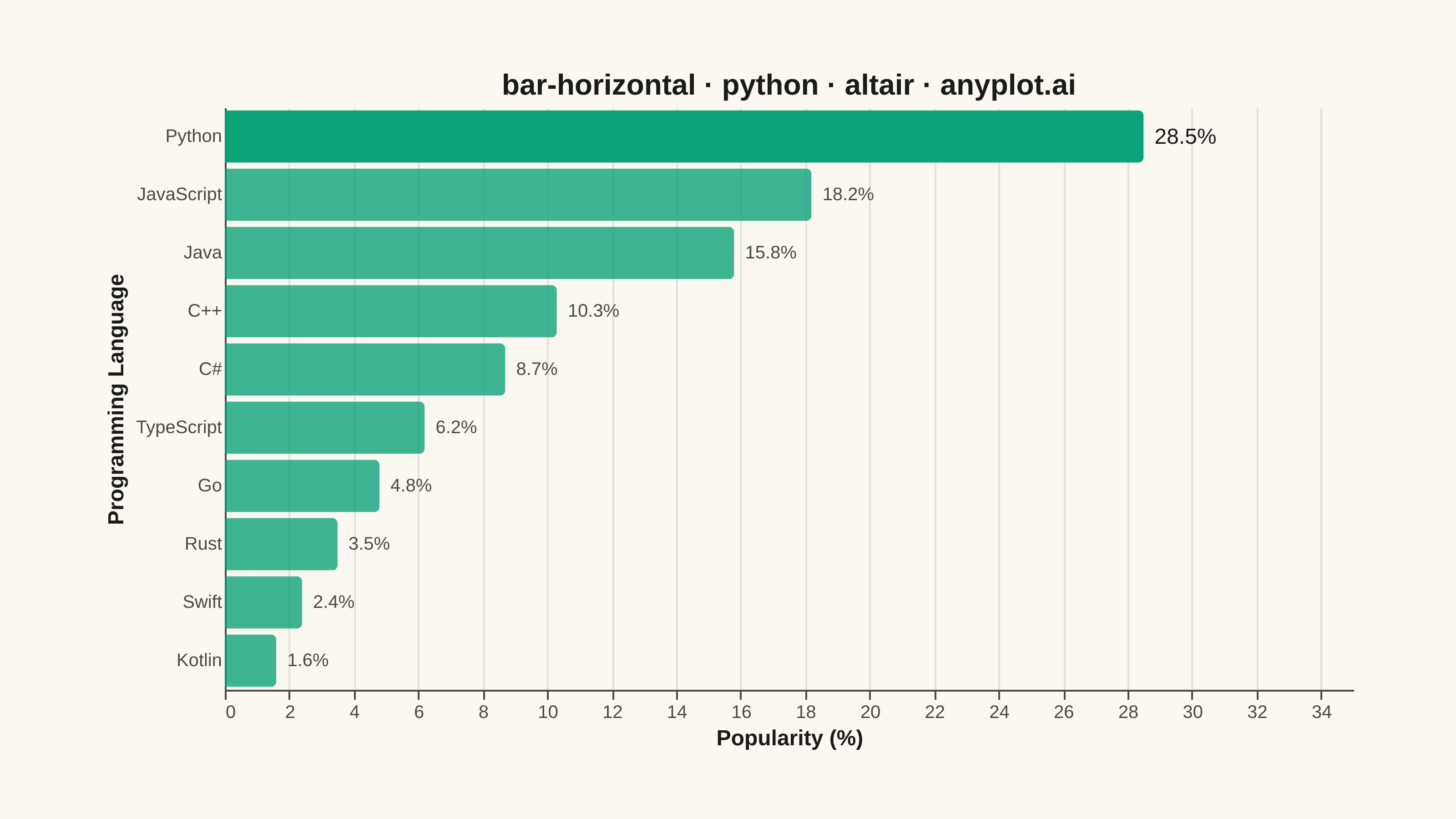
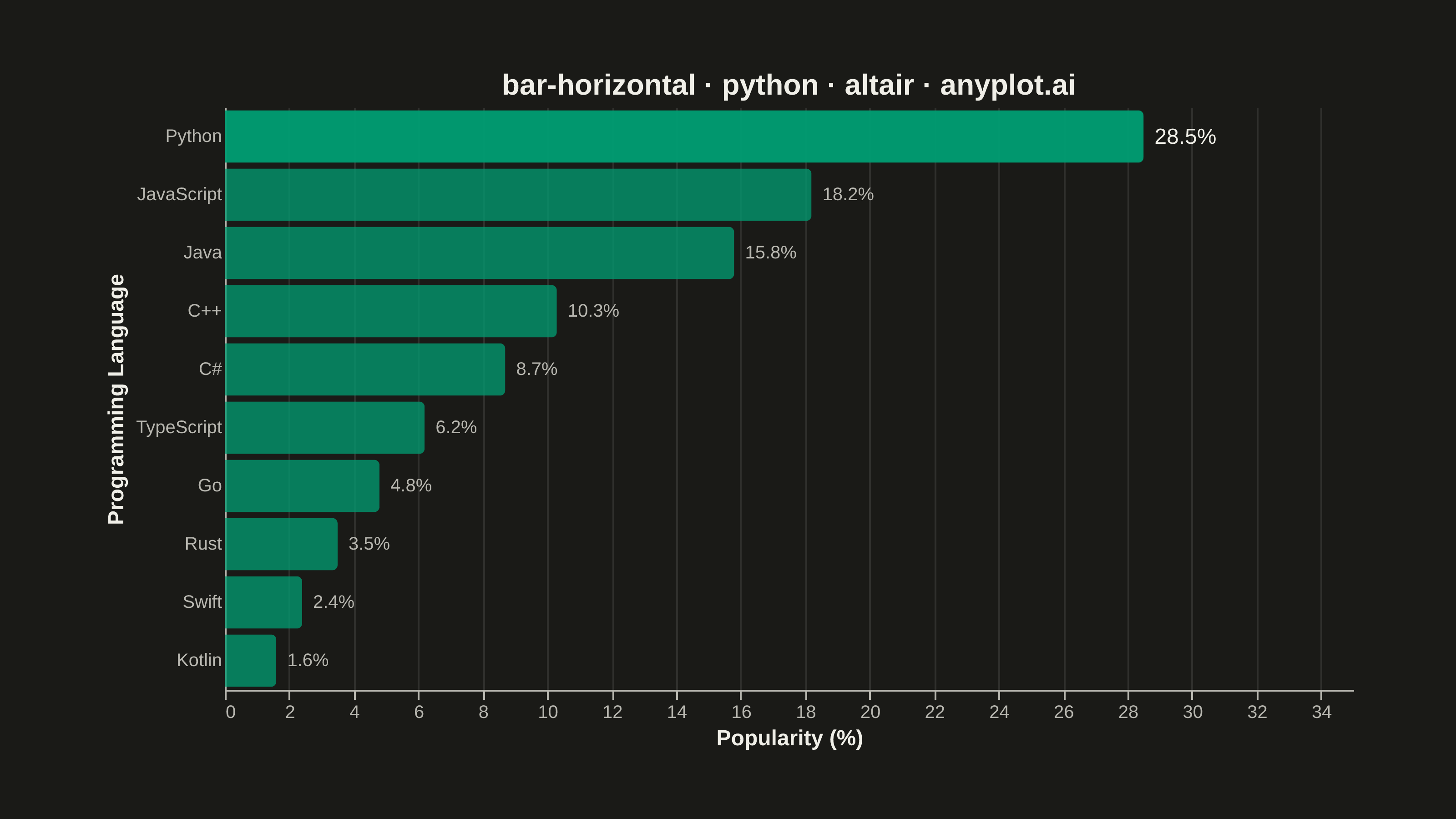
A horizontal bar chart displaying categorical data with rectangular bars extending horizontally from the y-axis. The length of each bar is proportional to the value it represents. This orientation is particularly effective when category names are long or numerous, as horizontal labels are easier to read than rotated vertical labels. Horizontal bar charts excel at rankings, comparisons, and survey results visualization.
""" anyplot.ai
bar-horizontal: Horizontal Bar Chart
Library: altair 6.2.2 | Python 3.13.14
Quality: 89/100 | Updated: 2026-08-05
"""

import os

import altair as alt
import pandas as pd
from PIL import Image


THEME = os.getenv("ANYPLOT_THEME", "light")
PAGE_BG = "#FAF8F1" if THEME == "light" else "#1A1A17"
INK = "#1A1A17" if THEME == "light" else "#F0EFE8"
INK_SOFT = "#4A4A44" if THEME == "light" else "#B8B7B0"
BRAND = "#009E73"  # Imprint palette position 1 — always the first categorical series

# Data: Top 10 programming languages by developer survey popularity
data = pd.DataFrame(
    {
        "language": ["Python", "JavaScript", "Java", "C++", "C#", "TypeScript", "Go", "Rust", "Swift", "Kotlin"],
        "popularity": [28.5, 18.2, 15.8, 10.3, 8.7, 6.2, 4.8, 3.5, 2.4, 1.6],
    }
)
data["label"] = data["popularity"].map(lambda v: f"{v:.1f}%")
data["is_top"] = data["popularity"] == data["popularity"].max()

# Leave headroom on the value axis so end-of-bar labels never clip
x_max = data["popularity"].max() * 1.15

hover = alt.selection_point(on="pointerover", fields=["language"], empty=False)

bars = (
    alt.Chart(data)
    .mark_bar(cornerRadiusEnd=3, color=BRAND)
    .encode(
        x=alt.X(
            "popularity:Q",
            title="Popularity (%)",
            scale=alt.Scale(domain=[0, x_max]),
            axis=alt.Axis(labelFontSize=10, titleFontSize=12),
        ),
        y=alt.Y(
            "language:N",
            title="Programming Language",
            sort="-x",
            axis=alt.Axis(labelFontSize=10, titleFontSize=12, ticks=False),
        ),
        opacity=alt.when(hover)
        .then(alt.value(1.0))
        .when("datum.is_top")
        .then(alt.value(0.95))
        .otherwise(alt.value(0.75)),
        tooltip=[
            alt.Tooltip("language:N", title="Language"),
            alt.Tooltip("popularity:Q", title="Popularity (%)", format=".1f"),
        ],
    )
    .add_params(hover)
)

labels = (
    alt.Chart(data)
    .mark_text(align="left", dx=6)
    .encode(
        x=alt.X("popularity:Q"),
        y=alt.Y("language:N", sort="-x"),
        text="label:N",
        size=alt.when("datum.is_top").then(alt.value(12)).otherwise(alt.value(10)),
        color=alt.when("datum.is_top").then(alt.value(INK)).otherwise(alt.value(INK_SOFT)),
    )
)

# Create horizontal bar chart with end-of-bar value labels and a pointer-hover highlight
chart = (
    (bars + labels)
    .properties(
        width=620,
        height=320,
        background=PAGE_BG,
        title=alt.Title("bar-horizontal · python · altair · anyplot.ai", fontSize=16, anchor="middle", color=INK),
    )
    .configure_view(fill=PAGE_BG, strokeWidth=0)
    .configure_axis(
        domainColor=INK_SOFT, tickColor=INK_SOFT, gridColor=INK, gridOpacity=0.10, labelColor=INK_SOFT, titleColor=INK
    )
    .configure_title(color=INK)
)

# Save PNG, then pad (never crop) up to the exact canonical canvas
chart.save(f"plot-{THEME}.png", scale_factor=4.0)

TW, TH = 3200, 1800
_img = Image.open(f"plot-{THEME}.png").convert("RGB")
_w, _h = _img.size
if _w > TW or _h > TH:
    raise SystemExit(
        f"altair vl-convert produced {_w}x{_h}, exceeds target {TW}x{TH}. "
        f"Shrink chart .properties(width=, height=) values and re-render."
    )
if _w < TW or _h < TH:
    _canvas = Image.new("RGB", (TW, TH), PAGE_BG)
    _canvas.paste(_img, ((TW - _w) // 2, (TH - _h) // 2))
    _canvas.save(f"plot-{THEME}.png")

chart.save(f"plot-{THEME}.html")
Runnable source as JSON, for any HTTP client: https://api.anyplot.ai/specs/bar-horizontal/altair/code. Any spec id and library id listed in llms-full.txt fit the same URL shape; every URL below is complete and callable.
{
  "spec_id": "bar-horizontal",
  "language": "python",
  "library": "altair",
  "page": "https://anyplot.ai/bar-horizontal/python/altair",
  "hub": "https://anyplot.ai/bar-horizontal",
  "code_json": "https://api.anyplot.ai/specs/bar-horizontal/altair/code",
  "spec_json": "https://api.anyplot.ai/specs/bar-horizontal",
  "render_light_png": "https://storage.googleapis.com/anyplot-images/plots/bar-horizontal/python/altair/plot-light.png",
  "render_dark_png": "https://storage.googleapis.com/anyplot-images/plots/bar-horizontal/python/altair/plot-dark.png",
  "interactive_light_html": "https://storage.googleapis.com/anyplot-images/plots/bar-horizontal/python/altair/plot-light.html",
  "interactive_dark_html": "https://storage.googleapis.com/anyplot-images/plots/bar-horizontal/python/altair/plot-dark.html",
  "quality_score": 89.0,
  "license": "MIT",
  "guide": "https://anyplot.ai/llms.txt"
}
Part of Horizontal Bar Chart on anyplot.ai.