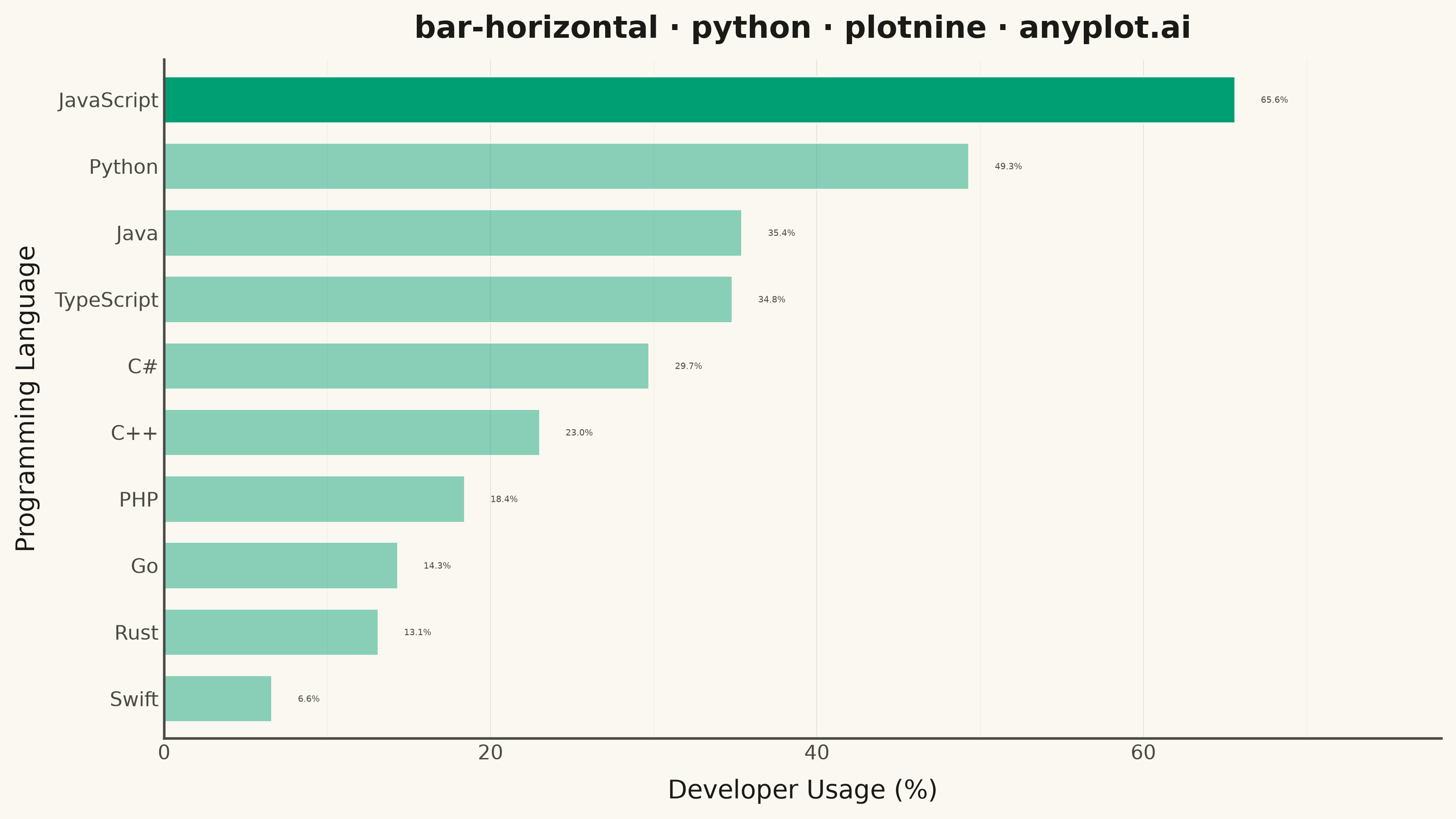
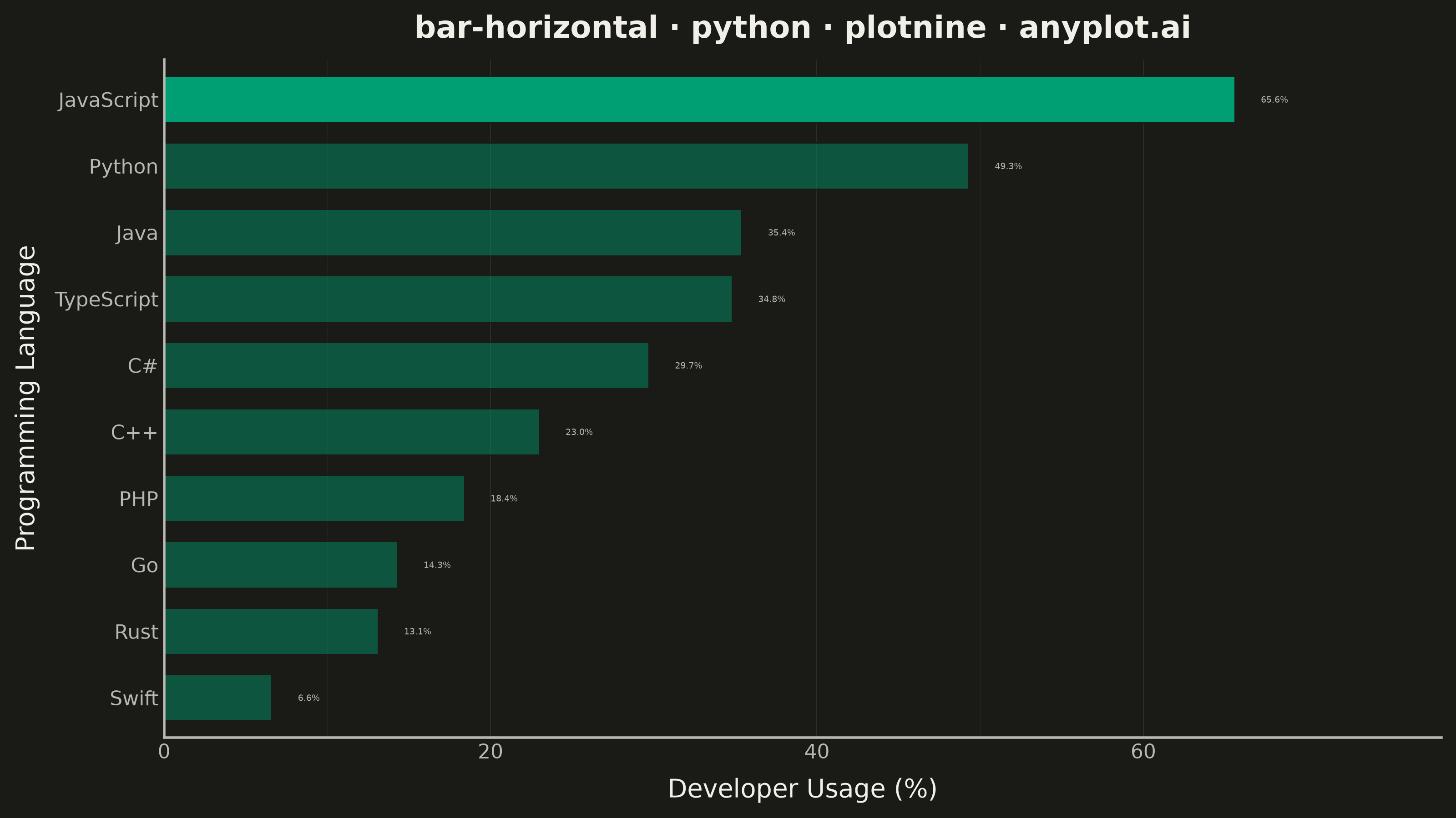
A horizontal bar chart displaying categorical data with rectangular bars extending horizontally from the y-axis. The length of each bar is proportional to the value it represents. This orientation is particularly effective when category names are long or numerous, as horizontal labels are easier to read than rotated vertical labels. Horizontal bar charts excel at rankings, comparisons, and survey results visualization.
""" anyplot.ai
bar-horizontal: Horizontal Bar Chart
Library: plotnine 0.15.7 | Python 3.13.14
Quality: 91/100 | Updated: 2026-08-05
"""

import os
import sys
from importlib import import_module


remove_paths = {os.path.dirname(os.path.abspath(__file__)), os.getcwd()}
sys.path[:] = [p for p in sys.path if os.path.abspath(p) not in remove_paths]

import pandas as pd


pn = import_module("plotnine")
aes = pn.aes
coord_flip = pn.coord_flip
element_blank = pn.element_blank
element_line = pn.element_line
element_rect = pn.element_rect
element_text = pn.element_text
geom_bar = pn.geom_bar
geom_text = pn.geom_text
ggplot = pn.ggplot
labs = pn.labs
scale_alpha_manual = pn.scale_alpha_manual
scale_y_continuous = pn.scale_y_continuous
theme = pn.theme
theme_minimal = pn.theme_minimal


# Theme tokens
THEME = os.getenv("ANYPLOT_THEME", "light")
PAGE_BG = "#FAF8F1" if THEME == "light" else "#1A1A17"
INK = "#1A1A17" if THEME == "light" else "#F0EFE8"
INK_SOFT = "#4A4A44" if THEME == "light" else "#B8B7B0"
BRAND = "#009E73"  # Imprint palette position 1 — ALWAYS first series

# Data: Top 10 programming languages by popularity (survey results)
data = {
    "language": ["JavaScript", "Python", "Java", "TypeScript", "C#", "C++", "PHP", "Go", "Rust", "Swift"],
    "users_percent": [65.6, 49.3, 35.4, 34.8, 29.7, 23.0, 18.4, 14.3, 13.1, 6.6],
}

df = pd.DataFrame(data)

# Sort by value and convert to categorical for proper ordering
df = df.sort_values("users_percent", ascending=True)
df["language"] = pd.Categorical(df["language"], categories=df["language"], ordered=True)
df["value_label"] = df["users_percent"].map(lambda v: f"{v:.1f}%")

# Emphasis layer: the top-ranked bar (highest usage) is drawn at full opacity,
# the rest at reduced opacity, sharpening the ranking's focal point.
df["highlight"] = df["users_percent"] == df["users_percent"].max()

# Theme-adaptive styling
anyplot_theme = theme(
    figure_size=(8, 4.5),
    text=element_text(size=7),
    plot_background=element_rect(fill=PAGE_BG, color=PAGE_BG),
    panel_background=element_rect(fill=PAGE_BG, color=PAGE_BG),
    panel_grid_major_x=element_line(color=INK, size=0.3, alpha=0.10),
    panel_grid_minor_x=element_line(color=INK, size=0.2, alpha=0.05),
    panel_grid_major_y=element_blank(),
    panel_grid_minor_y=element_blank(),
    panel_border=element_blank(),
    axis_ticks_major=element_blank(),
    axis_ticks_minor=element_blank(),
    axis_title=element_text(size=10, color=INK),
    axis_text=element_text(size=8, color=INK_SOFT),
    axis_line=element_line(color=INK_SOFT),
    plot_title=element_text(size=12, color=INK, weight="bold"),
)

# Plot — value labels at bar ends (spec: "Value labels can be placed at the end of bars")
# The top-ranked bar is highlighted via alpha; every bar keeps the same brand hue.
plot = (
    ggplot(df, aes(x="language", y="users_percent"))
    + geom_bar(
        aes(alpha="highlight"), stat="identity", fill=BRAND, color=PAGE_BG, size=0.3, width=0.7, show_legend=False
    )
    + scale_alpha_manual(values={True: 1.0, False: 0.45})
    + geom_text(aes(label="value_label"), nudge_y=1.6, ha="left", size=3.5, color=INK_SOFT)
    + coord_flip()
    + scale_y_continuous(expand=(0, 0, 0.12, 3))
    + labs(x="Programming Language", y="Developer Usage (%)", title="bar-horizontal · python · plotnine · anyplot.ai")
    + theme_minimal()
    + anyplot_theme
)

# Save
plot.save(f"plot-{THEME}.png", dpi=400, width=8, height=4.5, units="in", verbose=False)
Runnable source as JSON, for any HTTP client: https://api.anyplot.ai/specs/bar-horizontal/plotnine/code. Any spec id and library id listed in llms-full.txt fit the same URL shape; every URL below is complete and callable.
{
  "spec_id": "bar-horizontal",
  "language": "python",
  "library": "plotnine",
  "page": "https://anyplot.ai/bar-horizontal/python/plotnine",
  "hub": "https://anyplot.ai/bar-horizontal",
  "code_json": "https://api.anyplot.ai/specs/bar-horizontal/plotnine/code",
  "spec_json": "https://api.anyplot.ai/specs/bar-horizontal",
  "render_light_png": "https://storage.googleapis.com/anyplot-images/plots/bar-horizontal/python/plotnine/plot-light.png",
  "render_dark_png": "https://storage.googleapis.com/anyplot-images/plots/bar-horizontal/python/plotnine/plot-dark.png",
  "quality_score": 91.0,
  "license": "MIT",
  "guide": "https://anyplot.ai/llms.txt"
}
Part of Horizontal Bar Chart on anyplot.ai.