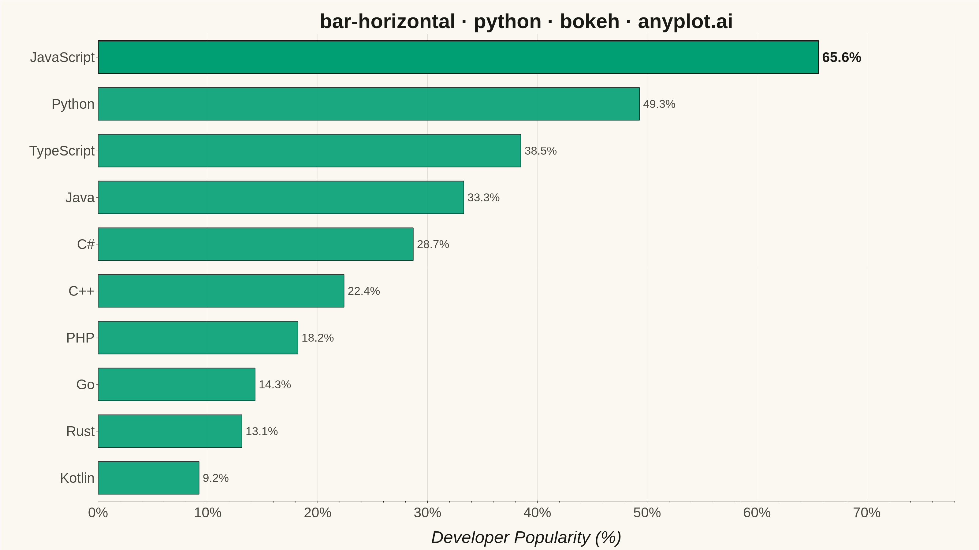
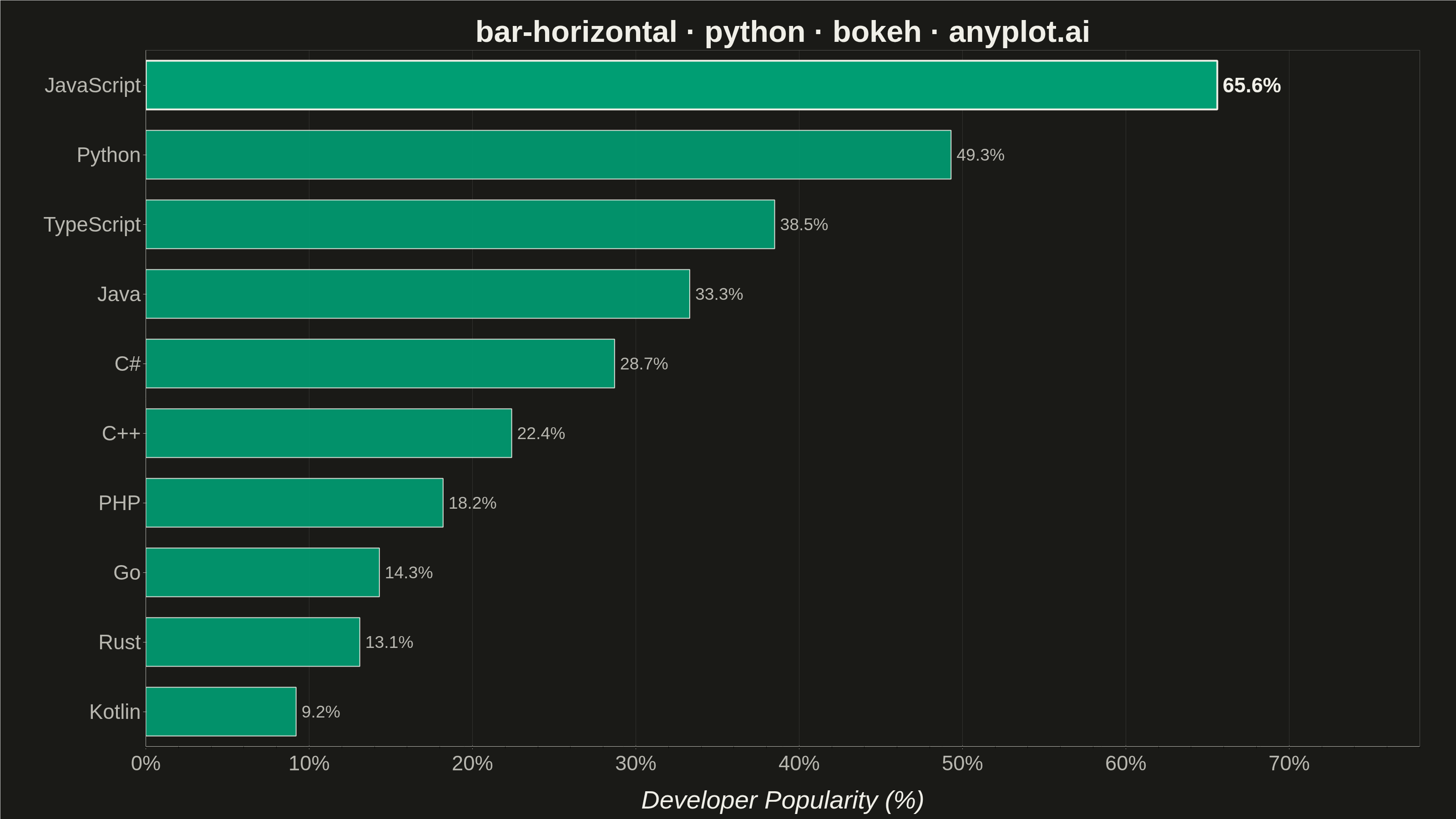
A horizontal bar chart displaying categorical data with rectangular bars extending horizontally from the y-axis. The length of each bar is proportional to the value it represents. This orientation is particularly effective when category names are long or numerous, as horizontal labels are easier to read than rotated vertical labels. Horizontal bar charts excel at rankings, comparisons, and survey results visualization.
""" anyplot.ai
bar-horizontal: Horizontal Bar Chart
Library: bokeh 3.9.2 | Python 3.13.14
Quality: 93/100 | Updated: 2026-08-05
"""

import os
import sys
import time
from pathlib import Path


if sys.path and sys.path[0] in ("", "."):
    sys.path.pop(0)

from bokeh.io import output_file, save
from bokeh.models import ColumnDataSource, HoverTool, LabelSet, PrintfTickFormatter
from bokeh.plotting import figure
from selenium import webdriver
from selenium.webdriver.chrome.options import Options


THEME = os.getenv("ANYPLOT_THEME", "light")
PAGE_BG = "#FAF8F1" if THEME == "light" else "#1A1A17"
ELEVATED_BG = "#FFFDF6" if THEME == "light" else "#242420"
INK = "#1A1A17" if THEME == "light" else "#F0EFE8"
INK_SOFT = "#4A4A44" if THEME == "light" else "#B8B7B0"

# Data - Top Programming Languages by Developer Popularity (%)
categories = ["JavaScript", "Python", "TypeScript", "Java", "C#", "C++", "PHP", "Go", "Rust", "Kotlin"]
values = [65.6, 49.3, 38.5, 33.3, 28.7, 22.4, 18.2, 14.3, 13.1, 9.2]

# Sort by value (smallest to largest for bottom-to-top display)
sorted_data = sorted(zip(categories, values, strict=True), key=lambda x: x[1])
categories_sorted = [x[0] for x in sorted_data]
values_sorted = [x[1] for x in sorted_data]
labels_sorted = [f"{v:.1f}%" for v in values_sorted]

# Split the leader (top bar, highest value) from the rest so it can carry a
# focal-point emphasis (thicker edge stroke + bolder, larger value label)
# without introducing a second hue into the single-series palette.
rest_source = ColumnDataSource(
    data={"categories": categories_sorted[:-1], "values": values_sorted[:-1], "labels": labels_sorted[:-1]}
)
leader_source = ColumnDataSource(
    data={"categories": categories_sorted[-1:], "values": values_sorted[-1:], "labels": labels_sorted[-1:]}
)

# Create figure with categorical y-axis (3200 x 1800 px, the canonical landscape canvas)
p = figure(
    width=3200,
    height=1800,
    y_range=categories_sorted,
    x_axis_label="Developer Popularity (%)",
    title="bar-horizontal · python · bokeh · anyplot.ai",
    toolbar_location=None,  # bokeh's default toolbar adds ~30-50px above the plot,
    # which would shrink the saved screenshot below the 3200x1800 target.
    min_border_bottom=160,  # room for 34pt x-tick labels + 42pt x-axis label
    min_border_left=320,  # room for 34pt category tick labels (up to "TypeScript")
    min_border_top=110,  # room for 50pt title
    min_border_right=80,  # room for value labels near the right edge
)

# Draw horizontal bars with Okabe-Ito color #009E73; the leader (top bar) gets
# a heavier edge stroke as a focal-point device to sharpen the ranking story
rest_bars = p.hbar(
    y="categories",
    right="values",
    height=0.7,
    source=rest_source,
    color="#009E73",
    line_color=INK,
    line_width=2,
    alpha=0.9,
)
leader_bars = p.hbar(
    y="categories",
    right="values",
    height=0.7,
    source=leader_source,
    color="#009E73",
    line_color=INK,
    line_width=4,
    alpha=1.0,
)

# End-of-bar value labels for direct, at-a-glance reading of each value; the
# leader's label is bolder and larger, reinforcing it as the headline insight
value_labels = LabelSet(
    x="values",
    y="categories",
    text="labels",
    source=rest_source,
    x_offset=12,
    text_font_size="28pt",
    text_color=INK_SOFT,
    text_baseline="middle",
)
p.add_layout(value_labels)

leader_label = LabelSet(
    x="values",
    y="categories",
    text="labels",
    source=leader_source,
    x_offset=12,
    text_font_size="34pt",
    text_font_style="bold",
    text_color=INK,
    text_baseline="middle",
)
p.add_layout(leader_label)

# Distinctive bokeh interactivity: formatted hover tooltips on both HTML renders
p.add_tools(
    HoverTool(
        renderers=[rest_bars, leader_bars], tooltips=[("Language", "@categories"), ("Popularity", "@values{0.0}%")]
    )
)

# Style title
p.title.text_font_size = "50pt"
p.title.align = "center"
p.title.text_color = INK

# Style axes for the 3200x1800 canvas
p.xaxis.axis_label_text_font_size = "42pt"
p.yaxis.axis_label_text_font_size = "42pt"
p.xaxis.major_label_text_font_size = "34pt"
p.yaxis.major_label_text_font_size = "34pt"
p.xaxis.axis_label_standoff = 20
p.yaxis.axis_label_standoff = 20
p.xaxis.axis_label_text_color = INK
p.yaxis.axis_label_text_color = INK
p.xaxis.major_label_text_color = INK_SOFT
p.yaxis.major_label_text_color = INK_SOFT
p.xaxis.axis_line_color = INK_SOFT
p.yaxis.axis_line_color = INK_SOFT
p.xaxis.major_tick_line_color = INK_SOFT
p.yaxis.major_tick_line_color = INK_SOFT
p.xaxis.formatter = PrintfTickFormatter(format="%d%%")

# Configure grid
p.xgrid.grid_line_color = INK
p.xgrid.grid_line_alpha = 0.12
p.ygrid.grid_line_alpha = 0

# Theme-adaptive background
p.background_fill_color = PAGE_BG
p.border_fill_color = PAGE_BG
# Drop the default four-sided box outline; the x/y axis lines already draw a
# refined L-shaped frame (left + bottom) without boxing the plot area in
p.outline_line_color = None

# Set x-axis range starting from 0, with headroom for the end-of-bar labels
p.x_range.start = 0
p.x_range.end = 78

# Save as HTML for interactivity
output_file(f"plot-{THEME}.html")
save(p)

# Screenshot with headless Chrome
W, H = 3200, 1800
opts = Options()
for arg in (
    "--headless=new",
    "--no-sandbox",
    "--disable-dev-shm-usage",
    "--disable-gpu",
    f"--window-size={W},{H}",
    "--hide-scrollbars",
):
    opts.add_argument(arg)
driver = webdriver.Chrome(options=opts)
driver.set_window_size(W, H)
driver.get(f"file://{Path(f'plot-{THEME}.html').resolve()}")
# Headless Chrome's --window-size sets the OUTER window, which still reserves a
# phantom title-bar height even headless — pin the viewport exactly via CDP so
# the screenshot lands at exactly W x H instead of coming out short.
driver.execute_cdp_cmd(
    "Emulation.setDeviceMetricsOverride", {"width": W, "height": H, "deviceScaleFactor": 1, "mobile": False}
)
time.sleep(3)
driver.save_screenshot(f"plot-{THEME}.png")
driver.quit()
Runnable source as JSON, for any HTTP client: https://api.anyplot.ai/specs/bar-horizontal/bokeh/code. Any spec id and library id listed in llms-full.txt fit the same URL shape; every URL below is complete and callable.
{
  "spec_id": "bar-horizontal",
  "language": "python",
  "library": "bokeh",
  "page": "https://anyplot.ai/bar-horizontal/python/bokeh",
  "hub": "https://anyplot.ai/bar-horizontal",
  "code_json": "https://api.anyplot.ai/specs/bar-horizontal/bokeh/code",
  "spec_json": "https://api.anyplot.ai/specs/bar-horizontal",
  "render_light_png": "https://storage.googleapis.com/anyplot-images/plots/bar-horizontal/python/bokeh/plot-light.png",
  "render_dark_png": "https://storage.googleapis.com/anyplot-images/plots/bar-horizontal/python/bokeh/plot-dark.png",
  "interactive_light_html": "https://storage.googleapis.com/anyplot-images/plots/bar-horizontal/python/bokeh/plot-light.html",
  "interactive_dark_html": "https://storage.googleapis.com/anyplot-images/plots/bar-horizontal/python/bokeh/plot-dark.html",
  "quality_score": 93.0,
  "license": "MIT",
  "guide": "https://anyplot.ai/llms.txt"
}
Part of Horizontal Bar Chart on anyplot.ai.