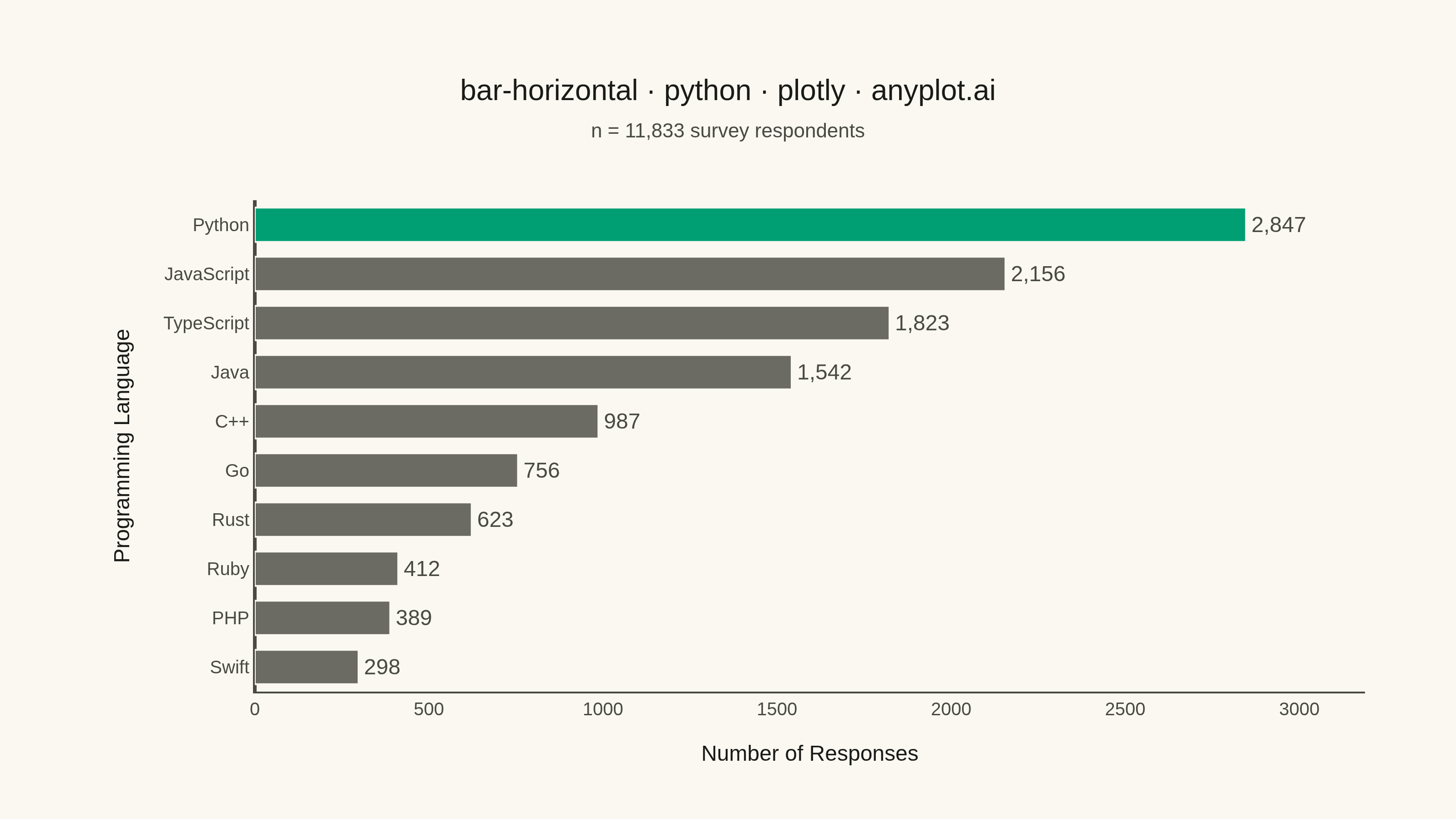
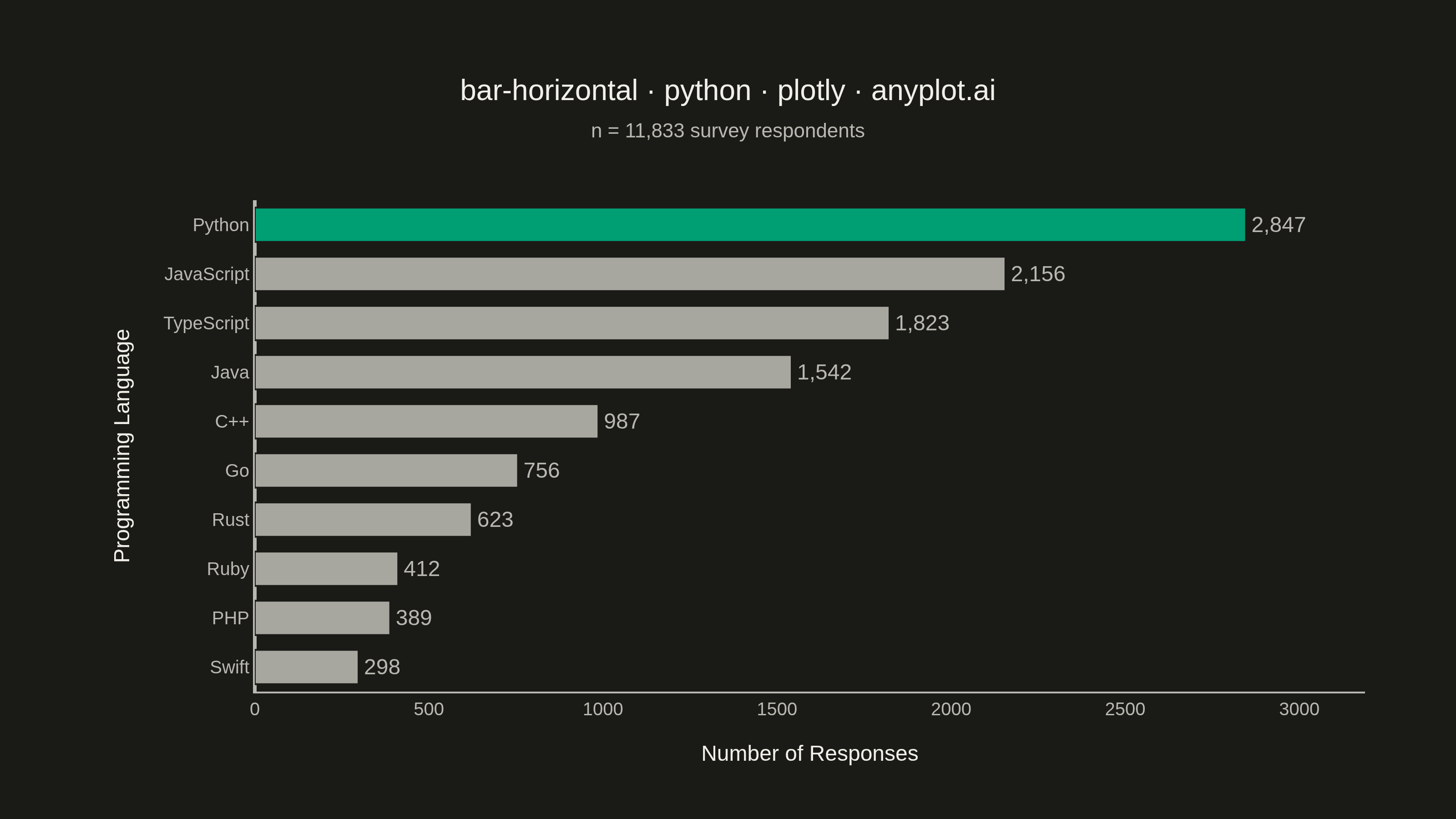
A horizontal bar chart displaying categorical data with rectangular bars extending horizontally from the y-axis. The length of each bar is proportional to the value it represents. This orientation is particularly effective when category names are long or numerous, as horizontal labels are easier to read than rotated vertical labels. Horizontal bar charts excel at rankings, comparisons, and survey results visualization.
""" anyplot.ai
bar-horizontal: Horizontal Bar Chart
Library: plotly 6.9.0 | Python 3.13.14
Quality: 93/100 | Updated: 2026-08-05
"""

import os

import plotly.graph_objects as go


# Theme tokens (see prompts/default-style-guide.md "Theme-adaptive Chrome")
THEME = os.getenv("ANYPLOT_THEME", "light")
PAGE_BG = "#FAF8F1" if THEME == "light" else "#1A1A17"
ELEVATED_BG = "#FFFDF6" if THEME == "light" else "#242420"
INK = "#1A1A17" if THEME == "light" else "#F0EFE8"
INK_SOFT = "#4A4A44" if THEME == "light" else "#B8B7B0"
INK_MUTED = "#6B6A63" if THEME == "light" else "#A8A79F"
BRAND = "#009E73"  # Imprint palette position 1 — the leading category

# Data - Survey results: "What programming language do you use most?"
categories = ["Python", "JavaScript", "TypeScript", "Java", "C++", "Go", "Rust", "Ruby", "PHP", "Swift"]
values = [2847, 2156, 1823, 1542, 987, 756, 623, 412, 389, 298]
total_responses = sum(values)

# Emphasize the leading language, mute the rest — "highlight specific bars to
# draw attention" per the spec's own guidance, using the muted semantic
# anchor for the "rest" role instead of diluting the categorical palette.
bar_colors = [BRAND if i == 0 else INK_MUTED for i in range(len(categories))]

# Plot — see default-style-guide.md "Visual Sizing Defaults" for the canvas + sizing values
fig = go.Figure()
fig.add_trace(
    go.Bar(
        y=categories,
        x=values,
        orientation="h",
        marker={"color": bar_colors, "line": {"color": PAGE_BG, "width": 1}},
        texttemplate="%{x:,}",
        textposition="outside",
        textfont={"size": 12, "color": INK_SOFT},
        cliponaxis=False,
        hovertemplate="<b>%{y}</b><br>%{x:,} responses<extra></extra>",
    )
)

# Style — title kept at the default 16px since the mandated title is only
# 45 chars (well under the 67-char baseline the sizing table is tuned for)
fig.update_layout(
    autosize=False,
    width=800,
    height=450,
    margin={"l": 140, "r": 50, "t": 110, "b": 70},
    title={
        "text": "bar-horizontal · python · plotly · anyplot.ai",
        "font": {"size": 16, "color": INK},
        "subtitle": {"text": f"n = {total_responses:,} survey respondents", "font": {"size": 11, "color": INK_SOFT}},
        "x": 0.5,
        "xanchor": "center",
    },
    xaxis={
        "title": {"text": "Number of Responses", "font": {"size": 12, "color": INK}},
        "tickfont": {"size": 10, "color": INK_SOFT},
        "showgrid": False,
        "showline": True,
        "linecolor": INK_SOFT,
        "zerolinecolor": INK_SOFT,
        "range": [0, max(values) * 1.12],
    },
    yaxis={
        "title": {"text": "Programming Language", "font": {"size": 12, "color": INK}},
        "tickfont": {"size": 10, "color": INK_SOFT},
        "autorange": "reversed",
        "showgrid": False,
        "showline": True,
        "linecolor": INK_SOFT,
    },
    paper_bgcolor=PAGE_BG,
    plot_bgcolor=PAGE_BG,
    font={"color": INK},
    bargap=0.3,
    showlegend=False,
)

# Save
fig.write_image(f"plot-{THEME}.png", width=800, height=450, scale=4)
fig.write_html(f"plot-{THEME}.html", include_plotlyjs="cdn")
Runnable source as JSON, for any HTTP client: https://api.anyplot.ai/specs/bar-horizontal/plotly/code. Any spec id and library id listed in llms-full.txt fit the same URL shape; every URL below is complete and callable.
{
  "spec_id": "bar-horizontal",
  "language": "python",
  "library": "plotly",
  "page": "https://anyplot.ai/bar-horizontal/python/plotly",
  "hub": "https://anyplot.ai/bar-horizontal",
  "code_json": "https://api.anyplot.ai/specs/bar-horizontal/plotly/code",
  "spec_json": "https://api.anyplot.ai/specs/bar-horizontal",
  "render_light_png": "https://storage.googleapis.com/anyplot-images/plots/bar-horizontal/python/plotly/plot-light.png",
  "render_dark_png": "https://storage.googleapis.com/anyplot-images/plots/bar-horizontal/python/plotly/plot-dark.png",
  "interactive_light_html": "https://storage.googleapis.com/anyplot-images/plots/bar-horizontal/python/plotly/plot-light.html",
  "interactive_dark_html": "https://storage.googleapis.com/anyplot-images/plots/bar-horizontal/python/plotly/plot-dark.html",
  "quality_score": 93.0,
  "license": "MIT",
  "guide": "https://anyplot.ai/llms.txt"
}
Part of Horizontal Bar Chart on anyplot.ai.