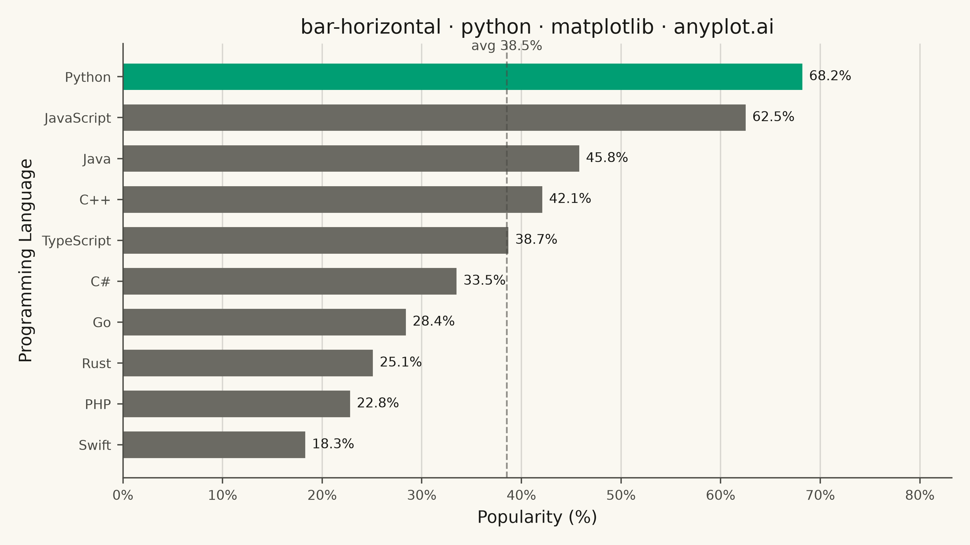
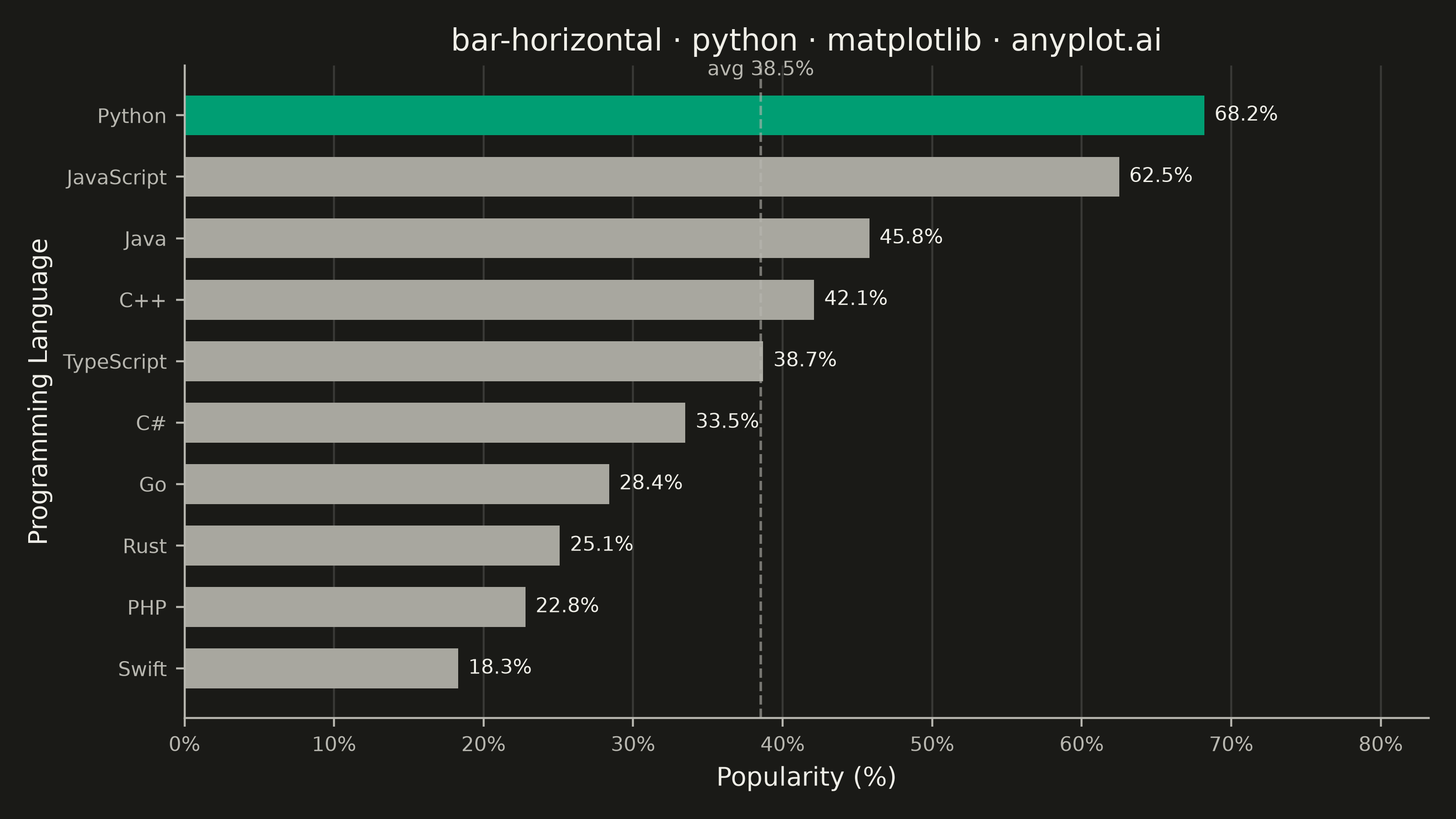
A horizontal bar chart displaying categorical data with rectangular bars extending horizontally from the y-axis. The length of each bar is proportional to the value it represents. This orientation is particularly effective when category names are long or numerous, as horizontal labels are easier to read than rotated vertical labels. Horizontal bar charts excel at rankings, comparisons, and survey results visualization.
""" anyplot.ai
bar-horizontal: Horizontal Bar Chart
Library: matplotlib 3.11.1 | Python 3.13.14
Quality: 91/100 | Updated: 2026-08-05
"""

import os

import matplotlib.pyplot as plt
import numpy as np
from matplotlib.ticker import PercentFormatter


# Theme tokens
THEME = os.getenv("ANYPLOT_THEME", "light")
PAGE_BG = "#FAF8F1" if THEME == "light" else "#1A1A17"
INK = "#1A1A17" if THEME == "light" else "#F0EFE8"
INK_SOFT = "#4A4A44" if THEME == "light" else "#B8B7B0"
MUTED = "#6B6A63" if THEME == "light" else "#A8A79F"
BRAND = "#009E73"

# Data: Top 10 programming languages by popularity
np.random.seed(42)
categories = ["Python", "JavaScript", "Java", "C++", "TypeScript", "C#", "Go", "Rust", "PHP", "Swift"]
values = [68.2, 62.5, 45.8, 42.1, 38.7, 33.5, 28.4, 25.1, 22.8, 18.3]

# Sort ascending so the top-ranked language sits at the top of the chart
sorted_indices = np.argsort(values)
categories = [categories[i] for i in sorted_indices]
values = [values[i] for i in sorted_indices]
average = np.mean(values)

# Highlight the leader in brand green, mute the rest to guide the eye
colors = [BRAND if i == len(values) - 1 else MUTED for i in range(len(values))]

# Plot — see default-style-guide.md "Visual Sizing Defaults" for the canvas + sizing values
title = "bar-horizontal · python · matplotlib · anyplot.ai"
fig, ax = plt.subplots(figsize=(8, 4.5), dpi=400, facecolor=PAGE_BG)
ax.set_facecolor(PAGE_BG)

y_positions = np.arange(len(categories))
bars = ax.barh(y_positions, values, height=0.65, color=colors, edgecolor="none")
ax.bar_label(bars, fmt="%.1f%%", padding=4, fontsize=8, color=INK)

# Average reference line for at-a-glance comparison
ax.axvline(average, color=INK_SOFT, linewidth=1, linestyle="--", alpha=0.6)
ax.annotate(
    f"avg {average:.1f}%",
    xy=(average, len(values) - 1),
    xytext=(average, len(values) - 0.35),
    fontsize=8,
    color=INK_SOFT,
    ha="center",
)

# Labels and styling
ax.set_xlabel("Popularity (%)", fontsize=10, color=INK)
ax.set_ylabel("Programming Language", fontsize=10, color=INK)
ax.set_title(title, fontsize=12, fontweight="medium", color=INK)
ax.set_yticks(y_positions)
ax.set_yticklabels(categories, color=INK_SOFT)
ax.tick_params(axis="both", labelsize=8, colors=INK_SOFT)
ax.xaxis.set_major_formatter(PercentFormatter(xmax=100, decimals=0))
ax.set_xlim(0, max(values) * 1.22)

# Grid on x-axis only
ax.xaxis.grid(True, alpha=0.15, linewidth=0.8, color=INK)
ax.set_axisbelow(True)

# Remove top and right spines
ax.spines["top"].set_visible(False)
ax.spines["right"].set_visible(False)
for s in ("left", "bottom"):
    ax.spines[s].set_color(INK_SOFT)

plt.tight_layout()
plt.savefig(f"plot-{THEME}.png", dpi=400, facecolor=PAGE_BG)
Runnable source as JSON, for any HTTP client: https://api.anyplot.ai/specs/bar-horizontal/matplotlib/code. Any spec id and library id listed in llms-full.txt fit the same URL shape; every URL below is complete and callable.
{
  "spec_id": "bar-horizontal",
  "language": "python",
  "library": "matplotlib",
  "page": "https://anyplot.ai/bar-horizontal/python/matplotlib",
  "hub": "https://anyplot.ai/bar-horizontal",
  "code_json": "https://api.anyplot.ai/specs/bar-horizontal/matplotlib/code",
  "spec_json": "https://api.anyplot.ai/specs/bar-horizontal",
  "render_light_png": "https://storage.googleapis.com/anyplot-images/plots/bar-horizontal/python/matplotlib/plot-light.png",
  "render_dark_png": "https://storage.googleapis.com/anyplot-images/plots/bar-horizontal/python/matplotlib/plot-dark.png",
  "quality_score": 91.0,
  "license": "MIT",
  "guide": "https://anyplot.ai/llms.txt"
}
Part of Horizontal Bar Chart on anyplot.ai.