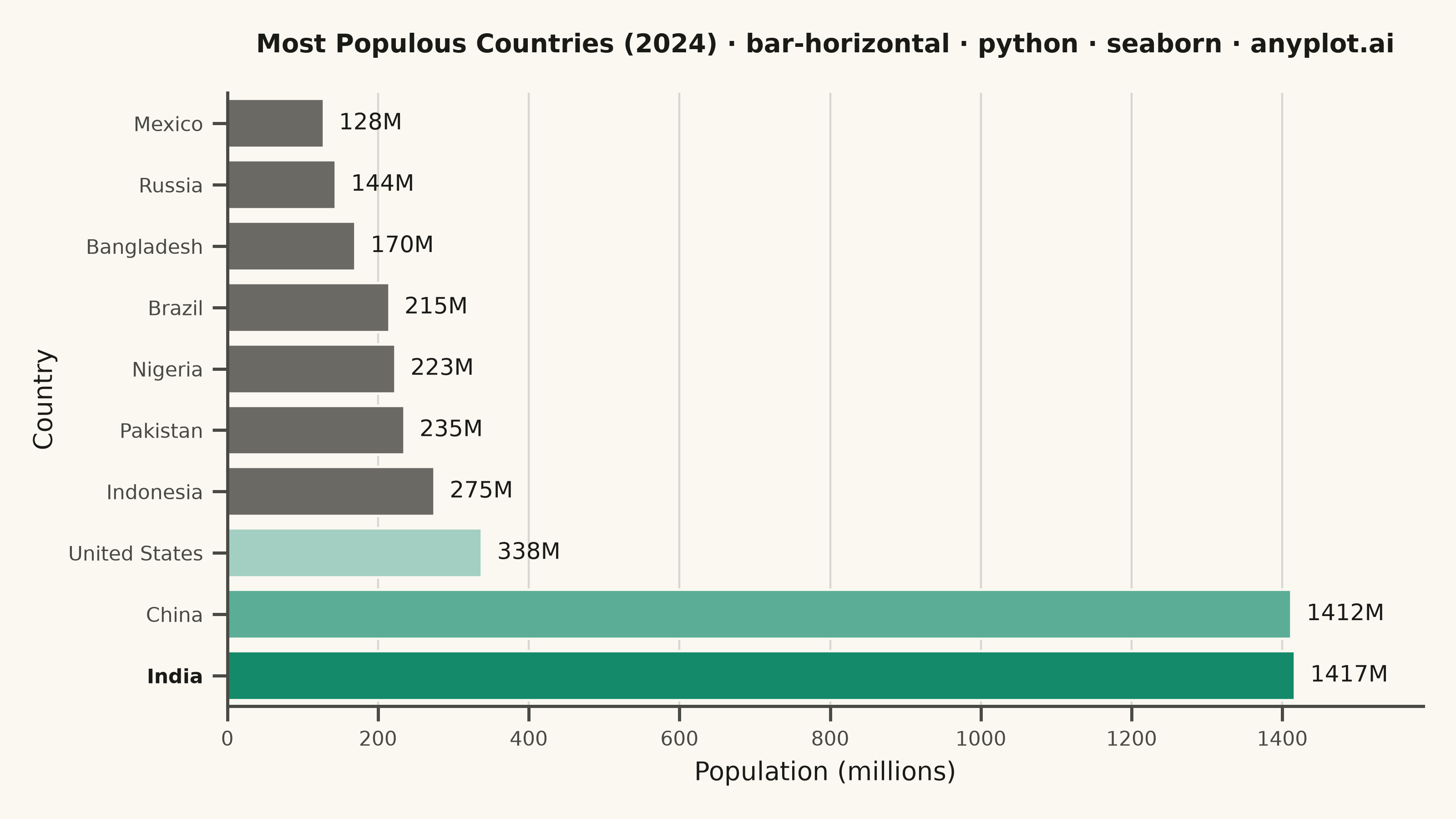
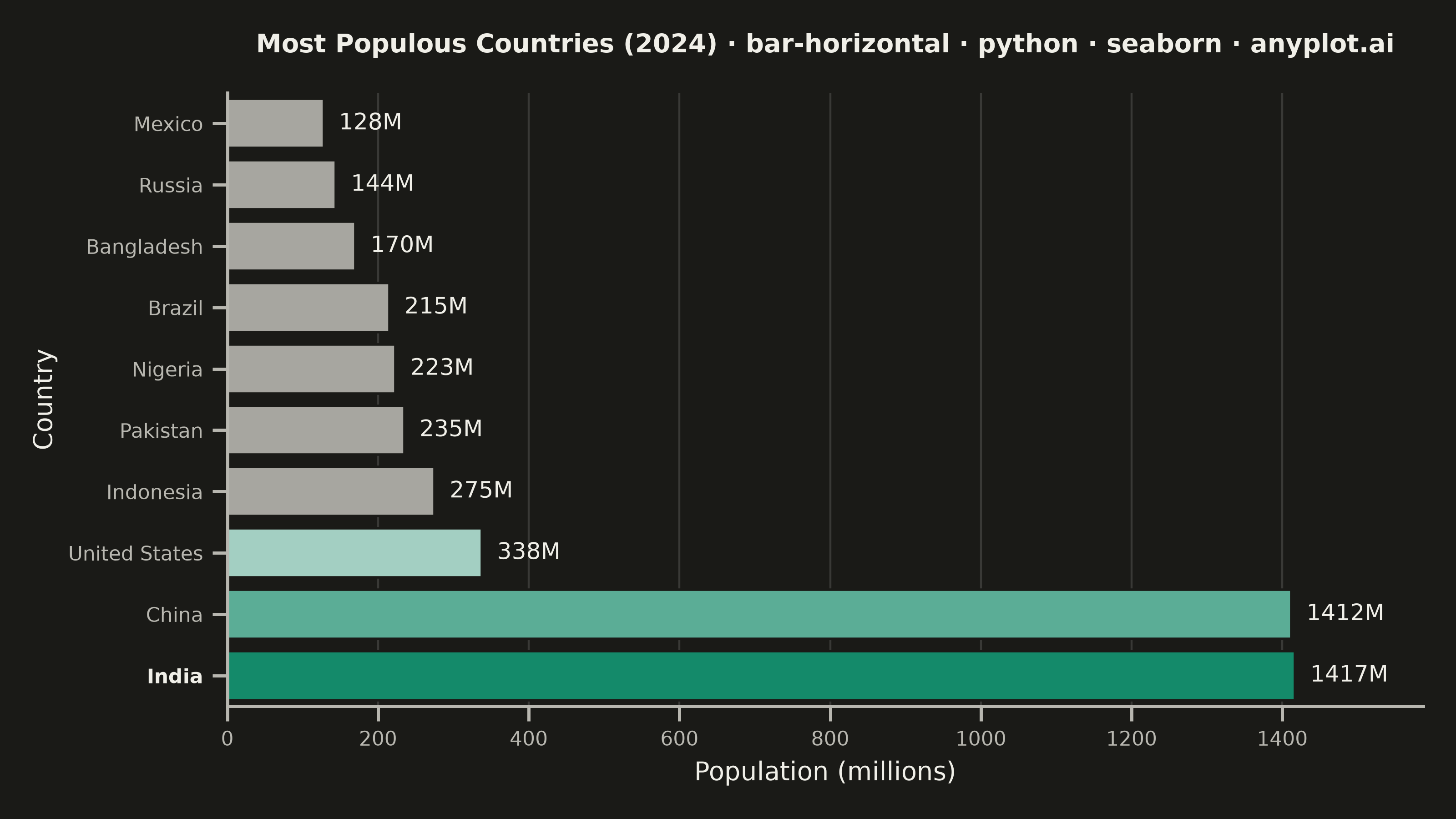
A horizontal bar chart displaying categorical data with rectangular bars extending horizontally from the y-axis. The length of each bar is proportional to the value it represents. This orientation is particularly effective when category names are long or numerous, as horizontal labels are easier to read than rotated vertical labels. Horizontal bar charts excel at rankings, comparisons, and survey results visualization.
""" anyplot.ai
bar-horizontal: Horizontal Bar Chart
Library: seaborn 0.13.2 | Python 3.13.14
Quality: 91/100 | Updated: 2026-08-05
"""

import os

import matplotlib.pyplot as plt
import pandas as pd
import seaborn as sns


# Theme tokens (see prompts/default-style-guide.md "Background" + "Theme-adaptive Chrome")
THEME = os.getenv("ANYPLOT_THEME", "light")
PAGE_BG = "#FAF8F1" if THEME == "light" else "#1A1A17"
ELEVATED_BG = "#FFFDF6" if THEME == "light" else "#242420"
INK = "#1A1A17" if THEME == "light" else "#F0EFE8"
INK_SOFT = "#4A4A44" if THEME == "light" else "#B8B7B0"
INK_MUTED = "#6B6A63" if THEME == "light" else "#A8A79F"
BRAND = "#009E73"  # Imprint palette position 1 — ALWAYS first series

sns.set_theme(
    style="ticks",
    rc={
        "figure.facecolor": PAGE_BG,
        "axes.facecolor": PAGE_BG,
        "axes.edgecolor": INK_SOFT,
        "axes.labelcolor": INK,
        "text.color": INK,
        "xtick.color": INK_SOFT,
        "ytick.color": INK_SOFT,
        "grid.color": INK,
        "grid.alpha": 0.15,
        "legend.facecolor": ELEVATED_BG,
        "legend.edgecolor": INK_SOFT,
    },
)

# Data — most populous countries (UN 2024 estimates)
data = {
    "Country": [
        "India",
        "China",
        "United States",
        "Indonesia",
        "Pakistan",
        "Brazil",
        "Nigeria",
        "Bangladesh",
        "Russia",
        "Mexico",
    ],
    "Population": [1417, 1412, 338, 275, 235, 215, 223, 170, 144, 128],
}
df = pd.DataFrame(data)

# Rank ascending so the largest bar lands at the top of the horizontal axis
order = df.sort_values("Population", ascending=True)["Country"].tolist()
top_country = df.loc[df["Population"].idxmax(), "Country"]

# Focal-point emphasis, graduated by rank: sns.light_palette generates a brand-anchored
# tint ramp (reverse=True keeps index 0 pixel-identical to BRAND), so the top-3 countries
# step from full brand green down to a soft tint instead of a flat two-tone split — the
# rest stay muted ink. hue=Country + palette=dict is the seaborn-idiomatic per-bar recolor.
top_n = 3
ranked = df.sort_values("Population", ascending=False)["Country"].tolist()
rank_shades = sns.light_palette(BRAND, n_colors=top_n + 1, reverse=True)[:top_n]
color_map = {
    country: (rank_shades[ranked.index(country)] if country in ranked[:top_n] else INK_MUTED)
    for country in df["Country"]
}

fig, ax = plt.subplots(figsize=(8, 4.5), dpi=400)

sns.barplot(
    data=df,
    y="Country",
    x="Population",
    order=order,
    hue="Country",
    palette=color_map,
    legend=False,
    dodge=False,
    edgecolor=PAGE_BG,
    linewidth=1,
    ax=ax,
)

# Value labels at the end of each bar
for container in ax.containers:
    ax.bar_label(container, fmt=lambda v: f"{v:.0f}M", padding=6, fontsize=9, color=INK)

# Mandated title (scales fontsize when longer than the 67-char baseline)
title = "Most Populous Countries (2024) · bar-horizontal · python · seaborn · anyplot.ai"
n = len(title)
ratio = 67 / n if n > 67 else 1.0
title_fontsize = round(12 * ratio)
ax.set_title(title, fontsize=title_fontsize, fontweight="bold", color=INK, pad=16)

ax.set_xlabel("Population (millions)", fontsize=10, color=INK)
ax.set_ylabel("Country", fontsize=10, color=INK)
ax.tick_params(axis="both", labelsize=8, colors=INK_SOFT)

# Bold the highlighted tick label to reinforce the visual emphasis
for tick_label in ax.get_yticklabels():
    if tick_label.get_text() == top_country:
        tick_label.set_fontweight("bold")
        tick_label.set_color(INK)

ax.xaxis.grid(True, alpha=0.15, linewidth=0.8)
ax.set_axisbelow(True)
ax.set_xlim(0, df["Population"].max() * 1.12)

sns.despine(ax=ax)

plt.tight_layout()
plt.savefig(f"plot-{THEME}.png", dpi=400, facecolor=PAGE_BG)
plt.close()
Runnable source as JSON, for any HTTP client: https://api.anyplot.ai/specs/bar-horizontal/seaborn/code. Any spec id and library id listed in llms-full.txt fit the same URL shape; every URL below is complete and callable.
{
  "spec_id": "bar-horizontal",
  "language": "python",
  "library": "seaborn",
  "page": "https://anyplot.ai/bar-horizontal/python/seaborn",
  "hub": "https://anyplot.ai/bar-horizontal",
  "code_json": "https://api.anyplot.ai/specs/bar-horizontal/seaborn/code",
  "spec_json": "https://api.anyplot.ai/specs/bar-horizontal",
  "render_light_png": "https://storage.googleapis.com/anyplot-images/plots/bar-horizontal/python/seaborn/plot-light.png",
  "render_dark_png": "https://storage.googleapis.com/anyplot-images/plots/bar-horizontal/python/seaborn/plot-dark.png",
  "quality_score": 91.0,
  "license": "MIT",
  "guide": "https://anyplot.ai/llms.txt"
}
Part of Horizontal Bar Chart on anyplot.ai.