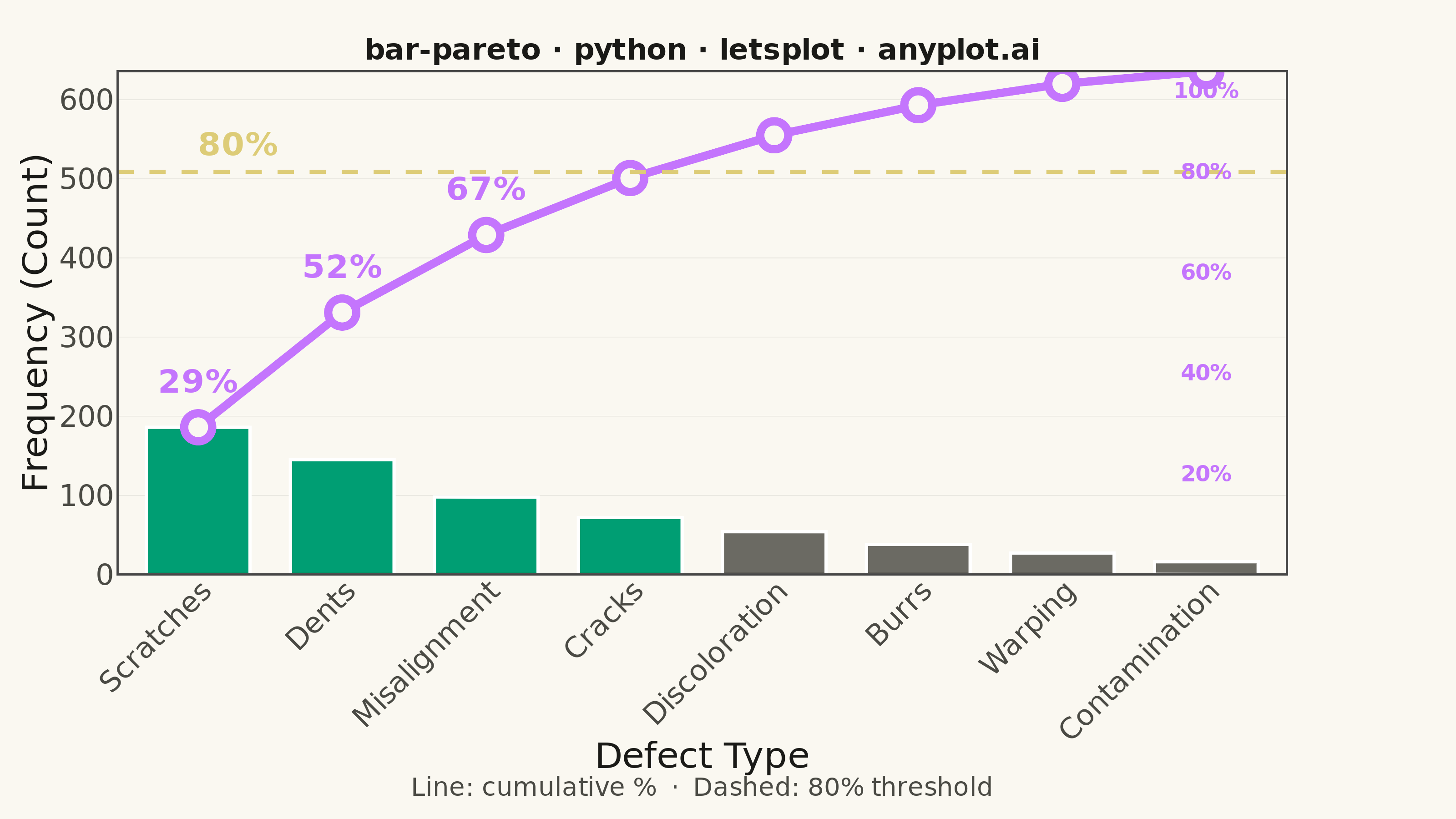
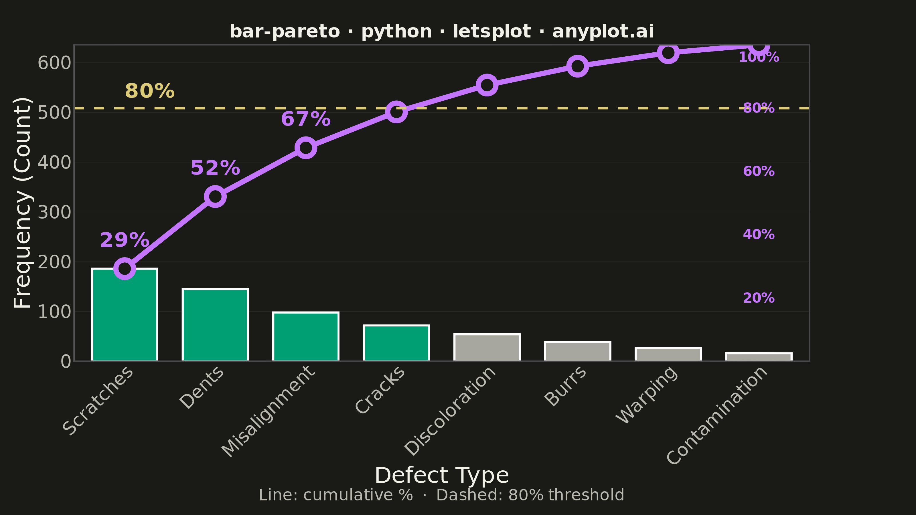
A Pareto chart combining descending-sorted bars (by frequency or count) with a cumulative percentage line overlay on a secondary y-axis. This visualization helps identify the most significant factors in a dataset by applying the Pareto principle (80/20 rule), making it one of the "7 Basic Tools of Quality" in Six Sigma and quality management. It reveals which categories contribute the most to an overall effect, enabling data-driven prioritization.
Preview render from the lets-plot implementation.