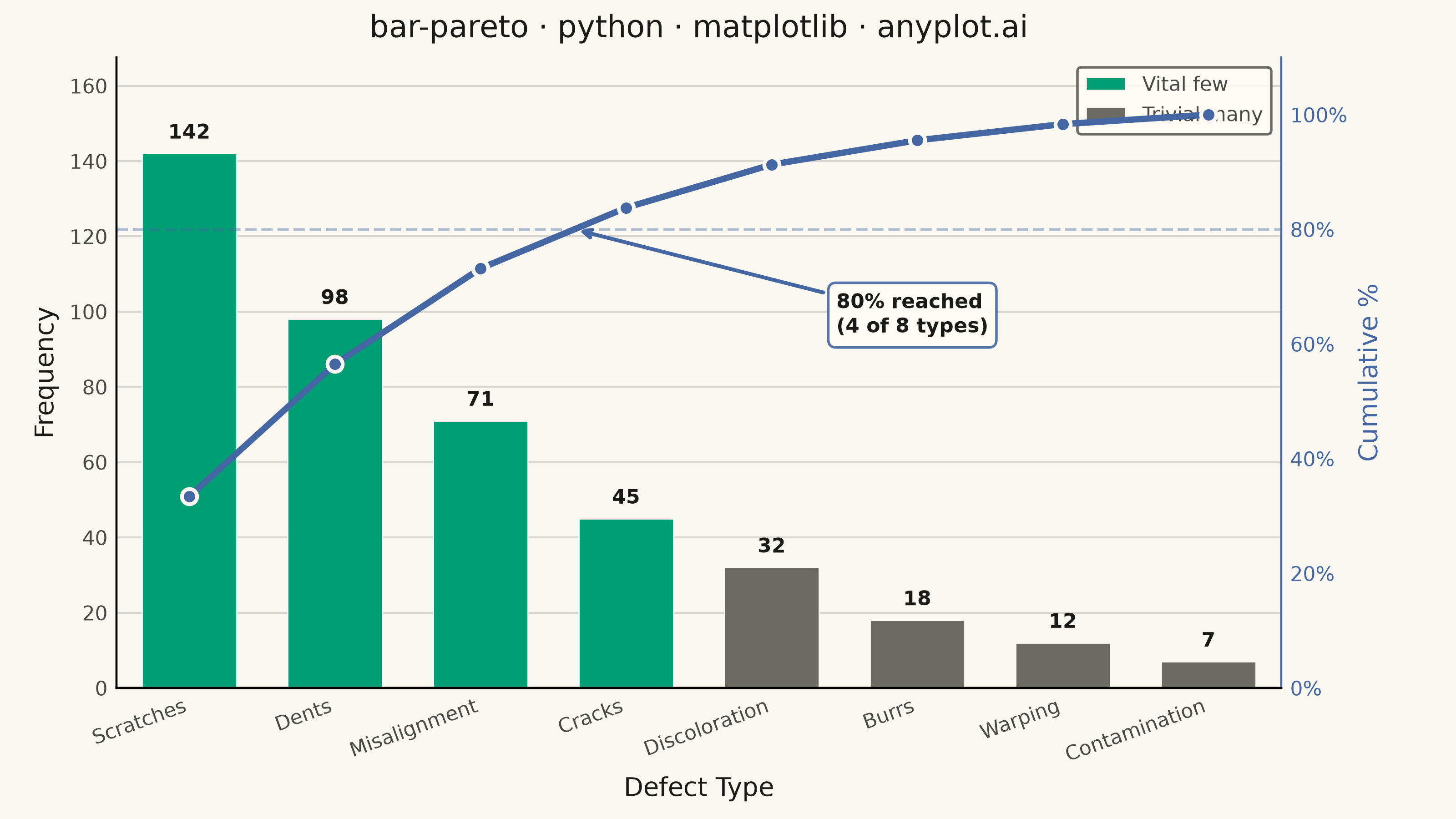
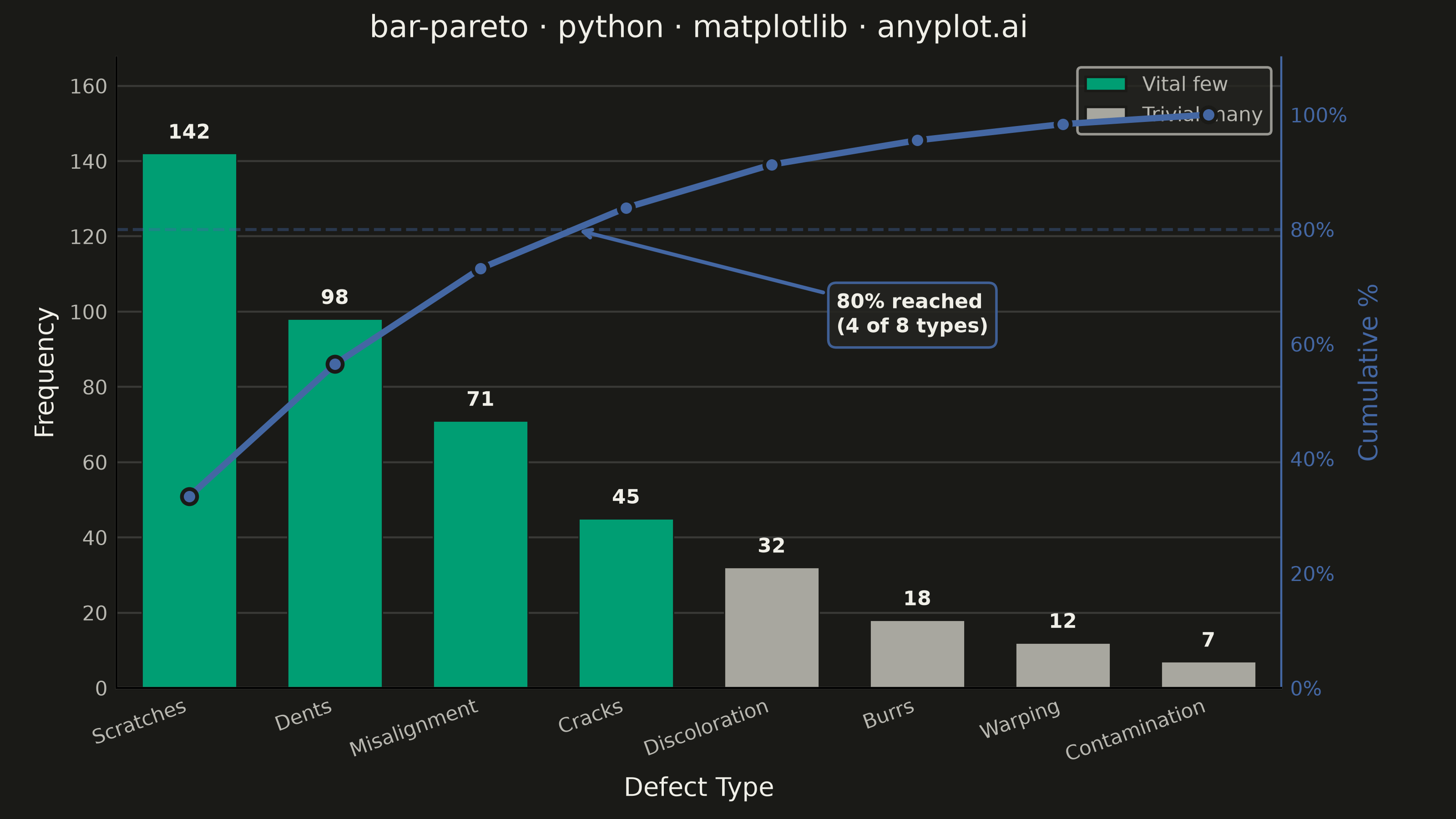
A Pareto chart combining descending-sorted bars (by frequency or count) with a cumulative percentage line overlay on a secondary y-axis. This visualization helps identify the most significant factors in a dataset by applying the Pareto principle (80/20 rule), making it one of the "7 Basic Tools of Quality" in Six Sigma and quality management. It reveals which categories contribute the most to an overall effect, enabling data-driven prioritization.
""" anyplot.ai
bar-pareto: Pareto Chart with Cumulative Line
Library: matplotlib 3.11.0 | Python 3.13.14
Quality: 88/100 | Updated: 2026-06-20
"""

import os

import matplotlib.pyplot as plt
import matplotlib.ticker as mticker
import numpy as np
from matplotlib.patches import Patch


THEME = os.getenv("ANYPLOT_THEME", "light")
PAGE_BG = "#FAF8F1" if THEME == "light" else "#1A1A17"
ELEVATED_BG = "#FFFDF6" if THEME == "light" else "#242420"
INK = "#1A1A17" if THEME == "light" else "#F0EFE8"
INK_SOFT = "#4A4A44" if THEME == "light" else "#B8B7B0"
INK_MUTED = "#6B6A63" if THEME == "light" else "#A8A79F"

# Imprint palette — position 1 is always first series
BAR_VITAL = "#009E73"  # Imprint pos 1 (brand green) — vital few bars
LINE_COLOR = "#4467A3"  # Imprint pos 3 (blue) — cumulative % line

# Data — manufacturing defect analysis
defect_types = ["Scratches", "Dents", "Misalignment", "Cracks", "Discoloration", "Burrs", "Warping", "Contamination"]
defect_counts = np.array([142, 98, 71, 45, 32, 18, 12, 7])

sort_idx = np.argsort(-defect_counts)
defect_types = [defect_types[i] for i in sort_idx]
defect_counts = defect_counts[sort_idx]
cumulative_pct = np.cumsum(defect_counts) / defect_counts.sum() * 100

# Vital few: bars that collectively account for >= 80% of defects
cross_idx = np.searchsorted(cumulative_pct, 80)  # first bar index at or past 80%
vital_count = cross_idx + 1
bar_colors = [BAR_VITAL if i < vital_count else INK_MUTED for i in range(len(defect_types))]

# Plot — landscape 3200×1800 px
fig, ax = plt.subplots(figsize=(8, 4.5), dpi=400, facecolor=PAGE_BG)
ax.set_facecolor(PAGE_BG)

x = np.arange(len(defect_types))
bars = ax.bar(x, defect_counts, color=bar_colors, width=0.65, zorder=2, edgecolor=PAGE_BG, linewidth=0.5)
ax.bar_label(bars, fontsize=8, fontweight="bold", padding=4, color=INK)

ax2 = ax.twinx()
ax2.patch.set_visible(False)
ax2.plot(
    x,
    cumulative_pct,
    color=LINE_COLOR,
    marker="o",
    markersize=6,
    linewidth=2.5,
    markeredgecolor=PAGE_BG,
    markeredgewidth=1.5,
    zorder=3,
)
ax2.axhline(y=80, color=LINE_COLOR, linestyle="--", linewidth=1.2, alpha=0.6, zorder=1)

# Annotate 80% crossing point with interpolated x position
cross_x = np.interp(80, cumulative_pct[max(0, cross_idx - 1) : cross_idx + 1], x[max(0, cross_idx - 1) : cross_idx + 1])
ax2.annotate(
    f"80% reached\n({vital_count} of {len(defect_types)} types)",
    xy=(cross_x, 80),
    xytext=(cross_x + 1.8, 62),
    fontsize=8,
    color=INK,
    fontweight="bold",
    arrowprops={"arrowstyle": "->", "color": LINE_COLOR, "lw": 1.5},
    bbox={"boxstyle": "round,pad=0.4", "fc": ELEVATED_BG, "ec": LINE_COLOR, "alpha": 0.9},
    zorder=4,
)

# Labels & title
ax.set_title("bar-pareto · python · matplotlib · anyplot.ai", fontsize=12, fontweight="medium", color=INK, pad=8)
ax.set_xlabel("Defect Type", fontsize=10, color=INK)
ax.set_ylabel("Frequency", fontsize=10, color=INK)
ax2.set_ylabel("Cumulative %", fontsize=10, color=LINE_COLOR)

ax.set_xticks(x)
ax.set_xticklabels(defect_types, fontsize=8, rotation=20, ha="right", color=INK_SOFT)
ax.tick_params(axis="y", labelsize=8, labelcolor=INK_SOFT, length=0)
ax.tick_params(axis="x", length=0)
ax2.tick_params(axis="y", labelsize=8, labelcolor=LINE_COLOR, length=0)
ax2.yaxis.set_major_formatter(mticker.FuncFormatter(lambda v, _: f"{v:.0f}%"))

ax2.set_ylim(0, 110)
ax.set_ylim(0, max(defect_counts) * 1.18)
ax.set_xlim(-0.5, len(defect_types) - 0.5)

# Spines
ax.spines["top"].set_visible(False)
ax.spines["right"].set_visible(False)
ax2.spines["top"].set_visible(False)
ax2.spines["right"].set_color(LINE_COLOR)
for spine in ("left", "bottom"):
    ax.spines[spine].set_color(INK_SOFT)

# Grid
ax.yaxis.grid(True, alpha=0.15, linewidth=0.8, color=INK)
ax.set_axisbelow(True)

# Legend distinguishing vital few from trivial many
legend_elements = [
    Patch(facecolor=BAR_VITAL, edgecolor=PAGE_BG, label="Vital few"),
    Patch(facecolor=INK_MUTED, edgecolor=PAGE_BG, label="Trivial many"),
]
leg = ax.legend(handles=legend_elements, fontsize=8, loc="upper left", frameon=True)
leg.get_frame().set_facecolor(ELEVATED_BG)
leg.get_frame().set_edgecolor(INK_SOFT)
plt.setp(leg.get_texts(), color=INK_SOFT)

fig.subplots_adjust(left=0.08, right=0.88, top=0.93, bottom=0.16)
plt.savefig(f"plot-{THEME}.png", dpi=400, facecolor=PAGE_BG)
plt.close()
Runnable source as JSON, for any HTTP client: https://api.anyplot.ai/specs/bar-pareto/matplotlib/code. Any spec id and library id listed in llms-full.txt fit the same URL shape; every URL below is complete and callable.
{
  "spec_id": "bar-pareto",
  "language": "python",
  "library": "matplotlib",
  "page": "https://anyplot.ai/bar-pareto/python/matplotlib",
  "hub": "https://anyplot.ai/bar-pareto",
  "code_json": "https://api.anyplot.ai/specs/bar-pareto/matplotlib/code",
  "spec_json": "https://api.anyplot.ai/specs/bar-pareto",
  "render_light_png": "https://storage.googleapis.com/anyplot-images/plots/bar-pareto/python/matplotlib/plot-light.png",
  "render_dark_png": "https://storage.googleapis.com/anyplot-images/plots/bar-pareto/python/matplotlib/plot-dark.png",
  "quality_score": 88.0,
  "license": "MIT",
  "guide": "https://anyplot.ai/llms.txt"
}
Part of Pareto Chart with Cumulative Line on anyplot.ai.