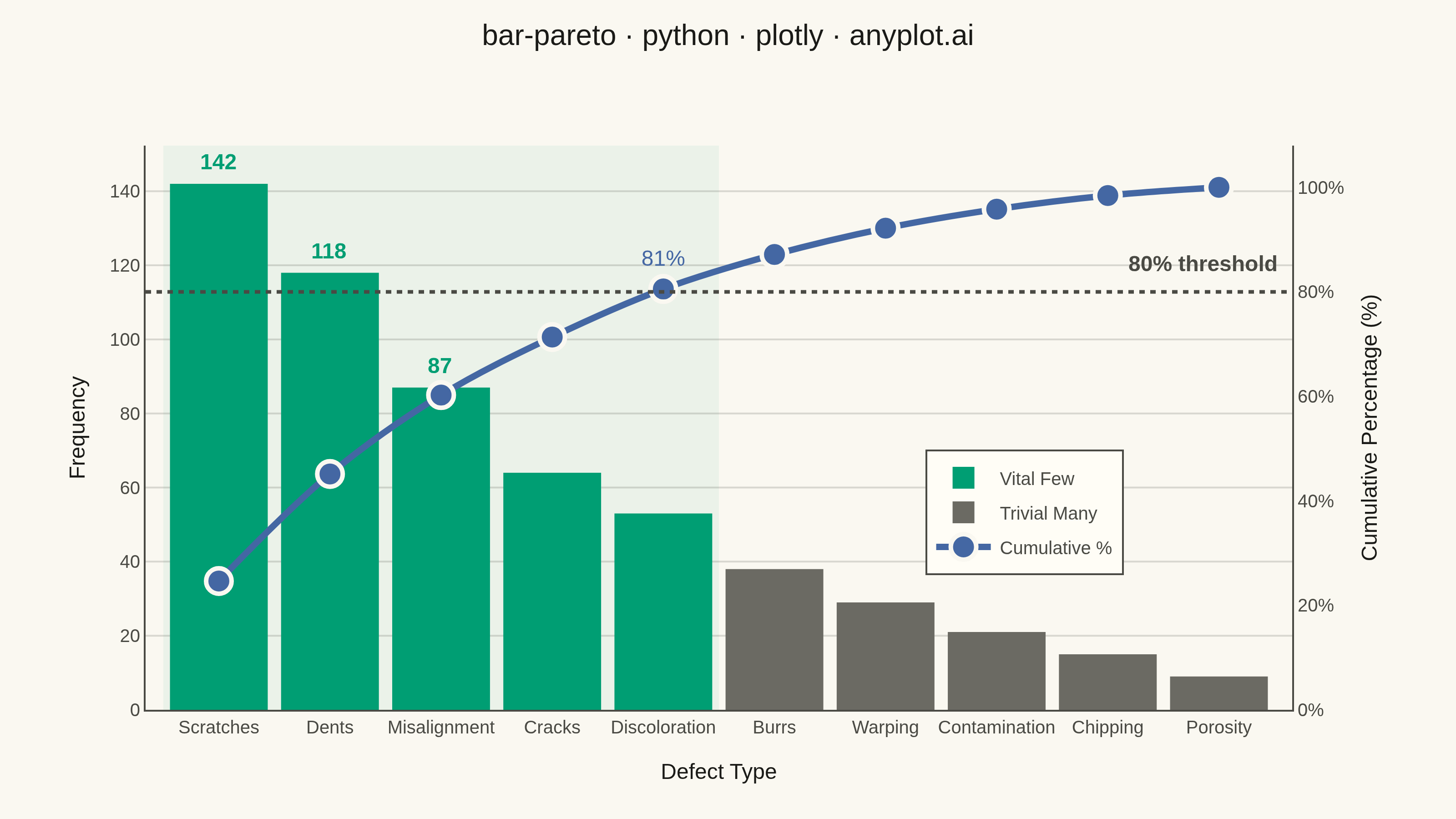
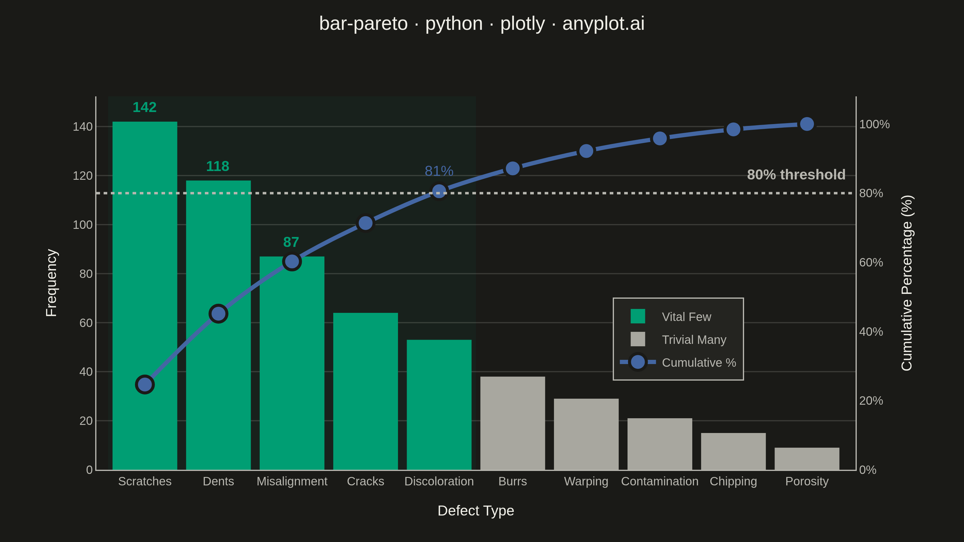
A Pareto chart combining descending-sorted bars (by frequency or count) with a cumulative percentage line overlay on a secondary y-axis. This visualization helps identify the most significant factors in a dataset by applying the Pareto principle (80/20 rule), making it one of the "7 Basic Tools of Quality" in Six Sigma and quality management. It reveals which categories contribute the most to an overall effect, enabling data-driven prioritization.
""" anyplot.ai
bar-pareto: Pareto Chart with Cumulative Line
Library: plotly 6.8.0 | Python 3.13.14
Quality: 90/100 | Updated: 2026-06-20
"""

import os

import numpy as np
import plotly.graph_objects as go


# Theme tokens
THEME = os.getenv("ANYPLOT_THEME", "light")
PAGE_BG = "#FAF8F1" if THEME == "light" else "#1A1A17"
ELEVATED_BG = "#FFFDF6" if THEME == "light" else "#242420"
INK = "#1A1A17" if THEME == "light" else "#F0EFE8"
INK_SOFT = "#4A4A44" if THEME == "light" else "#B8B7B0"
INK_MUTED = "#6B6A63" if THEME == "light" else "#A8A79F"
GRID = "rgba(26,26,23,0.15)" if THEME == "light" else "rgba(240,239,232,0.15)"

# Imprint categorical palette
BRAND = "#009E73"  # position 1 — Vital Few bars
BLUE = "#4467A3"  # position 3 — cumulative line

# Data — manufacturing defect types (Pareto principle applied to quality control)
categories = [
    "Scratches",
    "Dents",
    "Misalignment",
    "Cracks",
    "Discoloration",
    "Burrs",
    "Warping",
    "Contamination",
    "Chipping",
    "Porosity",
]
counts = np.array([142, 118, 87, 64, 53, 38, 29, 21, 15, 9])

sort_idx = np.argsort(-counts)
categories = [categories[i] for i in sort_idx]
counts = counts[sort_idx]

cumulative_pct = np.cumsum(counts) / counts.sum() * 100
threshold_idx = int(np.searchsorted(cumulative_pct, 80, side="right")) + 1

# Plot
fig = go.Figure()

# Vital Few bars (Imprint brand green — categories driving 80% of defects)
fig.add_trace(
    go.Bar(
        x=categories[:threshold_idx],
        y=counts[:threshold_idx],
        marker={"color": BRAND, "line": {"width": 0}},
        name="Vital Few",
        yaxis="y",
    )
)

# Trivial Many bars (muted — lower-priority defect categories)
fig.add_trace(
    go.Bar(
        x=categories[threshold_idx:],
        y=counts[threshold_idx:],
        marker={"color": INK_MUTED, "line": {"width": 0}},
        name="Trivial Many",
        yaxis="y",
    )
)

# Cumulative percentage line (Imprint blue)
fig.add_trace(
    go.Scatter(
        x=categories,
        y=cumulative_pct,
        mode="lines+markers+text",
        marker={"size": 14, "color": BLUE, "line": {"width": 2.5, "color": PAGE_BG}},
        line={"width": 3.5, "color": BLUE, "shape": "linear"},
        text=[f"{v:.0f}%" if i == threshold_idx - 1 else "" for i, v in enumerate(cumulative_pct)],
        textposition="top center",
        textfont={"size": 12, "color": BLUE},
        name="Cumulative %",
        yaxis="y2",
    )
)

# 80% reference line
fig.add_hline(y=80, line={"color": INK_SOFT, "width": 2, "dash": "dot"}, yref="y2")
fig.add_annotation(
    x=0.99,
    y=80,
    xref="paper",
    yref="y2",
    text="<b>80% threshold</b>",
    showarrow=False,
    font={"size": 12, "color": INK_SOFT},
    xanchor="right",
    yanchor="bottom",
    yshift=6,
)

# Vital few region shading (subtle green tint)
fig.add_vrect(x0=-0.5, x1=threshold_idx - 0.5, fillcolor="rgba(0,158,115,0.06)", line_width=0, layer="below")

# Value labels on top 3 bars
for i in range(min(3, len(counts))):
    fig.add_annotation(
        x=categories[i],
        y=counts[i],
        text=f"<b>{counts[i]}</b>",
        showarrow=False,
        font={"size": 12, "color": BRAND},
        yshift=12,
    )

title = "bar-pareto · python · plotly · anyplot.ai"

# Style
fig.update_layout(
    autosize=False,
    title={"text": title, "font": {"size": 16, "color": INK}, "x": 0.5, "xanchor": "center", "y": 0.97},
    xaxis={
        "title": {"text": "Defect Type", "font": {"size": 12, "color": INK}, "standoff": 15},
        "tickfont": {"size": 10, "color": INK_SOFT},
        "showline": False,
        "showgrid": False,
    },
    yaxis={
        "title": {"text": "Frequency", "font": {"size": 12, "color": INK}, "standoff": 10},
        "tickfont": {"size": 10, "color": INK_SOFT},
        "showgrid": True,
        "gridcolor": GRID,
        "gridwidth": 1,
        "zeroline": False,
        "showline": False,
    },
    yaxis2={
        "title": {"text": "Cumulative Percentage (%)", "font": {"size": 12, "color": INK}, "standoff": 10},
        "tickfont": {"size": 10, "color": INK_SOFT},
        "overlaying": "y",
        "side": "right",
        "range": [0, 108],
        "showgrid": False,
        "ticksuffix": "%",
        "zeroline": False,
        "linecolor": INK_SOFT,
    },
    legend={
        "font": {"size": 10, "color": INK_SOFT},
        "x": 0.68,
        "y": 0.35,
        "bgcolor": ELEVATED_BG,
        "bordercolor": INK_SOFT,
        "borderwidth": 1,
    },
    bargap=0.12,
    paper_bgcolor=PAGE_BG,
    plot_bgcolor=PAGE_BG,
    font={"color": INK},
    margin={"t": 80, "b": 60, "l": 80, "r": 90},
    barmode="overlay",
)

# Save
fig.write_image(f"plot-{THEME}.png", width=800, height=450, scale=4)
fig.write_html(f"plot-{THEME}.html", include_plotlyjs="cdn")
Runnable source as JSON, for any HTTP client: https://api.anyplot.ai/specs/bar-pareto/plotly/code. Any spec id and library id listed in llms-full.txt fit the same URL shape; every URL below is complete and callable.
{
  "spec_id": "bar-pareto",
  "language": "python",
  "library": "plotly",
  "page": "https://anyplot.ai/bar-pareto/python/plotly",
  "hub": "https://anyplot.ai/bar-pareto",
  "code_json": "https://api.anyplot.ai/specs/bar-pareto/plotly/code",
  "spec_json": "https://api.anyplot.ai/specs/bar-pareto",
  "render_light_png": "https://storage.googleapis.com/anyplot-images/plots/bar-pareto/python/plotly/plot-light.png",
  "render_dark_png": "https://storage.googleapis.com/anyplot-images/plots/bar-pareto/python/plotly/plot-dark.png",
  "interactive_light_html": "https://storage.googleapis.com/anyplot-images/plots/bar-pareto/python/plotly/plot-light.html",
  "interactive_dark_html": "https://storage.googleapis.com/anyplot-images/plots/bar-pareto/python/plotly/plot-dark.html",
  "quality_score": 90.0,
  "license": "MIT",
  "guide": "https://anyplot.ai/llms.txt"
}
Part of Pareto Chart with Cumulative Line on anyplot.ai.