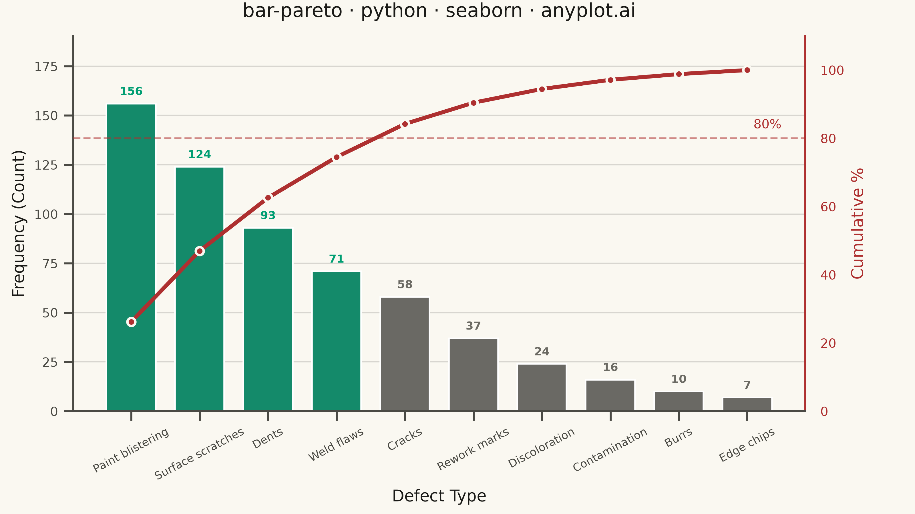
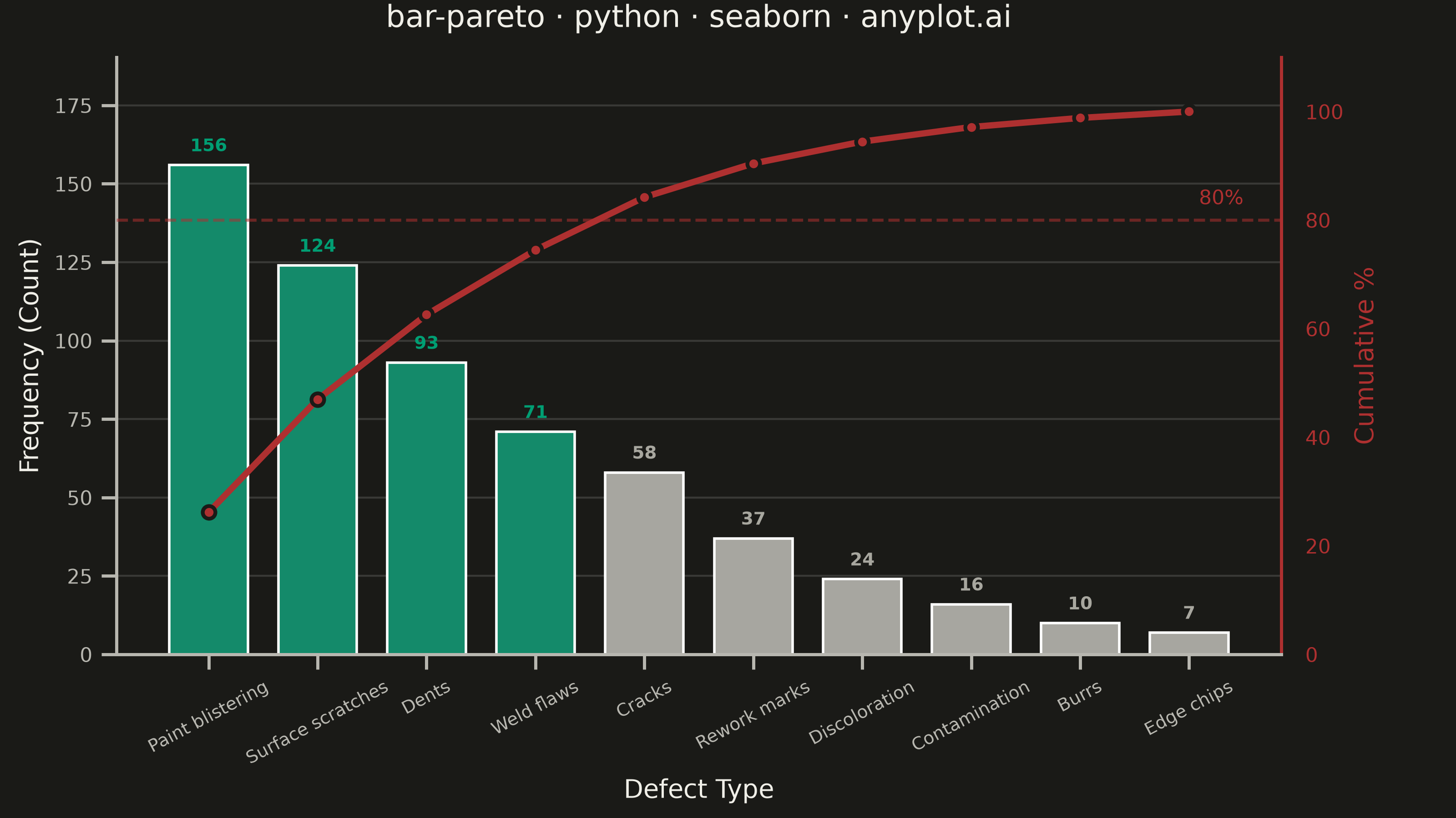
A Pareto chart combining descending-sorted bars (by frequency or count) with a cumulative percentage line overlay on a secondary y-axis. This visualization helps identify the most significant factors in a dataset by applying the Pareto principle (80/20 rule), making it one of the "7 Basic Tools of Quality" in Six Sigma and quality management. It reveals which categories contribute the most to an overall effect, enabling data-driven prioritization.
""" anyplot.ai
bar-pareto: Pareto Chart with Cumulative Line
Library: seaborn 0.13.2 | Python 3.13.14
Quality: 89/100 | Updated: 2026-06-20
"""

import os

import matplotlib.pyplot as plt
import numpy as np
import pandas as pd
import seaborn as sns


# Theme tokens (Imprint palette — theme-adaptive chrome)
THEME = os.getenv("ANYPLOT_THEME", "light")
PAGE_BG = "#FAF8F1" if THEME == "light" else "#1A1A17"
ELEVATED_BG = "#FFFDF6" if THEME == "light" else "#242420"
INK = "#1A1A17" if THEME == "light" else "#F0EFE8"
INK_SOFT = "#4A4A44" if THEME == "light" else "#B8B7B0"
INK_MUTED = "#6B6A63" if THEME == "light" else "#A8A79F"
BRAND = "#009E73"  # Imprint palette position 1 — dominant bars (≤80%)
LINE_COLOR = "#AE3030"  # Imprint semantic red — cumulative threshold line

# Apply seaborn theme with explicit RC overrides, then context for font hierarchy
sns.set_theme(
    style="ticks",
    rc={
        "figure.facecolor": PAGE_BG,
        "axes.facecolor": PAGE_BG,
        "axes.edgecolor": INK_SOFT,
        "axes.labelcolor": INK,
        "text.color": INK,
        "xtick.color": INK_SOFT,
        "ytick.color": INK_SOFT,
        "grid.color": INK,
        "grid.alpha": 0.15,
        "legend.facecolor": ELEVATED_BG,
        "legend.edgecolor": INK_SOFT,
    },
)
sns.set_context("notebook", font_scale=0.8)

# Data — 10 surface-quality defect categories (paint/surface/rework domain), descending frequency
data = pd.DataFrame(
    {
        "defect": [
            "Paint blistering",
            "Surface scratches",
            "Dents",
            "Weld flaws",
            "Cracks",
            "Rework marks",
            "Discoloration",
            "Contamination",
            "Burrs",
            "Edge chips",
        ],
        "count": [156, 124, 93, 71, 58, 37, 24, 16, 10, 7],
    }
)

# Cumulative percentage
cumulative_pct = np.cumsum(data["count"]) / data["count"].sum() * 100

# Bar colors via seaborn palette API: dominant (≤80%) → brand green; tail → muted
bar_color_list = [BRAND if cum <= 80 else INK_MUTED for cum in cumulative_pct]
bar_palette = sns.color_palette(bar_color_list)

# Canvas — 3200 × 1800 px landscape (hard contract: figsize=(8,4.5) × dpi=400)
fig, ax1 = plt.subplots(figsize=(8, 4.5), dpi=400, facecolor=PAGE_BG)
ax1.set_facecolor(PAGE_BG)

# Bars
sns.barplot(data=data, x="defect", y="count", hue="defect", palette=bar_palette, legend=False, width=0.72, ax=ax1)

# Count annotations above each bar (fontsize=8 for safer mobile readability)
for i, (_, row) in enumerate(data.iterrows()):
    ax1.text(
        i,
        row["count"] + 3,
        str(int(row["count"])),
        ha="center",
        va="bottom",
        fontsize=8,
        fontweight="bold",
        color=BRAND if cumulative_pct.iloc[i] <= 80 else INK_MUTED,
    )

# Primary axis styling
ax1.set_xlabel("Defect Type", fontsize=10, color=INK)
ax1.set_ylabel("Frequency (Count)", fontsize=10, color=INK)
ax1.tick_params(axis="x", labelsize=7, colors=INK_SOFT, rotation=28)
ax1.tick_params(axis="y", labelsize=8, colors=INK_SOFT)
ax1.yaxis.grid(True, alpha=0.15, linewidth=0.8)
ax1.set_axisbelow(True)
ax1.set_ylim(0, data["count"].max() * 1.22)
sns.despine(ax=ax1, top=True, right=True)

# Secondary y-axis — cumulative percentage
ax2 = ax1.twinx()
ax2.patch.set_alpha(0)  # transparent so ax1 background shows through

# Cumulative line — seaborn lineplot with DataFrame, explicit sort/estimator control
line_df = pd.DataFrame({"x": range(len(data)), "cumulative_pct": cumulative_pct})
sns.lineplot(
    data=line_df,
    x="x",
    y="cumulative_pct",
    color=LINE_COLOR,
    marker="o",
    markersize=5,
    linewidth=2.5,
    sort=False,
    estimator=None,
    ax=ax2,
)
for line in ax2.get_lines():
    line.set_markeredgecolor(PAGE_BG)
    line.set_markeredgewidth(1.5)

ax2.set_ylabel("Cumulative %", fontsize=10, color=LINE_COLOR)
ax2.set_ylim(0, 110)
ax2.tick_params(axis="y", labelsize=8, colors=LINE_COLOR)
ax2.yaxis.grid(False)
sns.despine(ax=ax2, top=True, left=True, right=False)
ax2.spines["right"].set_color(LINE_COLOR)

# 80% reference line
ax2.axhline(y=80, color=LINE_COLOR, linestyle="--", linewidth=1.2, alpha=0.55)
ax2.text(len(data) - 0.5, 82, "80%", fontsize=8, color=LINE_COLOR, ha="right", va="bottom")

# Narrative annotation: 4 categories drive 75% of defects — Pareto insight at crossover
ax2.text(
    3.5,
    88,
    "top 4 → 75% of defects",
    fontsize=7.5,
    color=LINE_COLOR,
    ha="center",
    va="bottom",
    alpha=0.85,
    style="italic",
)

# Title
title = "bar-pareto · python · seaborn · anyplot.ai"
ax1.set_title(title, fontsize=12, fontweight="medium", color=INK, pad=12)

fig.subplots_adjust(left=0.08, right=0.88, top=0.93, bottom=0.22)

# Save — no bbox_inches so figsize × dpi lands on exact 3200 × 1800
plt.savefig(f"plot-{THEME}.png", dpi=400, facecolor=PAGE_BG)
plt.close()
Runnable source as JSON, for any HTTP client: https://api.anyplot.ai/specs/bar-pareto/seaborn/code. Any spec id and library id listed in llms-full.txt fit the same URL shape; every URL below is complete and callable.
{
  "spec_id": "bar-pareto",
  "language": "python",
  "library": "seaborn",
  "page": "https://anyplot.ai/bar-pareto/python/seaborn",
  "hub": "https://anyplot.ai/bar-pareto",
  "code_json": "https://api.anyplot.ai/specs/bar-pareto/seaborn/code",
  "spec_json": "https://api.anyplot.ai/specs/bar-pareto",
  "render_light_png": "https://storage.googleapis.com/anyplot-images/plots/bar-pareto/python/seaborn/plot-light.png",
  "render_dark_png": "https://storage.googleapis.com/anyplot-images/plots/bar-pareto/python/seaborn/plot-dark.png",
  "quality_score": 89.0,
  "license": "MIT",
  "guide": "https://anyplot.ai/llms.txt"
}
Part of Pareto Chart with Cumulative Line on anyplot.ai.