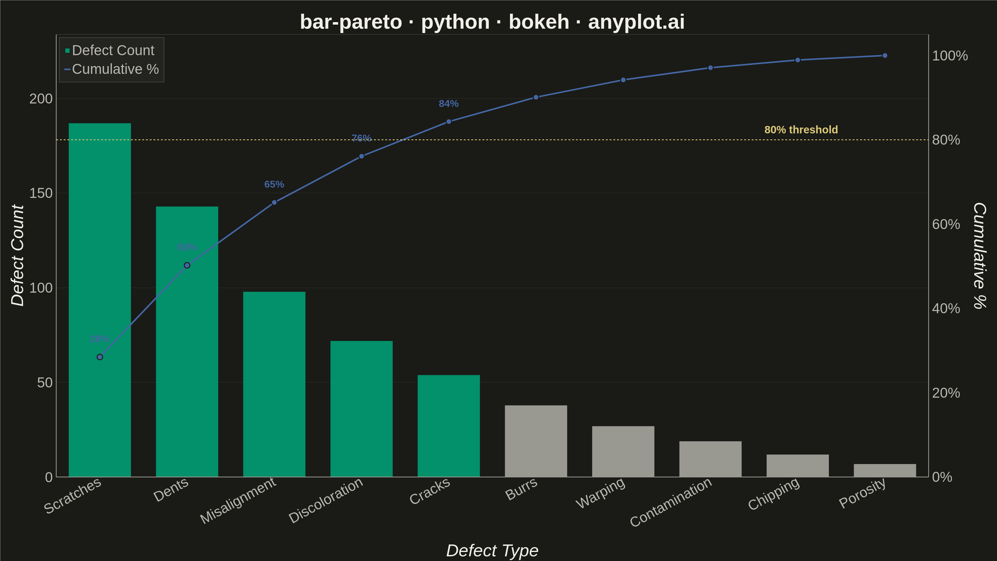
A Pareto chart combining descending-sorted bars (by frequency or count) with a cumulative percentage line overlay on a secondary y-axis. This visualization helps identify the most significant factors in a dataset by applying the Pareto principle (80/20 rule), making it one of the "7 Basic Tools of Quality" in Six Sigma and quality management. It reveals which categories contribute the most to an overall effect, enabling data-driven prioritization.
""" anyplot.ai
bar-pareto: Pareto Chart with Cumulative Line
Library: bokeh 3.9.1 | Python 3.13.14
Quality: 90/100 | Updated: 2026-06-20
"""

import os
import sys


# This file is named 'bokeh.py' — same as the package it imports.
# Remove the script's own directory from sys.path so 'from bokeh.io import ...'
# resolves to the installed bokeh package, not this file.
_sd = os.path.dirname(os.path.abspath(__file__))
sys.path = [p for p in sys.path if not p or os.path.abspath(p) != _sd]
del _sd

import time
from pathlib import Path

import numpy as np
from bokeh.io import output_file, save
from bokeh.models import ColumnDataSource, HoverTool, Label, LinearAxis, PrintfTickFormatter, Range1d, Span
from bokeh.plotting import figure
from bokeh.resources import INLINE
from selenium import webdriver
from selenium.webdriver.chrome.options import Options


# Theme tokens — Imprint palette, theme-adaptive chrome
THEME = os.getenv("ANYPLOT_THEME", "light")
PAGE_BG = "#FAF8F1" if THEME == "light" else "#1A1A17"
ELEVATED_BG = "#FFFDF6" if THEME == "light" else "#242420"
INK = "#1A1A17" if THEME == "light" else "#F0EFE8"
INK_SOFT = "#4A4A44" if THEME == "light" else "#B8B7B0"
INK_MUTED = "#6B6A63" if THEME == "light" else "#A8A79F"

VITAL_COLOR = "#009E73"  # Imprint position 1 — vital few bars
LINE_COLOR = "#4467A3"  # Imprint position 3 — cumulative line
AMBER = "#DDCC77"  # semantic anchor — warning/threshold for 80% reference line

# Data — manufacturing defect types sorted descending by frequency
categories = [
    "Scratches",
    "Dents",
    "Misalignment",
    "Discoloration",
    "Cracks",
    "Burrs",
    "Warping",
    "Contamination",
    "Chipping",
    "Porosity",
]
counts = np.array([187, 143, 98, 72, 54, 38, 27, 19, 12, 7])
cumulative_pct = np.cumsum(counts) / counts.sum() * 100

# Vital few = bars up through the first one to push cumulative past 80%
vital_mask = np.zeros(len(counts), dtype=bool)
for i, pct in enumerate(cumulative_pct):
    vital_mask[i] = True
    if pct >= 80:
        break

bar_colors = [VITAL_COLOR if v else INK_MUTED for v in vital_mask]

source = ColumnDataSource(
    data={
        "categories": categories,
        "counts": counts.tolist(),
        "cumulative_pct": cumulative_pct.tolist(),
        "colors": bar_colors,
        "pct_label": [f"{p:.0f}%" for p in cumulative_pct],
    }
)

# Figure — 3200×1800 landscape; extra right border for secondary axis
p = figure(
    x_range=categories,
    width=3200,
    height=1800,
    title="bar-pareto · python · bokeh · anyplot.ai",
    x_axis_label="Defect Type",
    y_axis_label="Defect Count",
    toolbar_location=None,
    min_border_bottom=160,
    min_border_left=180,
    min_border_top=110,
    min_border_right=220,
)

# Bars — vital few in brand green, trivial many in muted neutral
p.vbar(
    x="categories",
    top="counts",
    source=source,
    width=0.72,
    color="colors",
    alpha=0.9,
    line_color=PAGE_BG,
    line_width=2,
    legend_label="Defect Count",
)

# Secondary y-axis for cumulative percentage (0–100%)
p.extra_y_ranges = {"pct": Range1d(start=0, end=105)}
pct_axis = LinearAxis(
    y_range_name="pct",
    axis_label="Cumulative %",
    axis_label_text_font_size="42pt",
    axis_label_text_color=INK,
    major_label_text_font_size="34pt",
    major_label_text_color=INK_SOFT,
    axis_line_color=INK_SOFT,
    axis_line_width=2,
    major_tick_line_color=None,
    minor_tick_line_color=None,
)
pct_axis.formatter = PrintfTickFormatter(format="%d%%")
p.add_layout(pct_axis, "right")

# Cumulative line
p.line(
    x="categories",
    y="cumulative_pct",
    source=source,
    y_range_name="pct",
    line_width=5,
    line_color=LINE_COLOR,
    line_join="round",
    legend_label="Cumulative %",
)

# Markers on cumulative line
p.scatter(
    x="categories",
    y="cumulative_pct",
    source=source,
    y_range_name="pct",
    size=18,
    color=LINE_COLOR,
    line_color=PAGE_BG,
    line_width=3,
)

# Percentage labels — use text glyph with categorical x for correct anchoring
# (Label.x must be numeric; p.text() accepts string categories via ColumnDataSource)
vital_indices = [i for i in range(len(categories)) if vital_mask[i]]
label_source = ColumnDataSource(
    data={
        "lx": [categories[i] for i in vital_indices],
        "ly": [float(cumulative_pct[i]) + 3 for i in vital_indices],  # 3 pct-pts above marker
        "lt": [f"{cumulative_pct[i]:.0f}%" for i in vital_indices],
    }
)
p.text(
    x="lx",
    y="ly",
    text="lt",
    source=label_source,
    y_range_name="pct",
    text_font_size="24pt",
    text_color=LINE_COLOR,
    text_font_style="bold",
    text_align="center",
    text_baseline="bottom",
)

# 80% reference line
p.add_layout(
    Span(
        location=80,
        dimension="width",
        line_color=AMBER,
        line_dash="dashed",
        line_width=3,
        line_alpha=0.9,
        y_range_name="pct",
    )
)

# 80% threshold label
p.add_layout(
    Label(
        x=9,
        y=80,
        text="80% threshold",
        text_font_size="26pt",
        text_color=AMBER,
        text_font_style="bold",
        text_align="right",
        x_offset=-10,
        y_offset=14,
        y_range_name="pct",
    )
)

# HoverTool — signature Bokeh interactive feature
p.add_tools(
    HoverTool(tooltips=[("Defect", "@categories"), ("Count", "@counts"), ("Cumulative", "@pct_label")], mode="vline")
)

# Title
p.title.text_font_size = "50pt"
p.title.align = "center"
p.title.text_color = INK

# Axis labels
p.xaxis.axis_label_text_font_size = "42pt"
p.yaxis.axis_label_text_font_size = "42pt"
p.xaxis.axis_label_text_color = INK
p.yaxis.axis_label_text_color = INK

# Tick labels
p.xaxis.major_label_text_font_size = "34pt"
p.yaxis.major_label_text_font_size = "34pt"
p.xaxis.major_label_text_color = INK_SOFT
p.yaxis.major_label_text_color = INK_SOFT
p.xaxis.major_label_orientation = 0.5

# Axis lines
p.xaxis.axis_line_color = INK_SOFT
p.yaxis.axis_line_color = INK_SOFT
p.xaxis.axis_line_width = 2
p.yaxis.axis_line_width = 2

# Remove tick marks
p.xaxis.major_tick_line_color = None
p.yaxis.major_tick_line_color = None
p.xaxis.minor_tick_line_color = None
p.yaxis.minor_tick_line_color = None

# Grid — horizontal only, very subtle
p.xgrid.grid_line_color = None
p.ygrid.grid_line_color = INK
p.ygrid.grid_line_alpha = 0.12

# Y range with headroom for legend in top-left
p.y_range.start = 0
p.y_range.end = max(counts) * 1.25

# Background and frame
p.outline_line_color = None
p.background_fill_color = PAGE_BG
p.border_fill_color = PAGE_BG

# Legend
if p.legend:
    legend = p.legend[0]
    legend.location = "top_left"
    legend.label_text_font_size = "34pt"
    legend.label_text_color = INK_SOFT
    legend.background_fill_color = ELEVATED_BG
    legend.border_line_color = INK_SOFT
    legend.padding = 15
    legend.spacing = 8

# Save HTML artifact (interactive) — inline resources so Selenium can render via file://
output_file(f"plot-{THEME}.html")
save(p, resources=INLINE)

# Screenshot with Selenium headless Chrome
W, H = 3200, 1800
opts = Options()
for arg in (
    "--headless=new",
    "--no-sandbox",
    "--disable-dev-shm-usage",
    "--disable-gpu",
    f"--window-size={W},{H}",
    "--hide-scrollbars",
):
    opts.add_argument(arg)
driver = webdriver.Chrome(options=opts)
# Headless Chrome's inner viewport is smaller than the outer window by ~143px
# (browser UI chrome). Compensate so the screenshot is exactly W×H pixels.
inner_h = driver.execute_script("return window.innerHeight")
if inner_h < H:
    driver.set_window_size(W, H + (H - inner_h))
driver.get(f"file://{Path(f'plot-{THEME}.html').resolve()}")
time.sleep(3)
driver.save_screenshot(f"plot-{THEME}.png")
driver.quit()
Runnable source as JSON, for any HTTP client: https://api.anyplot.ai/specs/bar-pareto/bokeh/code. Any spec id and library id listed in llms-full.txt fit the same URL shape; every URL below is complete and callable.
{
  "spec_id": "bar-pareto",
  "language": "python",
  "library": "bokeh",
  "page": "https://anyplot.ai/bar-pareto/python/bokeh",
  "hub": "https://anyplot.ai/bar-pareto",
  "code_json": "https://api.anyplot.ai/specs/bar-pareto/bokeh/code",
  "spec_json": "https://api.anyplot.ai/specs/bar-pareto",
  "render_light_png": "https://storage.googleapis.com/anyplot-images/plots/bar-pareto/python/bokeh/plot-light.png",
  "render_dark_png": "https://storage.googleapis.com/anyplot-images/plots/bar-pareto/python/bokeh/plot-dark.png",
  "interactive_light_html": "https://storage.googleapis.com/anyplot-images/plots/bar-pareto/python/bokeh/plot-light.html",
  "interactive_dark_html": "https://storage.googleapis.com/anyplot-images/plots/bar-pareto/python/bokeh/plot-dark.html",
  "quality_score": 90.0,
  "license": "MIT",
  "guide": "https://anyplot.ai/llms.txt"
}
Part of Pareto Chart with Cumulative Line on anyplot.ai.