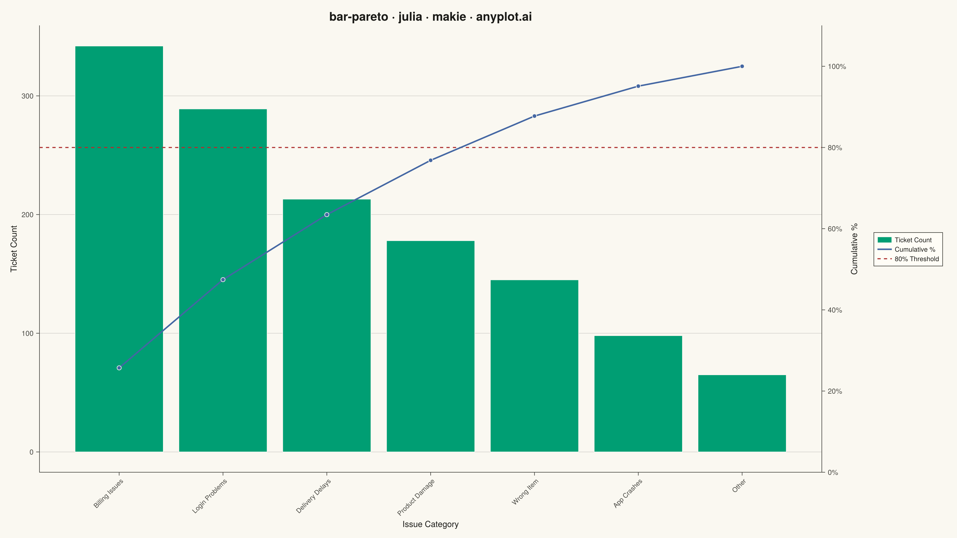
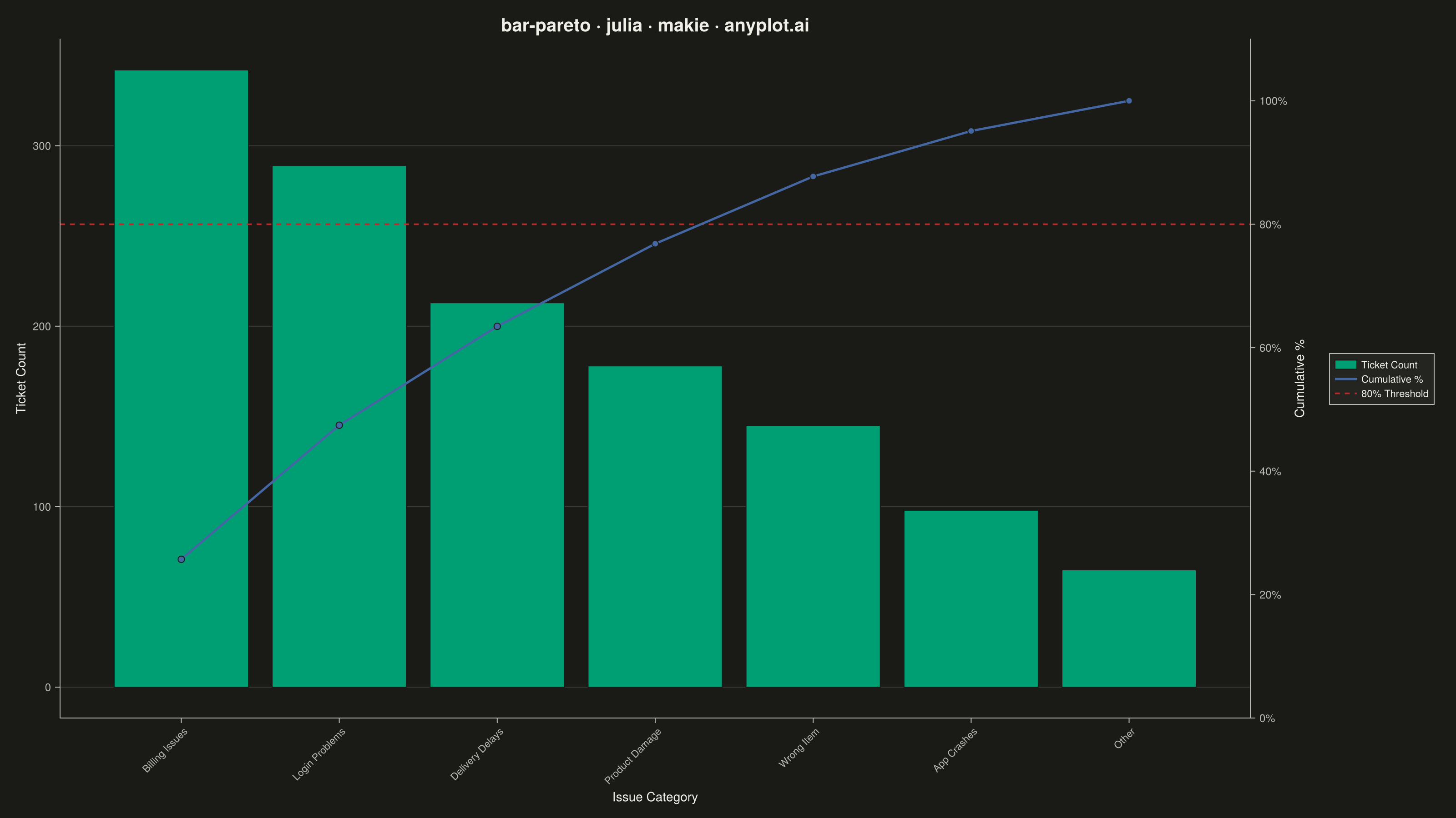
A Pareto chart combining descending-sorted bars (by frequency or count) with a cumulative percentage line overlay on a secondary y-axis. This visualization helps identify the most significant factors in a dataset by applying the Pareto principle (80/20 rule), making it one of the "7 Basic Tools of Quality" in Six Sigma and quality management. It reveals which categories contribute the most to an overall effect, enabling data-driven prioritization.
# anyplot.ai
# bar-pareto: Pareto Chart with Cumulative Line
# Library: makie 0.22.10 | Julia 1.11.9
# Quality: 88/100 | Created: 2026-06-20

using CairoMakie
using Colors
using Random

Random.seed!(42)

# Theme tokens
const THEME       = get(ENV, "ANYPLOT_THEME", "light")
const PAGE_BG     = THEME == "light" ? colorant"#FAF8F1" : colorant"#1A1A17"
const ELEVATED_BG = THEME == "light" ? colorant"#FFFDF6" : colorant"#242420"
const INK         = THEME == "light" ? colorant"#1A1A17" : colorant"#F0EFE8"
const INK_SOFT    = THEME == "light" ? colorant"#4A4A44" : colorant"#B8B7B0"

const IMPRINT_PALETTE = [
    colorant"#009E73",  # 1 — brand green (first series)
    colorant"#C475FD",  # 2 — lavender
    colorant"#4467A3",  # 3 — blue
    colorant"#BD8233",  # 4 — ochre
    colorant"#AE3030",  # 5 — matte red (semantic: threshold / error)
    colorant"#2ABCCD",  # 6 — cyan
    colorant"#954477",  # 7 — rose
    colorant"#99B314",  # 8 — lime
]

# Data — e-commerce support ticket categories, sorted descending by volume
categories = ["Billing Issues", "Login Problems", "Delivery Delays",
              "Product Damage", "Wrong Item", "App Crashes", "Other"]
counts     = [342, 289, 213, 178, 145, 98, 65]

n       = length(categories)
total   = sum(counts)
cum_pct = cumsum(counts) ./ total .* 100
xs      = collect(1:n)

# Interpolated x where cumulative line crosses 80% (for crossing annotation)
cross_idx = findfirst(cum_pct .>= 80.0)
cross_x   = xs[cross_idx - 1] +
            (80.0 - cum_pct[cross_idx - 1]) /
            (cum_pct[cross_idx] - cum_pct[cross_idx - 1])

# --- Figure ------------------------------------------------------------------
fig = Figure(
    size            = (1600, 900),
    fontsize        = 14,
    backgroundcolor = PAGE_BG,
)

# Primary axis: bars (left y = ticket counts)
ax1 = Axis(
    fig[1, 1];
    title              = "bar-pareto · julia · makie · anyplot.ai",
    titlesize          = 20,
    titlecolor         = INK,
    xlabel             = "Issue Category",
    ylabel             = "Ticket Count",
    xlabelcolor        = INK,
    ylabelcolor        = INK,
    xticklabelcolor    = INK_SOFT,
    yticklabelcolor    = INK_SOFT,
    xtickcolor         = INK_SOFT,
    ytickcolor         = INK_SOFT,
    leftspinecolor     = INK_SOFT,
    bottomspinecolor   = INK_SOFT,
    topspinevisible    = false,
    rightspinevisible  = false,
    backgroundcolor    = PAGE_BG,
    xticks             = (xs, categories),
    xticklabelrotation = π / 4,
    xticklabelalign    = (:right, :top),
    xticklabelsize     = 12,
    yticklabelsize     = 12,
    xlabelsize         = 14,
    ylabelsize         = 14,
    xgridvisible       = false,
    ygridcolor         = RGBAf(INK.r, INK.g, INK.b, 0.15f0),
    yminorgridvisible  = false,
    xminorgridvisible  = false,
)

# Secondary axis: cumulative % line (right y = 0–100%)
ax2 = Axis(
    fig[1, 1];
    yaxisposition      = :right,
    ylabel             = "Cumulative %",
    ylabelcolor        = INK,
    yticklabelcolor    = INK_SOFT,
    ytickcolor         = INK_SOFT,
    rightspinecolor    = INK_SOFT,
    topspinevisible    = false,
    leftspinevisible   = false,
    bottomspinevisible = false,
    backgroundcolor    = :transparent,
    yticks             = (collect(0:20:100), ["0%", "20%", "40%", "60%", "80%", "100%"]),
    yticklabelsize     = 12,
    ylabelsize         = 14,
    xgridvisible       = false,
    ygridvisible       = false,
)
hidexdecorations!(ax2)
linkxaxes!(ax1, ax2)
ylims!(ax2, 0, 110)

# --- Bars (descending order, Imprint brand green) ----------------------------
barplot!(ax1, xs, counts;
    color       = IMPRINT_PALETTE[1],
    strokecolor = PAGE_BG,
    strokewidth = 1,
    gap         = 0.15,
)

# --- 80% threshold line (matte red dashed — semantic anchor for threshold) ---
hlines!(ax2, [80.0];
    color     = IMPRINT_PALETTE[5],
    linestyle = :dash,
    linewidth = 1.8,
)

# --- Cumulative % line with markers at bar centers ---------------------------
lines!(ax2, xs, cum_pct;
    color     = IMPRINT_PALETTE[3],
    linewidth = 2.5,
)
scatter!(ax2, xs, cum_pct;
    color        = IMPRINT_PALETTE[3],
    markersize   = 10,
    strokewidth  = 1.0,
    strokecolor  = PAGE_BG,
)

# --- 80% crossing annotation: diamond + label reveal the "vital few" --------
scatter!(ax2, [cross_x], [80.0];
    color       = IMPRINT_PALETTE[5],
    marker      = :diamond,
    markersize  = 14,
    strokewidth = 1.5,
    strokecolor = PAGE_BG,
)
text!(ax2, [cross_x + 0.2], [89.0];
    text     = ["Top $(cross_idx) of $(n) categories"],
    color    = INK,
    fontsize = 11,
    align    = [(:left, :bottom)],
)

# --- Legend ------------------------------------------------------------------
Legend(
    fig[1, 2],
    [
        PolyElement(color = IMPRINT_PALETTE[1], strokecolor = PAGE_BG, strokewidth = 1),
        LineElement(color = IMPRINT_PALETTE[3], linewidth = 2.5),
        LineElement(color = IMPRINT_PALETTE[5], linestyle = :dash, linewidth = 1.8),
    ],
    ["Ticket Count", "Cumulative %", "80% Threshold"],
    framecolor       = INK_SOFT,
    backgroundcolor  = ELEVATED_BG,
    labelcolor  = INK,
    labelsize   = 11,
    patchsize   = (24, 10),
    margin      = (8, 8, 8, 8),
)

# --- Save --------------------------------------------------------------------
save("plot-$(THEME).png", fig; px_per_unit = 2)
Runnable source as JSON, for any HTTP client: https://api.anyplot.ai/specs/bar-pareto/makie/code. Any spec id and library id listed in llms-full.txt fit the same URL shape; every URL below is complete and callable.
{
  "spec_id": "bar-pareto",
  "language": "julia",
  "library": "makie",
  "page": "https://anyplot.ai/bar-pareto/julia/makie",
  "hub": "https://anyplot.ai/bar-pareto",
  "code_json": "https://api.anyplot.ai/specs/bar-pareto/makie/code",
  "spec_json": "https://api.anyplot.ai/specs/bar-pareto",
  "render_light_png": "https://storage.googleapis.com/anyplot-images/plots/bar-pareto/julia/makie/plot-light.png",
  "render_dark_png": "https://storage.googleapis.com/anyplot-images/plots/bar-pareto/julia/makie/plot-dark.png",
  "quality_score": 88.0,
  "license": "MIT",
  "guide": "https://anyplot.ai/llms.txt"
}
Part of Pareto Chart with Cumulative Line on anyplot.ai.