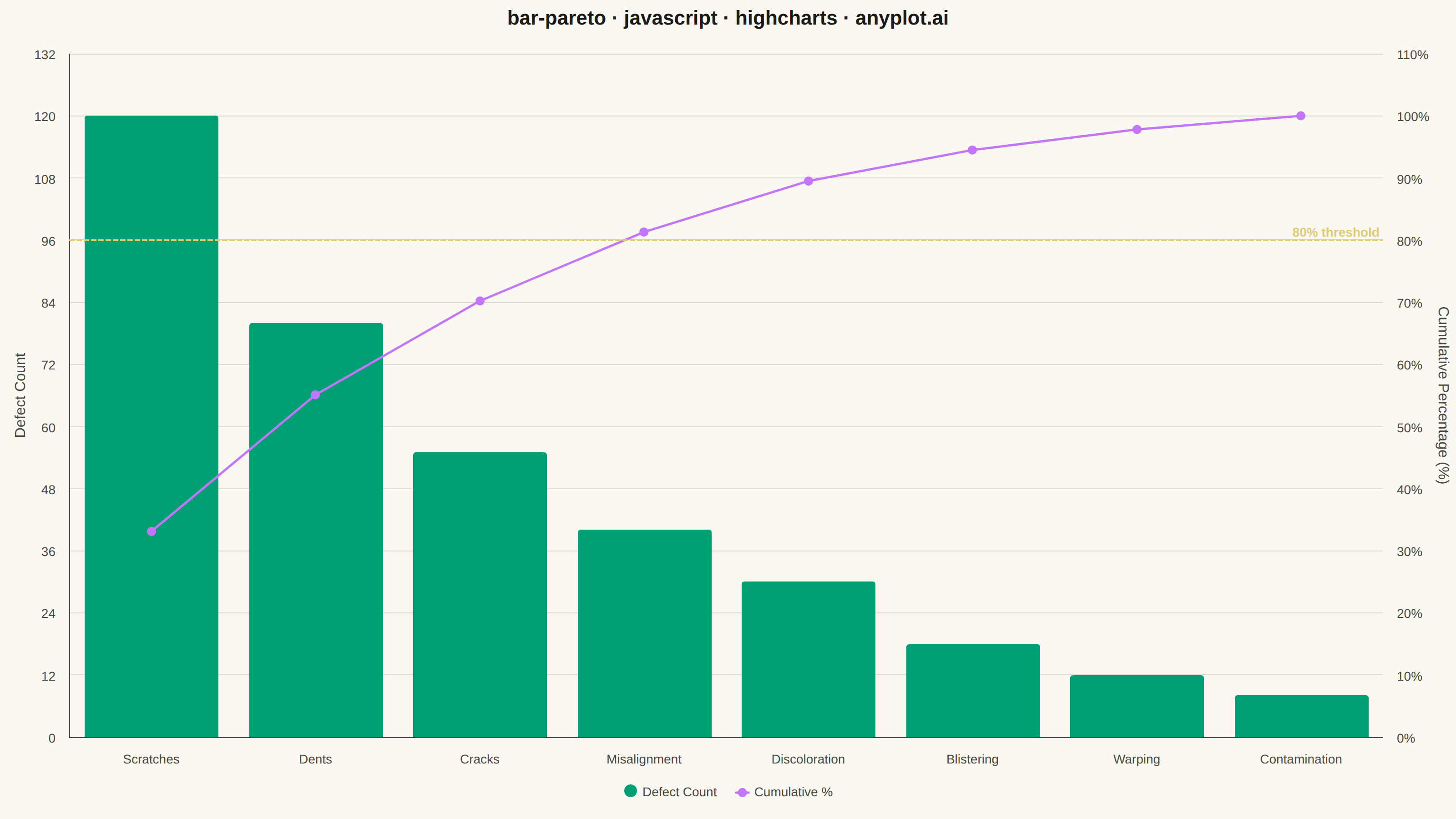
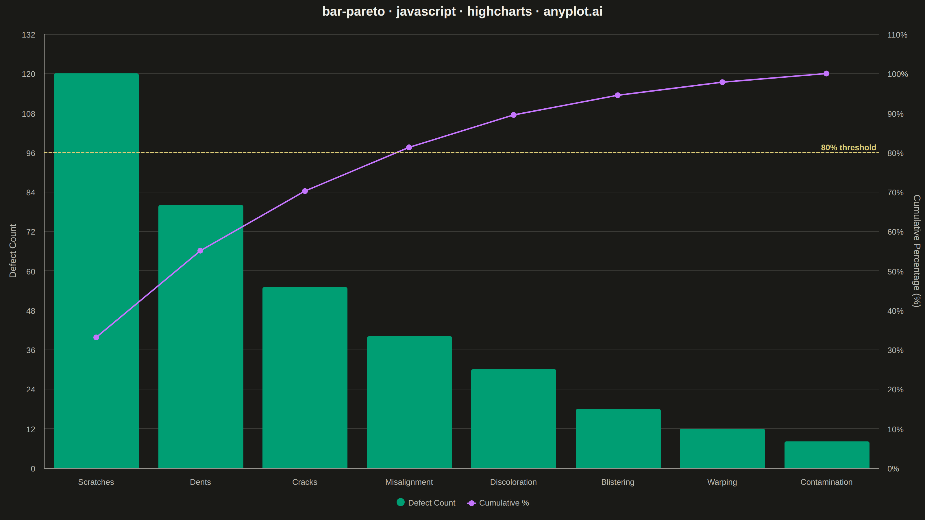
A Pareto chart combining descending-sorted bars (by frequency or count) with a cumulative percentage line overlay on a secondary y-axis. This visualization helps identify the most significant factors in a dataset by applying the Pareto principle (80/20 rule), making it one of the "7 Basic Tools of Quality" in Six Sigma and quality management. It reveals which categories contribute the most to an overall effect, enabling data-driven prioritization.
// anyplot.ai
// bar-pareto: Pareto Chart with Cumulative Line
// Library: highcharts 12.6.0 | JavaScript 22.22.3
// Quality: 90/100 | Created: 2026-06-20

//# anyplot-orientation: landscape
const t = window.ANYPLOT_TOKENS;

// --- Data (manufacturing defects, sorted descending by count) ---------------
const defects = [
  { name: "Scratches",     count: 120 },
  { name: "Dents",         count: 80  },
  { name: "Cracks",        count: 55  },
  { name: "Misalignment",  count: 40  },
  { name: "Discoloration", count: 30  },
  { name: "Blistering",    count: 18  },
  { name: "Warping",       count: 12  },
  { name: "Contamination", count: 8   },
];

const categories = defects.map(d => d.name);
const counts     = defects.map(d => d.count);
const total      = counts.reduce((a, b) => a + b, 0);

// Cumulative percentages (one decimal place)
let cumSum = 0;
const cumulativePct = counts.map(c => {
  cumSum += c;
  return Math.round((cumSum / total) * 1000) / 10;
});

// --- Chart ------------------------------------------------------------------
Highcharts.chart("container", {
  chart: {
    backgroundColor: "transparent",
    animation: false,
    style: { fontFamily: "inherit" },
    marginRight: 80,
    plotBorderWidth: 0,
  },
  credits: { enabled: false },
  colors: t.palette,
  title: {
    text: "bar-pareto · javascript · highcharts · anyplot.ai",
    style: { color: t.ink, fontSize: "22px", fontWeight: "600" },
    margin: 24,
  },
  xAxis: {
    categories,
    lineColor: t.inkSoft,
    lineWidth: 1,
    tickColor: t.inkSoft,
    labels: { style: { color: t.inkSoft, fontSize: "14px" } },
  },
  yAxis: [
    {
      // Primary axis — raw defect counts (left)
      title: {
        text: "Defect Count",
        style: { color: t.inkSoft, fontSize: "16px" },
      },
      min: 0,
      gridLineColor: t.grid,
      lineColor: t.inkSoft,
      lineWidth: 1,
      tickColor: t.inkSoft,
      labels: { style: { color: t.inkSoft, fontSize: "14px" } },
    },
    {
      // Secondary axis — cumulative percentage (right)
      title: {
        text: "Cumulative Percentage (%)",
        style: { color: t.inkSoft, fontSize: "16px" },
      },
      min: 0,
      max: 100,
      opposite: true,
      gridLineColor: "transparent",
      lineWidth: 0,
      tickColor: t.inkSoft,
      labels: {
        format: "{value}%",
        style: { color: t.inkSoft, fontSize: "14px" },
      },
      plotLines: [
        {
          value: 80,
          color: "#DDCC77",
          dashStyle: "ShortDash",
          width: 2,
          zIndex: 5,
          label: {
            text: "80% threshold",
            align: "right",
            x: -4,
            style: { color: "#DDCC77", fontSize: "14px", fontWeight: "600" },
          },
        },
      ],
    },
  ],
  legend: {
    enabled: true,
    itemStyle: { color: t.inkSoft, fontSize: "14px" },
    itemHoverStyle: { color: t.ink },
  },
  plotOptions: {
    series: { animation: false },
    column: {
      borderWidth: 0,
      groupPadding: 0.05,
      pointPadding: 0.05,
    },
    line: {
      lineWidth: 2.5,
      marker: { enabled: true, radius: 5, symbol: "circle" },
    },
  },
  series: [
    {
      type: "column",
      name: "Defect Count",
      data: counts,
      color: t.palette[0],
      yAxis: 0,
    },
    {
      type: "line",
      name: "Cumulative %",
      data: cumulativePct,
      color: t.palette[1],
      yAxis: 1,
      marker: { enabled: true, radius: 5, symbol: "circle" },
    },
  ],
});
Runnable source as JSON, for any HTTP client: https://api.anyplot.ai/specs/bar-pareto/highcharts/code. Any spec id and library id listed in llms-full.txt fit the same URL shape; every URL below is complete and callable.
{
  "spec_id": "bar-pareto",
  "language": "javascript",
  "library": "highcharts",
  "page": "https://anyplot.ai/bar-pareto/javascript/highcharts",
  "hub": "https://anyplot.ai/bar-pareto",
  "code_json": "https://api.anyplot.ai/specs/bar-pareto/highcharts/code",
  "spec_json": "https://api.anyplot.ai/specs/bar-pareto",
  "render_light_png": "https://storage.googleapis.com/anyplot-images/plots/bar-pareto/javascript/highcharts/plot-light.png",
  "render_dark_png": "https://storage.googleapis.com/anyplot-images/plots/bar-pareto/javascript/highcharts/plot-dark.png",
  "interactive_light_html": "https://storage.googleapis.com/anyplot-images/plots/bar-pareto/javascript/highcharts/plot-light.html",
  "interactive_dark_html": "https://storage.googleapis.com/anyplot-images/plots/bar-pareto/javascript/highcharts/plot-dark.html",
  "quality_score": 90.0,
  "license": "MIT",
  "guide": "https://anyplot.ai/llms.txt"
}
Part of Pareto Chart with Cumulative Line on anyplot.ai.