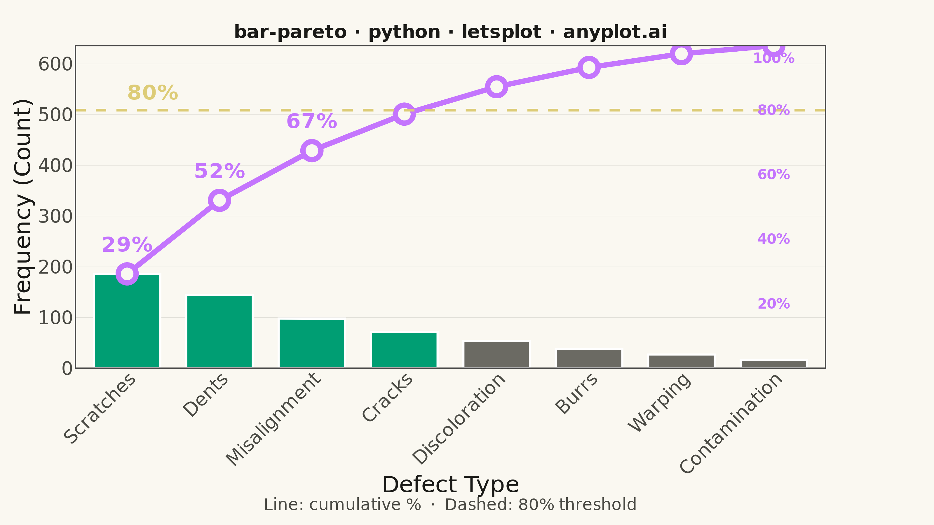
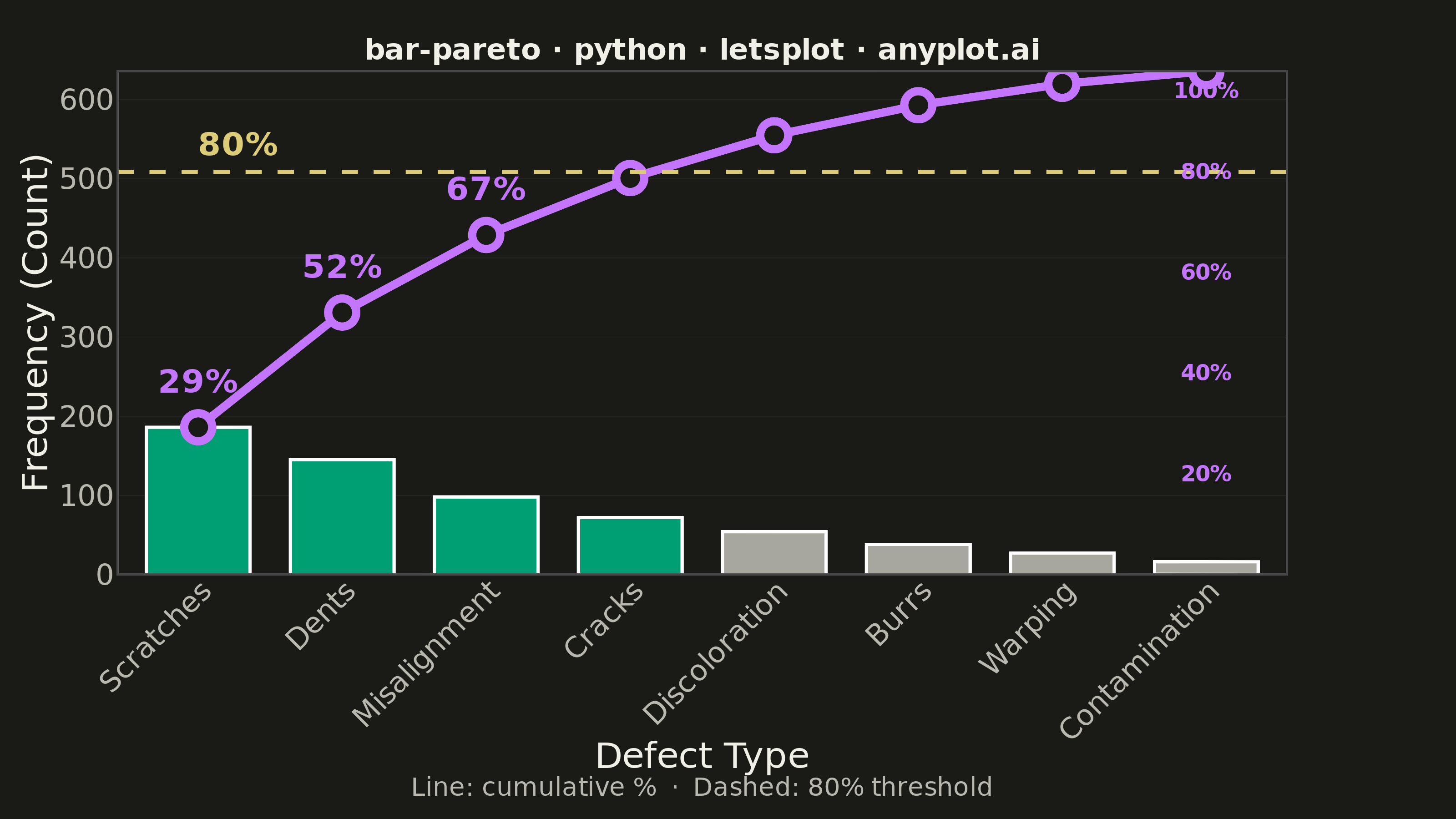
A Pareto chart combining descending-sorted bars (by frequency or count) with a cumulative percentage line overlay on a secondary y-axis. This visualization helps identify the most significant factors in a dataset by applying the Pareto principle (80/20 rule), making it one of the "7 Basic Tools of Quality" in Six Sigma and quality management. It reveals which categories contribute the most to an overall effect, enabling data-driven prioritization.
""" anyplot.ai
bar-pareto: Pareto Chart with Cumulative Line
Library: letsplot 4.10.1 | Python 3.13.14
Quality: 91/100 | Updated: 2026-06-20
"""

import os

import numpy as np
import pandas as pd
from lets_plot import *
from lets_plot import ggsave


LetsPlot.setup_html()

THEME = os.getenv("ANYPLOT_THEME", "light")
PAGE_BG = "#FAF8F1" if THEME == "light" else "#1A1A17"
ELEVATED_BG = "#FFFDF6" if THEME == "light" else "#242420"
INK = "#1A1A17" if THEME == "light" else "#F0EFE8"
INK_SOFT = "#4A4A44" if THEME == "light" else "#B8B7B0"
INK_MUTED = "#6B6A63" if THEME == "light" else "#A8A79F"
GRID_COLOR = "#E0DFD8" if THEME == "light" else "#2A2A27"

# Imprint palette — canonical order
IMPRINT_PALETTE = ["#009E73", "#C475FD", "#4467A3", "#BD8233", "#AE3030", "#2ABCCD", "#954477", "#99B314"]
BRAND = IMPRINT_PALETTE[0]  # brand green — bars contributing to 80%
CUMLINE_COLOR = IMPRINT_PALETTE[1]  # lavender — cumulative percentage line
THRESHOLD_COLOR = "#DDCC77"  # amber — warning/caution semantic anchor

# Data — manufacturing defect types sorted by frequency (descending)
categories = ["Scratches", "Dents", "Misalignment", "Cracks", "Discoloration", "Burrs", "Warping", "Contamination"]
counts = [186, 145, 98, 72, 54, 38, 27, 16]

df = pd.DataFrame({"category": categories, "count": counts})

# Cumulative percentage
total = sum(counts)
cumulative_pct = np.cumsum(counts) / total * 100

# Scale cumulative percentages to share the primary y-axis
max_count = max(counts)
y_max = total
scale_factor = y_max / 100

cumulative_scaled = cumulative_pct * scale_factor
threshold_80_scaled = 80 * scale_factor

# Semantic bar colors: brand green for ≤80% threshold, muted for the tail
bar_colors = [BRAND if cumulative_pct[i] <= 80 else INK_MUTED for i in range(len(categories))]
df["bar_color"] = bar_colors

# Segments to draw cumulative line across discrete x-axis
seg_df = pd.DataFrame(
    {
        "x": categories[:-1],
        "xend": categories[1:],
        "y": cumulative_scaled[:-1].tolist(),
        "yend": cumulative_scaled[1:].tolist(),
    }
)

# Points for cumulative line markers
df_points = pd.DataFrame(
    {
        "category": categories,
        "cumulative_scaled": cumulative_scaled.tolist(),
        "cumulative_pct": [f"{p:.0f}%" for p in cumulative_pct],
    }
)

# Simulated secondary y-axis tick labels (right of last bar)
sec_ticks = [20, 40, 60, 80, 100]
sec_labels_df = pd.DataFrame(
    {
        "category": [categories[-1]] * len(sec_ticks),
        "y": [t * scale_factor for t in sec_ticks],
        "label": [f"{t}%" for t in sec_ticks],
    }
)

# Title with dynamic font size (16px baseline for ~67-char title)
title = "bar-pareto · python · letsplot · anyplot.ai"
n = len(title)
title_size = round(16 * 67 / n) if n > 67 else 16
title_size = max(title_size, 11)

# Plot
plot = (
    ggplot(df, aes(x="category", y="count"))
    + geom_bar(
        aes(fill="bar_color"),
        stat="identity",
        width=0.72,
        tooltips=layer_tooltips()
        .title("@category")
        .line("Count|@count")
        .format("count", "d"),
        show_legend=False,
    )
    + scale_fill_identity()
    # Cumulative percentage line (segments span discrete axis positions)
    + geom_segment(
        data=seg_df,
        mapping=aes(x="x", y="y", xend="xend", yend="yend"),
        color=CUMLINE_COLOR,
        size=2.0,
        inherit_aes=False,
    )
    # Cumulative line markers
    + geom_point(
        data=df_points,
        mapping=aes(x="category", y="cumulative_scaled"),
        color=CUMLINE_COLOR,
        fill=PAGE_BG,
        size=5,
        shape=21,
        stroke=2.0,
        inherit_aes=False,
        tooltips=layer_tooltips().line("Cumulative|@cumulative_pct"),
    )
    # 80% threshold reference line (amber warning anchor)
    + geom_hline(yintercept=threshold_80_scaled, color=THRESHOLD_COLOR, size=1.0, linetype="dashed")
    + geom_text(
        data=pd.DataFrame({"category": [categories[0]], "y": [threshold_80_scaled], "label": ["80%"]}),
        mapping=aes(x="category", y="y", label="label"),
        color=THRESHOLD_COLOR,
        size=9,
        hjust=0.0,
        vjust=-0.7,
        fontface="bold",
        inherit_aes=False,
    )
    # Simulated secondary y-axis labels (right of last category)
    + geom_text(
        data=sec_labels_df[sec_labels_df["label"] != "100%"],
        mapping=aes(x="category", y="y", label="label"),
        color=CUMLINE_COLOR,
        size=6,
        hjust=-1.6,
        fontface="bold",
        inherit_aes=False,
    )
    + geom_text(
        data=sec_labels_df[sec_labels_df["label"] == "100%"],
        mapping=aes(x="category", y="y", label="label"),
        color=CUMLINE_COLOR,
        size=6,
        hjust=-1.6,
        vjust=1.8,
        fontface="bold",
        inherit_aes=False,
    )
    # Cumulative percentage annotations on first 3 points
    + geom_text(
        data=df_points.iloc[:3],
        mapping=aes(x="category", y="cumulative_scaled", label="cumulative_pct"),
        color=CUMLINE_COLOR,
        size=9,
        vjust=-1.5,
        fontface="bold",
        inherit_aes=False,
    )
    + scale_x_discrete(limits=categories)
    + scale_y_continuous(limits=[0, y_max], expand=[0, 0, 0.05, 0])
    + labs(
        x="Defect Type", y="Frequency (Count)", title=title, caption="Line: cumulative %  ·  Dashed: 80% threshold"
    )
    + theme_minimal()
    + theme(
        axis_text_x=element_text(angle=45, hjust=1, size=16, color=INK_SOFT),
        axis_text_y=element_text(size=16, color=INK_SOFT),
        axis_title=element_text(size=20, color=INK),
        plot_title=element_text(size=title_size, hjust=0.5, face="bold", color=INK),
        plot_caption=element_text(size=14, color=INK_SOFT, hjust=0.5),
        panel_grid_major_x=element_blank(),
        panel_grid_minor=element_blank(),
        panel_grid_major_y=element_line(color=GRID_COLOR, size=0.3),
        plot_background=element_rect(fill=PAGE_BG, color=PAGE_BG),
        panel_background=element_rect(fill=PAGE_BG),
        legend_background=element_rect(fill=ELEVATED_BG, color=INK_SOFT),
        axis_line=element_line(color=INK_SOFT),
        plot_margin=[20, 90, 10, 10],
    )
    + ggsize(800, 450)
)

# Save — scale=4 yields 3200×1800 px from the 800×450 base
ggsave(plot, f"plot-{THEME}.png", path=".", scale=4)
ggsave(plot, f"plot-{THEME}.html", path=".")
Runnable source as JSON, for any HTTP client: https://api.anyplot.ai/specs/bar-pareto/letsplot/code. Any spec id and library id listed in llms-full.txt fit the same URL shape; every URL below is complete and callable.
{
  "spec_id": "bar-pareto",
  "language": "python",
  "library": "letsplot",
  "page": "https://anyplot.ai/bar-pareto/python/letsplot",
  "hub": "https://anyplot.ai/bar-pareto",
  "code_json": "https://api.anyplot.ai/specs/bar-pareto/letsplot/code",
  "spec_json": "https://api.anyplot.ai/specs/bar-pareto",
  "render_light_png": "https://storage.googleapis.com/anyplot-images/plots/bar-pareto/python/letsplot/plot-light.png",
  "render_dark_png": "https://storage.googleapis.com/anyplot-images/plots/bar-pareto/python/letsplot/plot-dark.png",
  "interactive_light_html": "https://storage.googleapis.com/anyplot-images/plots/bar-pareto/python/letsplot/plot-light.html",
  "interactive_dark_html": "https://storage.googleapis.com/anyplot-images/plots/bar-pareto/python/letsplot/plot-dark.html",
  "quality_score": 91.0,
  "license": "MIT",
  "guide": "https://anyplot.ai/llms.txt"
}
Part of Pareto Chart with Cumulative Line on anyplot.ai.