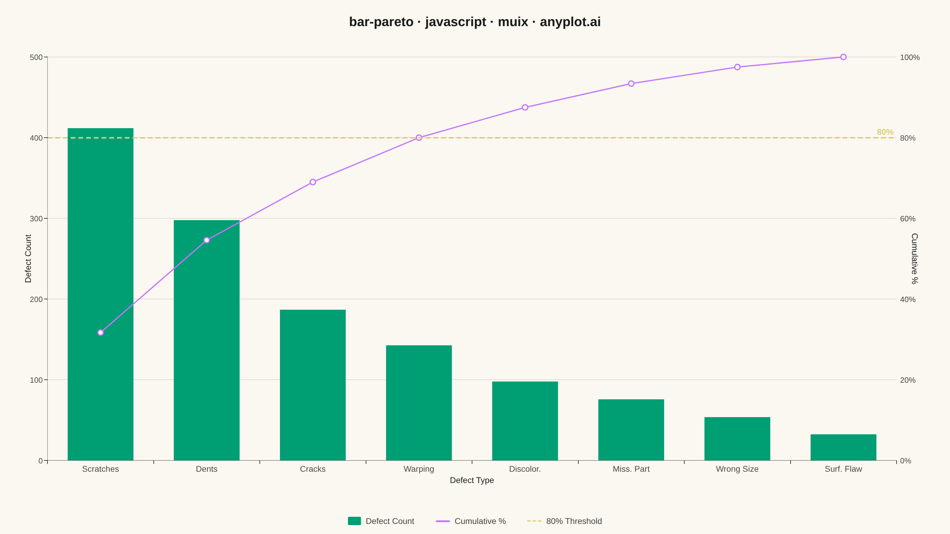
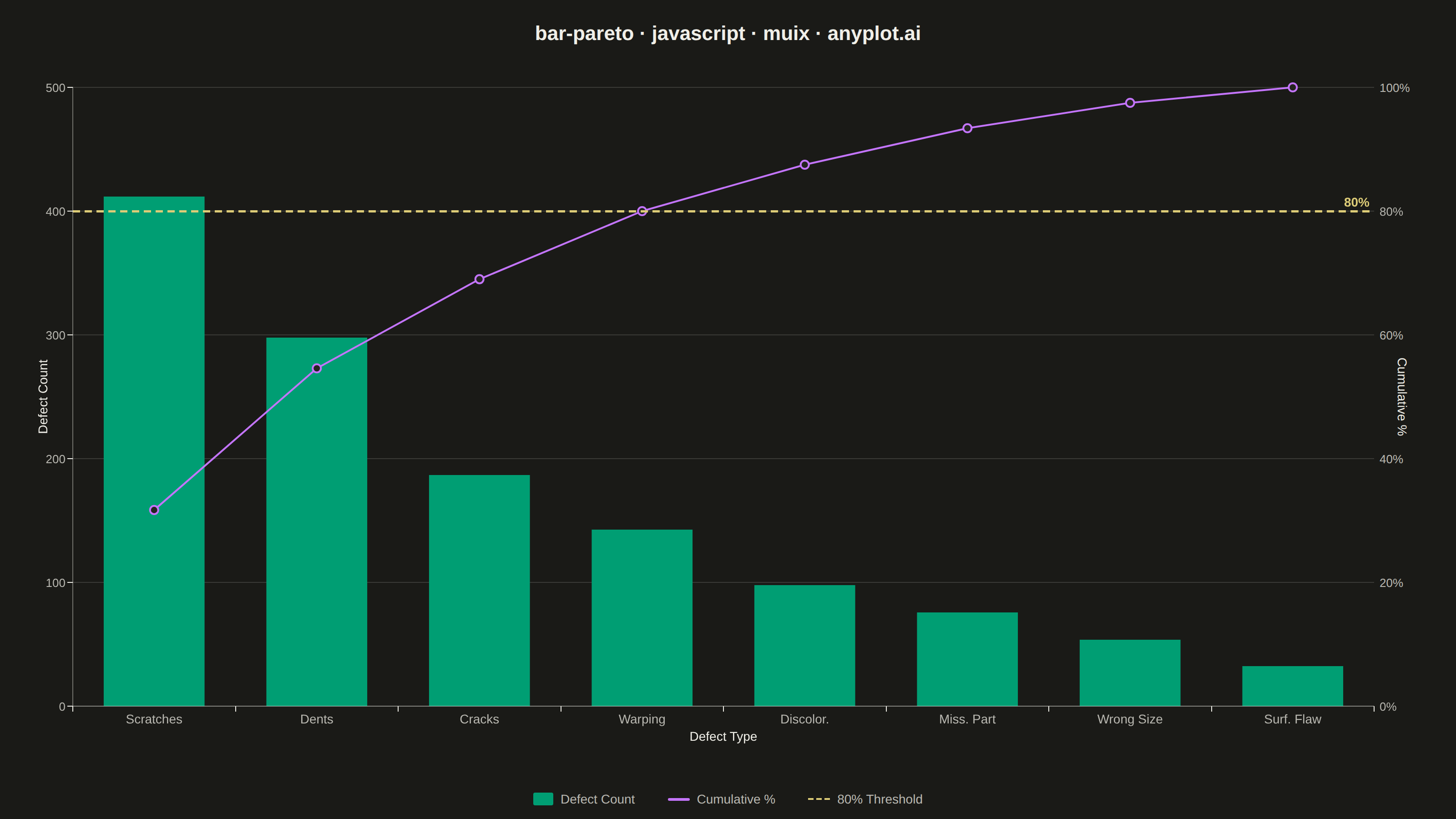
A Pareto chart combining descending-sorted bars (by frequency or count) with a cumulative percentage line overlay on a secondary y-axis. This visualization helps identify the most significant factors in a dataset by applying the Pareto principle (80/20 rule), making it one of the "7 Basic Tools of Quality" in Six Sigma and quality management. It reveals which categories contribute the most to an overall effect, enabling data-driven prioritization.
// anyplot.ai
// bar-pareto: Pareto Chart with Cumulative Line
// Library: muix 7.29.1 | JavaScript 22.22.3
// Quality: 88/100 | Created: 2026-06-20
//# anyplot-orientation: landscape
// anyplot.ai
// bar-pareto: Pareto Chart with Cumulative Line
// Library: MUI X Charts | React | Node 22
// License: @mui/x-charts — MIT (community). Pro/Premium are out of scope.
// Quality: pending | Created: 2026-06-20

import { ChartContainer } from "@mui/x-charts/ChartContainer";
import { BarPlot } from "@mui/x-charts/BarChart";
import { LinePlot, MarkPlot } from "@mui/x-charts/LineChart";
import { ChartsXAxis } from "@mui/x-charts/ChartsXAxis";
import { ChartsYAxis } from "@mui/x-charts/ChartsYAxis";
import { ChartsGrid } from "@mui/x-charts/ChartsGrid";
import { ChartsReferenceLine } from "@mui/x-charts/ChartsReferenceLine";
import Box from "@mui/material/Box";
import Typography from "@mui/material/Typography";

const t = window.ANYPLOT_TOKENS;

// Manufacturing QC: defect frequency analysis — sorted descending
const categories = [
  "Scratches", "Dents", "Cracks", "Warping",
  "Discolor.", "Miss. Part", "Wrong Size", "Surf. Flaw",
];
const counts = [412, 298, 187, 143, 98, 76, 54, 32];
const total = counts.reduce((a, b) => a + b, 0); // 1300

// Cumulative percentages (0–100 range): 31.7, 54.6, 69.0, 80.0, 87.5, 93.4, 97.5, 100.0
let running = 0;
const cumPercent = counts.map((c) => {
  running += c;
  return parseFloat(((running / total) * 100).toFixed(1));
});

const COUNT_MAX = 500; // multiple of 500 ensures left ticks (100,200,300,400,500) align with right ticks (20,40,60,80,100%) at exact 20% intervals

const MARGIN = { top: 24, right: 90, bottom: 80, left: 80 };

export default function Chart() {
  const W = window.ANYPLOT_SIZE.width;   // 1600 CSS px (landscape)
  const H = window.ANYPLOT_SIZE.height;  // 900 CSS px
  const TITLE_H = 72;
  const LEGEND_H = 44;
  const chartH = H - TITLE_H - LEGEND_H; // 784

  return (
    <Box
      sx={{
        width: W,
        height: H,
        bgcolor: t.pageBg,
        display: "flex",
        flexDirection: "column",
        fontFamily: "'Roboto', 'Helvetica Neue', Arial, sans-serif",
        boxSizing: "border-box",
      }}
    >
      {/* Title */}
      <Box sx={{ height: TITLE_H, display: "flex", alignItems: "center", justifyContent: "center" }}>
        <Typography sx={{ color: t.ink, fontSize: 22, fontWeight: 600 }}>
          bar-pareto · javascript · muix · anyplot.ai
        </Typography>
      </Box>

      {/* Chart */}
      <ChartContainer
        width={W}
        height={chartH}
        series={[
          {
            type: "bar",
            id: "defect-counts",
            yAxisId: "counts",
            data: counts,
            label: "Defect Count",
            color: t.palette[0],
          },
          {
            type: "line",
            id: "cum-line",
            yAxisId: "percent",
            data: cumPercent,
            label: "Cumulative %",
            color: t.palette[1],
            showMark: true,
            curve: "linear",
          },
        ]}
        xAxis={[
          {
            id: "x",
            scaleType: "band",
            data: categories,
            categoryGapRatio: 0.38,
            tickLabelStyle: { fontSize: 14, fill: t.inkSoft },
          },
        ]}
        yAxis={[
          {
            id: "counts",
            min: 0,
            max: COUNT_MAX,
            tickMinStep: 100,
            tickLabelStyle: { fontSize: 13, fill: t.inkSoft },
          },
          {
            // Right axis: 0–100% domain. Aligned with left axis (100/500 = 20/100).
            id: "percent",
            position: "right",
            min: 0,
            max: 100,
            tickMinStep: 20,
            valueFormatter: (v) => `${v}%`,
            tickLabelStyle: { fontSize: 13, fill: t.inkSoft },
          },
        ]}
        margin={MARGIN}
        skipAnimation
        sx={{
          "& .MuiChartsAxis-line": { stroke: t.inkSoft, strokeOpacity: 0.4 },
          "& .MuiChartsGrid-line": { stroke: t.grid },
        }}
      >
        <ChartsGrid horizontal />
        <BarPlot />
        <LinePlot />
        <MarkPlot />
        {/* 80% threshold on the percentage axis — y=80 == 80% cumulative */}
        <ChartsReferenceLine
          y={80}
          axisId="percent"
          label="80%"
          labelAlign="end"
          lineStyle={{ stroke: t.amber, strokeDasharray: "8 5", strokeWidth: 2.5 }}
          labelStyle={{ fill: t.amber, fontSize: 14, fontWeight: 700 }}
        />
        <ChartsXAxis axisId="x" position="bottom" label="Defect Type" labelStyle={{ fontSize: 14, fill: t.ink }} />
        <ChartsYAxis axisId="counts" position="left" label="Defect Count" labelStyle={{ fontSize: 14, fill: t.ink }} />
        <ChartsYAxis axisId="percent" position="right" label="Cumulative %" labelStyle={{ fontSize: 14, fill: t.ink }} disableLine disableTicks />
      </ChartContainer>

      {/* Legend */}
      <Box sx={{ height: LEGEND_H, display: "flex", alignItems: "center", justifyContent: "center", gap: "36px" }}>
        <Box sx={{ display: "flex", alignItems: "center", gap: "8px" }}>
          <Box sx={{ width: 22, height: 14, bgcolor: t.palette[0], borderRadius: "2px", flexShrink: 0 }} />
          <Typography sx={{ color: t.inkSoft, fontSize: 14 }}>Defect Count</Typography>
        </Box>
        <Box sx={{ display: "flex", alignItems: "center", gap: "8px" }}>
          <Box sx={{ width: 24, height: 3, bgcolor: t.palette[1], borderRadius: "2px", flexShrink: 0 }} />
          <Typography sx={{ color: t.inkSoft, fontSize: 14 }}>Cumulative %</Typography>
        </Box>
        <Box sx={{ display: "flex", alignItems: "center", gap: "8px" }}>
          <Box sx={{ width: 24, height: 0, borderTop: `2.5px dashed ${t.amber}`, flexShrink: 0 }} />
          <Typography sx={{ color: t.inkSoft, fontSize: 14 }}>80% Threshold</Typography>
        </Box>
      </Box>
    </Box>
  );
}
Runnable source as JSON, for any HTTP client: https://api.anyplot.ai/specs/bar-pareto/muix/code. Any spec id and library id listed in llms-full.txt fit the same URL shape; every URL below is complete and callable.
{
  "spec_id": "bar-pareto",
  "language": "javascript",
  "library": "muix",
  "page": "https://anyplot.ai/bar-pareto/javascript/muix",
  "hub": "https://anyplot.ai/bar-pareto",
  "code_json": "https://api.anyplot.ai/specs/bar-pareto/muix/code",
  "spec_json": "https://api.anyplot.ai/specs/bar-pareto",
  "render_light_png": "https://storage.googleapis.com/anyplot-images/plots/bar-pareto/javascript/muix/plot-light.png",
  "render_dark_png": "https://storage.googleapis.com/anyplot-images/plots/bar-pareto/javascript/muix/plot-dark.png",
  "interactive_light_html": "https://storage.googleapis.com/anyplot-images/plots/bar-pareto/javascript/muix/plot-light.html",
  "interactive_dark_html": "https://storage.googleapis.com/anyplot-images/plots/bar-pareto/javascript/muix/plot-dark.html",
  "quality_score": 88.0,
  "license": "MIT",
  "guide": "https://anyplot.ai/llms.txt"
}
Part of Pareto Chart with Cumulative Line on anyplot.ai.