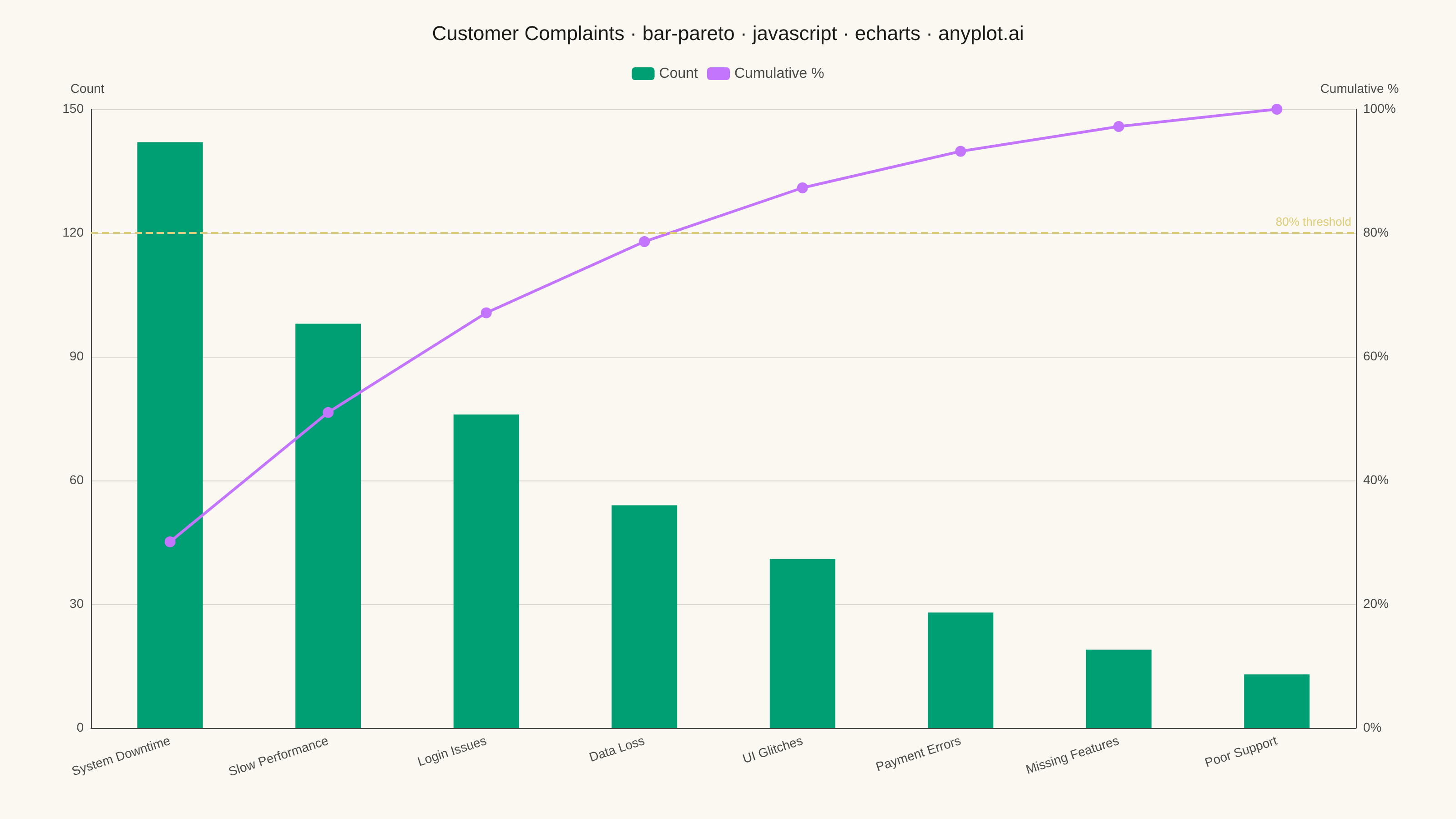
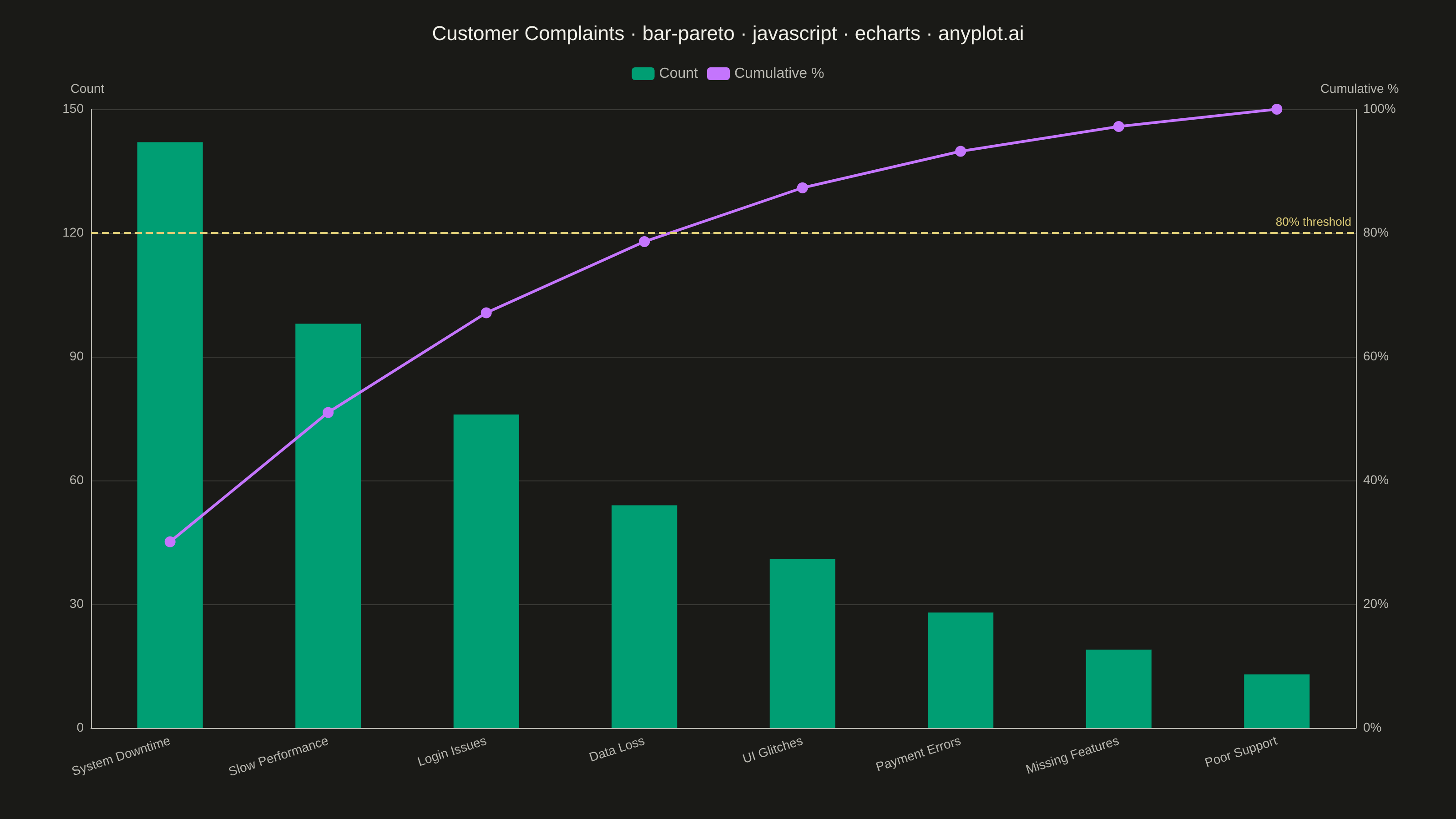
A Pareto chart combining descending-sorted bars (by frequency or count) with a cumulative percentage line overlay on a secondary y-axis. This visualization helps identify the most significant factors in a dataset by applying the Pareto principle (80/20 rule), making it one of the "7 Basic Tools of Quality" in Six Sigma and quality management. It reveals which categories contribute the most to an overall effect, enabling data-driven prioritization.
// anyplot.ai
// bar-pareto: Pareto Chart with Cumulative Line
// Library: echarts 5.5.1 | JavaScript 22.22.3
// Quality: 91/100 | Created: 2026-06-20
//# anyplot-orientation: landscape

const t = window.ANYPLOT_TOKENS;

// Customer complaint categories, pre-sorted descending by count
const rawData = [
  { category: "System Downtime", count: 142 },
  { category: "Slow Performance", count: 98 },
  { category: "Login Issues", count: 76 },
  { category: "Data Loss", count: 54 },
  { category: "UI Glitches", count: 41 },
  { category: "Payment Errors", count: 28 },
  { category: "Missing Features", count: 19 },
  { category: "Poor Support", count: 13 },
];

const total = rawData.reduce((sum, d) => sum + d.count, 0);
let running = 0;
const cumulativePct = rawData.map((d) => {
  running += d.count;
  return parseFloat(((running / total) * 100).toFixed(1));
});

const categories = rawData.map((d) => d.category);
const counts = rawData.map((d) => d.count);

// Title font size scaled by length (67-char baseline at 22px)
const title =
  "Customer Complaints · bar-pareto · javascript · echarts · anyplot.ai";
const titleFontSize =
  title.length > 67 ? Math.round((22 * 67) / title.length) : 22;

const chart = echarts.init(document.getElementById("container"));

chart.setOption({
  animation: false,
  color: t.palette,
  backgroundColor: "transparent",

  title: {
    text: title,
    left: "center",
    top: 22,
    textStyle: { color: t.ink, fontSize: titleFontSize, fontWeight: "500" },
  },

  legend: {
    data: ["Count", "Cumulative %"],
    top: 68,
    textStyle: { color: t.inkSoft, fontSize: 16 },
    icon: "roundRect",
  },

  grid: { left: 100, right: 110, top: 120, bottom: 100 },

  xAxis: {
    type: "category",
    data: categories,
    axisLabel: {
      color: t.inkSoft,
      fontSize: 14,
      rotate: 18,
      margin: 14,
    },
    axisLine: { lineStyle: { color: t.inkSoft } },
    axisTick: { show: false },
    splitLine: { show: false },
  },

  yAxis: [
    {
      type: "value",
      name: "Count",
      nameTextStyle: { color: t.inkSoft, fontSize: 14, padding: [0, 8, 0, 0] },
      axisLabel: { color: t.inkSoft, fontSize: 14 },
      axisLine: { show: true, lineStyle: { color: t.inkSoft } },
      axisTick: { show: false },
      splitLine: { lineStyle: { color: t.grid } },
    },
    {
      type: "value",
      name: "Cumulative %",
      min: 0,
      max: 100,
      nameTextStyle: { color: t.inkSoft, fontSize: 14, padding: [0, 0, 0, 8] },
      axisLabel: {
        color: t.inkSoft,
        fontSize: 14,
        formatter: "{value}%",
      },
      axisLine: { show: true, lineStyle: { color: t.inkSoft } },
      axisTick: { show: false },
      splitLine: { show: false },
    },
  ],

  series: [
    {
      name: "Count",
      type: "bar",
      data: counts,
      yAxisIndex: 0,
      itemStyle: { color: t.palette[0] },
      barMaxWidth: 72,
    },
    {
      name: "Cumulative %",
      type: "line",
      data: cumulativePct,
      yAxisIndex: 1,
      symbol: "circle",
      symbolSize: 12,
      lineStyle: { color: t.palette[1], width: 3 },
      itemStyle: { color: t.palette[1] },
      // 80% Pareto threshold reference line (amber = warning/threshold semantic anchor)
      markLine: {
        silent: true,
        symbol: ["none", "none"],
        lineStyle: { color: "#DDCC77", type: "dashed", width: 2 },
        data: [{ yAxis: 80 }],
        label: {
          show: true,
          formatter: "80% threshold",
          color: "#DDCC77",
          fontSize: 13,
          position: "insideEndTop",
        },
      },
    },
  ],
});
Runnable source as JSON, for any HTTP client: https://api.anyplot.ai/specs/bar-pareto/echarts/code. Any spec id and library id listed in llms-full.txt fit the same URL shape; every URL below is complete and callable.
{
  "spec_id": "bar-pareto",
  "language": "javascript",
  "library": "echarts",
  "page": "https://anyplot.ai/bar-pareto/javascript/echarts",
  "hub": "https://anyplot.ai/bar-pareto",
  "code_json": "https://api.anyplot.ai/specs/bar-pareto/echarts/code",
  "spec_json": "https://api.anyplot.ai/specs/bar-pareto",
  "render_light_png": "https://storage.googleapis.com/anyplot-images/plots/bar-pareto/javascript/echarts/plot-light.png",
  "render_dark_png": "https://storage.googleapis.com/anyplot-images/plots/bar-pareto/javascript/echarts/plot-dark.png",
  "interactive_light_html": "https://storage.googleapis.com/anyplot-images/plots/bar-pareto/javascript/echarts/plot-light.html",
  "interactive_dark_html": "https://storage.googleapis.com/anyplot-images/plots/bar-pareto/javascript/echarts/plot-dark.html",
  "quality_score": 91.0,
  "license": "MIT",
  "guide": "https://anyplot.ai/llms.txt"
}
Part of Pareto Chart with Cumulative Line on anyplot.ai.