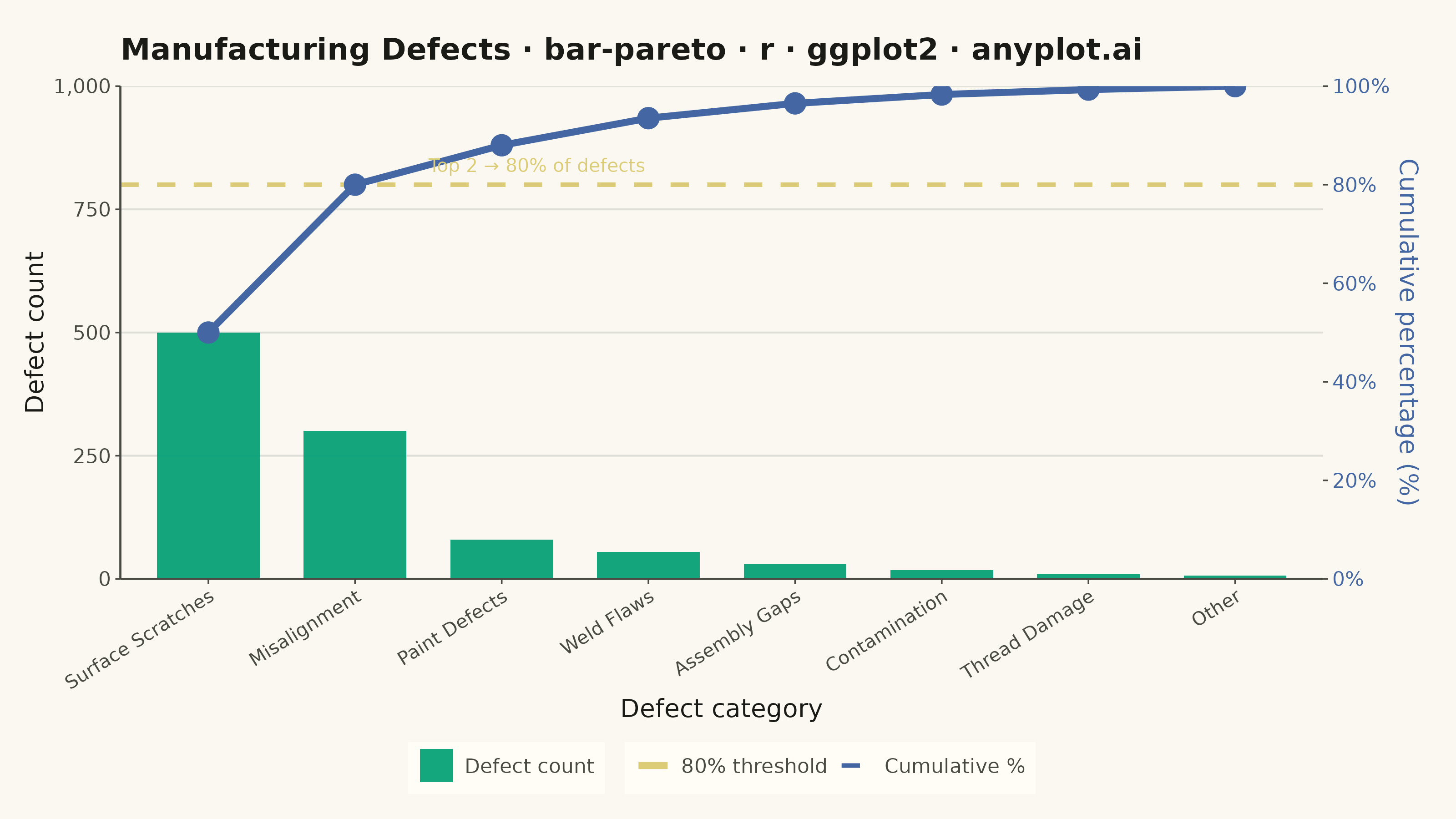
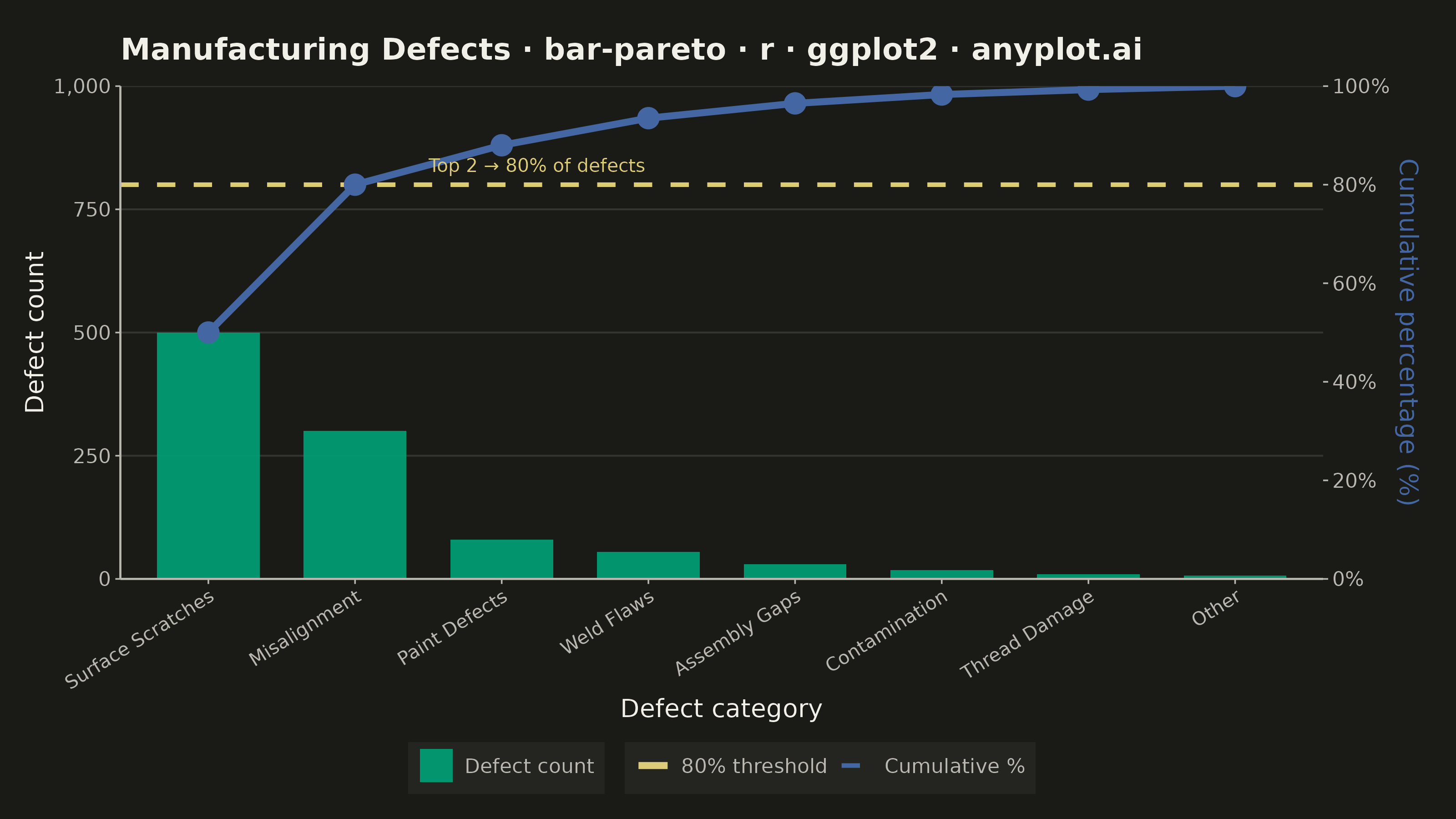
A Pareto chart combining descending-sorted bars (by frequency or count) with a cumulative percentage line overlay on a secondary y-axis. This visualization helps identify the most significant factors in a dataset by applying the Pareto principle (80/20 rule), making it one of the "7 Basic Tools of Quality" in Six Sigma and quality management. It reveals which categories contribute the most to an overall effect, enabling data-driven prioritization.
#' anyplot.ai
#' bar-pareto: Pareto Chart with Cumulative Line
#' Library: ggplot2 3.5.1 | R 4.4.1
#' Quality: 91/100 | Created: 2026-06-20

library(ggplot2)
library(dplyr)
library(scales)
library(ragg)

# --- Theme tokens ---
THEME       <- Sys.getenv("ANYPLOT_THEME", "light")
PAGE_BG     <- if (THEME == "light") "#FAF8F1" else "#1A1A17"
ELEVATED_BG <- if (THEME == "light") "#FFFDF6" else "#242420"
INK         <- if (THEME == "light") "#1A1A17" else "#F0EFE8"
INK_SOFT    <- if (THEME == "light") "#4A4A44" else "#B8B7B0"
IMPRINT_PALETTE <- c(
    "#009E73", "#C475FD", "#4467A3", "#BD8233",
    "#AE3030", "#2ABCCD", "#954477", "#99B314"
)
ANYPLOT_AMBER <- "#DDCC77"

# --- Data ---
# Manufacturing defect data: two root causes dominate (Pareto principle)
defect_data <- data.frame(
    category = c(
        "Surface Scratches", "Misalignment", "Paint Defects",
        "Weld Flaws", "Assembly Gaps", "Contamination",
        "Thread Damage", "Other"
    ),
    count = c(500, 300, 80, 55, 30, 18, 10, 7)
)

# Sort descending and compute cumulative sums
defect_data <- defect_data |>
    arrange(desc(count)) |>
    mutate(
        category  = factor(category, levels = category),
        cum_count = cumsum(count)
    )

total_count     <- sum(defect_data$count)
threshold_count <- 0.8 * total_count

# --- Plot ---
plot_title <- "Manufacturing Defects · bar-pareto · r · ggplot2 · anyplot.ai"

p <- ggplot(defect_data, aes(x = category)) +

    # Bars (primary axis: raw counts, fill-mapped for legend)
    geom_col(
        aes(y = count, fill = "Defect count"),
        width = 0.7,
        alpha = 0.92
    ) +

    # 80% Pareto threshold reference line (color-mapped for legend)
    geom_hline(
        aes(yintercept = threshold_count, color = "80% threshold"),
        linewidth = 0.85,
        linetype  = "dashed"
    ) +

    # Cumulative percentage line (color-mapped for legend)
    geom_line(
        aes(y = cum_count, group = 1, color = "Cumulative %"),
        linewidth = 1.3
    ) +

    # Markers at center-top of each bar
    geom_point(
        aes(y = cum_count, color = "Cumulative %"),
        size  = 3.5,
        shape = 19
    ) +

    # Annotation: highlight where cumulative % crosses 80%
    annotate(
        "text",
        x     = 2.5,
        y     = threshold_count + total_count * 0.04,
        label = "Top 2 → 80% of defects",
        color = ANYPLOT_AMBER,
        size  = 2.6,
        hjust = 0
    ) +

    # Dual y-axis: primary = count, secondary = cumulative %
    scale_y_continuous(
        name     = "Defect count",
        limits   = c(0, total_count),
        expand   = expansion(mult = c(0, 0)),
        labels   = scales::comma,
        sec.axis = sec_axis(
            ~ . / total_count * 100,
            name   = "Cumulative percentage (%)",
            breaks = seq(0, 100, 20),
            labels = function(x) paste0(x, "%")
        )
    ) +

    scale_x_discrete(expand = expansion(add = c(0.6, 0.6))) +

    # Legend: fill scale for bars
    scale_fill_manual(
        name   = NULL,
        values = c("Defect count" = IMPRINT_PALETTE[1])
    ) +

    # Legend: color scale for line and reference
    scale_color_manual(
        name   = NULL,
        values = c(
            "Cumulative %"  = IMPRINT_PALETTE[3],
            "80% threshold" = ANYPLOT_AMBER
        ),
        guide = guide_legend(
            override.aes = list(
                linetype  = c("solid", "dashed"),
                shape     = c(16, NA),
                linewidth = c(1.3, 0.85)
            )
        )
    ) +

    labs(
        x     = "Defect category",
        title = plot_title
    ) +

    theme_minimal(base_size = 8) +
    theme(
        plot.background    = element_rect(fill = PAGE_BG, color = PAGE_BG),
        panel.background   = element_rect(fill = PAGE_BG, color = NA),
        # L-frame: bottom and left axis lines only (remove full box border)
        panel.border       = element_blank(),
        axis.line.x.bottom = element_line(color = INK_SOFT, linewidth = 0.4),
        axis.line.y.left   = element_line(color = INK_SOFT, linewidth = 0.4),
        panel.grid.major.y = element_line(
            color     = adjustcolor(INK, alpha.f = 0.12),
            linewidth = 0.35
        ),
        panel.grid.major.x = element_blank(),
        panel.grid.minor   = element_blank(),
        axis.title.x       = element_text(color = INK,                size = 10),
        axis.title.y.left  = element_text(color = INK,                size = 10),
        axis.title.y.right = element_text(color = IMPRINT_PALETTE[3], size = 10),
        axis.text.x        = element_text(color = INK_SOFT, size = 7.5, angle = 32, hjust = 1),
        axis.text.y.left   = element_text(color = INK_SOFT,           size = 8),
        # Use INK_SOFT for right-axis ticks in dark mode (better contrast vs. #1A1A17)
        axis.text.y.right  = element_text(
            color = if (THEME == "dark") INK_SOFT else IMPRINT_PALETTE[3],
            size  = 8
        ),
        axis.ticks         = element_line(color = INK_SOFT, linewidth = 0.3),
        plot.title         = element_text(color = INK, size = 12, face = "bold",
                                          margin = margin(b = 8)),
        plot.margin        = margin(t = 15, r = 15, b = 10, l = 10, unit = "pt"),
        legend.position    = "bottom",
        legend.background  = element_rect(fill = ELEVATED_BG, color = NA),
        legend.text        = element_text(color = INK_SOFT, size = 8),
        legend.key         = element_rect(fill = NA, color = NA),
        legend.key.size    = unit(1, "lines"),
        legend.box         = "horizontal",
        legend.margin      = margin(t = 2, b = 4, l = 4, r = 4)
    )

# --- Save ---
ggsave(
    filename = sprintf("plot-%s.png", THEME),
    plot     = p,
    device   = ragg::agg_png,
    width    = 8,
    height   = 4.5,
    units    = "in",
    dpi      = 400
)
Runnable source as JSON, for any HTTP client: https://api.anyplot.ai/specs/bar-pareto/ggplot2/code. Any spec id and library id listed in llms-full.txt fit the same URL shape; every URL below is complete and callable.
{
  "spec_id": "bar-pareto",
  "language": "r",
  "library": "ggplot2",
  "page": "https://anyplot.ai/bar-pareto/r/ggplot2",
  "hub": "https://anyplot.ai/bar-pareto",
  "code_json": "https://api.anyplot.ai/specs/bar-pareto/ggplot2/code",
  "spec_json": "https://api.anyplot.ai/specs/bar-pareto",
  "render_light_png": "https://storage.googleapis.com/anyplot-images/plots/bar-pareto/r/ggplot2/plot-light.png",
  "render_dark_png": "https://storage.googleapis.com/anyplot-images/plots/bar-pareto/r/ggplot2/plot-dark.png",
  "quality_score": 91.0,
  "license": "MIT",
  "guide": "https://anyplot.ai/llms.txt"
}
Part of Pareto Chart with Cumulative Line on anyplot.ai.