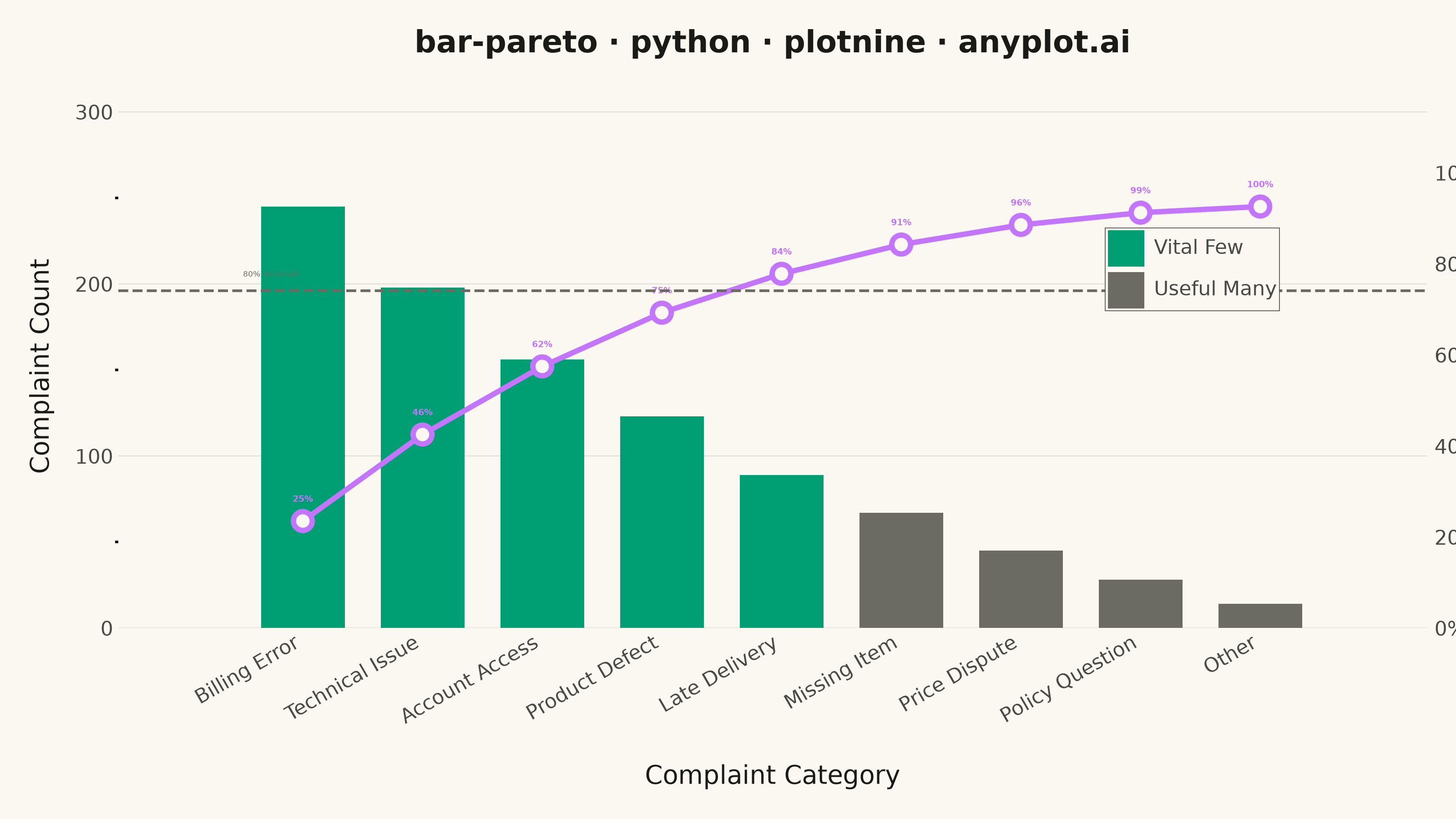
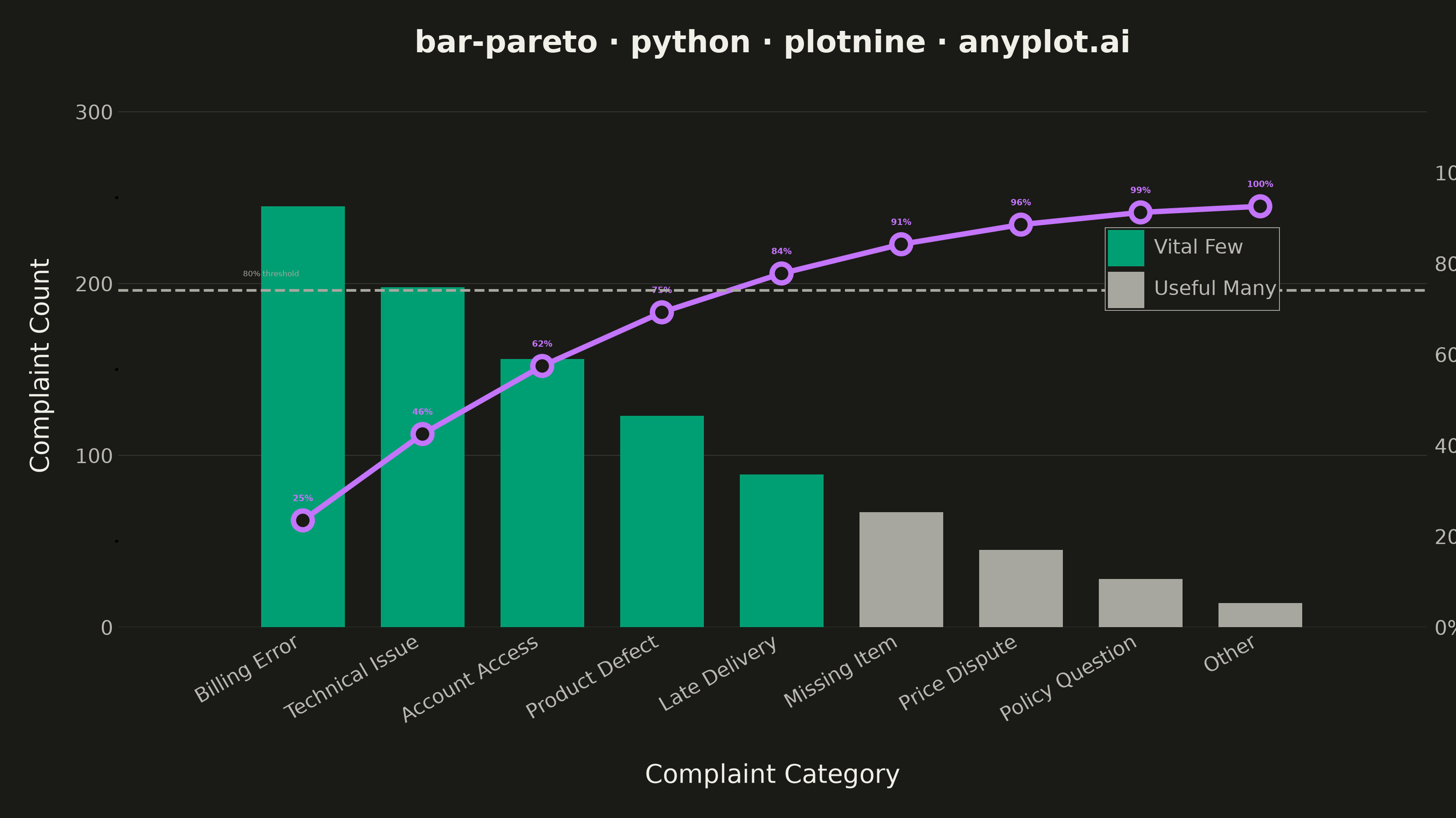
A Pareto chart combining descending-sorted bars (by frequency or count) with a cumulative percentage line overlay on a secondary y-axis. This visualization helps identify the most significant factors in a dataset by applying the Pareto principle (80/20 rule), making it one of the "7 Basic Tools of Quality" in Six Sigma and quality management. It reveals which categories contribute the most to an overall effect, enabling data-driven prioritization.
""" anyplot.ai
bar-pareto: Pareto Chart with Cumulative Line
Library: plotnine 0.15.7 | Python 3.13.14
Quality: 86/100 | Updated: 2026-06-20
"""

import os
import sys


sys.path = [p for p in sys.path if os.path.abspath(p) != os.getcwd()]

import pandas as pd
from plotnine import (
    aes,
    annotate,
    element_blank,
    element_line,
    element_rect,
    element_text,
    geom_bar,
    geom_hline,
    geom_line,
    geom_point,
    geom_text,
    ggplot,
    labs,
    scale_fill_manual,
    scale_x_discrete,
    scale_y_continuous,
    theme,
    theme_minimal,
)


# Theme tokens — Imprint palette, theme-adaptive chrome
THEME = os.getenv("ANYPLOT_THEME", "light")
PAGE_BG = "#FAF8F1" if THEME == "light" else "#1A1A17"
INK = "#1A1A17" if THEME == "light" else "#F0EFE8"
INK_SOFT = "#4A4A44" if THEME == "light" else "#B8B7B0"
INK_MUTED = "#6B6A63" if THEME == "light" else "#A8A79F"

VITAL_COLOR = "#009E73"  # Imprint position 1 — vital few (highest-impact complaints)
CUMLINE_COLOR = "#C475FD"  # Imprint position 2 — cumulative percentage line

# Data — call-centre complaint categories, Q1 (9 categories)
categories = [
    "Billing Error",
    "Technical Issue",
    "Account Access",
    "Product Defect",
    "Late Delivery",
    "Missing Item",
    "Price Dispute",
    "Policy Question",
    "Other",
]
counts = [245, 198, 156, 123, 89, 67, 45, 28, 14]

df = pd.DataFrame({"category": categories, "count": counts})
df = df.sort_values("count", ascending=False).reset_index(drop=True)
df["category"] = pd.Categorical(df["category"], categories=df["category"], ordered=True)

# Cumulative percentage scaled to primary y-axis
total = df["count"].sum()
df["cum_pct"] = df["count"].cumsum() / total * 100
max_count = df["count"].max()
scale_factor = max_count / 100
df["cum_scaled"] = df["cum_pct"] * scale_factor

# Vital few (all bars where cumulative % before them is < 80%) vs useful many
df["vital"] = df["cum_pct"].shift(1, fill_value=0) < 80
df["bar_fill"] = df["vital"].map({True: "vital", False: "useful"})

# Cumulative percentage labels
df["pct_label"] = df["cum_pct"].apply(lambda v: f"{v:.0f}%")

y_max = max_count * 1.15
title = "bar-pareto · python · plotnine · anyplot.ai"

# Plot
plot = (
    ggplot(df, aes(x="category"))
    + geom_bar(aes(y="count", fill="bar_fill"), stat="identity", width=0.7)
    + scale_fill_manual(
        values={"vital": VITAL_COLOR, "useful": INK_MUTED},
        breaks=["vital", "useful"],
        labels=["Vital Few", "Useful Many"],
        name="",
    )
    + geom_line(aes(y="cum_scaled", group=1), color=CUMLINE_COLOR, size=1.2)
    + geom_point(aes(y="cum_scaled"), color=CUMLINE_COLOR, fill=PAGE_BG, size=3, stroke=1.2)
    + geom_text(
        aes(y="cum_scaled", label="pct_label"),
        size=3.5,
        va="bottom",
        nudge_y=10,
        color=CUMLINE_COLOR,
        fontweight="bold",
    )
    + geom_hline(yintercept=80 * scale_factor, linetype="dashed", color=INK_MUTED, size=0.6)
    + annotate("text", x=0.5, y=80 * scale_factor + 10, label="80% threshold", size=3, color=INK_MUTED, ha="left")
    + scale_y_continuous(name="Complaint Count", expand=(0, 0, 0.08, 0), limits=(0, y_max))
    + scale_x_discrete(expand=(0.05, 0.6))
    + labs(x="Complaint Category", title=title)
    + theme_minimal(base_size=10)
    + theme(
        figure_size=(8, 4.5),
        plot_title=element_text(size=12, weight="bold", color=INK, margin={"b": 10}),
        axis_title_x=element_text(size=10, color=INK, margin={"t": 8}),
        axis_title_y=element_text(size=10, color=INK, margin={"r": 8}),
        axis_text=element_text(size=8, color=INK_SOFT),
        axis_text_x=element_text(rotation=30, ha="right"),
        panel_grid_major_x=element_blank(),
        panel_grid_minor=element_blank(),
        panel_grid_major_y=element_line(alpha=0.15, size=0.3, color=INK),
        axis_ticks=element_blank(),
        plot_background=element_rect(fill=PAGE_BG, color=PAGE_BG),
        panel_background=element_rect(fill=PAGE_BG),
        legend_position=(0.87, 0.72),
        legend_direction="vertical",
        legend_background=element_rect(fill=PAGE_BG, color=INK_SOFT, size=0.3),
        legend_text=element_text(size=8, color=INK_SOFT),
        legend_title=element_blank(),
        legend_key=element_rect(fill=PAGE_BG, color=PAGE_BG),
        plot_margin=0.02,
    )
)

# Draw to matplotlib figure, then add secondary y-axis for cumulative %
fig = plot.draw()
ax = fig.axes[0]

ax2 = ax.twinx()
ax2.set_ylim(0, y_max / scale_factor)
ax2.set_yticks([0, 20, 40, 60, 80, 100])
ax2.set_yticklabels([f"{t}%" for t in [0, 20, 40, 60, 80, 100]], fontsize=8, color=INK_SOFT)
ax2.tick_params(axis="y", length=0, pad=3)
for spine in ax2.spines.values():
    spine.set_visible(False)

# Adjust layout so secondary y-axis fits within canvas without bbox_inches='tight'
fig.subplots_adjust(right=0.87)

# Save — figure_size=(8, 4.5) dpi=400 → 3200×1800 px; no bbox_inches='tight'
fig.savefig(f"plot-{THEME}.png", dpi=400, facecolor=PAGE_BG)
Runnable source as JSON, for any HTTP client: https://api.anyplot.ai/specs/bar-pareto/plotnine/code. Any spec id and library id listed in llms-full.txt fit the same URL shape; every URL below is complete and callable.
{
  "spec_id": "bar-pareto",
  "language": "python",
  "library": "plotnine",
  "page": "https://anyplot.ai/bar-pareto/python/plotnine",
  "hub": "https://anyplot.ai/bar-pareto",
  "code_json": "https://api.anyplot.ai/specs/bar-pareto/plotnine/code",
  "spec_json": "https://api.anyplot.ai/specs/bar-pareto",
  "render_light_png": "https://storage.googleapis.com/anyplot-images/plots/bar-pareto/python/plotnine/plot-light.png",
  "render_dark_png": "https://storage.googleapis.com/anyplot-images/plots/bar-pareto/python/plotnine/plot-dark.png",
  "quality_score": 86.0,
  "license": "MIT",
  "guide": "https://anyplot.ai/llms.txt"
}
Part of Pareto Chart with Cumulative Line on anyplot.ai.