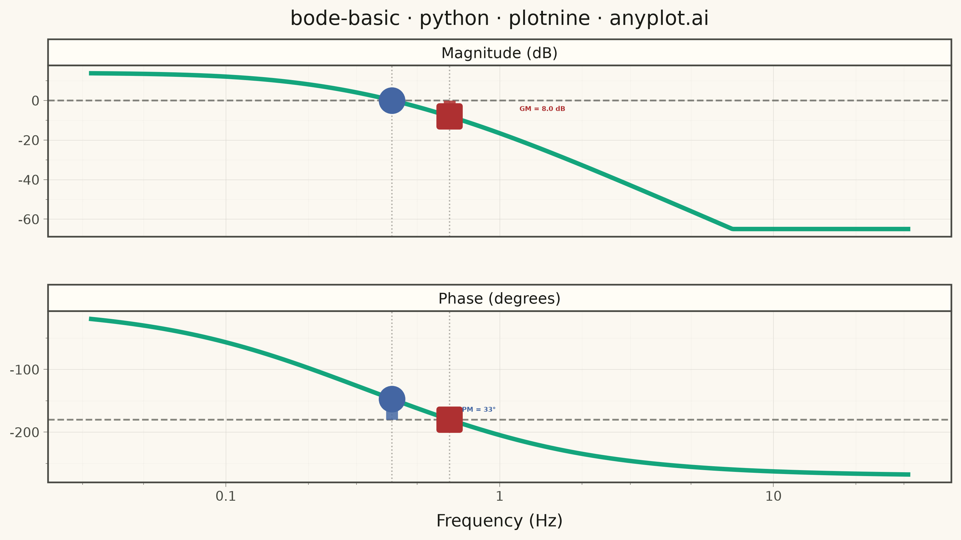
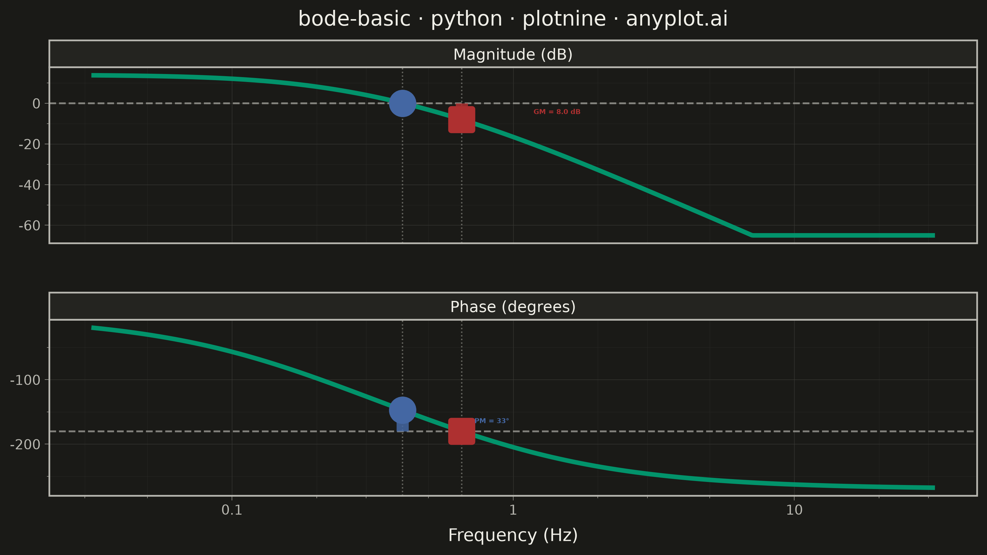
A Bode plot displays a system's frequency response as two vertically aligned panels: magnitude (in decibels) on top and phase (in degrees) on the bottom, both plotted against frequency on a shared logarithmic scale. This visualization is fundamental in control systems engineering and signal processing for analyzing how a system responds to sinusoidal inputs across a range of frequencies, revealing stability characteristics, bandwidth, and resonance behavior.
""" anyplot.ai
bode-basic: Bode Plot for Frequency Response
Library: plotnine 0.15.7 | Python 3.13.14
Quality: 90/100 | Updated: 2026-06-17
"""

import os
import pathlib
import sys


script_dir = str(pathlib.Path(__file__).parent)
sys.path = [p for p in sys.path if os.path.abspath(p) != os.path.abspath(script_dir)]

import numpy as np
import pandas as pd
from plotnine import (
    aes,
    element_line,
    element_rect,
    element_text,
    facet_wrap,
    geom_hline,
    geom_line,
    geom_point,
    geom_segment,
    geom_text,
    geom_vline,
    ggplot,
    labs,
    scale_x_log10,
    scale_y_continuous,
    theme,
    theme_minimal,
)


# Theme tokens
THEME = os.getenv("ANYPLOT_THEME", "light")
PAGE_BG = "#FAF8F1" if THEME == "light" else "#1A1A17"
ELEVATED_BG = "#FFFDF6" if THEME == "light" else "#242420"
INK = "#1A1A17" if THEME == "light" else "#F0EFE8"
INK_SOFT = "#4A4A44" if THEME == "light" else "#B8B7B0"
INK_MUTED = "#6B6A63" if THEME == "light" else "#A8A79F"
GRID_MAJOR = "#D8D7D0" if THEME == "light" else "#3A3A36"
GRID_MINOR = "#E8E7E0" if THEME == "light" else "#2E2E2B"

# Imprint palette — first series always #009E73
IMPRINT_PALETTE = ["#009E73", "#C475FD", "#4467A3", "#BD8233", "#AE3030", "#2ABCCD", "#954477", "#99B314"]
BRAND = IMPRINT_PALETTE[0]  # #009E73 — transfer function line
MARGIN_RED = IMPRINT_PALETTE[4]  # #AE3030 — gain margin (instability distance)
MARGIN_BLUE = IMPRINT_PALETTE[2]  # #4467A3 — phase margin

# Data — third-order open-loop TF: G(s) = 5 / [(s+1)(0.5s+1)(0.2s+1)]
# Poles at s=-1, -2, -5; stable system with clear gain and phase margins
frequency_hz = np.logspace(-1.5, 1.5, 600)
omega = 2 * np.pi * frequency_hz
jw = 1j * omega
G = 5.0 / ((jw + 1) * (0.5 * jw + 1) * (0.2 * jw + 1))

magnitude_db = 20 * np.log10(np.abs(G))
phase_deg = np.degrees(np.unwrap(np.angle(G)))

# Clip display range so both panels are visually balanced (no empty white space)
mag_display = np.clip(magnitude_db, -65.0, 25.0)
phase_display = np.clip(phase_deg, -290.0, 10.0)

# Gain crossover: where magnitude crosses 0 dB
gc_idx = np.argmin(np.abs(magnitude_db))
gc_freq = frequency_hz[gc_idx]
phase_at_gc = phase_deg[gc_idx]
phase_margin = 180 + phase_at_gc

# Phase crossover: where phase crosses -180 degrees
pc_idx = np.argmin(np.abs(phase_deg + 180))
pc_freq = frequency_hz[pc_idx]
mag_at_pc = magnitude_db[pc_idx]
gain_margin = -mag_at_pc

# Panel ordering
panels = ["Magnitude (dB)", "Phase (degrees)"]
panel_cat = pd.CategoricalDtype(categories=panels, ordered=True)

# Long-format DataFrame for faceted plot
df = pd.concat(
    [
        pd.DataFrame({"freq": frequency_hz, "value": mag_display, "panel": "Magnitude (dB)"}),
        pd.DataFrame({"freq": frequency_hz, "value": phase_display, "panel": "Phase (degrees)"}),
    ],
    ignore_index=True,
)
df["panel"] = df["panel"].astype(panel_cat)

# Reference lines: 0 dB in magnitude panel, -180° in phase panel
ref_lines = pd.DataFrame({"panel": pd.Categorical(panels, dtype=panel_cat), "yintercept": [0.0, -180.0]})

# Margin annotation segments (clipped to display range)
gm_seg = pd.DataFrame(
    {
        "x": [pc_freq],
        "ymin": [max(mag_at_pc, -65.0)],
        "ymax": [0.0],
        "panel": pd.Categorical(["Magnitude (dB)"], dtype=panel_cat),
    }
)
pm_seg = pd.DataFrame(
    {
        "x": [gc_freq],
        "ymin": [-180.0],
        "ymax": [min(phase_at_gc, 0.0)],
        "panel": pd.Categorical(["Phase (degrees)"], dtype=panel_cat),
    }
)

# Crossover markers
markers = pd.DataFrame(
    {
        "freq": [gc_freq, gc_freq, pc_freq, pc_freq],
        "value": [0.0, phase_at_gc, mag_at_pc, -180.0],
        "panel": pd.Categorical(
            ["Magnitude (dB)", "Phase (degrees)", "Magnitude (dB)", "Phase (degrees)"], dtype=panel_cat
        ),
        "mtype": ["gc", "gc", "pc", "pc"],
    }
)

# Annotation labels (GM/PM values placed to the right of margin segments)
gm_label = pd.DataFrame(
    {
        "freq": [pc_freq * 1.8],
        "value": [mag_at_pc / 2],
        "label": [f"GM = {gain_margin:.1f} dB"],
        "panel": pd.Categorical(["Magnitude (dB)"], dtype=panel_cat),
    }
)
pm_label = pd.DataFrame(
    {
        "freq": [gc_freq * 1.8],
        "value": [(phase_at_gc - 180) / 2],
        "label": [f"PM = {phase_margin:.0f}°"],
        "panel": pd.Categorical(["Phase (degrees)"], dtype=panel_cat),
    }
)

# Vertical crossover guides in both panels
guides = pd.DataFrame(
    {
        "xintercept": [gc_freq, gc_freq, pc_freq, pc_freq],
        "panel": pd.Categorical(
            ["Magnitude (dB)", "Phase (degrees)", "Magnitude (dB)", "Phase (degrees)"], dtype=panel_cat
        ),
    }
)

# Title — 43 chars, well under the 67-char baseline, no scaling needed
title = "bode-basic · python · plotnine · anyplot.ai"

# Plot — landscape format for optimal log-frequency axis display
plot = (
    ggplot(df, aes(x="freq", y="value"))
    + geom_line(size=1.5, color=BRAND, alpha=0.92)
    + geom_hline(ref_lines, aes(yintercept="yintercept"), linetype="dashed", color=INK_SOFT, size=0.6, alpha=0.65)
    + geom_vline(guides, aes(xintercept="xintercept"), linetype="dotted", color=INK_MUTED, size=0.45, alpha=0.55)
    + geom_segment(gm_seg, aes(x="x", xend="x", y="ymin", yend="ymax"), color=MARGIN_RED, size=4.0, alpha=0.85)
    + geom_segment(pm_seg, aes(x="x", xend="x", y="ymin", yend="ymax"), color=MARGIN_BLUE, size=4.0, alpha=0.85)
    + geom_point(
        markers[markers["mtype"] == "pc"],
        aes(x="freq", y="value"),
        color=MARGIN_RED,
        fill=MARGIN_RED,
        size=5,
        shape="s",
        stroke=2.0,
    )
    + geom_point(
        markers[markers["mtype"] == "gc"],
        aes(x="freq", y="value"),
        color=MARGIN_BLUE,
        fill=MARGIN_BLUE,
        size=5,
        shape="o",
        stroke=2.0,
    )
    + geom_text(
        gm_label, aes(x="freq", y="value", label="label"), color=MARGIN_RED, size=4, fontweight="bold", ha="left"
    )
    + geom_text(
        pm_label, aes(x="freq", y="value", label="label"), color=MARGIN_BLUE, size=4, fontweight="bold", ha="left"
    )
    + facet_wrap("~panel", ncol=1, scales="free_y")
    + scale_x_log10(
        breaks=[0.1, 1, 10], labels=["0.1", "1", "10"], minor_breaks=[0.03, 0.05, 0.2, 0.3, 0.5, 2, 3, 5, 20, 30]
    )
    + scale_y_continuous(labels=lambda lst: [f"{v:.0f}" for v in lst])
    + labs(x="Frequency (Hz)", y="", title=title)
    + theme_minimal()
    + theme(
        figure_size=(8, 4.5),
        text=element_text(size=7, color=INK_SOFT),
        axis_title=element_text(size=10, color=INK),
        axis_text=element_text(size=8, color=INK_SOFT),
        axis_ticks=element_line(color=INK_MUTED, size=0.3),
        plot_title=element_text(size=12, color=INK),
        strip_text=element_text(size=9, color=INK),
        strip_background=element_rect(fill=ELEVATED_BG, color=INK_SOFT),
        panel_grid_major=element_line(color=GRID_MAJOR, size=0.25),
        panel_grid_minor=element_line(color=GRID_MINOR, size=0.12),
        panel_border=element_rect(color=INK_SOFT, fill=None),
        panel_spacing_y=0.05,
        plot_background=element_rect(fill=PAGE_BG, color=PAGE_BG),
        panel_background=element_rect(fill=PAGE_BG, color="none"),
        legend_background=element_rect(fill=ELEVATED_BG, color=INK_SOFT),
        legend_text=element_text(color=INK_SOFT),
    )
)

# Save
plot.save(f"plot-{THEME}.png", dpi=400, width=8, height=4.5, units="in", verbose=False)
Runnable source as JSON, for any HTTP client: https://api.anyplot.ai/specs/bode-basic/plotnine/code. Any spec id and library id listed in llms-full.txt fit the same URL shape; every URL below is complete and callable.
{
  "spec_id": "bode-basic",
  "language": "python",
  "library": "plotnine",
  "page": "https://anyplot.ai/bode-basic/python/plotnine",
  "hub": "https://anyplot.ai/bode-basic",
  "code_json": "https://api.anyplot.ai/specs/bode-basic/plotnine/code",
  "spec_json": "https://api.anyplot.ai/specs/bode-basic",
  "render_light_png": "https://storage.googleapis.com/anyplot-images/plots/bode-basic/python/plotnine/plot-light.png",
  "render_dark_png": "https://storage.googleapis.com/anyplot-images/plots/bode-basic/python/plotnine/plot-dark.png",
  "quality_score": 90.0,
  "license": "MIT",
  "guide": "https://anyplot.ai/llms.txt"
}
Part of Bode Plot for Frequency Response on anyplot.ai.