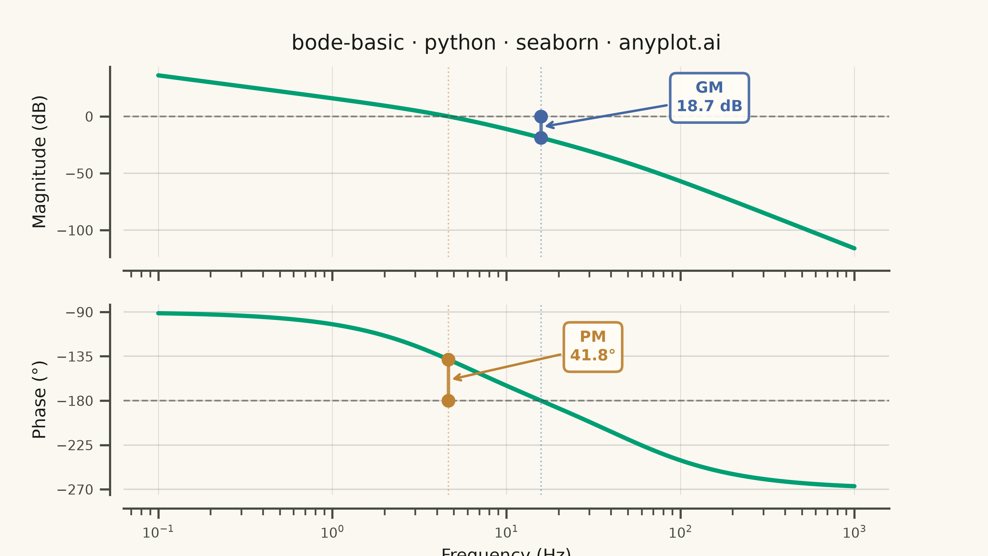
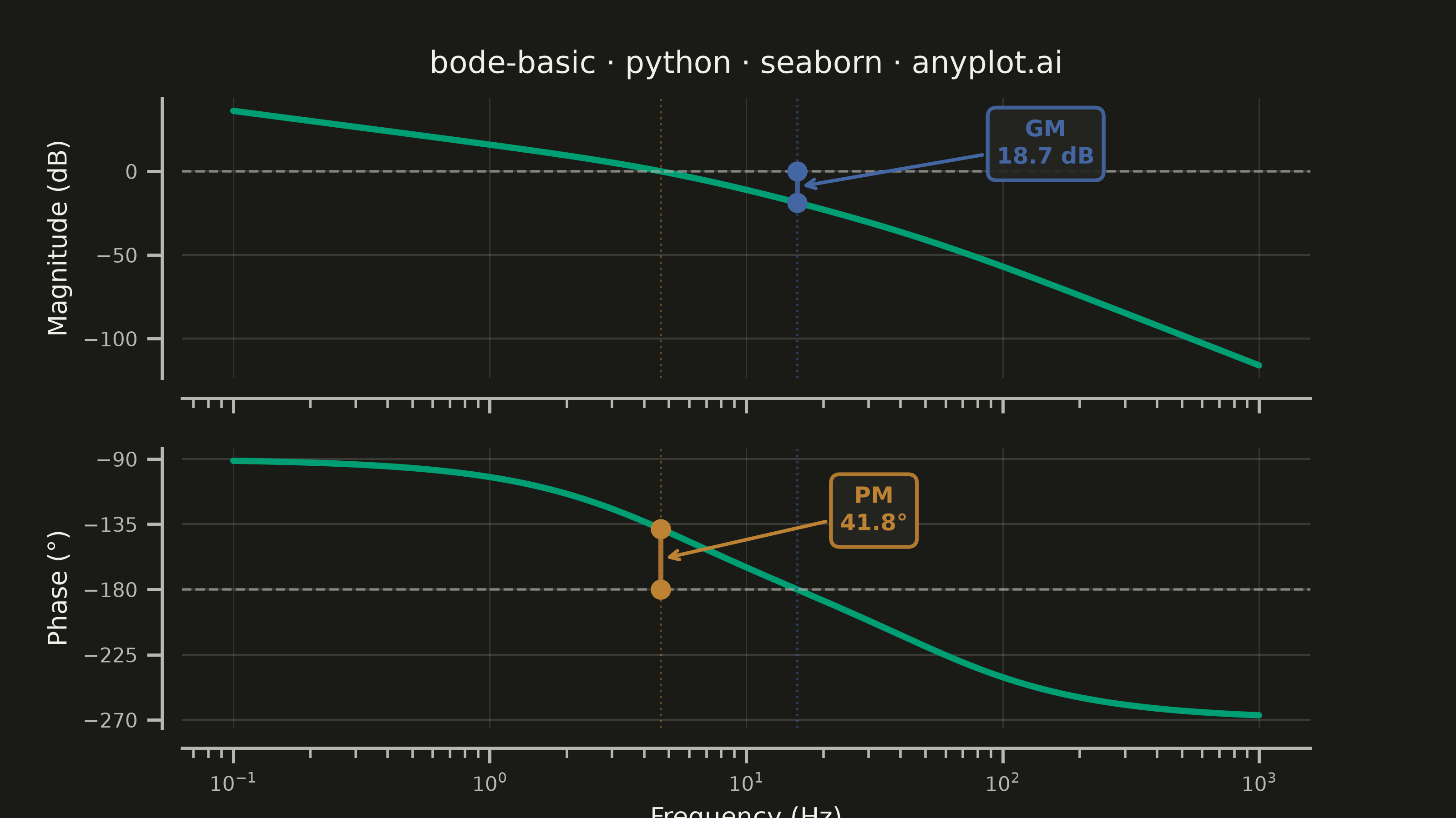
A Bode plot displays a system's frequency response as two vertically aligned panels: magnitude (in decibels) on top and phase (in degrees) on the bottom, both plotted against frequency on a shared logarithmic scale. This visualization is fundamental in control systems engineering and signal processing for analyzing how a system responds to sinusoidal inputs across a range of frequencies, revealing stability characteristics, bandwidth, and resonance behavior.
""" anyplot.ai
bode-basic: Bode Plot for Frequency Response
Library: seaborn 0.13.2 | Python 3.13.14
Quality: 90/100 | Updated: 2026-06-17
"""

import os

import matplotlib.pyplot as plt
import numpy as np
import pandas as pd
import seaborn as sns


# Theme tokens
THEME = os.getenv("ANYPLOT_THEME", "light")
PAGE_BG = "#FAF8F1" if THEME == "light" else "#1A1A17"
ELEVATED_BG = "#FFFDF6" if THEME == "light" else "#242420"
INK = "#1A1A17" if THEME == "light" else "#F0EFE8"
INK_SOFT = "#4A4A44" if THEME == "light" else "#B8B7B0"

# Imprint palette — canonical order, first series always #009E73
IMPRINT_PALETTE = ["#009E73", "#C475FD", "#4467A3", "#BD8233", "#AE3030", "#2ABCCD", "#954477", "#99B314"]
LINE_COLOR = IMPRINT_PALETTE[0]  # brand green — frequency response line
GM_COLOR = IMPRINT_PALETTE[2]  # blue — gain margin
PM_COLOR = IMPRINT_PALETTE[3]  # ochre — phase margin

sns.set_theme(
    context="notebook",
    style="ticks",
    rc={
        "figure.facecolor": PAGE_BG,
        "axes.facecolor": PAGE_BG,
        "axes.edgecolor": INK_SOFT,
        "axes.labelcolor": INK,
        "text.color": INK,
        "xtick.color": INK_SOFT,
        "ytick.color": INK_SOFT,
        "grid.color": INK,
        "grid.alpha": 0.15,
        "legend.facecolor": ELEVATED_BG,
        "legend.edgecolor": INK_SOFT,
    },
)

# Data — Type-1 open-loop transfer function: H(s) = K·p1·p2 / (s·(s+p1)·(s+p2))
K = 40.0
p1 = 2 * np.pi * 5  # pole at 5 Hz
p2 = 2 * np.pi * 50  # pole at 50 Hz

frequency_hz = np.logspace(-1, 3, 600)
omega = 2 * np.pi * frequency_hz
s = 1j * omega

H = K * p1 * p2 / (s * (s + p1) * (s + p2))
magnitude_db = 20 * np.log10(np.abs(H))
phase_deg = np.degrees(np.unwrap(np.angle(H)))

# Gain crossover — magnitude crosses 0 dB (interpolated)
sign_changes = np.diff(np.sign(magnitude_db))
gc_indices = np.where(sign_changes != 0)[0]
idx = gc_indices[0]
frac = -magnitude_db[idx] / (magnitude_db[idx + 1] - magnitude_db[idx])
gain_cross_freq = frequency_hz[idx] * (frequency_hz[idx + 1] / frequency_hz[idx]) ** frac
phase_at_gain_cross = phase_deg[idx] + frac * (phase_deg[idx + 1] - phase_deg[idx])
phase_margin = 180 + phase_at_gain_cross

# Phase crossover — phase crosses −180° (interpolated)
phase_shift = phase_deg + 180
sign_changes_ph = np.diff(np.sign(phase_shift))
pc_indices = np.where(sign_changes_ph != 0)[0]
idx = pc_indices[0]
frac = -phase_shift[idx] / (phase_shift[idx + 1] - phase_shift[idx])
phase_cross_freq = frequency_hz[idx] * (frequency_hz[idx + 1] / frequency_hz[idx]) ** frac
mag_at_phase_cross = magnitude_db[idx] + frac * (magnitude_db[idx + 1] - magnitude_db[idx])
gain_margin = -mag_at_phase_cross

# Long-form DataFrame for seaborn faceting
df_mag = pd.DataFrame({"Frequency (Hz)": frequency_hz, "value": magnitude_db, "panel": "Magnitude (dB)"})
df_phase = pd.DataFrame({"Frequency (Hz)": frequency_hz, "value": phase_deg, "panel": "Phase (°)"})
df = pd.concat([df_mag, df_phase], ignore_index=True)

# FacetGrid — idiomatic seaborn dual-panel layout
g = sns.FacetGrid(
    df, row="panel", height=2.25, aspect=8 / 2.25, sharex=True, sharey=False, gridspec_kws={"hspace": 0.25}
)
g.map_dataframe(sns.lineplot, x="Frequency (Hz)", y="value", color=LINE_COLOR, linewidth=2.5)
g.figure.set_dpi(400)
g.figure.set_facecolor(PAGE_BG)

ax_mag = g.axes[0, 0]
ax_phase = g.axes[1, 0]

g.set_titles("")
g.set_axis_labels("", "")

for ax in g.axes.flat:
    ax.set_xscale("log")
    ax.set_facecolor(PAGE_BG)

# Reference lines at 0 dB and −180°
ax_mag.axhline(0, color=INK_SOFT, linewidth=1.0, linestyle="--", alpha=0.6)
ax_phase.axhline(-180, color=INK_SOFT, linewidth=1.0, linestyle="--", alpha=0.6)

# Crossover vertical markers tying both panels together
for ax in [ax_mag, ax_phase]:
    ax.axvline(gain_cross_freq, color=PM_COLOR, linewidth=0.9, linestyle=":", alpha=0.45)
    ax.axvline(phase_cross_freq, color=GM_COLOR, linewidth=0.9, linestyle=":", alpha=0.45)

# Gain margin — markers and annotation in the magnitude panel
ax_mag.vlines(phase_cross_freq, mag_at_phase_cross, 0, color=GM_COLOR, linewidth=2.0, alpha=0.85)
ax_mag.plot(phase_cross_freq, mag_at_phase_cross, "o", color=GM_COLOR, markersize=7, zorder=5)
ax_mag.plot(phase_cross_freq, 0, "o", color=GM_COLOR, markersize=7, zorder=5)
gm_mid_y = (mag_at_phase_cross + 0) / 2
ax_mag.annotate(
    f"GM\n{gain_margin:.1f} dB",
    xy=(phase_cross_freq, gm_mid_y),
    xytext=(phase_cross_freq * 6, gm_mid_y + 14),
    fontsize=9,
    fontweight="bold",
    multialignment="center",
    color=GM_COLOR,
    arrowprops={"arrowstyle": "->", "color": GM_COLOR, "lw": 1.4},
    bbox={"boxstyle": "round,pad=0.4", "fc": ELEVATED_BG, "ec": GM_COLOR, "alpha": 0.92, "lw": 1.5},
)

# Phase margin — markers and annotation in the phase panel
ax_phase.vlines(gain_cross_freq, -180, phase_at_gain_cross, color=PM_COLOR, linewidth=2.0, alpha=0.85)
ax_phase.plot(gain_cross_freq, phase_at_gain_cross, "o", color=PM_COLOR, markersize=7, zorder=5)
ax_phase.plot(gain_cross_freq, -180, "o", color=PM_COLOR, markersize=7, zorder=5)
pm_mid_y = (phase_at_gain_cross + (-180)) / 2
ax_phase.annotate(
    f"PM\n{phase_margin:.1f}°",
    xy=(gain_cross_freq, pm_mid_y),
    xytext=(gain_cross_freq * 5, pm_mid_y + 20),
    fontsize=9,
    fontweight="bold",
    multialignment="center",
    color=PM_COLOR,
    arrowprops={"arrowstyle": "->", "color": PM_COLOR, "lw": 1.4},
    bbox={"boxstyle": "round,pad=0.4", "fc": ELEVATED_BG, "ec": PM_COLOR, "alpha": 0.92, "lw": 1.5},
)

# Title — length check for fontsize scaling (baseline 67 chars)
title = "bode-basic · python · seaborn · anyplot.ai"
title_fs = round(12 * (67 / len(title))) if len(title) > 67 else 12

ax_mag.set_title(title, fontsize=title_fs, fontweight="medium", pad=10, color=INK)
ax_mag.set_ylabel("Magnitude (dB)", fontsize=10, color=INK)
ax_mag.tick_params(axis="both", labelsize=8)

ax_phase.set_xlabel("Frequency (Hz)", fontsize=10, color=INK)
ax_phase.set_ylabel("Phase (°)", fontsize=10, color=INK)
ax_phase.tick_params(axis="both", labelsize=8)
ax_phase.set_yticks([-90, -135, -180, -225, -270])

# Spine removal — offset=8 adds the characteristic seaborn axis-spine gap
sns.despine(ax=ax_mag, offset=8)
sns.despine(ax=ax_phase, offset=8)
for ax in [ax_mag, ax_phase]:
    for spine in ax.spines.values():
        spine.set_color(INK_SOFT)

# Grid — subtle, both axes for frequency response charts
for ax in [ax_mag, ax_phase]:
    ax.yaxis.grid(True, alpha=0.15, linewidth=0.8, color=INK)
    ax.xaxis.grid(True, alpha=0.12, linewidth=0.5, color=INK)

# Canvas — exactly 3200×1800 px (8 in × 4.5 in @ dpi=400)
g.figure.set_size_inches(8, 4.5)

# Save — no bbox_inches='tight' to preserve exact canvas dimensions
plt.savefig(f"plot-{THEME}.png", dpi=400, facecolor=PAGE_BG)
plt.close()
Runnable source as JSON, for any HTTP client: https://api.anyplot.ai/specs/bode-basic/seaborn/code. Any spec id and library id listed in llms-full.txt fit the same URL shape; every URL below is complete and callable.
{
  "spec_id": "bode-basic",
  "language": "python",
  "library": "seaborn",
  "page": "https://anyplot.ai/bode-basic/python/seaborn",
  "hub": "https://anyplot.ai/bode-basic",
  "code_json": "https://api.anyplot.ai/specs/bode-basic/seaborn/code",
  "spec_json": "https://api.anyplot.ai/specs/bode-basic",
  "render_light_png": "https://storage.googleapis.com/anyplot-images/plots/bode-basic/python/seaborn/plot-light.png",
  "render_dark_png": "https://storage.googleapis.com/anyplot-images/plots/bode-basic/python/seaborn/plot-dark.png",
  "quality_score": 90.0,
  "license": "MIT",
  "guide": "https://anyplot.ai/llms.txt"
}
Part of Bode Plot for Frequency Response on anyplot.ai.