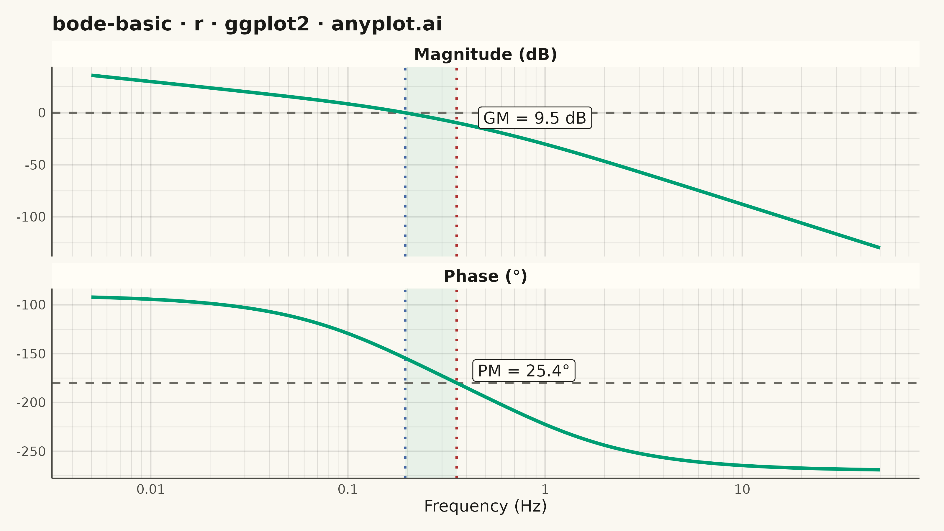
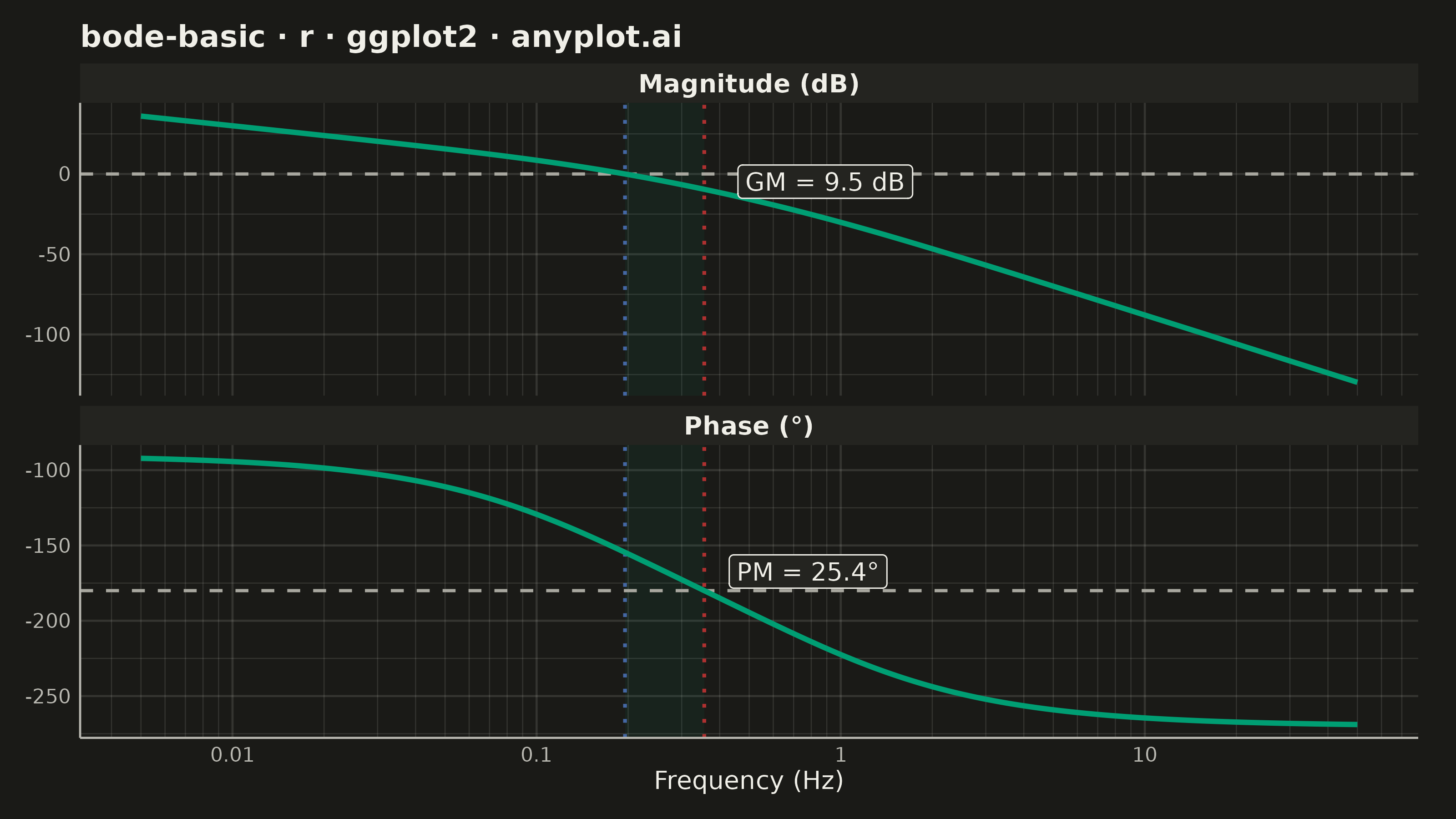
A Bode plot displays a system's frequency response as two vertically aligned panels: magnitude (in decibels) on top and phase (in degrees) on the bottom, both plotted against frequency on a shared logarithmic scale. This visualization is fundamental in control systems engineering and signal processing for analyzing how a system responds to sinusoidal inputs across a range of frequencies, revealing stability characteristics, bandwidth, and resonance behavior.
#' anyplot.ai
#' bode-basic: Bode Plot for Frequency Response
#' Library: ggplot2 3.5.1 | R 4.4.1
#' Quality: 92/100 | Created: 2026-06-17

library(ggplot2)
library(ragg)

# Theme tokens (Imprint palette — see prompts/default-style-guide.md)
THEME       <- Sys.getenv("ANYPLOT_THEME", "light")
PAGE_BG     <- if (THEME == "light") "#FAF8F1" else "#1A1A17"
ELEVATED_BG <- if (THEME == "light") "#FFFDF6" else "#242420"
INK         <- if (THEME == "light") "#1A1A17" else "#F0EFE8"
INK_SOFT    <- if (THEME == "light") "#4A4A44" else "#B8B7B0"
INK_MUTED   <- if (THEME == "light") "#6B6A63" else "#A8A79F"
GRID_COLOR  <- adjustcolor(INK, alpha.f = 0.12)

IMPRINT_PALETTE <- c(
  "#009E73",  # 1 — brand green (first series)
  "#C475FD",  # 2 — lavender
  "#4467A3",  # 3 — blue
  "#BD8233",  # 4 — ochre
  "#AE3030",  # 5 — matte red
  "#2ABCCD",  # 6 — cyan
  "#954477",  # 7 — rose
  "#99B314"   # 8 — lime
)

# Transfer function G(s) = 10 / (s(s+1)(s+5)) — type-1 system with two real poles
# Phase crossover at omega = sqrt(5), gain margin ~9.54 dB
freq_hz <- 10^seq(log10(0.005), log10(50), length.out = 500)
omega   <- 2 * pi * freq_hz

# Analytical magnitude and phase (avoids Arg() wrapping for high-order systems)
magnitude_db <- 20 * log10(10 / (omega * sqrt(1 + omega^2) * sqrt(25 + omega^2)))
phase_deg    <- -90 - atan(omega) * (180 / pi) - atan(omega / 5) * (180 / pi)

# Gain crossover frequency: |G| crosses 0 dB downward
gc_idx    <- which(diff(sign(magnitude_db)) < 0)[1]
gc_freq   <- 10^(log10(freq_hz[gc_idx]) +
                 (0 - magnitude_db[gc_idx]) *
                 (log10(freq_hz[gc_idx + 1]) - log10(freq_hz[gc_idx])) /
                 (magnitude_db[gc_idx + 1] - magnitude_db[gc_idx]))
gc_phase  <- approx(freq_hz, phase_deg, xout = gc_freq)$y
phase_margin <- 180 + gc_phase

# Phase crossover frequency: phase crosses -180° downward
pc_idx    <- which(diff(sign(phase_deg + 180)) < 0)[1]
pc_freq   <- 10^(log10(freq_hz[pc_idx]) +
                 (-180 - phase_deg[pc_idx]) *
                 (log10(freq_hz[pc_idx + 1]) - log10(freq_hz[pc_idx])) /
                 (phase_deg[pc_idx + 1] - phase_deg[pc_idx]))
pc_mag    <- approx(freq_hz, magnitude_db, xout = pc_freq)$y
gain_margin <- -pc_mag

# Long-format data for dual-panel faceted plot
panels <- c("Magnitude (dB)", "Phase (°)")
df <- tibble::tibble(
  freq  = c(freq_hz, freq_hz),
  value = c(magnitude_db, phase_deg),
  panel = factor(rep(panels, each = 500), levels = panels)
)

# Per-facet reference lines: 0 dB (magnitude) and -180° (phase)
ref_df <- tibble::tibble(
  panel = factor(panels, levels = panels),
  yint  = c(0, -180)
)

# Stability zone shading: vertical band between gain and phase crossover frequencies
shade_df <- tibble::tibble(
  panel = factor(panels, levels = panels),
  xmin  = min(gc_freq, pc_freq),
  xmax  = max(gc_freq, pc_freq),
  ymin  = -Inf,
  ymax  = Inf
)

# Stability margin annotations: place in each panel near the relevant crossover
ann_df <- tibble::tibble(
  freq  = c(pc_freq * 2.5, gc_freq * 4.0),
  value = c(pc_mag / 2, (gc_phase - 180) / 2),
  label = c(sprintf("GM = %.1f dB", gain_margin),
            sprintf("PM = %.1f°", phase_margin)),
  panel = factor(panels, levels = panels)
)

title_str  <- "bode-basic · r · ggplot2 · anyplot.ai"
title_size <- max(8, round(12 * min(1.0, 67 / nchar(title_str))))

p <- ggplot(df, aes(x = freq, y = value)) +
  # Stability zone: vertical band between crossover frequencies
  geom_rect(
    data = shade_df,
    aes(xmin = xmin, xmax = xmax, ymin = ymin, ymax = ymax),
    inherit.aes = FALSE,
    fill = adjustcolor(IMPRINT_PALETTE[1], alpha.f = 0.07),
    color = NA
  ) +
  # Reference lines per facet (0 dB and -180°)
  geom_hline(
    data = ref_df, aes(yintercept = yint),
    color = INK_MUTED, linetype = "dashed", linewidth = 0.6
  ) +
  # Gain crossover frequency marker (both panels)
  geom_vline(
    xintercept = gc_freq,
    color = IMPRINT_PALETTE[3], linetype = "dotted", linewidth = 0.7
  ) +
  # Phase crossover frequency marker (both panels)
  geom_vline(
    xintercept = pc_freq,
    color = IMPRINT_PALETTE[5], linetype = "dotted", linewidth = 0.7
  ) +
  # Frequency response curves
  geom_line(color = IMPRINT_PALETTE[1], linewidth = 1.0) +
  # Stability margin annotations
  geom_label(
    data = ann_df,
    aes(x = freq, y = value, label = label),
    color = INK, fill = ELEVATED_BG,
    label.size = 0.25, size = 3.5, label.r = unit(0.15, "lines")
  ) +
  scale_x_log10(
    breaks       = 10^(-2:1),
    labels       = c("0.01", "0.1", "1", "10"),
    minor_breaks = as.vector(outer(1:9, 10^(-3:2)))
  ) +
  facet_wrap(~ panel, ncol = 1, scales = "free_y") +
  labs(
    title = title_str,
    x     = "Frequency (Hz)",
    y     = NULL
  ) +
  theme_minimal(base_size = 8) +
  theme(
    plot.background  = element_rect(fill = PAGE_BG,     color = PAGE_BG),
    panel.background = element_rect(fill = PAGE_BG,     color = NA),
    panel.grid.major = element_line(color = GRID_COLOR, linewidth = 0.4),
    panel.grid.minor = element_line(color = GRID_COLOR, linewidth = 0.2),
    panel.border     = element_blank(),
    axis.line        = element_line(color = INK_SOFT,  linewidth = 0.4),
    axis.title.x     = element_text(color = INK,      size = 10),
    axis.text        = element_text(color = INK_SOFT,  size = 8),
    plot.title       = element_text(color = INK,      size = title_size, face = "bold"),
    strip.text       = element_text(color = INK,      size = 10, face = "bold"),
    strip.background = element_rect(fill = ELEVATED_BG, color = NA),
    plot.margin      = margin(10, 15, 10, 10, unit = "pt")
  )

ggsave(
  filename = sprintf("plot-%s.png", THEME),
  plot     = p,
  device   = ragg::agg_png,
  width    = 8,
  height   = 4.5,
  units    = "in",
  dpi      = 400
)
Runnable source as JSON, for any HTTP client: https://api.anyplot.ai/specs/bode-basic/ggplot2/code. Any spec id and library id listed in llms-full.txt fit the same URL shape; every URL below is complete and callable.
{
  "spec_id": "bode-basic",
  "language": "r",
  "library": "ggplot2",
  "page": "https://anyplot.ai/bode-basic/r/ggplot2",
  "hub": "https://anyplot.ai/bode-basic",
  "code_json": "https://api.anyplot.ai/specs/bode-basic/ggplot2/code",
  "spec_json": "https://api.anyplot.ai/specs/bode-basic",
  "render_light_png": "https://storage.googleapis.com/anyplot-images/plots/bode-basic/r/ggplot2/plot-light.png",
  "render_dark_png": "https://storage.googleapis.com/anyplot-images/plots/bode-basic/r/ggplot2/plot-dark.png",
  "quality_score": 92.0,
  "license": "MIT",
  "guide": "https://anyplot.ai/llms.txt"
}
Part of Bode Plot for Frequency Response on anyplot.ai.