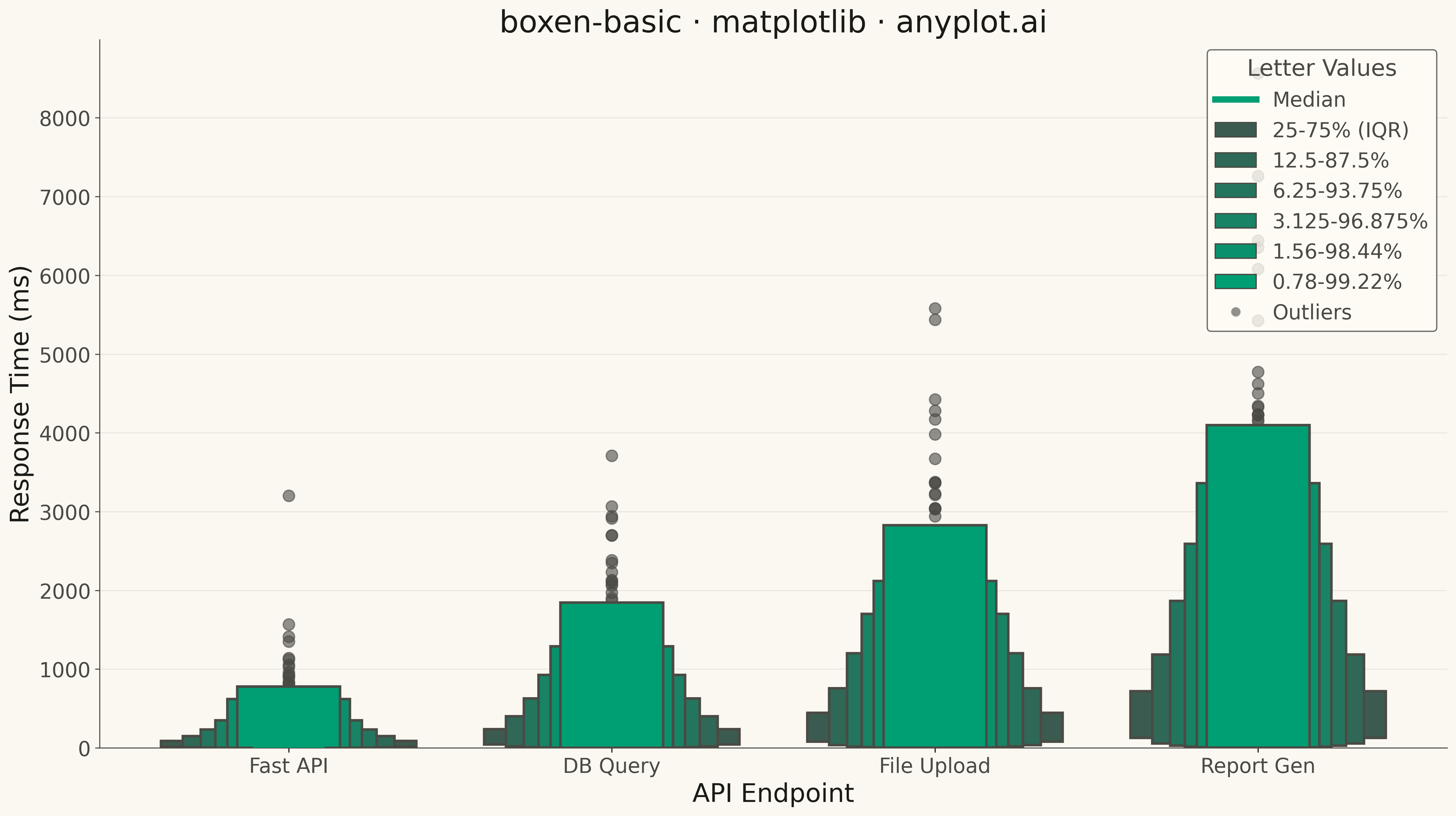
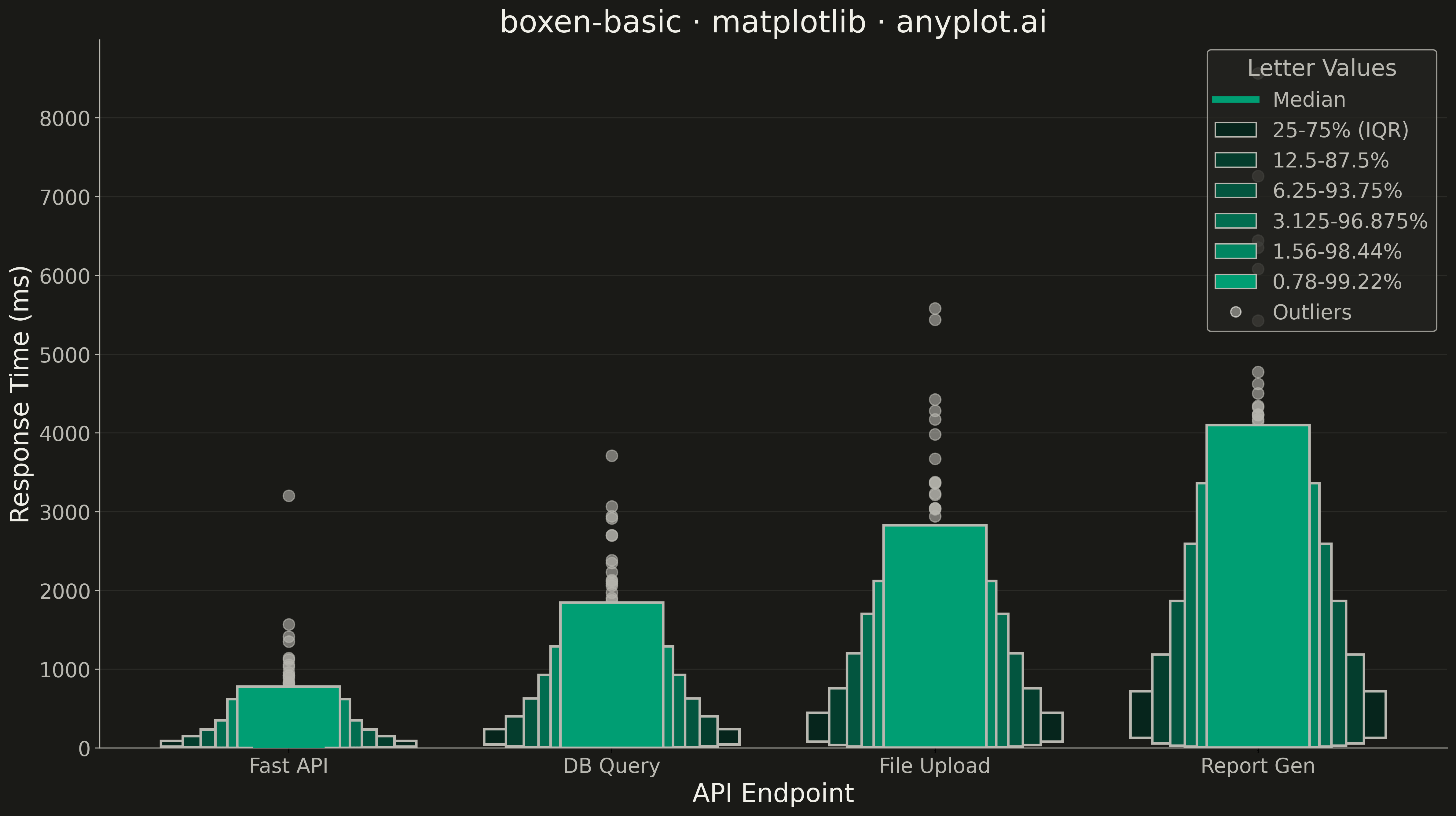
A boxen plot (also known as letter-value plot) extends the traditional box plot to show more quantile information, making it ideal for large datasets with 1000+ observations. Instead of just displaying the median and quartiles, it shows additional "letter values" (eighths, sixteenths, etc.) as nested boxes, revealing the full shape of the distribution including tail behavior. This makes outlier detection more meaningful and distribution comparison more detailed.
""" anyplot.ai
boxen-basic: Basic Boxen Plot (Letter-Value Plot)
Library: matplotlib 3.10.9 | Python 3.13.13
Quality: 86/100 | Updated: 2026-05-17
"""

import matplotlib.patches as mpatches
import matplotlib.pyplot as plt
import numpy as np


# Data - Server response times (ms) by endpoint
np.random.seed(42)

# Generate realistic response time distributions (right-skewed)
# Different endpoints have different performance characteristics
n_points = 2000

# Fast API endpoint (mostly quick, some slow)
fast_api = np.concatenate(
    [
        np.random.exponential(scale=50, size=int(n_points * 0.85)),
        np.random.exponential(scale=200, size=int(n_points * 0.12)),
        np.random.exponential(scale=500, size=int(n_points * 0.03)),
    ]
)

# Database query endpoint (moderate with variability)
db_query = np.concatenate(
    [
        np.random.exponential(scale=120, size=int(n_points * 0.7)),
        np.random.exponential(scale=350, size=int(n_points * 0.25)),
        np.random.exponential(scale=800, size=int(n_points * 0.05)),
    ]
)

# File upload endpoint (slower, more variable)
file_upload = np.concatenate(
    [
        np.random.exponential(scale=200, size=int(n_points * 0.6)),
        np.random.exponential(scale=500, size=int(n_points * 0.3)),
        np.random.exponential(scale=1000, size=int(n_points * 0.1)),
    ]
)

# Report generation (heavy task, wide distribution)
report_gen = np.concatenate(
    [
        np.random.exponential(scale=300, size=int(n_points * 0.5)),
        np.random.exponential(scale=700, size=int(n_points * 0.35)),
        np.random.exponential(scale=1500, size=int(n_points * 0.15)),
    ]
)

categories = ["Fast API", "DB Query", "File Upload", "Report Gen"]
data = [fast_api, db_query, file_upload, report_gen]

# Create plot
fig, ax = plt.subplots(figsize=(16, 9))

# Color palette - nested boxes use progressively darker shades
n_levels = 6

# Generate colors from light (outer) to dark (inner) for Python Blue
colors = []
for i in range(n_levels):
    # Interpolate from very light blue to Python Blue
    factor = 0.2 + (i / (n_levels - 1)) * 0.8
    r = int(48 * factor + 230 * (1 - factor))
    g = int(105 * factor + 240 * (1 - factor))
    b = int(152 * factor + 255 * (1 - factor))
    colors.append(f"#{r:02x}{g:02x}{b:02x}")

# Width parameters - each level gets progressively narrower
base_width = 0.75
width_decay = 0.82  # Each inner box is 82% width of outer
positions = range(1, len(categories) + 1)

# Draw boxen plots for each category
for pos, arr in zip(positions, data, strict=True):
    # Compute letter values (quantiles for boxen plot)
    # Level 0: 25-75% (IQR), Level 1: 12.5-87.5%, etc.
    quantile_pairs = []
    for i in range(n_levels):
        lower_p = 0.5 ** (i + 2)  # 0.25, 0.125, 0.0625, ...
        upper_p = 1 - lower_p  # 0.75, 0.875, 0.9375, ...
        lower_val = np.percentile(arr, lower_p * 100)
        upper_val = np.percentile(arr, upper_p * 100)
        quantile_pairs.append((lower_val, upper_val))

    median = np.median(arr)

    # Draw boxes from outermost (widest) to innermost (narrowest)
    for i in range(n_levels - 1, -1, -1):
        lower_val, upper_val = quantile_pairs[i]
        width = base_width * (width_decay**i)

        # Draw rectangle for this quantile level
        rect = mpatches.FancyBboxPatch(
            (pos - width / 2, lower_val),
            width,
            upper_val - lower_val,
            boxstyle=mpatches.BoxStyle("Round", pad=0.02),
            facecolor=colors[i],
            edgecolor="#1a3d5c",
            linewidth=2,
            zorder=5 + i,
        )
        ax.add_patch(rect)

    # Draw median line (bright yellow for visibility)
    median_width = base_width * (width_decay ** (n_levels - 1)) * 0.8
    ax.hlines(median, pos - median_width / 2, pos + median_width / 2, colors="#FFD43B", linewidth=5, zorder=20)

    # Plot outliers beyond the outermost quantile
    outer_lower, outer_upper = quantile_pairs[-1]
    outliers = arr[(arr < outer_lower) | (arr > outer_upper)]
    if len(outliers) > 0:
        # Sample outliers if too many
        if len(outliers) > 80:
            outlier_sample = np.random.choice(outliers, 80, replace=False)
        else:
            outlier_sample = outliers
        ax.scatter([pos] * len(outlier_sample), outlier_sample, color="#1a3d5c", s=40, alpha=0.6, zorder=4, marker="o")

# Labels and styling
ax.set_xlabel("API Endpoint", fontsize=20)
ax.set_ylabel("Response Time (ms)", fontsize=20)
ax.set_title("boxen-basic · matplotlib · pyplots.ai", fontsize=24)
ax.set_xticks(list(positions))
ax.set_xticklabels(categories, fontsize=16)
ax.tick_params(axis="y", labelsize=16)
ax.grid(True, alpha=0.3, linestyle="--", axis="y")

# Set y-axis to start at 0
ax.set_ylim(bottom=0)

# Create legend showing quantile coverage
legend_labels = ["25-75% (IQR)", "12.5-87.5%", "6.25-93.75%", "3.125-96.875%", "1.56-98.44%", "0.78-99.22%"]
legend_patches = []
for color, label in zip(colors, legend_labels, strict=True):
    patch = mpatches.Patch(facecolor=color, edgecolor="#1a3d5c", linewidth=1, label=label)
    legend_patches.append(patch)

# Add median and outlier markers to legend
median_line = plt.Line2D([0], [0], color="#FFD43B", linewidth=5, label="Median")
legend_patches.insert(0, median_line)
outlier_marker = plt.Line2D(
    [0],
    [0],
    marker="o",
    color="w",
    markerfacecolor="#1a3d5c",
    markersize=8,
    alpha=0.6,
    label="Outliers",
    linestyle="None",
)
legend_patches.append(outlier_marker)

ax.legend(
    handles=legend_patches, loc="upper right", fontsize=13, title="Letter Values", title_fontsize=15, framealpha=0.95
)

plt.tight_layout()
plt.savefig("plot.png", dpi=300, bbox_inches="tight")
Runnable source as JSON, for any HTTP client: https://api.anyplot.ai/specs/boxen-basic/matplotlib/code. Any spec id and library id listed in llms-full.txt fit the same URL shape; every URL below is complete and callable.
{
  "spec_id": "boxen-basic",
  "language": "python",
  "library": "matplotlib",
  "page": "https://anyplot.ai/boxen-basic/python/matplotlib",
  "hub": "https://anyplot.ai/boxen-basic",
  "code_json": "https://api.anyplot.ai/specs/boxen-basic/matplotlib/code",
  "spec_json": "https://api.anyplot.ai/specs/boxen-basic",
  "render_light_png": "https://storage.googleapis.com/anyplot-images/plots/boxen-basic/python/matplotlib/plot-light.png",
  "render_dark_png": "https://storage.googleapis.com/anyplot-images/plots/boxen-basic/python/matplotlib/plot-dark.png",
  "quality_score": 86.0,
  "license": "MIT",
  "guide": "https://anyplot.ai/llms.txt"
}
Part of Basic Boxen Plot (Letter-Value Plot) on anyplot.ai.