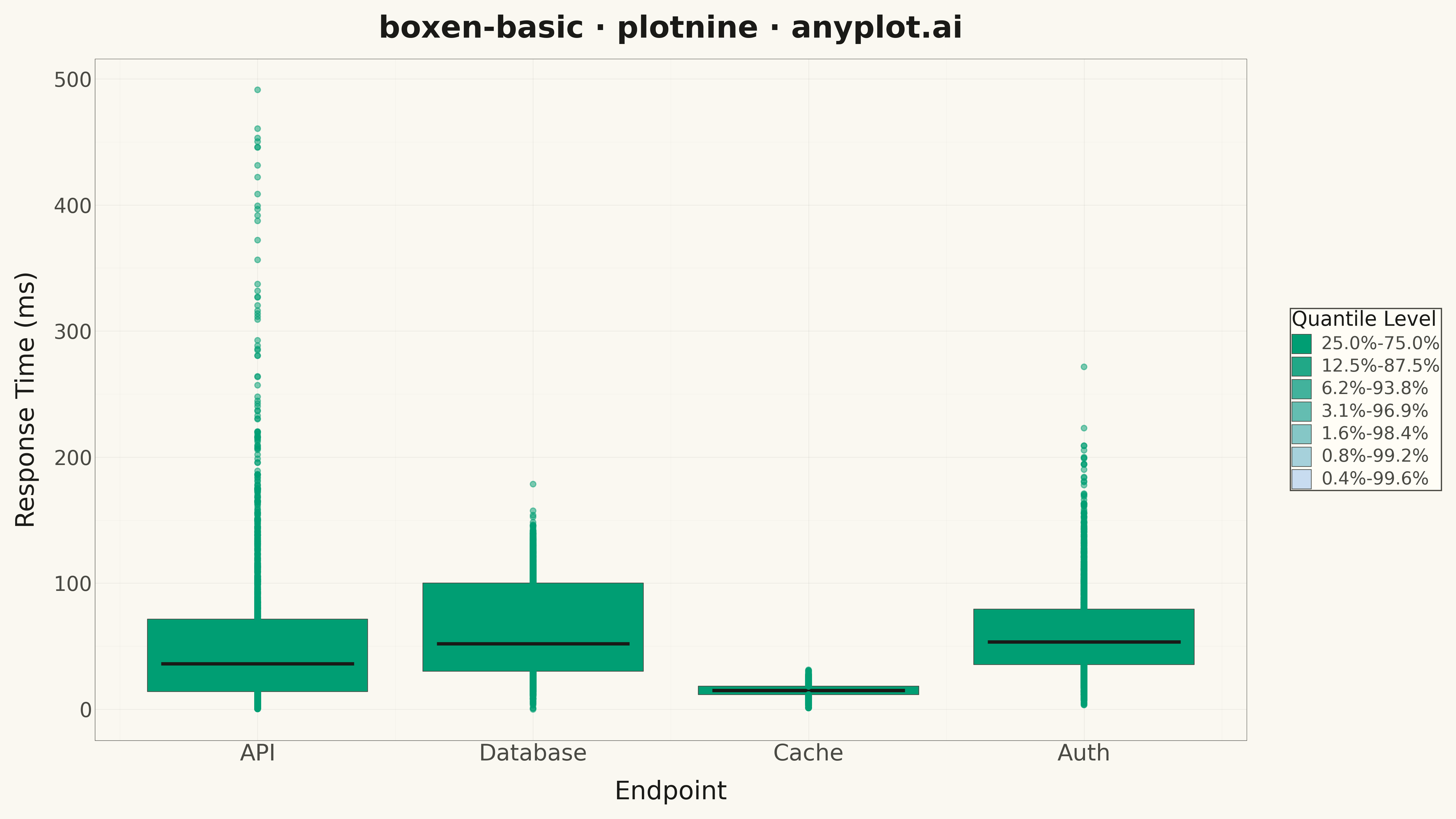
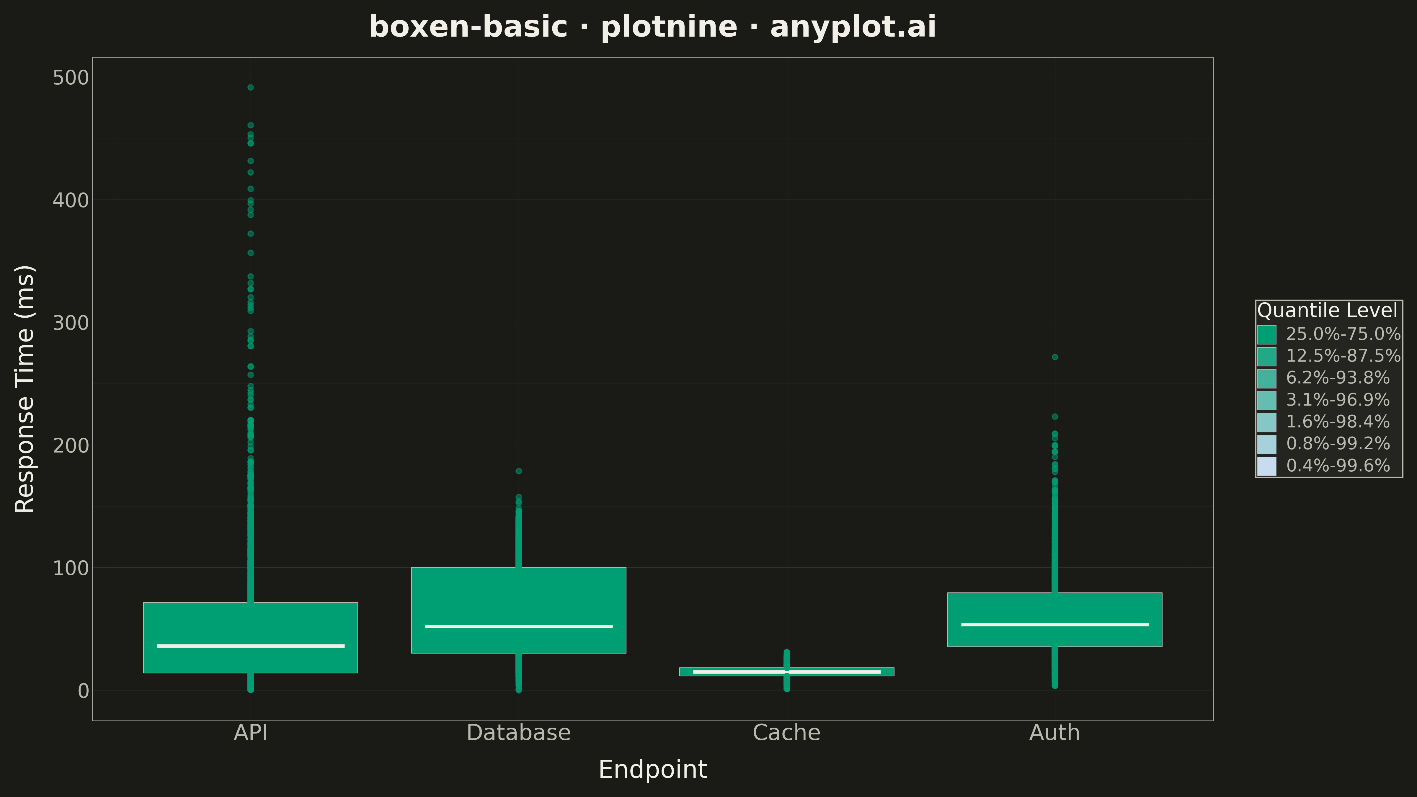
A boxen plot (also known as letter-value plot) extends the traditional box plot to show more quantile information, making it ideal for large datasets with 1000+ observations. Instead of just displaying the median and quartiles, it shows additional "letter values" (eighths, sixteenths, etc.) as nested boxes, revealing the full shape of the distribution including tail behavior. This makes outlier detection more meaningful and distribution comparison more detailed.
""" anyplot.ai
boxen-basic: Basic Boxen Plot (Letter-Value Plot)
Library: plotnine 0.15.4 | Python 3.13.13
Quality: 93/100 | Updated: 2026-05-17
"""

import os
import sys

import numpy as np
import pandas as pd


# Avoid shadowing by removing current directory from path during import
cwd = os.getcwd()
sys.path = [p for p in sys.path if os.path.abspath(p) != cwd]

from plotnine import (
    aes,
    element_line,
    element_rect,
    element_text,
    geom_point,
    geom_rect,
    geom_segment,
    ggplot,
    labs,
    scale_fill_manual,
    scale_x_continuous,
    theme,
    theme_minimal,
)


# Theme tokens
THEME = os.getenv("ANYPLOT_THEME", "light")
PAGE_BG = "#FAF8F1" if THEME == "light" else "#1A1A17"
ELEVATED_BG = "#FFFDF6" if THEME == "light" else "#242420"
INK = "#1A1A17" if THEME == "light" else "#F0EFE8"
INK_SOFT = "#4A4A44" if THEME == "light" else "#B8B7B0"
BRAND = "#009E73"  # Okabe-Ito position 1

# Set seed for reproducibility
np.random.seed(42)

# Generate data - server response times by endpoint (1000+ per category)
n_per_group = 2000
endpoints = ["API", "Database", "Cache", "Auth"]

data = []
for endpoint in endpoints:
    if endpoint == "API":
        # Right-skewed with some outliers
        values = np.concatenate(
            [
                np.random.exponential(50, n_per_group - 20),
                np.random.uniform(300, 500, 20),  # Outliers
            ]
        )
    elif endpoint == "Database":
        # Bimodal - some fast, some slow queries
        values = np.concatenate(
            [np.random.normal(30, 10, n_per_group // 2), np.random.normal(100, 20, n_per_group // 2)]
        )
    elif endpoint == "Cache":
        # Fast and tight distribution
        values = np.random.normal(15, 5, n_per_group)
        values = np.maximum(values, 1)  # No negative response times
    else:  # Auth
        # Medium with heavy tail
        values = np.random.gamma(3, 20, n_per_group)

    for v in values:
        data.append({"endpoint": endpoint, "response_time": v})

df = pd.DataFrame(data)

# Compute letter values for each group
categories = df["endpoint"].unique()
box_data = []
outlier_data = []
median_data = []

# Width parameters
base_width = 0.8
width_decay = 0.85  # Each nested level is 85% of previous width

for i, cat in enumerate(categories):
    values = df[df["endpoint"] == cat]["response_time"].values

    # Calculate letter values (quantiles) inline
    n = len(values)
    k = min(max(3, int(np.floor(np.log2(n)) - 2)), 8)  # Adaptive levels, cap at 8

    # Compute quantile depths
    depths = [0.5]  # Start with median
    for j in range(1, k):
        depth = 0.5 ** (j + 1)
        depths.append(0.5 - depth)
        depths.append(0.5 + depth)

    depths = sorted(set(depths))
    quantiles = np.quantile(values, depths)

    # Find median
    median_idx = depths.index(0.5)
    median_val = quantiles[median_idx]
    median_data.append({"x": i, "y": median_val, "endpoint": cat})

    # Create nested boxes from outer to inner
    n_pairs = (len(depths) - 1) // 2
    for level in range(n_pairs):
        lower_idx = level
        upper_idx = len(depths) - 1 - level
        ymin = quantiles[lower_idx]
        ymax = quantiles[upper_idx]
        width = base_width * (width_decay**level)

        box_data.append(
            {
                "endpoint": cat,
                "x": i,
                "xmin": i - width / 2,
                "xmax": i + width / 2,
                "ymin": ymin,
                "ymax": ymax,
                "level": level,
            }
        )

    # Outliers beyond deepest letter value
    lower_bound = quantiles[0]
    upper_bound = quantiles[-1]
    outliers = values[(values < lower_bound) | (values > upper_bound)]
    for o in outliers:
        outlier_data.append({"x": i, "y": o, "endpoint": cat})

box_df = pd.DataFrame(box_data)
outlier_df = pd.DataFrame(outlier_data) if outlier_data else pd.DataFrame(columns=["x", "y", "endpoint"])
median_df = pd.DataFrame(median_data)

# Color palette - high contrast gradient with brand color base
# Using Okabe-Ito greens and blues for better contrast
n_levels = box_df["level"].max() + 1 if len(box_df) > 0 else 1
colors = []
if n_levels == 1:
    colors = [BRAND]
else:
    # Create a gradient from dark brand to light, with stronger contrast
    for i in range(n_levels):
        t = i / max(n_levels - 1, 1)  # 0 to 1
        # Interpolate from darker brand shade to lighter version
        r = int(0 + t * (200 - 0))
        g = int(158 + t * (220 - 158))
        b = int(115 + t * (240 - 115))
        colors.append(f"#{r:02x}{g:02x}{b:02x}")

# Create the plot
plot = (
    ggplot()
    + geom_rect(
        data=box_df.sort_values("level", ascending=False),  # Draw outer boxes first
        mapping=aes(xmin="xmin", xmax="xmax", ymin="ymin", ymax="ymax", fill="factor(level)"),
        color=INK_SOFT,
        size=0.3,
    )
    + geom_segment(data=median_df, mapping=aes(x="x - 0.35", xend="x + 0.35", y="y", yend="y"), color=INK, size=1.5)
    + scale_fill_manual(
        values=colors,
        name="Quantile Level",
        labels=[f"{50 * (0.5 ** (i + 1)):.1f}%-{100 - 50 * (0.5 ** (i + 1)):.1f}%" for i in range(n_levels)],
    )
    + labs(title="boxen-basic · plotnine · anyplot.ai", x="Endpoint", y="Response Time (ms)")
    + theme_minimal()
    + theme(
        figure_size=(16, 9),
        plot_background=element_rect(fill=PAGE_BG, color=PAGE_BG),
        panel_background=element_rect(fill=PAGE_BG),
        panel_grid_major=element_line(color=INK, alpha=0.10, size=0.3),
        panel_grid_minor=element_line(color=INK, alpha=0.05, size=0.2),
        panel_border=element_rect(color=INK_SOFT, fill=None, size=0.3),
        axis_line=element_line(color=INK_SOFT, size=0.3),
        plot_title=element_text(size=24, color=INK, weight="bold"),
        axis_title=element_text(size=20, color=INK),
        axis_text=element_text(size=16, color=INK_SOFT),
        axis_text_x=element_text(size=18, color=INK_SOFT),
        legend_title=element_text(size=16, color=INK),
        legend_text=element_text(size=14, color=INK_SOFT),
        legend_background=element_rect(fill=ELEVATED_BG, color=INK_SOFT),
        legend_position="right",
    )
)

# Add outliers if present
if len(outlier_df) > 0:
    plot = plot + geom_point(data=outlier_df, mapping=aes(x="x", y="y"), color=BRAND, size=2, alpha=0.5)

# Custom x-axis scale for category names
plot = plot + scale_x_continuous(breaks=list(range(len(categories))), labels=list(categories))

# Save the plot
plot.save(f"plot-{THEME}.png", dpi=300, width=16, height=9)
Runnable source as JSON, for any HTTP client: https://api.anyplot.ai/specs/boxen-basic/plotnine/code. Any spec id and library id listed in llms-full.txt fit the same URL shape; every URL below is complete and callable.
{
  "spec_id": "boxen-basic",
  "language": "python",
  "library": "plotnine",
  "page": "https://anyplot.ai/boxen-basic/python/plotnine",
  "hub": "https://anyplot.ai/boxen-basic",
  "code_json": "https://api.anyplot.ai/specs/boxen-basic/plotnine/code",
  "spec_json": "https://api.anyplot.ai/specs/boxen-basic",
  "render_light_png": "https://storage.googleapis.com/anyplot-images/plots/boxen-basic/python/plotnine/plot-light.png",
  "render_dark_png": "https://storage.googleapis.com/anyplot-images/plots/boxen-basic/python/plotnine/plot-dark.png",
  "quality_score": 93.0,
  "license": "MIT",
  "guide": "https://anyplot.ai/llms.txt"
}
Part of Basic Boxen Plot (Letter-Value Plot) on anyplot.ai.