The same plot in 14 other libraries — JavaScript: D3.js, Apache ECharts, Highcharts, MUI X Charts; Python: Altair, Bokeh, lets-plot, Matplotlib, Plotly, plotnine, Pygal, Seaborn; R: ggplot2; Julia: Makie.jl. Compare all 15 side by side: Basic Bullet Chart in Python, R, Julia and JavaScript.
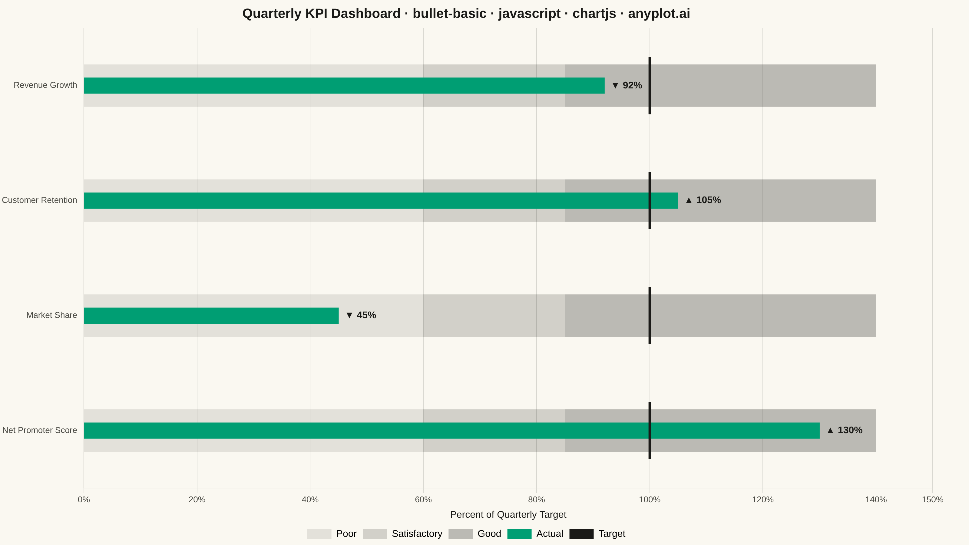
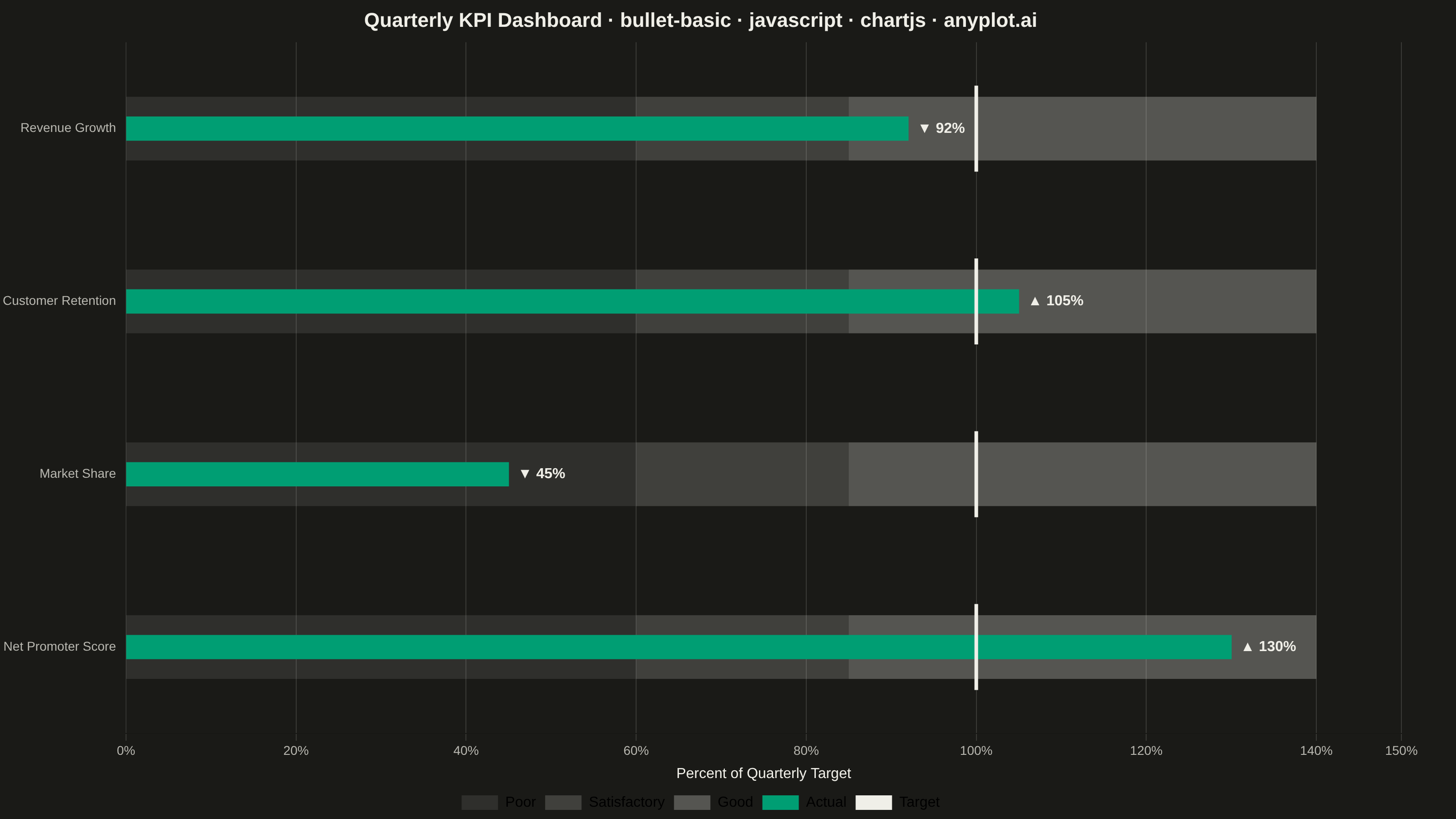
A bullet chart displays a single measure against qualitative ranges and a target marker, designed by Stephen Few as a space-efficient alternative to gauge charts. The linear format shows actual performance as a bar, a target as a vertical marker, and background bands representing qualitative ranges (poor/satisfactory/good). Its compact design allows multiple bullet charts to fit on a single dashboard for easy comparison across metrics.
// anyplot.ai
// bullet-basic: Basic Bullet Chart
// Library: chartjs 4.4.7 | JavaScript 22.23.2
// Quality: 88/100 | Created: 2026-08-24

const t = window.ANYPLOT_TOKENS;
const theme = window.ANYPLOT_THEME || "light";

// --- Data (in-memory, deterministic) ----------------------------------------
// Quarterly KPIs normalized to a common "% of target" scale so the bullets
// stay comparable at a glance, per anyplot's own dashboard-alignment note.
// Market Share deliberately lands in the "Poor" band so the demo covers all
// three qualitative outcomes, not just satisfactory/good.
const metrics = [
  { name: "Revenue Growth", actual: 92, target: 100 },
  { name: "Customer Retention", actual: 105, target: 100 },
  { name: "Market Share", actual: 45, target: 100 },
  { name: "Net Promoter Score", actual: 130, target: 100 },
];
const ranges = [60, 85, 140]; // poor / satisfactory / good band boundaries
const rangeBounds = [
  [0, ranges[0]],
  [ranges[0], ranges[1]],
  [ranges[1], ranges[2]],
];

// Grayscale bands read as chrome (structural, not data) — built from the ink
// token so they stay theme-adaptive while staying strictly grayscale.
const inkRGB = theme === "light" ? "26,26,23" : "240,239,232";
const bandColors = [`rgba(${inkRGB},0.10)`, `rgba(${inkRGB},0.18)`, `rgba(${inkRGB},0.28)`];

const categories = metrics.map((m) => m.name);
const bandThickness = 70;
const actualThickness = 26;

// --- Mount -------------------------------------------------------------------
const canvas = document.createElement("canvas");
document.getElementById("container").appendChild(canvas);

// --- Custom draw: qualitative bands + target ticks + value labels -----------
// Core Chart.js plugin API (beforeDatasetsDraw / afterDatasetsDraw hooks) — no
// external plugin package. Chart.js's `grouped: false` does not actually
// overlay multiple bar datasets on the same row in this version (each dataset
// still gets its own lane), so bands, target ticks, and labels are all drawn
// manually here off the single "Actual" bar's own row geometry — guaranteeing
// every visual element for a row shares one y-center and never drifts apart.
const bulletExtrasPlugin = {
  id: "bulletExtras",
  beforeDatasetsDraw(chart) {
    const { ctx, scales } = chart;
    const meta = chart.getDatasetMeta(0);
    const half = bandThickness / 2;
    ctx.save();
    metrics.forEach((m, i) => {
      const row = meta.data[i];
      rangeBounds.forEach(([lo, hi], bandIdx) => {
        const x0 = scales.x.getPixelForValue(lo);
        const x1 = scales.x.getPixelForValue(hi);
        ctx.fillStyle = bandColors[bandIdx];
        ctx.fillRect(x0, row.y - half, x1 - x0, bandThickness);
      });
    });
    ctx.restore();
  },
  afterDatasetsDraw(chart) {
    const { ctx, scales } = chart;
    const meta = chart.getDatasetMeta(0);
    const half = (bandThickness / 2) * 1.35;
    ctx.save();
    metrics.forEach((m, i) => {
      const row = meta.data[i];
      const targetX = scales.x.getPixelForValue(m.target);
      ctx.strokeStyle = t.ink;
      ctx.lineWidth = 4;
      ctx.beginPath();
      ctx.moveTo(targetX, row.y - half);
      ctx.lineTo(targetX, row.y + half);
      ctx.stroke();

      // Shape-coded (not hue-coded) over/under-target cue — keeps the CVD-safe
      // all-ink text while still calling out which metrics missed target.
      const arrow = m.actual >= m.target ? "▲" : "▼";
      ctx.fillStyle = t.ink;
      ctx.font = "600 16px sans-serif";
      ctx.textBaseline = "middle";
      ctx.textAlign = "left";
      ctx.fillText(`${arrow} ${m.actual}%`, row.x + 10, row.y);
    });
    ctx.restore();
  },
};

// --- Chart ---------------------------------------------------------------------
new Chart(canvas, {
  type: "bar",
  data: {
    labels: categories,
    datasets: [
      {
        label: "Actual",
        data: metrics.map((m) => [0, m.actual]),
        backgroundColor: t.palette[0],
        barThickness: actualThickness,
        borderWidth: 0,
      },
    ],
  },
  options: {
    indexAxis: "y",
    responsive: true,
    maintainAspectRatio: false,
    animation: false,
    layout: { padding: { right: 60 } },
    plugins: {
      title: {
        display: true,
        text: "Quarterly KPI Dashboard · bullet-basic · javascript · chartjs · anyplot.ai",
        color: t.ink,
        font: { size: 22 },
      },
      legend: {
        position: "bottom",
        labels: {
          color: t.ink,
          font: { size: 16 },
          generateLabels: () => [
            { text: "Poor", fillStyle: bandColors[0], strokeStyle: bandColors[0], lineWidth: 0 },
            { text: "Satisfactory", fillStyle: bandColors[1], strokeStyle: bandColors[1], lineWidth: 0 },
            { text: "Good", fillStyle: bandColors[2], strokeStyle: bandColors[2], lineWidth: 0 },
            { text: "Actual", fillStyle: t.palette[0], strokeStyle: t.palette[0], lineWidth: 0 },
            { text: "Target", fillStyle: t.ink, strokeStyle: t.ink, lineWidth: 0 },
          ],
        },
      },
    },
    scales: {
      x: {
        min: 0,
        max: 150,
        ticks: { color: t.inkSoft, font: { size: 14 }, callback: (v) => `${v}%` },
        grid: { color: t.grid },
        title: { display: true, text: "Percent of Quarterly Target", color: t.ink, font: { size: 16 } },
      },
      y: {
        ticks: { color: t.inkSoft, font: { size: 14 } },
        grid: { display: false },
      },
    },
  },
  plugins: [bulletExtrasPlugin],
});
Runnable source as JSON, for any HTTP client: https://api.anyplot.ai/specs/bullet-basic/chartjs/code. Any spec id and library id listed in llms-full.txt fit the same URL shape; every URL below is complete and callable.
{
  "spec_id": "bullet-basic",
  "language": "javascript",
  "library": "chartjs",
  "page": "https://anyplot.ai/bullet-basic/javascript/chartjs",
  "hub": "https://anyplot.ai/bullet-basic",
  "code_json": "https://api.anyplot.ai/specs/bullet-basic/chartjs/code",
  "spec_json": "https://api.anyplot.ai/specs/bullet-basic",
  "render_light_png": "https://storage.googleapis.com/anyplot-images/plots/bullet-basic/javascript/chartjs/plot-light.png",
  "render_dark_png": "https://storage.googleapis.com/anyplot-images/plots/bullet-basic/javascript/chartjs/plot-dark.png",
  "interactive_light_html": "https://storage.googleapis.com/anyplot-images/plots/bullet-basic/javascript/chartjs/plot-light.html",
  "interactive_dark_html": "https://storage.googleapis.com/anyplot-images/plots/bullet-basic/javascript/chartjs/plot-dark.html",
  "quality_score": 88.0,
  "license": "MIT",
  "guide": "https://anyplot.ai/llms.txt"
}
Part of Basic Bullet Chart on anyplot.ai.