The same plot in 14 other libraries — JavaScript: Chart.js, D3.js, Apache ECharts, Highcharts; Python: Altair, Bokeh, lets-plot, Matplotlib, Plotly, plotnine, Pygal, Seaborn; R: ggplot2; Julia: Makie.jl. Compare all 15 side by side: Basic Bullet Chart in Python, R, Julia and JavaScript.
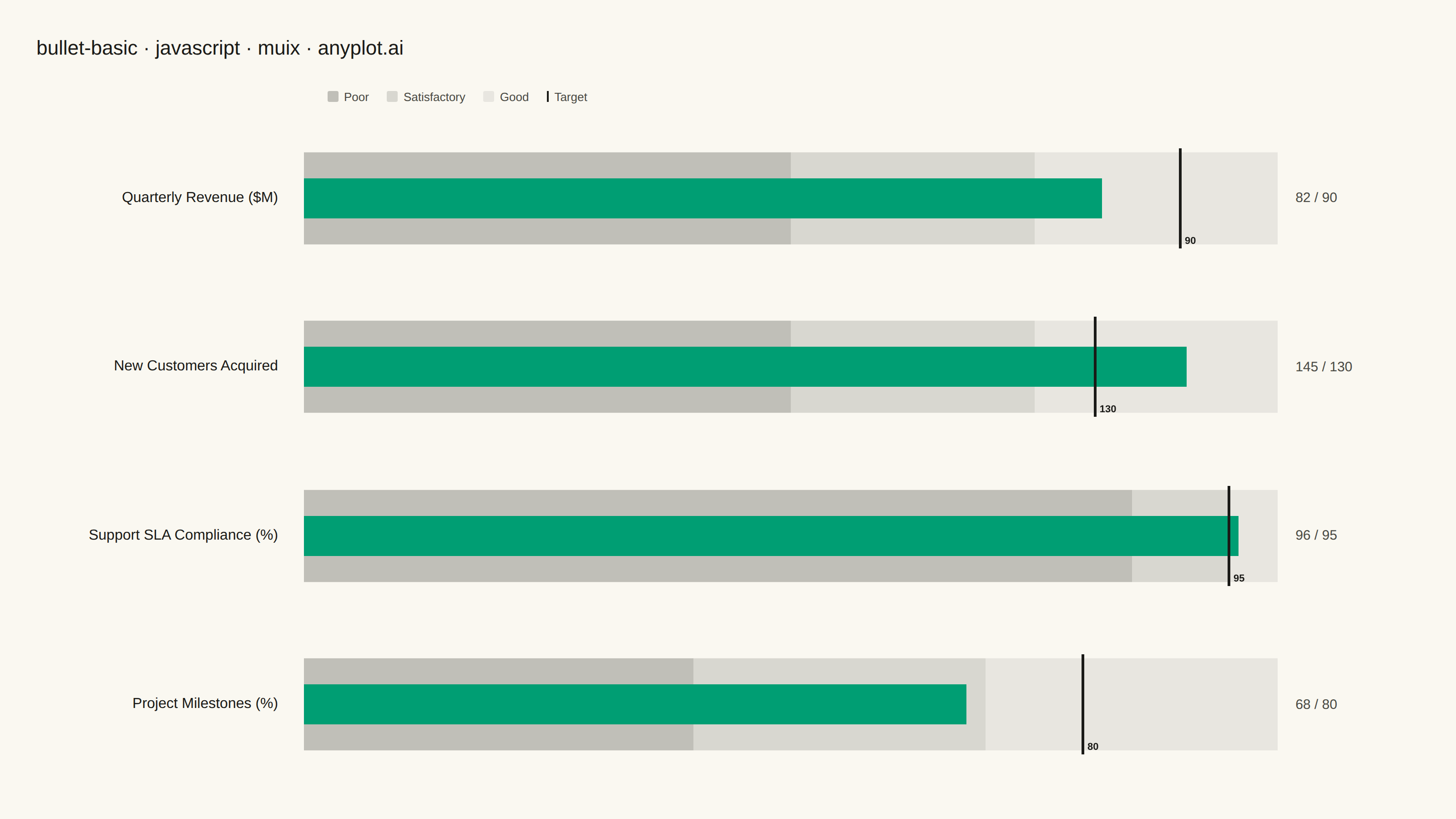
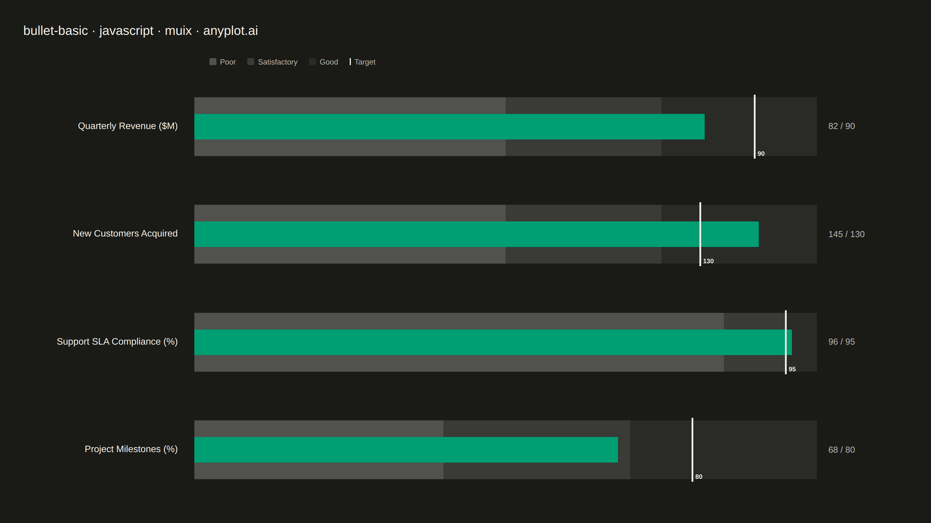
A bullet chart displays a single measure against qualitative ranges and a target marker, designed by Stephen Few as a space-efficient alternative to gauge charts. The linear format shows actual performance as a bar, a target as a vertical marker, and background bands representing qualitative ranges (poor/satisfactory/good). Its compact design allows multiple bullet charts to fit on a single dashboard for easy comparison across metrics.
// anyplot.ai
// bullet-basic: Basic Bullet Chart
// Library: muix 7.29.1 | JavaScript 22.23.2
// Quality: 91/100 | Created: 2026-08-24
import { BarChart } from "@mui/x-charts/BarChart";
import { ChartsReferenceLine } from "@mui/x-charts/ChartsReferenceLine";

const t = window.ANYPLOT_TOKENS;
const SIZE = window.ANYPLOT_SIZE;

// --- Data (in-memory, deterministic) ----------------------------------------
// Quarterly KPI dashboard: actual performance vs. target, banded by
// poor / satisfactory / good qualitative ranges (Stephen Few's design).
const kpis = [
  { label: "Quarterly Revenue ($M)", actual: 82, target: 90, ranges: [50, 75, 100] },
  { label: "New Customers Acquired", actual: 145, target: 130, ranges: [80, 120, 160] },
  { label: "Support SLA Compliance (%)", actual: 96, target: 95, ranges: [85, 95, 100] },
  { label: "Project Milestones (%)", actual: 68, target: 80, ranges: [40, 70, 100] },
];

const hexToRgba = (hex, alpha) => {
  const int = parseInt(hex.slice(1), 16);
  const r = (int >> 16) & 255;
  const g = (int >> 8) & 255;
  const b = int & 255;
  return `rgba(${r}, ${g}, ${b}, ${alpha})`;
};

// Grayscale range-band shading (darkest = poor, lightest = good) per spec notes.
const BAND_COLORS = [hexToRgba(t.ink, 0.26), hexToRgba(t.ink, 0.15), hexToRgba(t.ink, 0.08)];
const BAR_COLOR = t.palette[0]; // brand green — the measure, identical across every bullet

// --- Layout constants (CSS px within the mount's coordinate space) ---------
// BAND_HEIGHT occupies most of each row (denser, space-efficient dashboard
// block per the spec's own framing) instead of a thin band lost in tall rows.
const PADDING = 40;
const TITLE_HEIGHT = 40;
const KEY_HEIGHT = 24;
const ROW_GAP = 14;
const LABEL_WIDTH = 300;
const VALUE_WIDTH = 150;
const BAND_HEIGHT = 110;

const rowAreaHeight =
  SIZE.height - PADDING * 2 - TITLE_HEIGHT - KEY_HEIGHT - ROW_GAP * (kpis.length + 1);
const rowHeight = rowAreaHeight / kpis.length;
const chartWidth = SIZE.width - PADDING * 2 - LABEL_WIDTH - VALUE_WIDTH;

function Bullet({ kpi }) {
  const maxRange = kpi.ranges[2];
  const bands = [kpi.ranges[0], kpi.ranges[1] - kpi.ranges[0], kpi.ranges[2] - kpi.ranges[1]];

  return (
    <div style={{ display: "flex", alignItems: "center", height: rowHeight, gap: 20 }}>
      <div
        style={{
          width: LABEL_WIDTH,
          textAlign: "right",
          color: t.ink,
          fontSize: 16,
          fontWeight: 500,
          paddingRight: 8,
        }}
      >
        {kpi.label}
      </div>
      <div style={{ position: "relative", width: chartWidth, height: BAND_HEIGHT }}>
        {/* Background: stacked qualitative range bands, grayscale, full band height */}
        <BarChart
          width={chartWidth}
          height={BAND_HEIGHT}
          layout="horizontal"
          series={bands.map((value, i) => ({ data: [value], stack: "range", color: BAND_COLORS[i] }))}
          xAxis={[{ scaleType: "linear", min: 0, max: maxRange }]}
          yAxis={[{ scaleType: "band", data: [""], categoryGapRatio: 0.08 }]}
          margin={{ top: 0, bottom: 0, left: 0, right: 0 }}
          bottomAxis={null}
          leftAxis={null}
          slotProps={{ legend: { hidden: true } }}
          tooltip={{ trigger: "none" }}
          skipAnimation
        />
        {/* Foreground: thin actual-value bar plus the target reference line */}
        <div style={{ position: "absolute", top: 0, left: 0 }}>
          <BarChart
            width={chartWidth}
            height={BAND_HEIGHT}
            layout="horizontal"
            series={[{ data: [kpi.actual], color: BAR_COLOR }]}
            xAxis={[{ scaleType: "linear", min: 0, max: maxRange }]}
            yAxis={[{ scaleType: "band", data: [""], categoryGapRatio: 0.6 }]}
            margin={{ top: 0, bottom: 0, left: 0, right: 0 }}
            bottomAxis={null}
            leftAxis={null}
            slotProps={{ legend: { hidden: true } }}
            tooltip={{ trigger: "none" }}
            skipAnimation
          >
            <ChartsReferenceLine
              x={kpi.target}
              lineStyle={{ stroke: t.ink, strokeWidth: 3 }}
              label={`${kpi.target}`}
              labelStyle={{ fill: t.ink, fontSize: 11, fontWeight: 600 }}
              labelAlign="end"
            />
          </BarChart>
        </div>
      </div>
      <div style={{ width: VALUE_WIDTH, color: t.inkSoft, fontSize: 15 }}>
        {kpi.actual} / {kpi.target}
      </div>
    </div>
  );
}

// --- Chart (default-exported component — the harness mounts it) ------------
export default function Chart() {
  return (
    <div
      style={{
        width: SIZE.width,
        height: SIZE.height,
        padding: PADDING,
        boxSizing: "border-box",
        display: "flex",
        flexDirection: "column",
      }}
    >
      <div style={{ height: TITLE_HEIGHT, color: t.ink, fontSize: 22, fontWeight: 500 }}>
        bullet-basic · javascript · muix · anyplot.ai
      </div>
      <div
        style={{
          display: "flex",
          alignItems: "center",
          height: KEY_HEIGHT,
          marginTop: ROW_GAP,
          marginLeft: LABEL_WIDTH + 20,
          gap: 20,
          fontSize: 13,
          color: t.inkSoft,
        }}
      >
        {["Poor", "Satisfactory", "Good"].map((name, i) => (
          <div key={name} style={{ display: "flex", alignItems: "center", gap: 6 }}>
            <span style={{ width: 12, height: 12, background: BAND_COLORS[i], borderRadius: 2 }} />
            {name}
          </div>
        ))}
        <div style={{ display: "flex", alignItems: "center", gap: 6 }}>
          <span style={{ width: 2, height: 12, background: t.ink }} />
          Target
        </div>
      </div>
      <div style={{ display: "flex", flexDirection: "column", gap: ROW_GAP, marginTop: ROW_GAP }}>
        {kpis.map((kpi) => (
          <Bullet key={kpi.label} kpi={kpi} />
        ))}
      </div>
    </div>
  );
}
Runnable source as JSON, for any HTTP client: https://api.anyplot.ai/specs/bullet-basic/muix/code. Any spec id and library id listed in llms-full.txt fit the same URL shape; every URL below is complete and callable.
{
  "spec_id": "bullet-basic",
  "language": "javascript",
  "library": "muix",
  "page": "https://anyplot.ai/bullet-basic/javascript/muix",
  "hub": "https://anyplot.ai/bullet-basic",
  "code_json": "https://api.anyplot.ai/specs/bullet-basic/muix/code",
  "spec_json": "https://api.anyplot.ai/specs/bullet-basic",
  "render_light_png": "https://storage.googleapis.com/anyplot-images/plots/bullet-basic/javascript/muix/plot-light.png",
  "render_dark_png": "https://storage.googleapis.com/anyplot-images/plots/bullet-basic/javascript/muix/plot-dark.png",
  "interactive_light_html": "https://storage.googleapis.com/anyplot-images/plots/bullet-basic/javascript/muix/plot-light.html",
  "interactive_dark_html": "https://storage.googleapis.com/anyplot-images/plots/bullet-basic/javascript/muix/plot-dark.html",
  "quality_score": 91.0,
  "license": "MIT",
  "guide": "https://anyplot.ai/llms.txt"
}
Part of Basic Bullet Chart on anyplot.ai.