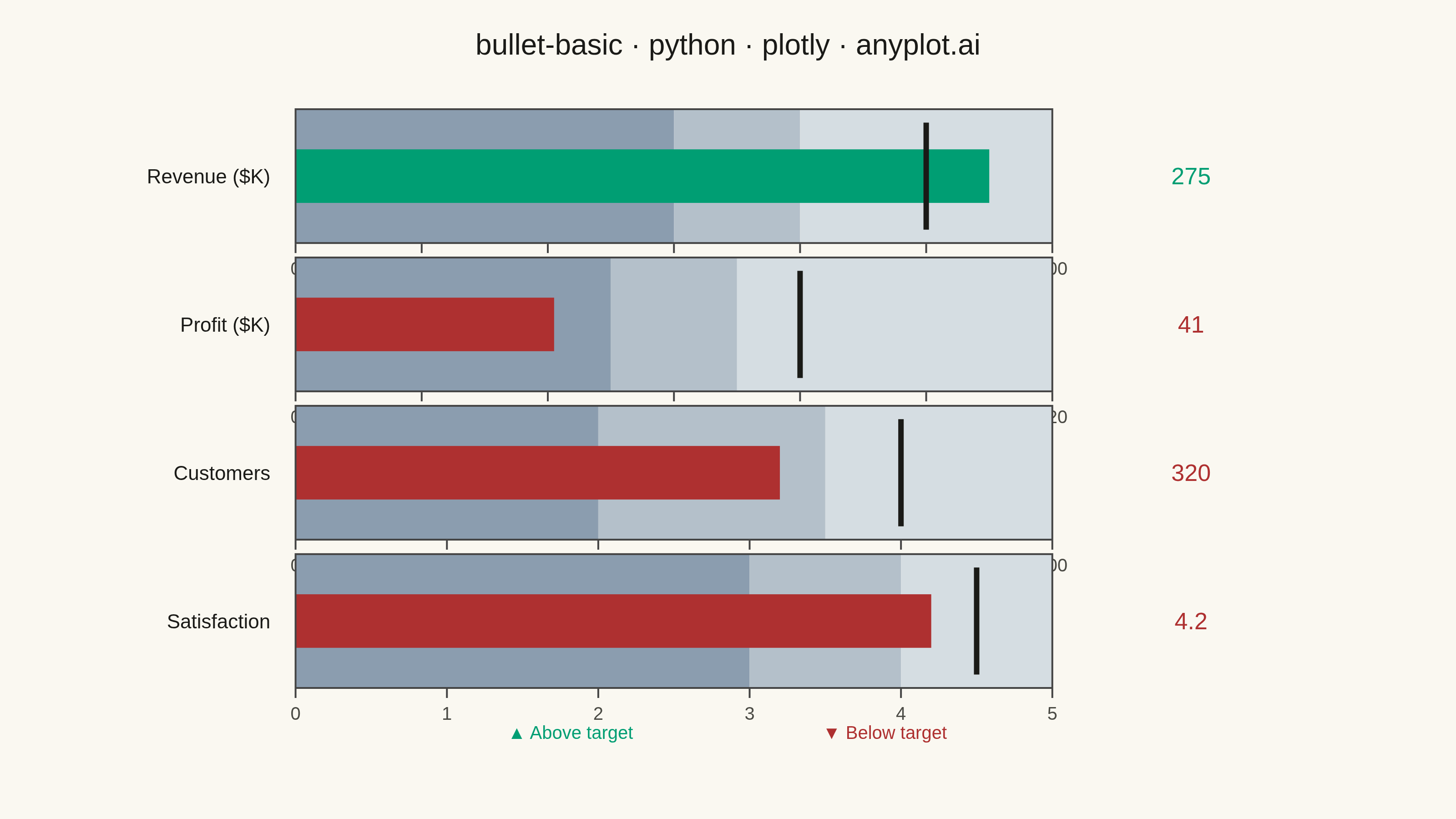
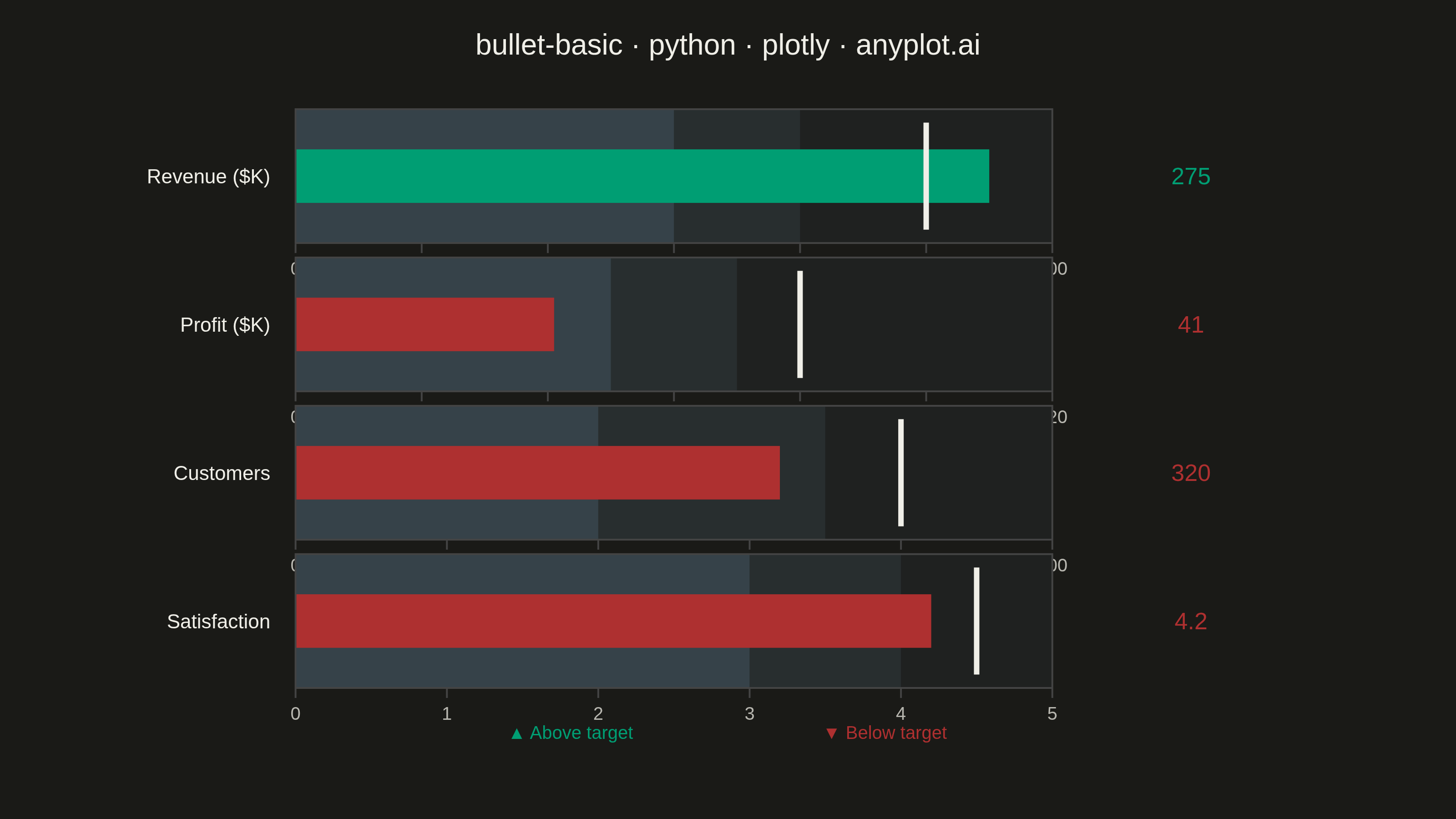
A bullet chart displays a single measure against qualitative ranges and a target marker, designed by Stephen Few as a space-efficient alternative to gauge charts. The linear format shows actual performance as a bar, a target as a vertical marker, and background bands representing qualitative ranges (poor/satisfactory/good). Its compact design allows multiple bullet charts to fit on a single dashboard for easy comparison across metrics.
""" anyplot.ai
bullet-basic: Basic Bullet Chart
Library: plotly 6.7.0 | Python 3.13.13
Quality: 83/100 | Updated: 2026-05-29
"""

import os
import sys


# Prevent self-import: remove this script's own directory from sys.path so that
# "import plotly" resolves to the installed package, not this file.
_here = os.path.dirname(os.path.abspath(__file__))
sys.path = [p for p in sys.path if os.path.abspath(p) != _here]

import plotly.graph_objects as go


THEME = os.getenv("ANYPLOT_THEME", "light")

# Theme-adaptive chrome — Imprint palette
PAGE_BG = "#FAF8F1" if THEME == "light" else "#1A1A17"
ELEVATED_BG = "#FFFDF6" if THEME == "light" else "#242420"
INK = "#1A1A17" if THEME == "light" else "#F0EFE8"
INK_SOFT = "#4A4A44" if THEME == "light" else "#B8B7B0"
INK_MUTED = "#6B6A63" if THEME == "light" else "#A8A79F"

# Semantic status colors (Imprint palette positions 1 and 5)
ABOVE_TARGET = "#009E73"  # brand green → good / pass / above target
BELOW_TARGET = "#AE3030"  # matte red → bad / fail / below target

# Qualitative range band colors: poor → satisfactory → good
if THEME == "light":
    range_colors = ["#8B9DAF", "#B4C0CA", "#D5DDE2"]
else:
    # Semi-transparent blue-gray overlays on dark bg
    range_colors = ["rgba(120,160,190,0.30)", "rgba(120,160,190,0.15)", "rgba(120,160,190,0.06)"]

# Data — KPI dashboard covering all three qualitative zones:
# Revenue in "good" (above target), Profit in "poor" (far below target),
# Customers and Satisfaction both in "satisfactory" (below target)
metrics = [
    {"label": "Revenue ($K)", "actual": 275, "target": 250, "ranges": [150, 200, 300]},
    {"label": "Profit ($K)", "actual": 41, "target": 80, "ranges": [50, 70, 120]},
    {"label": "Customers", "actual": 320, "target": 400, "ranges": [200, 350, 500]},
    {"label": "Satisfaction", "actual": 4.2, "target": 4.5, "ranges": [3.0, 4.0, 5.0]},
]

fig = go.Figure()
n = len(metrics)
spacing = 0.025
row_height = (1.0 - spacing * (n - 1)) / n

for i, m in enumerate(metrics):
    y_end = 1.0 - i * (row_height + spacing)
    y_start = max(0.0, y_end - row_height)
    meets_target = m["actual"] >= m["target"]
    bar_color = ABOVE_TARGET if meets_target else BELOW_TARGET

    fig.add_trace(
        go.Indicator(
            mode="number+gauge",
            value=m["actual"],
            number={"font": {"size": 13, "color": bar_color, "family": "Helvetica Neue, Arial, sans-serif"}},
            domain={"x": [0.17, 0.94], "y": [y_start, y_end]},
            title={
                "text": m["label"],
                "font": {"size": 11, "color": INK, "family": "Helvetica Neue, Arial, sans-serif"},
                "align": "left",
            },
            gauge={
                "shape": "bullet",
                "axis": {
                    "range": [0, m["ranges"][-1]],
                    "tickfont": {"size": 10, "color": INK_SOFT, "family": "Helvetica Neue, Arial, sans-serif"},
                },
                "bar": {"color": bar_color, "thickness": 0.4},
                "bgcolor": PAGE_BG,
                "threshold": {"line": {"color": INK, "width": 3}, "thickness": 0.8, "value": m["target"]},
                "steps": [
                    {"range": [0, m["ranges"][0]], "color": range_colors[0]},
                    {"range": [m["ranges"][0], m["ranges"][1]], "color": range_colors[1]},
                    {"range": [m["ranges"][1], m["ranges"][2]], "color": range_colors[2]},
                ],
            },
        )
    )

# Status legend — centered below the chart as a footer (more connected to data)
fig.add_annotation(
    x=0.38,
    y=-0.10,
    xref="paper",
    yref="paper",
    text="▲ Above target",
    showarrow=False,
    font={"size": 10, "color": ABOVE_TARGET, "family": "Helvetica Neue, Arial, sans-serif"},
    xanchor="center",
)
fig.add_annotation(
    x=0.62,
    y=-0.10,
    xref="paper",
    yref="paper",
    text="▼ Below target",
    showarrow=False,
    font={"size": 10, "color": BELOW_TARGET, "family": "Helvetica Neue, Arial, sans-serif"},
    xanchor="center",
)

fig.update_layout(
    autosize=False,
    title={
        "text": "bullet-basic · python · plotly · anyplot.ai",
        "font": {"size": 16, "family": "Helvetica Neue, Arial, sans-serif", "color": INK},
        "x": 0.5,
        "xanchor": "center",
    },
    paper_bgcolor=PAGE_BG,
    plot_bgcolor=PAGE_BG,
    font={"color": INK, "family": "Helvetica Neue, Arial, sans-serif"},
    margin={"l": 40, "r": 40, "t": 60, "b": 72},
    width=800,
    height=450,
)

fig.write_image(f"plot-{THEME}.png", width=800, height=450, scale=4)
fig.write_html(f"plot-{THEME}.html", include_plotlyjs="cdn")
Runnable source as JSON, for any HTTP client: https://api.anyplot.ai/specs/bullet-basic/plotly/code. Any spec id and library id listed in llms-full.txt fit the same URL shape; every URL below is complete and callable.
{
  "spec_id": "bullet-basic",
  "language": "python",
  "library": "plotly",
  "page": "https://anyplot.ai/bullet-basic/python/plotly",
  "hub": "https://anyplot.ai/bullet-basic",
  "code_json": "https://api.anyplot.ai/specs/bullet-basic/plotly/code",
  "spec_json": "https://api.anyplot.ai/specs/bullet-basic",
  "render_light_png": "https://storage.googleapis.com/anyplot-images/plots/bullet-basic/python/plotly/plot-light.png",
  "render_dark_png": "https://storage.googleapis.com/anyplot-images/plots/bullet-basic/python/plotly/plot-dark.png",
  "interactive_light_html": "https://storage.googleapis.com/anyplot-images/plots/bullet-basic/python/plotly/plot-light.html",
  "interactive_dark_html": "https://storage.googleapis.com/anyplot-images/plots/bullet-basic/python/plotly/plot-dark.html",
  "quality_score": 83.0,
  "license": "MIT",
  "guide": "https://anyplot.ai/llms.txt"
}
Part of Basic Bullet Chart on anyplot.ai.