The same plot in 14 other libraries — JavaScript: Chart.js, D3.js, Highcharts, MUI X Charts; Python: Altair, Bokeh, lets-plot, Matplotlib, Plotly, plotnine, Pygal, Seaborn; R: ggplot2; Julia: Makie.jl. Compare all 15 side by side: Basic Bullet Chart in Python, R, Julia and JavaScript.
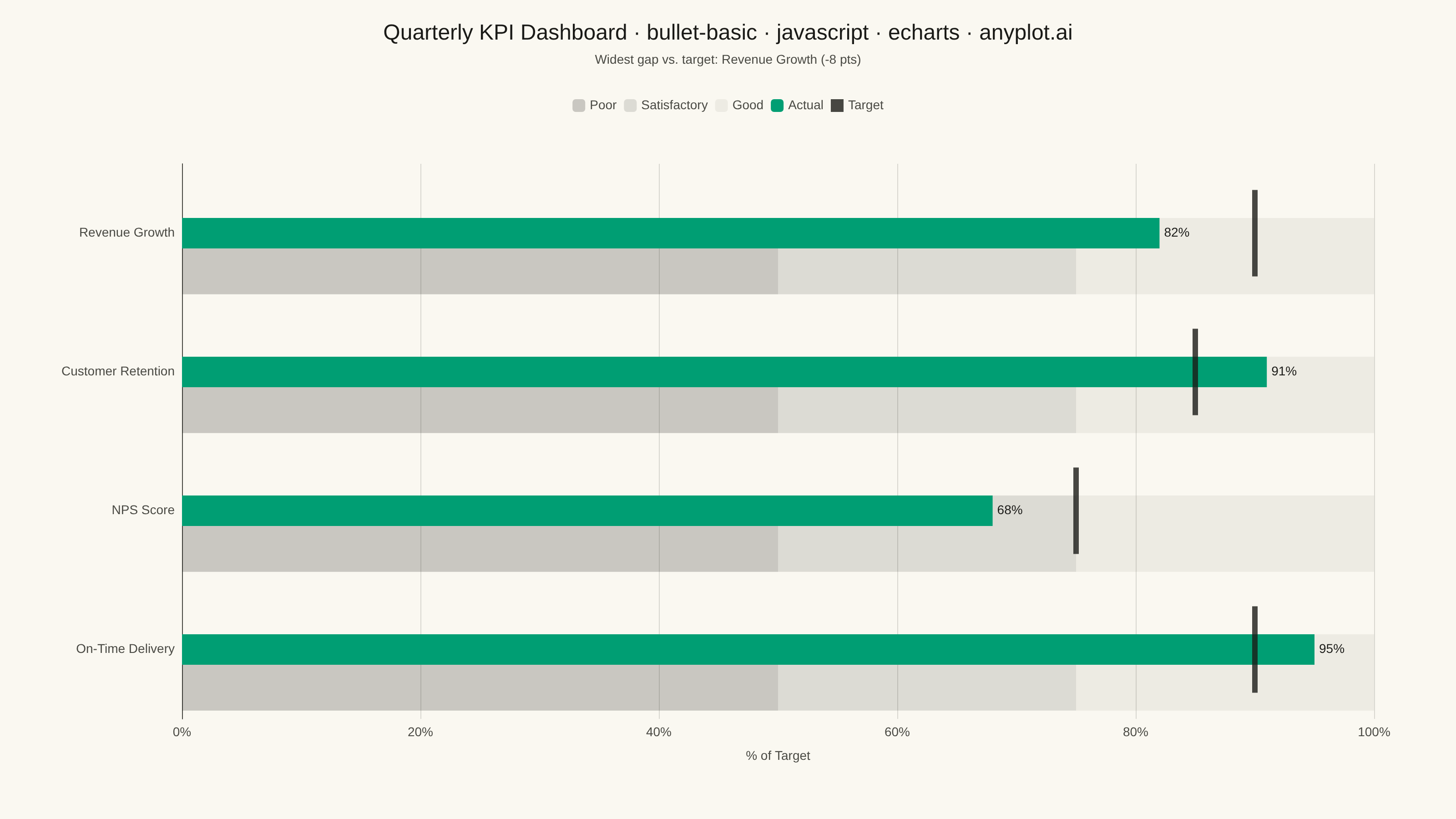
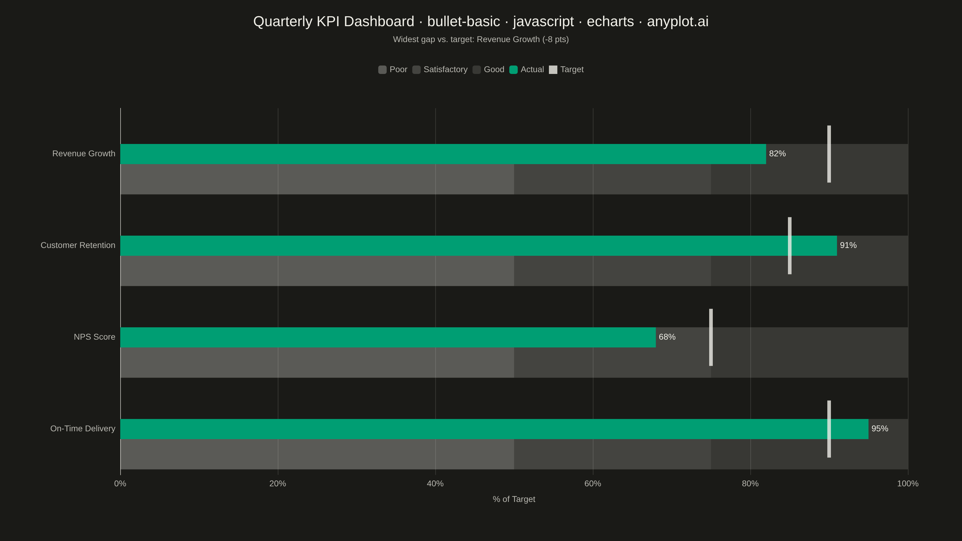
A bullet chart displays a single measure against qualitative ranges and a target marker, designed by Stephen Few as a space-efficient alternative to gauge charts. The linear format shows actual performance as a bar, a target as a vertical marker, and background bands representing qualitative ranges (poor/satisfactory/good). Its compact design allows multiple bullet charts to fit on a single dashboard for easy comparison across metrics.
// anyplot.ai
// bullet-basic: Basic Bullet Chart
// Library: echarts 6.1.0 | JavaScript 22.23.2
// Quality: 89/100 | Created: 2026-08-24
//# anyplot-orientation: landscape

const t = window.ANYPLOT_TOKENS;
const isDark = window.ANYPLOT_THEME === "dark";

// --- Data (in-memory, deterministic) ----------------------------------------
// Quarterly KPI dashboard — every metric normalised to "% of target achieved"
// so the four bullets share one common scale, as recommended for comparison.
const labels = ["Revenue Growth", "Customer Retention", "NPS Score", "On-Time Delivery"];
const actual = [82, 91, 68, 95];
const target = [90, 85, 75, 90];
const ranges = [50, 75, 100]; // poor / satisfactory / good thresholds, shared by all rows

const bandPoor = labels.map(() => ranges[0]);
const bandSatisfactory = labels.map(() => ranges[1] - ranges[0]);
const bandGood = labels.map(() => ranges[2] - ranges[1]);
const targetPoints = target.map((value, index) => [value, index]);

// Band opacity needs a higher floor in dark theme, or the lightest ("Good")
// band nearly disappears against the near-black page background.
const bandOpacity = isDark ? [0.3, 0.2, 0.14] : [0.22, 0.13, 0.06];

// Callout: highlight the metric with the widest actual-vs-target gap.
const gaps = actual.map((value, index) => value - target[index]);
const widestGapIndex = gaps.reduce(
  (best, gap, index) => (Math.abs(gap) > Math.abs(gaps[best]) ? index : best),
  0
);
const widestGapText = `Widest gap vs. target: ${labels[widestGapIndex]} (${
  gaps[widestGapIndex] > 0 ? "+" : ""
}${gaps[widestGapIndex]} pts)`;

// --- Init ---------------------------------------------------------------------
const chart = echarts.init(document.getElementById("container"));

// --- Option ---------------------------------------------------------------------
chart.setOption({
  animation: false,
  backgroundColor: "transparent",
  title: {
    text: "Quarterly KPI Dashboard · bullet-basic · javascript · echarts · anyplot.ai",
    subtext: widestGapText,
    left: "center",
    top: 20,
    textStyle: { color: t.ink, fontSize: 24, fontWeight: 500 },
    subtextStyle: { color: t.inkSoft, fontSize: 14 },
  },
  legend: {
    top: 104,
    left: "center",
    data: ["Poor", "Satisfactory", "Good", "Actual", "Target"],
    itemWidth: 14,
    itemHeight: 14,
    textStyle: { color: t.inkSoft, fontSize: 14 },
  },
  grid: { left: 200, right: 90, top: 180, bottom: 110 },
  xAxis: {
    type: "value",
    min: 0,
    max: 100,
    name: "% of Target",
    nameLocation: "middle",
    nameGap: 34,
    nameTextStyle: { color: t.inkSoft, fontSize: 14 },
    axisLabel: { color: t.inkSoft, fontSize: 14, formatter: "{value}%" },
    axisLine: { lineStyle: { color: t.inkSoft } },
    splitLine: { lineStyle: { color: t.grid } },
  },
  yAxis: {
    type: "category",
    data: labels,
    inverse: true,
    axisLabel: { color: t.inkSoft, fontSize: 14 },
    axisLine: { lineStyle: { color: t.inkSoft } },
    axisTick: { show: false },
    splitLine: { show: false },
  },
  series: [
    {
      name: "Poor",
      type: "bar",
      stack: "range",
      barWidth: "55%",
      silent: true,
      data: bandPoor,
      itemStyle: { color: t.ink, opacity: bandOpacity[0] },
      z: 1,
    },
    {
      name: "Satisfactory",
      type: "bar",
      stack: "range",
      barWidth: "55%",
      silent: true,
      data: bandSatisfactory,
      itemStyle: { color: t.ink, opacity: bandOpacity[1] },
      z: 1,
    },
    {
      name: "Good",
      type: "bar",
      stack: "range",
      barWidth: "55%",
      silent: true,
      data: bandGood,
      itemStyle: { color: t.ink, opacity: bandOpacity[2] },
      z: 1,
    },
    {
      name: "Actual",
      type: "bar",
      barWidth: "22%",
      barGap: "-100%",
      data: actual,
      itemStyle: { color: t.palette[0] },
      label: {
        show: true,
        position: "right",
        color: t.ink,
        fontSize: 14,
        formatter: (p) => `${p.value}%`,
      },
      z: 2,
    },
    {
      name: "Target",
      type: "scatter",
      symbol: "rect",
      symbolSize: [6, 95],
      data: targetPoints,
      itemStyle: { color: t.ink },
      z: 3,
    },
  ],
});
Runnable source as JSON, for any HTTP client: https://api.anyplot.ai/specs/bullet-basic/echarts/code. Any spec id and library id listed in llms-full.txt fit the same URL shape; every URL below is complete and callable.
{
  "spec_id": "bullet-basic",
  "language": "javascript",
  "library": "echarts",
  "page": "https://anyplot.ai/bullet-basic/javascript/echarts",
  "hub": "https://anyplot.ai/bullet-basic",
  "code_json": "https://api.anyplot.ai/specs/bullet-basic/echarts/code",
  "spec_json": "https://api.anyplot.ai/specs/bullet-basic",
  "render_light_png": "https://storage.googleapis.com/anyplot-images/plots/bullet-basic/javascript/echarts/plot-light.png",
  "render_dark_png": "https://storage.googleapis.com/anyplot-images/plots/bullet-basic/javascript/echarts/plot-dark.png",
  "interactive_light_html": "https://storage.googleapis.com/anyplot-images/plots/bullet-basic/javascript/echarts/plot-light.html",
  "interactive_dark_html": "https://storage.googleapis.com/anyplot-images/plots/bullet-basic/javascript/echarts/plot-dark.html",
  "quality_score": 89.0,
  "license": "MIT",
  "guide": "https://anyplot.ai/llms.txt"
}
Part of Basic Bullet Chart on anyplot.ai.