The same plot in 14 other libraries — Python: Altair, Bokeh, lets-plot, Matplotlib, Plotly, plotnine, Pygal, Seaborn; Julia: Makie.jl; JavaScript: Chart.js, D3.js, Apache ECharts, Highcharts, MUI X Charts. Compare all 15 side by side: Basic Bullet Chart in Python, R, Julia and JavaScript.
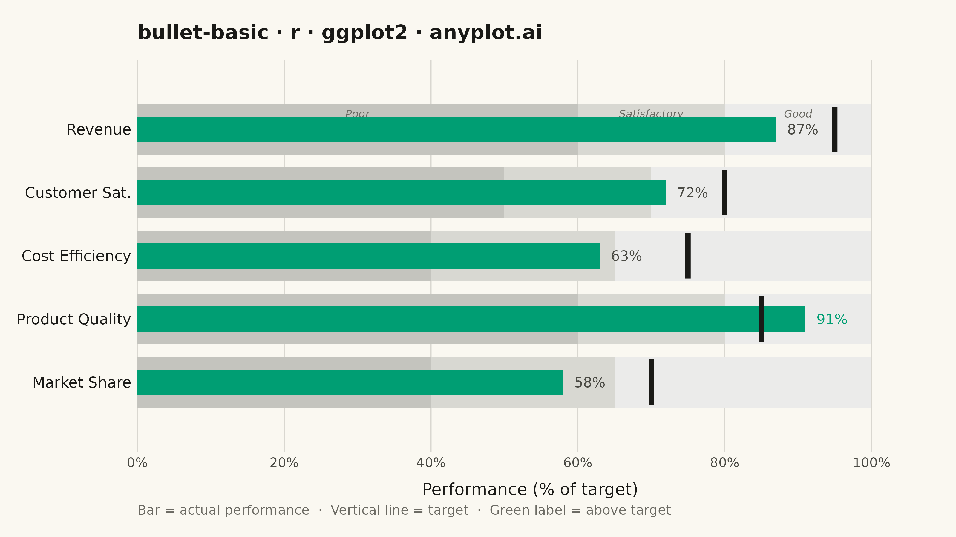
A bullet chart displays a single measure against qualitative ranges and a target marker, designed by Stephen Few as a space-efficient alternative to gauge charts. The linear format shows actual performance as a bar, a target as a vertical marker, and background bands representing qualitative ranges (poor/satisfactory/good). Its compact design allows multiple bullet charts to fit on a single dashboard for easy comparison across metrics.
#' anyplot.ai
#' bullet-basic: Basic Bullet Chart
#' Library: ggplot2 3.5.1 | R 4.4.1
#' Quality: 89/100 | Created: 2026-05-29

library(ggplot2)
library(ragg)

set.seed(42)

# --- Theme tokens -----------------------------------------------------------
THEME       <- Sys.getenv("ANYPLOT_THEME", "light")
PAGE_BG     <- if (THEME == "light") "#FAF8F1" else "#1A1A17"
ELEVATED_BG <- if (THEME == "light") "#FFFDF6" else "#242420"
INK         <- if (THEME == "light") "#1A1A17" else "#F0EFE8"
INK_SOFT    <- if (THEME == "light") "#4A4A44" else "#B8B7B0"
INK_MUTED   <- if (THEME == "light") "#6B6A63" else "#A8A79F"
GRID        <- paste0(INK, "26")  # INK at ~15% opacity for subtle gridlines

# Qualitative band fills (grayscale, theme-adaptive: dark = poor, light = good)
BAND_POOR <- if (THEME == "light") "#C4C4BE" else "#353530"
BAND_SATS <- if (THEME == "light") "#D8D8D2" else "#464641"
BAND_GOOD <- if (THEME == "light") "#EBEBEA" else "#575752"

# Imprint palette — position 1 used for the actual performance bar
IMPRINT_PALETTE <- c(
  "#009E73", "#C475FD", "#4467A3", "#BD8233",
  "#AE3030", "#2ABCCD", "#954477", "#99B314"
)

# --- Data -------------------------------------------------------------------
# Q2 departmental KPI dashboard: actual performance vs. targets (% of goal)
metrics <- data.frame(
  label      = c("Revenue", "Customer Sat.", "Cost Efficiency", "Product Quality", "Market Share"),
  actual     = c(87, 72, 63, 91, 58),
  target     = c(95, 80, 75, 85, 70),
  range_poor = c(60, 50, 40, 60, 40),
  range_sats = c(80, 70, 65, 80, 65),
  range_good = c(100, 100, 100, 100, 100),
  stringsAsFactors = FALSE
)

n_met     <- nrow(metrics)
# Reversed so first metric appears at the top of the chart
metrics$y_pos <- seq(n_met, 1)

band_h <- 0.40  # half-height of qualitative background bands
bar_h  <- 0.20  # half-height of actual performance bar

# Background qualitative bands (poor / satisfactory / good)
bands_df <- rbind(
  data.frame(
    xmin = rep(0, n_met), xmax = metrics$range_poor,
    ymin = metrics$y_pos - band_h, ymax = metrics$y_pos + band_h,
    fill_color = BAND_POOR, stringsAsFactors = FALSE
  ),
  data.frame(
    xmin = metrics$range_poor, xmax = metrics$range_sats,
    ymin = metrics$y_pos - band_h, ymax = metrics$y_pos + band_h,
    fill_color = BAND_SATS, stringsAsFactors = FALSE
  ),
  data.frame(
    xmin = metrics$range_sats, xmax = metrics$range_good,
    ymin = metrics$y_pos - band_h, ymax = metrics$y_pos + band_h,
    fill_color = BAND_GOOD, stringsAsFactors = FALSE
  )
)

# Actual performance bars (narrower than bands)
bars_df <- data.frame(
  xmin = 0, xmax = metrics$actual,
  ymin = metrics$y_pos - bar_h, ymax = metrics$y_pos + bar_h
)

# Target markers (vertical lines taller than the bar but shorter than the bands)
targets_df <- data.frame(
  x    = metrics$target,
  ymin = metrics$y_pos - band_h * 0.9,
  ymax = metrics$y_pos + band_h * 0.9
)

# Value labels — above-target metric highlighted with bar color for emphasis
above_target <- metrics$actual >= metrics$target
labels_df <- data.frame(
  x      = metrics$actual + 1.5,
  y      = metrics$y_pos,
  label  = paste0(metrics$actual, "%"),
  lcolor = ifelse(above_target, IMPRINT_PALETTE[1], INK_SOFT),
  stringsAsFactors = FALSE
)

# Zone midpoints for annotate() labels in the top row (Revenue, y_pos = 5)
top_y    <- metrics$y_pos[1]
poor_mid <- metrics$range_poor[1] / 2
sats_mid <- metrics$range_poor[1] + (metrics$range_sats[1] - metrics$range_poor[1]) / 2
good_mid <- metrics$range_sats[1] + (metrics$range_good[1] - metrics$range_sats[1]) / 2

# --- Plot -------------------------------------------------------------------
title_str  <- "bullet-basic · r · ggplot2 · anyplot.ai"
n_ch       <- nchar(title_str)
title_size <- max(8, round(12 * (if (n_ch > 67) 67 / n_ch else 1.0)))

p <- ggplot() +
  # Qualitative background bands
  geom_rect(
    data = bands_df,
    aes(xmin = xmin, xmax = xmax, ymin = ymin, ymax = ymax, fill = fill_color),
    color = NA
  ) +
  scale_fill_identity(guide = "none") +
  # Zone labels via annotate() — ggplot2-idiomatic alternative to a side legend
  annotate("text", x = poor_mid, y = top_y + band_h * 0.62,
           label = "Poor", color = INK_MUTED, size = 2.3, fontface = "italic") +
  annotate("text", x = sats_mid, y = top_y + band_h * 0.62,
           label = "Satisfactory", color = INK_MUTED, size = 2.3, fontface = "italic") +
  annotate("text", x = good_mid, y = top_y + band_h * 0.62,
           label = "Good", color = INK_MUTED, size = 2.3, fontface = "italic") +
  # Actual performance bars (Imprint palette position 1)
  geom_rect(
    data = bars_df,
    aes(xmin = xmin, xmax = xmax, ymin = ymin, ymax = ymax),
    fill = IMPRINT_PALETTE[1], color = NA
  ) +
  # Target markers as thin vertical lines
  geom_segment(
    data = targets_df,
    aes(x = x, xend = x, y = ymin, yend = ymax),
    color = INK, linewidth = 1.5
  ) +
  # Value labels — above-target metric rendered in bar color for clear emphasis
  geom_text(
    data = labels_df,
    aes(x = x, y = y, label = label, color = lcolor),
    size = 3.0, hjust = 0
  ) +
  scale_color_identity() +
  scale_y_continuous(
    breaks = metrics$y_pos,
    labels = metrics$label,
    expand = expansion(add = 0.7)
  ) +
  scale_x_continuous(
    limits = c(0, 107),
    expand = expansion(mult = 0),
    labels = function(x) paste0(x, "%"),
    breaks = seq(0, 100, by = 20)
  ) +
  labs(
    title   = title_str,
    x       = "Performance (% of target)",
    y       = NULL,
    caption = "Bar = actual performance  ·  Vertical line = target  ·  Green label = above target"
  ) +
  theme_minimal(base_size = 8) +
  theme(
    plot.background    = element_rect(fill = PAGE_BG, color = PAGE_BG),
    panel.background   = element_rect(fill = PAGE_BG, color = NA),
    panel.grid.major.x = element_line(color = GRID, linewidth = 0.3),
    panel.grid.major.y = element_blank(),
    panel.grid.minor   = element_blank(),
    axis.title.x       = element_text(color = INK, size = 10, margin = margin(t = 8)),
    axis.text.x        = element_text(color = INK_SOFT, size = 8),
    axis.text.y        = element_text(color = INK, size = 9, hjust = 1),
    axis.ticks         = element_blank(),
    plot.title         = element_text(
      color = INK, size = title_size, face = "bold", margin = margin(b = 10)
    ),
    plot.caption       = element_text(color = INK_MUTED, size = 8, hjust = 0),
    legend.position    = "none",
    plot.margin        = margin(t = 15, r = 20, b = 12, l = 10)
  )

# --- Save -------------------------------------------------------------------
ggsave(
  filename = sprintf("plot-%s.png", THEME),
  plot     = p,
  device   = ragg::agg_png,
  width    = 8,
  height   = 4.5,
  units    = "in",
  dpi      = 400
)
Runnable source as JSON, for any HTTP client: https://api.anyplot.ai/specs/bullet-basic/ggplot2/code. Any spec id and library id listed in llms-full.txt fit the same URL shape; every URL below is complete and callable.
{
  "spec_id": "bullet-basic",
  "language": "r",
  "library": "ggplot2",
  "page": "https://anyplot.ai/bullet-basic/r/ggplot2",
  "hub": "https://anyplot.ai/bullet-basic",
  "code_json": "https://api.anyplot.ai/specs/bullet-basic/ggplot2/code",
  "spec_json": "https://api.anyplot.ai/specs/bullet-basic",
  "render_light_png": "https://storage.googleapis.com/anyplot-images/plots/bullet-basic/r/ggplot2/plot-light.png",
  "render_dark_png": "https://storage.googleapis.com/anyplot-images/plots/bullet-basic/r/ggplot2/plot-dark.png",
  "quality_score": 89.0,
  "license": "MIT",
  "guide": "https://anyplot.ai/llms.txt"
}
Part of Basic Bullet Chart on anyplot.ai.