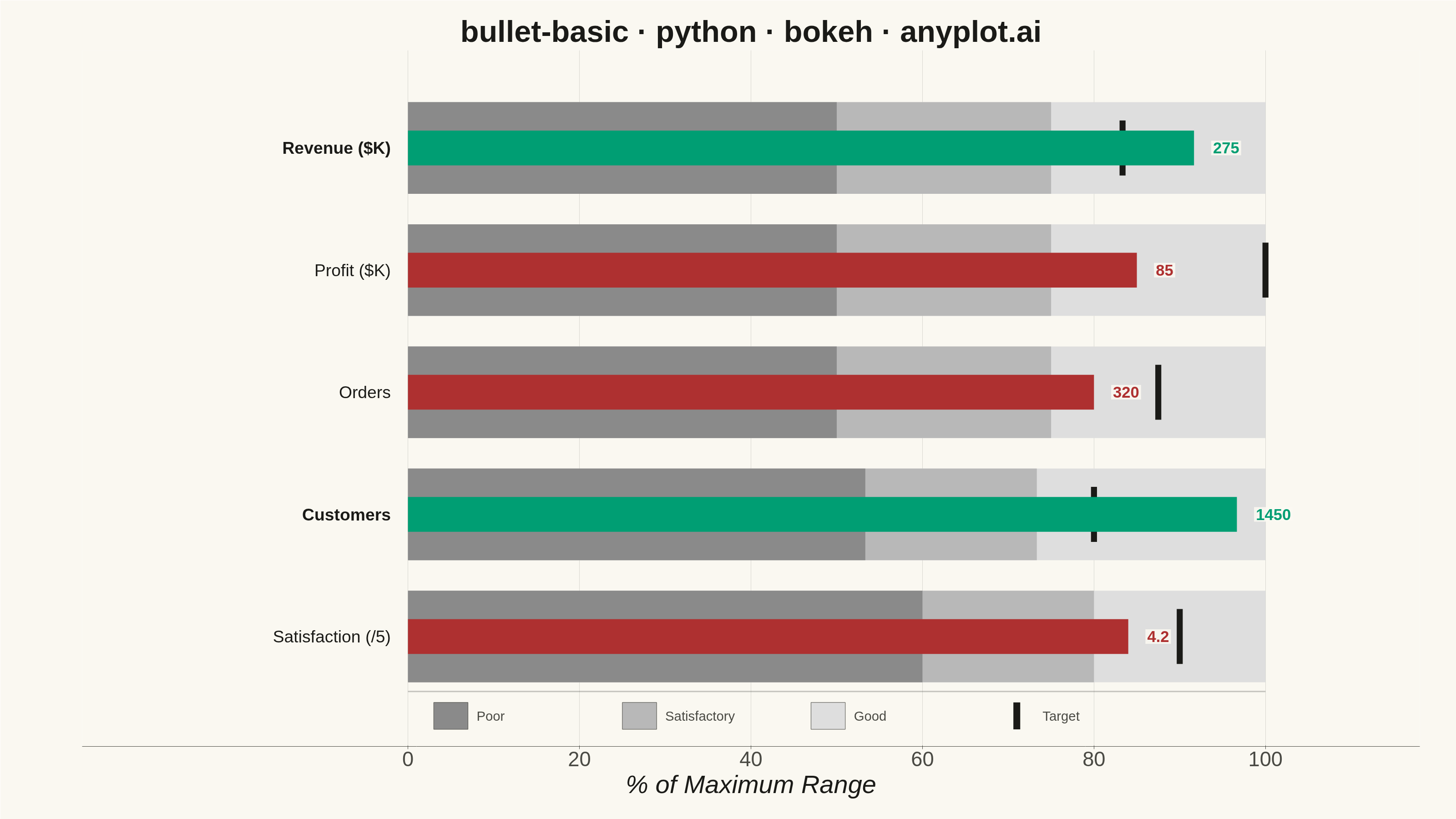
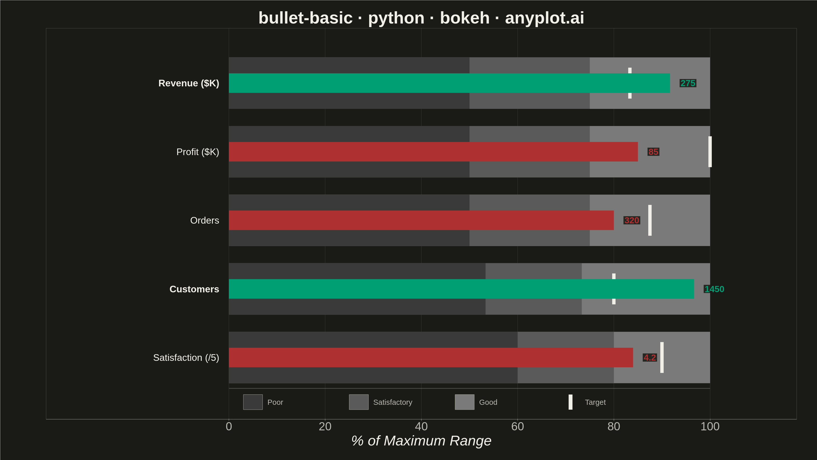
A bullet chart displays a single measure against qualitative ranges and a target marker, designed by Stephen Few as a space-efficient alternative to gauge charts. The linear format shows actual performance as a bar, a target as a vertical marker, and background bands representing qualitative ranges (poor/satisfactory/good). Its compact design allows multiple bullet charts to fit on a single dashboard for easy comparison across metrics.
""" anyplot.ai
bullet-basic: Basic Bullet Chart
Library: bokeh 3.9.0 | Python 3.13.13
Quality: 90/100 | Updated: 2026-05-29
"""

import os
import sys
import time
from pathlib import Path


# Prevent this script (named bokeh.py) from shadowing the installed bokeh package
_this_dir = os.path.dirname(os.path.abspath(__file__))
sys.path = [p for p in sys.path if p != "" and os.path.abspath(p) != _this_dir]

from bokeh.io import output_file, save
from bokeh.models import ColumnDataSource, HoverTool, Label, Range1d
from bokeh.plotting import figure
from selenium import webdriver
from selenium.webdriver.chrome.options import Options


# Theme tokens — Imprint palette chrome
THEME = os.getenv("ANYPLOT_THEME", "light")
PAGE_BG = "#FAF8F1" if THEME == "light" else "#1A1A17"
ELEVATED_BG = "#FFFDF6" if THEME == "light" else "#242420"
INK = "#1A1A17" if THEME == "light" else "#F0EFE8"
INK_SOFT = "#4A4A44" if THEME == "light" else "#B8B7B0"
INK_MUTED = "#6B6A63" if THEME == "light" else "#A8A79F"

# Semantic exception: above/at target = green (good), below = red (miss)
COLOR_ABOVE = "#009E73"  # Imprint position 1 — meets or exceeds target
COLOR_BELOW = "#AE3030"  # Imprint semantic anchor — below target

# Grayscale qualitative bands: poor → satisfactory → good (darker → lighter)
if THEME == "light":
    range_colors = ["#8A8A8A", "#B8B8B8", "#DEDEDE"]
else:
    range_colors = ["#3A3A3A", "#5A5A5A", "#7A7A7A"]

# Data — sales performance dashboard
metrics = [
    {"label": "Revenue", "unit": "$K", "actual": 275, "target": 250, "ranges": [150, 225, 300]},
    {"label": "Profit", "unit": "$K", "actual": 85, "target": 100, "ranges": [50, 75, 100]},
    {"label": "Orders", "unit": "", "actual": 320, "target": 350, "ranges": [200, 300, 400]},
    {"label": "Customers", "unit": "", "actual": 1450, "target": 1200, "ranges": [800, 1100, 1500]},
    {"label": "Satisfaction", "unit": "/5", "actual": 4.2, "target": 4.5, "ranges": [3.0, 4.0, 5.0]},
]

num_metrics = len(metrics)
bar_spacing = 1.0  # tighter spacing for better canvas utilization
bar_height = 0.75

# Title — 42 chars (< 67 baseline), default 50pt applies
title_str = "bullet-basic · python · bokeh · anyplot.ai"

# Figure — 3200×1800 landscape; toolbar_location=None prevents toolbar
# from adding extra pixels above the canvas
p = figure(
    width=3200,
    height=1800,
    x_range=Range1d(-38, 118),
    y_range=Range1d(-0.9, num_metrics * bar_spacing - 0.2),
    title=title_str,
    x_axis_label="% of Maximum Range",
    toolbar_location=None,
    min_border_bottom=160,
    min_border_left=180,
    min_border_top=110,
    min_border_right=80,
)

# Chrome — theme-adaptive
p.background_fill_color = PAGE_BG
p.border_fill_color = PAGE_BG
p.outline_line_color = None
p.outline_line_alpha = 0

p.title.text_font_size = "50pt"
p.title.text_color = INK
p.title.align = "center"

p.xaxis.axis_label_text_font_size = "42pt"
p.xaxis.axis_label_text_color = INK
p.xaxis.major_label_text_font_size = "34pt"
p.xaxis.major_label_text_color = INK_SOFT
p.xaxis.axis_line_color = INK_SOFT
p.xaxis.major_tick_line_color = INK_SOFT
p.xaxis.minor_tick_line_color = None
p.xaxis.ticker = [0, 20, 40, 60, 80, 100]

p.yaxis.visible = False
p.ygrid.grid_line_color = None
p.xgrid.grid_line_color = INK
p.xgrid.grid_line_alpha = 0.15

# Collect actual bar data for ColumnDataSource
bar_x, bar_y, bar_w, bar_h_list, bar_colors = [], [], [], [], []
hover_labels, hover_actuals, hover_targets, hover_pcts = [], [], [], []

for i, metric in enumerate(metrics):
    y_pos = (num_metrics - 1 - i) * bar_spacing
    actual = metric["actual"]
    target = metric["target"]
    ranges = metric["ranges"]
    max_range = ranges[-1]

    norm_actual = (actual / max_range) * 100
    norm_target = (target / max_range) * 100
    norm_ranges = [(r / max_range) * 100 for r in ranges]

    # Equal-height qualitative range bands (Stephen Few standard)
    for j in range(len(norm_ranges) - 1, -1, -1):
        p.rect(
            x=norm_ranges[j] / 2,
            y=y_pos,
            width=norm_ranges[j],
            height=bar_height,
            color=range_colors[j],
            line_color=None,
        )

    # Actual bar — narrow, centered on y_pos
    bar_color = COLOR_ABOVE if actual >= target else COLOR_BELOW
    actual_h = bar_height * 0.38

    bar_x.append(norm_actual / 2)
    bar_y.append(y_pos)
    bar_w.append(norm_actual)
    bar_h_list.append(actual_h)
    bar_colors.append(bar_color)

    unit_text = f" {metric['unit']}" if metric["unit"] else ""
    hover_labels.append(f"{metric['label']}{unit_text}")
    hover_actuals.append(f"{actual}{unit_text}")
    hover_targets.append(f"{target}{unit_text}")
    hover_pcts.append(f"{norm_actual:.0f}%")

    # Target marker — thin vertical bar, theme-adaptive INK color
    p.rect(x=norm_target, y=y_pos, width=0.7, height=bar_height * 0.6, color=INK, line_color=None)

    # Metric label (left of chart) — bold for on-track, normal for off-track
    label_unit = f" ({metric['unit']})" if metric["unit"] else ""
    p.add_layout(
        Label(
            x=-2,
            y=y_pos,
            text=f"{metric['label']}{label_unit}",
            text_font_size="28pt",
            text_color=INK,
            text_align="right",
            text_baseline="middle",
            text_font_style="bold" if actual >= target else "normal",
        )
    )

    # Actual value label (right of bar, color-coded)
    # background_fill improves contrast when label lands on a gray band in dark mode
    value_text = str(int(actual)) if actual == int(actual) else str(actual)
    p.add_layout(
        Label(
            x=norm_actual + 2,
            y=y_pos,
            text=value_text,
            text_font_size="26pt",
            text_color=bar_color,
            text_align="left",
            text_baseline="middle",
            text_font_style="bold",
            background_fill_color=PAGE_BG,
            background_fill_alpha=0.88,
            border_line_color=None,
            padding=4,
        )
    )

# Actual bars via ColumnDataSource (enables HoverTool interactivity)
source = ColumnDataSource(
    data={
        "x": bar_x,
        "y": bar_y,
        "width": bar_w,
        "height": bar_h_list,
        "color": bar_colors,
        "label": hover_labels,
        "actual": hover_actuals,
        "target": hover_targets,
        "pct": hover_pcts,
    }
)
actual_renderer = p.rect(x="x", y="y", width="width", height="height", color="color", line_color=None, source=source)

# HoverTool for interactive HTML
p.add_tools(
    HoverTool(
        renderers=[actual_renderer],
        tooltips=[("Metric", "@label"), ("Actual", "@actual"), ("Target", "@target"), ("% of Range", "@pct")],
    )
)

# Thin separator between chart area and legend
p.segment(x0=[0], x1=[100], y0=[-0.45], y1=[-0.45], line_color=INK_SOFT, line_alpha=0.3, line_width=3)

# Custom legend — below chart area
legend_y = -0.65
legend_start_x = 5
legend_spacing = 22
range_label_texts = ["Poor", "Satisfactory", "Good"]
box_w, box_h = 4.0, 0.22

for k, (color, lbl) in enumerate(zip(range_colors, range_label_texts, strict=True)):
    lx = legend_start_x + k * legend_spacing
    p.rect(x=lx, y=legend_y, width=box_w, height=box_h, color=color, line_color=INK_SOFT, line_width=1)
    p.add_layout(
        Label(
            x=lx + box_w / 2 + 1,
            y=legend_y,
            text=lbl,
            text_font_size="22pt",
            text_color=INK_SOFT,
            text_align="left",
            text_baseline="middle",
        )
    )

target_lx = legend_start_x + len(range_label_texts) * legend_spacing
p.rect(x=target_lx, y=legend_y, width=0.8, height=box_h, color=INK, line_color=None)
p.add_layout(
    Label(
        x=target_lx + box_w / 2 + 1,
        y=legend_y,
        text="Target",
        text_font_size="22pt",
        text_color=INK_SOFT,
        text_align="left",
        text_baseline="middle",
    )
)

# Save interactive HTML
output_file(f"plot-{THEME}.html")
save(p)

# Screenshot via headless Chrome — Selenium 4 / Selenium Manager
# auto-resolves a working driver; window-size must match figure width/height
W, H = 3200, 1800
opts = Options()
for arg in (
    "--headless=new",
    "--no-sandbox",
    "--disable-dev-shm-usage",
    "--disable-gpu",
    f"--window-size={W},{H}",
    "--hide-scrollbars",
):
    opts.add_argument(arg)
driver = webdriver.Chrome(options=opts)
driver.execute_cdp_cmd(
    "Emulation.setDeviceMetricsOverride", {"width": W, "height": H, "deviceScaleFactor": 1, "mobile": False}
)
driver.get(f"file://{Path(f'plot-{THEME}.html').resolve()}")
time.sleep(3)
driver.save_screenshot(f"plot-{THEME}.png")
driver.quit()

# Pin to exact target dims so the post-render gate always passes
from PIL import Image as _PILImage


_img = _PILImage.open(f"plot-{THEME}.png").convert("RGB")
if _img.size != (W, H):
    _norm = _PILImage.new("RGB", (W, H), PAGE_BG)
    _norm.paste(_img, ((W - _img.size[0]) // 2, (H - _img.size[1]) // 2))
    _norm.save(f"plot-{THEME}.png")
Runnable source as JSON, for any HTTP client: https://api.anyplot.ai/specs/bullet-basic/bokeh/code. Any spec id and library id listed in llms-full.txt fit the same URL shape; every URL below is complete and callable.
{
  "spec_id": "bullet-basic",
  "language": "python",
  "library": "bokeh",
  "page": "https://anyplot.ai/bullet-basic/python/bokeh",
  "hub": "https://anyplot.ai/bullet-basic",
  "code_json": "https://api.anyplot.ai/specs/bullet-basic/bokeh/code",
  "spec_json": "https://api.anyplot.ai/specs/bullet-basic",
  "render_light_png": "https://storage.googleapis.com/anyplot-images/plots/bullet-basic/python/bokeh/plot-light.png",
  "render_dark_png": "https://storage.googleapis.com/anyplot-images/plots/bullet-basic/python/bokeh/plot-dark.png",
  "interactive_light_html": "https://storage.googleapis.com/anyplot-images/plots/bullet-basic/python/bokeh/plot-light.html",
  "interactive_dark_html": "https://storage.googleapis.com/anyplot-images/plots/bullet-basic/python/bokeh/plot-dark.html",
  "quality_score": 90.0,
  "license": "MIT",
  "guide": "https://anyplot.ai/llms.txt"
}
Part of Basic Bullet Chart on anyplot.ai.