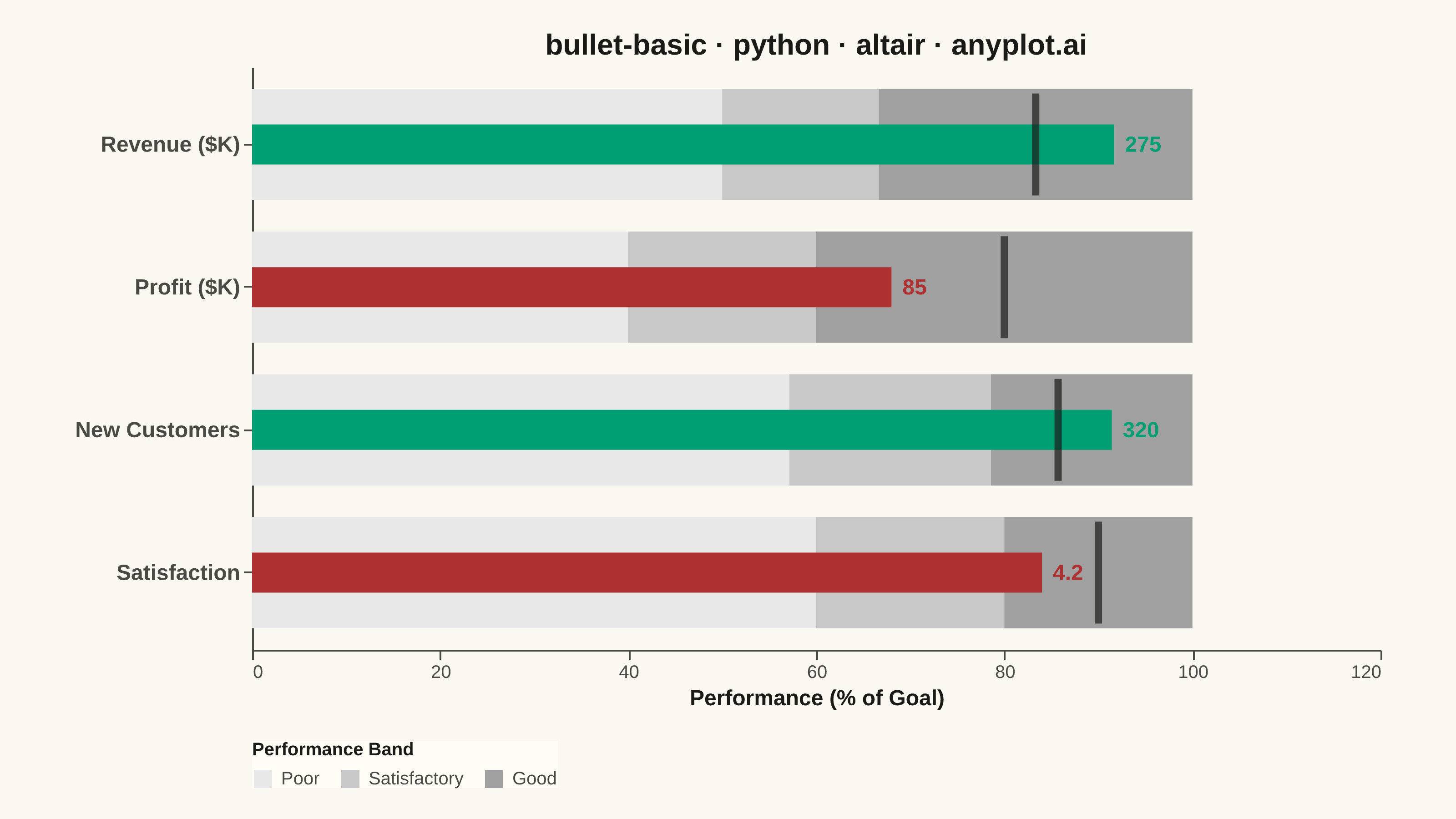
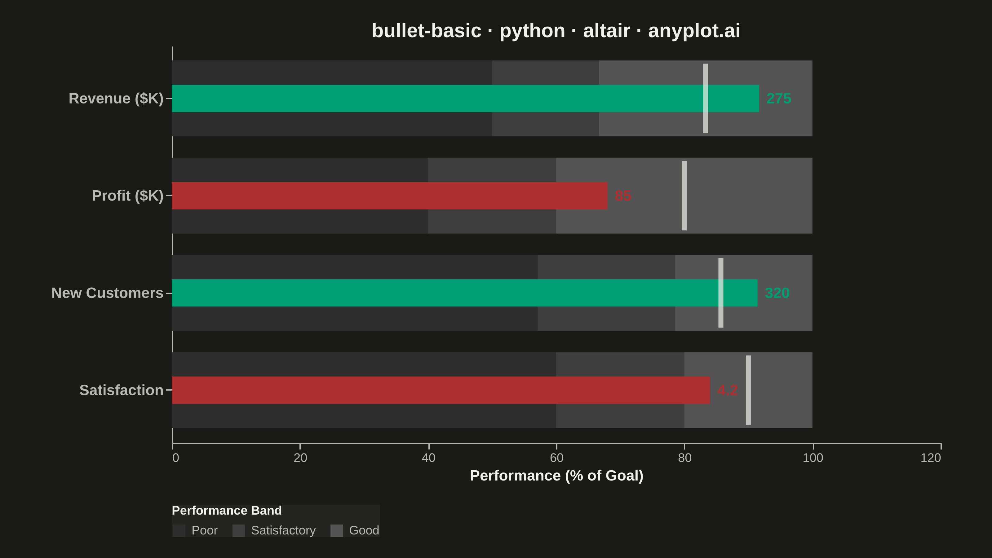
A bullet chart displays a single measure against qualitative ranges and a target marker, designed by Stephen Few as a space-efficient alternative to gauge charts. The linear format shows actual performance as a bar, a target as a vertical marker, and background bands representing qualitative ranges (poor/satisfactory/good). Its compact design allows multiple bullet charts to fit on a single dashboard for easy comparison across metrics.
""" anyplot.ai
bullet-basic: Basic Bullet Chart
Library: altair 6.1.0 | Python 3.13.13
Quality: 91/100 | Updated: 2026-05-29
"""

import os
import sys


# Prevent self-import: this file is named altair.py; remove the script directory
# from sys.path so `import altair` finds the installed package, not this file.
_this_dir = os.path.dirname(os.path.abspath(__file__))
sys.path = [p for p in sys.path if not p or os.path.abspath(p) != _this_dir]

import altair as alt
import pandas as pd
from PIL import Image


# Theme tokens
THEME = os.getenv("ANYPLOT_THEME", "light")
PAGE_BG = "#FAF8F1" if THEME == "light" else "#1A1A17"
ELEVATED_BG = "#FFFDF6" if THEME == "light" else "#242420"
INK = "#1A1A17" if THEME == "light" else "#F0EFE8"
INK_SOFT = "#4A4A44" if THEME == "light" else "#B8B7B0"

# Imprint palette — semantic mapping: green = above-target (good), red = below-target (loss)
ABOVE_COLOR = "#009E73"  # Imprint position 1, brand green
BELOW_COLOR = "#AE3030"  # Imprint semantic anchor, matte red

# Grayscale bands: theme-adaptive so bands read clearly against both backgrounds
if THEME == "light":
    BAND_COLORS = ["#e8e8e8", "#c8c8c8", "#a0a0a0"]
else:
    BAND_COLORS = ["#2e2e2e", "#3e3e3e", "#545454"]

# Data — KPI dashboard: mix of above-target and below-target results across four metrics
metrics = [
    {"metric": "Revenue ($K)", "actual": 275, "target": 250, "poor": 150, "satisfactory": 200, "good": 300},
    {"metric": "Profit ($K)", "actual": 85, "target": 100, "poor": 50, "satisfactory": 75, "good": 125},
    {"metric": "New Customers", "actual": 320, "target": 300, "poor": 200, "satisfactory": 275, "good": 350},
    {"metric": "Satisfaction", "actual": 4.2, "target": 4.5, "poor": 3.0, "satisfactory": 4.0, "good": 5.0},
]
metric_order = [m["metric"] for m in metrics]

# Normalize to percentage-of-goal for fair cross-metric comparison
range_data = []
for m in metrics:
    max_val = m["good"]
    poor_pct = (m["poor"] / max_val) * 100
    sat_pct = (m["satisfactory"] / max_val) * 100
    range_data.append({"metric": m["metric"], "start": 0, "end": poor_pct, "band": "Poor"})
    range_data.append({"metric": m["metric"], "start": poor_pct, "end": sat_pct, "band": "Satisfactory"})
    range_data.append({"metric": m["metric"], "start": sat_pct, "end": 100, "band": "Good"})

df_ranges = pd.DataFrame(range_data)

df_actual = pd.DataFrame(
    [
        {
            "metric": m["metric"],
            "actual_pct": (m["actual"] / m["good"]) * 100,
            "actual_raw": m["actual"],
            "above_target": m["actual"] >= m["target"],
        }
        for m in metrics
    ]
)

df_target = pd.DataFrame(
    [{"metric": m["metric"], "target_pct": (m["target"] / m["good"]) * 100, "target_raw": m["target"]} for m in metrics]
)

# Shared Y scale with tight padding for compact bullet rows
y_scale = alt.Scale(paddingInner=0.22, paddingOuter=0.15)

# Background qualitative ranges (grayscale per spec)
ranges_chart = (
    alt.Chart(df_ranges)
    .mark_bar()
    .encode(
        y=alt.Y(
            "metric:N",
            title=None,
            sort=metric_order,
            scale=y_scale,
            axis=alt.Axis(labelFontSize=12, labelFontWeight="bold"),
        ),
        x=alt.X(
            "start:Q",
            title="Performance (% of Goal)",
            scale=alt.Scale(domain=[0, 115]),
            axis=alt.Axis(titleFontSize=12, labelFontSize=10, tickCount=6),
        ),
        x2="end:Q",
        color=alt.Color(
            "band:N",
            scale=alt.Scale(domain=["Poor", "Satisfactory", "Good"], range=BAND_COLORS),
            legend=alt.Legend(
                title="Performance Band", orient="bottom", titleFontSize=10, labelFontSize=10, direction="horizontal"
            ),
        ),
        tooltip=[alt.Tooltip("metric:N", title="Metric"), alt.Tooltip("band:N", title="Band")],
    )
)

# Actual value bars: Imprint green (above-target) or Imprint red (below-target)
actual_chart = (
    alt.Chart(df_actual)
    .mark_bar(height=22)
    .encode(
        y=alt.Y("metric:N", sort=metric_order, scale=y_scale),
        x=alt.X("actual_pct:Q"),
        color=alt.condition(alt.datum.above_target, alt.value(ABOVE_COLOR), alt.value(BELOW_COLOR)),
        tooltip=[
            alt.Tooltip("metric:N", title="Metric"),
            alt.Tooltip("actual_raw:Q", title="Actual"),
            alt.Tooltip("actual_pct:Q", title="% of Goal", format=".1f"),
        ],
    )
)

# Target marker — theme-adaptive ink-color tick
target_chart = (
    alt.Chart(df_target)
    .mark_tick(color=INK, thickness=4, size=56)
    .encode(
        y=alt.Y("metric:N", sort=metric_order, scale=y_scale),
        x=alt.X("target_pct:Q"),
        tooltip=[alt.Tooltip("metric:N", title="Metric"), alt.Tooltip("target_raw:Q", title="Target")],
    )
)

# Value labels at end of each bar
value_labels = (
    alt.Chart(df_actual)
    .mark_text(align="left", dx=6, fontSize=12, fontWeight="bold")
    .encode(
        y=alt.Y("metric:N", sort=metric_order, scale=y_scale),
        x=alt.X("actual_pct:Q"),
        text=alt.Text("actual_raw:Q"),
        color=alt.condition(alt.datum.above_target, alt.value(ABOVE_COLOR), alt.value(BELOW_COLOR)),
    )
)

# Title — 43 chars, below 67-char baseline so no scaling needed
title_str = "bullet-basic · python · altair · anyplot.ai"
title_fs = round(16 * min(1.0, 67 / len(title_str)))

chart = (
    alt.layer(ranges_chart, actual_chart, target_chart, value_labels)
    .properties(
        width=620,
        height=320,
        background=PAGE_BG,
        title=alt.Title(title_str, fontSize=title_fs, color=INK, anchor="middle"),
    )
    .configure_view(fill=PAGE_BG, stroke=None)
    .configure_axis(domainColor=INK_SOFT, tickColor=INK_SOFT, grid=False, labelColor=INK_SOFT, titleColor=INK)
    .configure_legend(fillColor=ELEVATED_BG, strokeColor=None, labelColor=INK_SOFT, titleColor=INK)
)

# Save PNG and HTML
chart.save(f"plot-{THEME}.png", scale_factor=4.0)
chart.save(f"plot-{THEME}.html")

# Pad to exact 3200×1800 canvas (vl-convert can undershoot)
TW, TH = 3200, 1800
_img = Image.open(f"plot-{THEME}.png").convert("RGB")
_w, _h = _img.size
if _w > TW or _h > TH:
    raise SystemExit(
        f"altair vl-convert produced {_w}×{_h}, exceeds target {TW}×{TH}. "
        f"Shrink chart .properties(width=, height=) values and re-render."
    )
if _w < TW or _h < TH:
    _canvas = Image.new("RGB", (TW, TH), PAGE_BG)
    _canvas.paste(_img, ((TW - _w) // 2, (TH - _h) // 2))
    _canvas.save(f"plot-{THEME}.png")
Runnable source as JSON, for any HTTP client: https://api.anyplot.ai/specs/bullet-basic/altair/code. Any spec id and library id listed in llms-full.txt fit the same URL shape; every URL below is complete and callable.
{
  "spec_id": "bullet-basic",
  "language": "python",
  "library": "altair",
  "page": "https://anyplot.ai/bullet-basic/python/altair",
  "hub": "https://anyplot.ai/bullet-basic",
  "code_json": "https://api.anyplot.ai/specs/bullet-basic/altair/code",
  "spec_json": "https://api.anyplot.ai/specs/bullet-basic",
  "render_light_png": "https://storage.googleapis.com/anyplot-images/plots/bullet-basic/python/altair/plot-light.png",
  "render_dark_png": "https://storage.googleapis.com/anyplot-images/plots/bullet-basic/python/altair/plot-dark.png",
  "interactive_light_html": "https://storage.googleapis.com/anyplot-images/plots/bullet-basic/python/altair/plot-light.html",
  "interactive_dark_html": "https://storage.googleapis.com/anyplot-images/plots/bullet-basic/python/altair/plot-dark.html",
  "quality_score": 91.0,
  "license": "MIT",
  "guide": "https://anyplot.ai/llms.txt"
}
Part of Basic Bullet Chart on anyplot.ai.