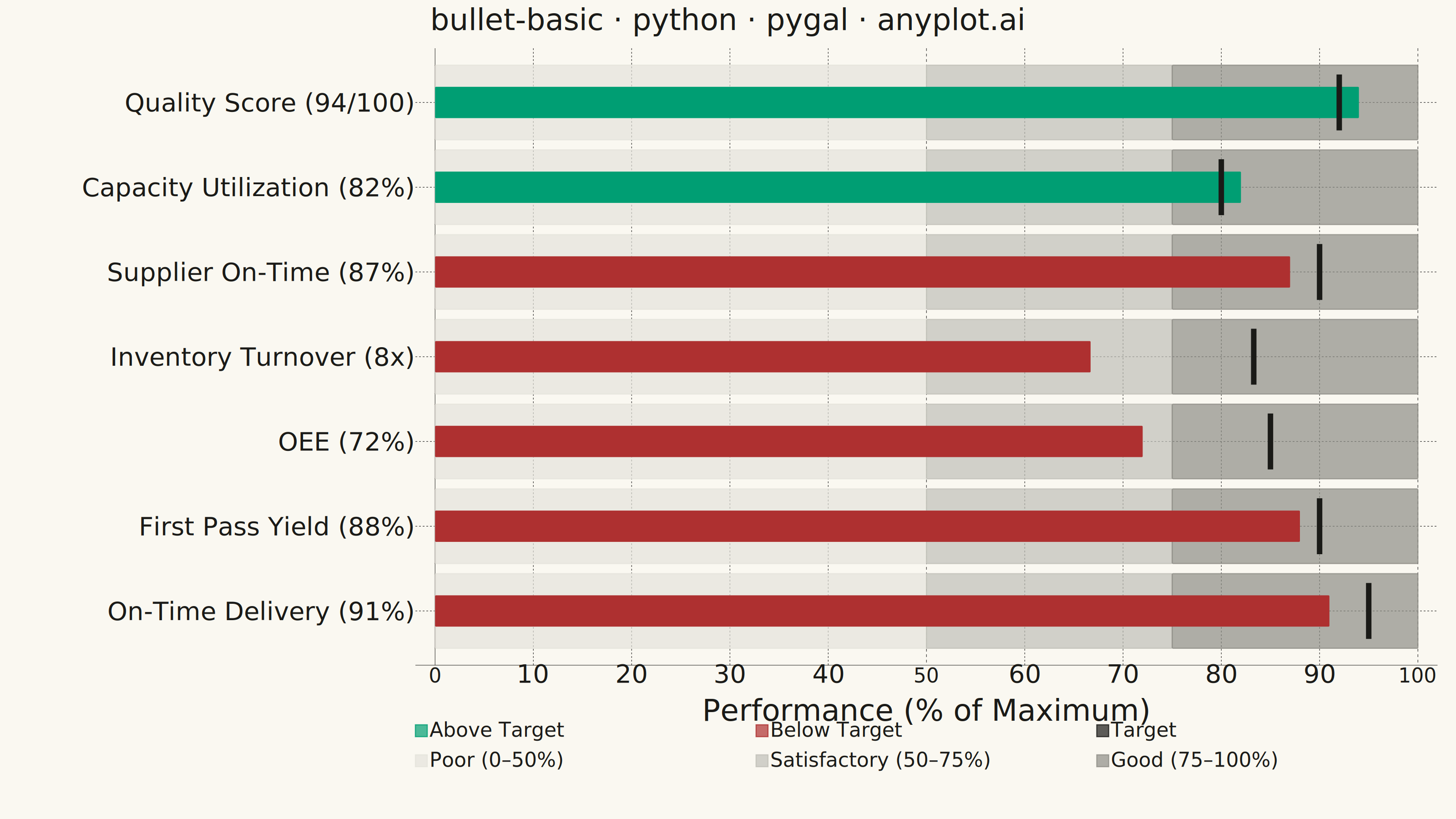
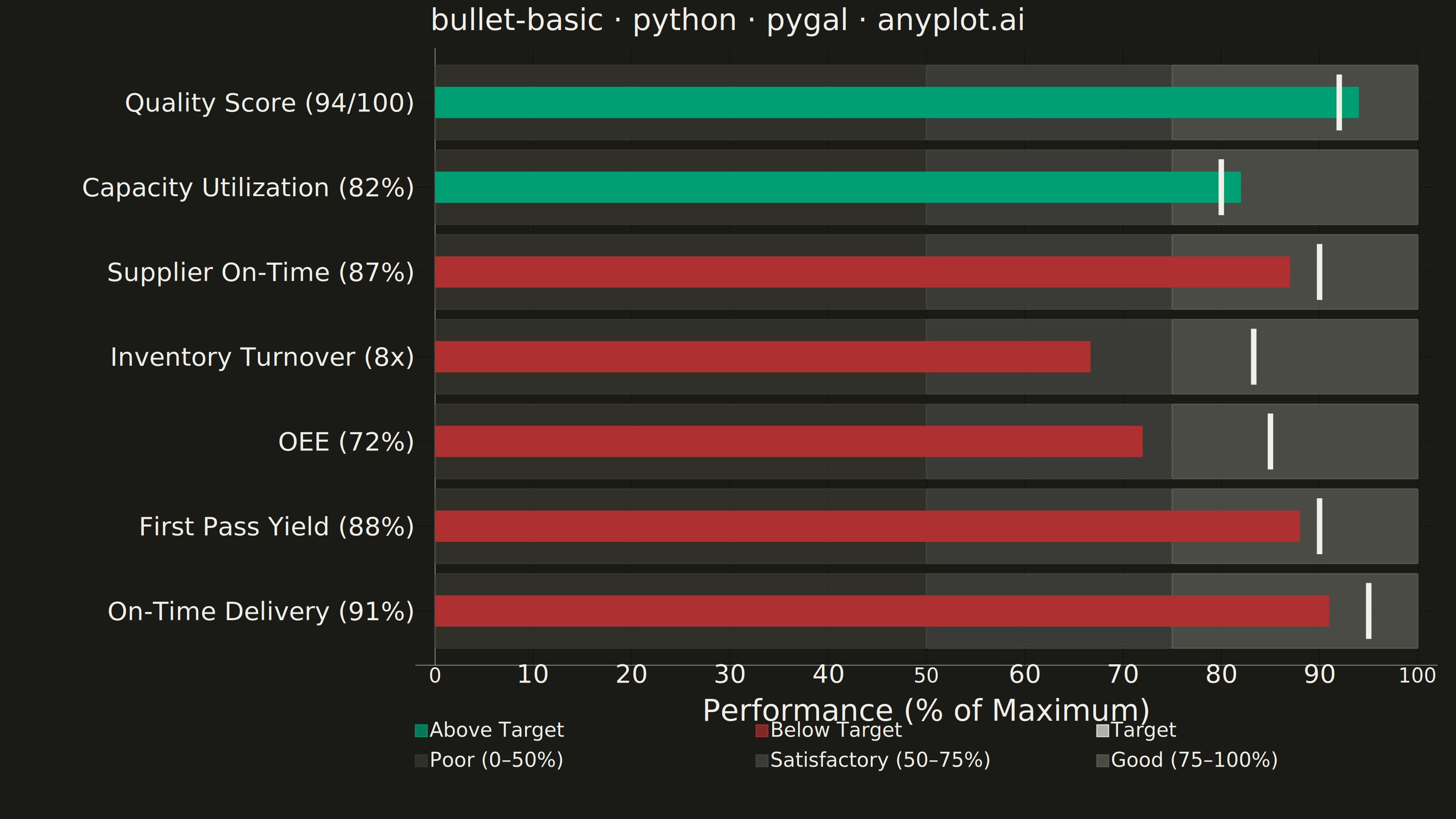
A bullet chart displays a single measure against qualitative ranges and a target marker, designed by Stephen Few as a space-efficient alternative to gauge charts. The linear format shows actual performance as a bar, a target as a vertical marker, and background bands representing qualitative ranges (poor/satisfactory/good). Its compact design allows multiple bullet charts to fit on a single dashboard for easy comparison across metrics.
""" anyplot.ai
bullet-basic: Basic Bullet Chart
Library: pygal 3.1.0 | Python 3.13.13
Quality: 86/100 | Updated: 2026-05-29
"""

import importlib.util
import os
import sys
import xml.etree.ElementTree as ET

import cairosvg


# Guard against self-import: this file is named pygal.py, so a plain
# `import pygal` picks up itself instead of the installed package.
pygal_spec = importlib.util.find_spec("pygal")
if pygal_spec and pygal_spec.origin != __file__:
    import pygal
    from pygal.style import Style
else:
    _cwd = os.getcwd()
    sys.path = [p for p in sys.path if os.path.abspath(p) != os.path.abspath(_cwd)]
    try:
        import pygal
        from pygal.style import Style
    finally:
        sys.path.insert(0, _cwd)

THEME = os.getenv("ANYPLOT_THEME", "light")

# Theme-adaptive chrome — Imprint palette
PAGE_BG = "#FAF8F1" if THEME == "light" else "#1A1A17"
INK = "#1A1A17" if THEME == "light" else "#F0EFE8"
INK_MUTED = "#6B6A63" if THEME == "light" else "#A8A79F"

# Qualitative range band colors: warm-neutral grays, theme-adaptive
if THEME == "light":
    BAND_POOR = "#E4E3DC"
    BAND_SAT = "#C0BFB8"
    BAND_GOOD = "#8E8D87"
else:
    BAND_POOR = "#3A3A30"
    BAND_SAT = "#484843"
    BAND_GOOD = "#60605A"

# Imprint semantic anchors: green for at/above target, red for below
COLOR_ABOVE = "#009E73"  # brand green — at or above target
COLOR_BELOW = "#AE3030"  # matte red — below target
COLOR_TARGET = INK  # theme-adaptive neutral for target marker

# Manufacturing & supply chain KPIs (7 metrics across ops domains)
metrics = [
    {"label": "On-Time Delivery", "actual": 91, "target": 95, "max": 100, "fmt": "{}%"},
    {"label": "First Pass Yield", "actual": 88, "target": 90, "max": 100, "fmt": "{}%"},
    {"label": "OEE", "actual": 72, "target": 85, "max": 100, "fmt": "{}%"},
    {"label": "Inventory Turnover", "actual": 8, "target": 10, "max": 12, "fmt": "{}x"},
    {"label": "Supplier On-Time", "actual": 87, "target": 90, "max": 100, "fmt": "{}%"},
    {"label": "Capacity Utilization", "actual": 82, "target": 80, "max": 100, "fmt": "{}%"},
    {"label": "Quality Score", "actual": 94, "target": 92, "max": 100, "fmt": "{}/100"},
]

POOR_PCT = 50
SAT_PCT = 75

actual_pcts = [round((m["actual"] / m["max"]) * 100, 1) for m in metrics]
target_pcts = [round((m["target"] / m["max"]) * 100, 1) for m in metrics]
above_target = [m["actual"] >= m["target"] for m in metrics]
labels = [f"{m['label']} ({m['fmt'].format(m['actual'])})" for m in metrics]

custom_style = Style(
    background=PAGE_BG,
    plot_background=PAGE_BG,
    foreground=INK,
    foreground_strong=INK,
    foreground_subtle=INK_MUTED,
    font_family="DejaVu Sans, Helvetica, Arial, sans-serif",
    colors=(COLOR_ABOVE, COLOR_BELOW, COLOR_TARGET, BAND_POOR, BAND_SAT, BAND_GOOD),
    title_font_size=66,
    label_font_size=56,
    major_label_font_size=44,
    legend_font_size=44,
    value_font_size=36,
    stroke_width=2.5,
)

chart = pygal.HorizontalStackedBar(
    width=3200,
    height=1800,
    title="bullet-basic · python · pygal · anyplot.ai",
    style=custom_style,
    show_legend=True,
    legend_at_bottom=True,
    legend_box_size=26,
    print_values=False,
    print_zeroes=False,
    show_y_guides=False,
    show_x_guides=True,
    margin=40,
    spacing=0,
    rounded_bars=2,
    truncate_label=-1,
    x_title="Performance (% of Maximum)",
    range=(0, 100),
)
chart.x_labels = labels

# Legend-only placeholder series (serie-0/1/2): first series gets brand green (#009E73)
chart.add("Above Target", [None] * len(metrics))
chart.add("Below Target", [None] * len(metrics))
chart.add("Target", [None] * len(metrics))

# Background bands: stacked segments for Poor / Satisfactory / Good zones (serie-3/4/5)
chart.add("Poor (0–50%)", [{"value": POOR_PCT, "label": lbl} for lbl in labels])
chart.add("Satisfactory (50–75%)", [{"value": SAT_PCT - POOR_PCT, "label": lbl} for lbl in labels])
chart.add("Good (75–100%)", [{"value": 100 - SAT_PCT, "label": lbl} for lbl in labels])

# Parse rendered SVG for coordinate-space injection of actual bars and markers
ET.register_namespace("", "http://www.w3.org/2000/svg")
ET.register_namespace("xlink", "http://www.w3.org/1999/xlink")
svg_bytes = chart.render()
root = ET.fromstring(svg_bytes)
NS = "http://www.w3.org/2000/svg"

parent_map = {child: parent for parent in root.iter() for child in parent}

# Make all stroked lines solid — style guide requires solid reference lines
for elem in root.iter():
    if "stroke-dasharray" in elem.attrib:
        del elem.attrib["stroke-dasharray"]

# serie-3 (Poor band) rects serve as the coordinate reference for injection
serie_0 = next((g for g in root.iter(f"{{{NS}}}g") if "serie-3" in g.get("class", "")), None)

poor_bars = []
if serie_0 is not None:
    for rect in serie_0.iter(f"{{{NS}}}rect"):
        w, h = float(rect.get("width", "0")), float(rect.get("height", "0"))
        if w > 1 and h > 1:
            poor_bars.append((float(rect.get("x")), float(rect.get("y")), w, h))

inject_parent = parent_map.get(serie_0, root)
for i, (bx, by, bw, bh) in enumerate(poor_bars):
    px_per_pct = bw / POOR_PCT
    cy = by + bh / 2

    # Actual value bar at 42% of band height (classic bullet chart layering)
    actual_w = actual_pcts[i] * px_per_pct
    bar_h = bh * 0.42
    bar_color = COLOR_ABOVE if above_target[i] else COLOR_BELOW
    a = ET.SubElement(inject_parent, f"{{{NS}}}rect")
    a.set("x", f"{bx:.1f}")
    a.set("y", f"{cy - bar_h / 2:.1f}")
    a.set("width", f"{actual_w:.1f}")
    a.set("height", f"{bar_h:.1f}")
    a.set("fill", bar_color)
    a.set("rx", "2")

    # Target marker: prominent vertical rectangle at target percentage
    tx = bx + target_pcts[i] * px_per_pct
    marker_h = bh * 0.75
    t = ET.SubElement(inject_parent, f"{{{NS}}}rect")
    t.set("x", f"{tx - 6:.1f}")
    t.set("y", f"{cy - marker_h / 2:.1f}")
    t.set("width", "12")
    t.set("height", f"{marker_h:.1f}")
    t.set("fill", COLOR_TARGET)

svg_modified = ET.tostring(root, encoding="utf-8")

# Save PNG at canonical 3200x1800 and interactive HTML
cairosvg.svg2png(bytestring=svg_modified, write_to=f"plot-{THEME}.png")
with open(f"plot-{THEME}.html", "wb") as f:
    f.write(svg_modified)
Runnable source as JSON, for any HTTP client: https://api.anyplot.ai/specs/bullet-basic/pygal/code. Any spec id and library id listed in llms-full.txt fit the same URL shape; every URL below is complete and callable.
{
  "spec_id": "bullet-basic",
  "language": "python",
  "library": "pygal",
  "page": "https://anyplot.ai/bullet-basic/python/pygal",
  "hub": "https://anyplot.ai/bullet-basic",
  "code_json": "https://api.anyplot.ai/specs/bullet-basic/pygal/code",
  "spec_json": "https://api.anyplot.ai/specs/bullet-basic",
  "render_light_png": "https://storage.googleapis.com/anyplot-images/plots/bullet-basic/python/pygal/plot-light.png",
  "render_dark_png": "https://storage.googleapis.com/anyplot-images/plots/bullet-basic/python/pygal/plot-dark.png",
  "interactive_light_html": "https://storage.googleapis.com/anyplot-images/plots/bullet-basic/python/pygal/plot-light.html",
  "interactive_dark_html": "https://storage.googleapis.com/anyplot-images/plots/bullet-basic/python/pygal/plot-dark.html",
  "quality_score": 86.0,
  "license": "MIT",
  "guide": "https://anyplot.ai/llms.txt"
}
Part of Basic Bullet Chart on anyplot.ai.