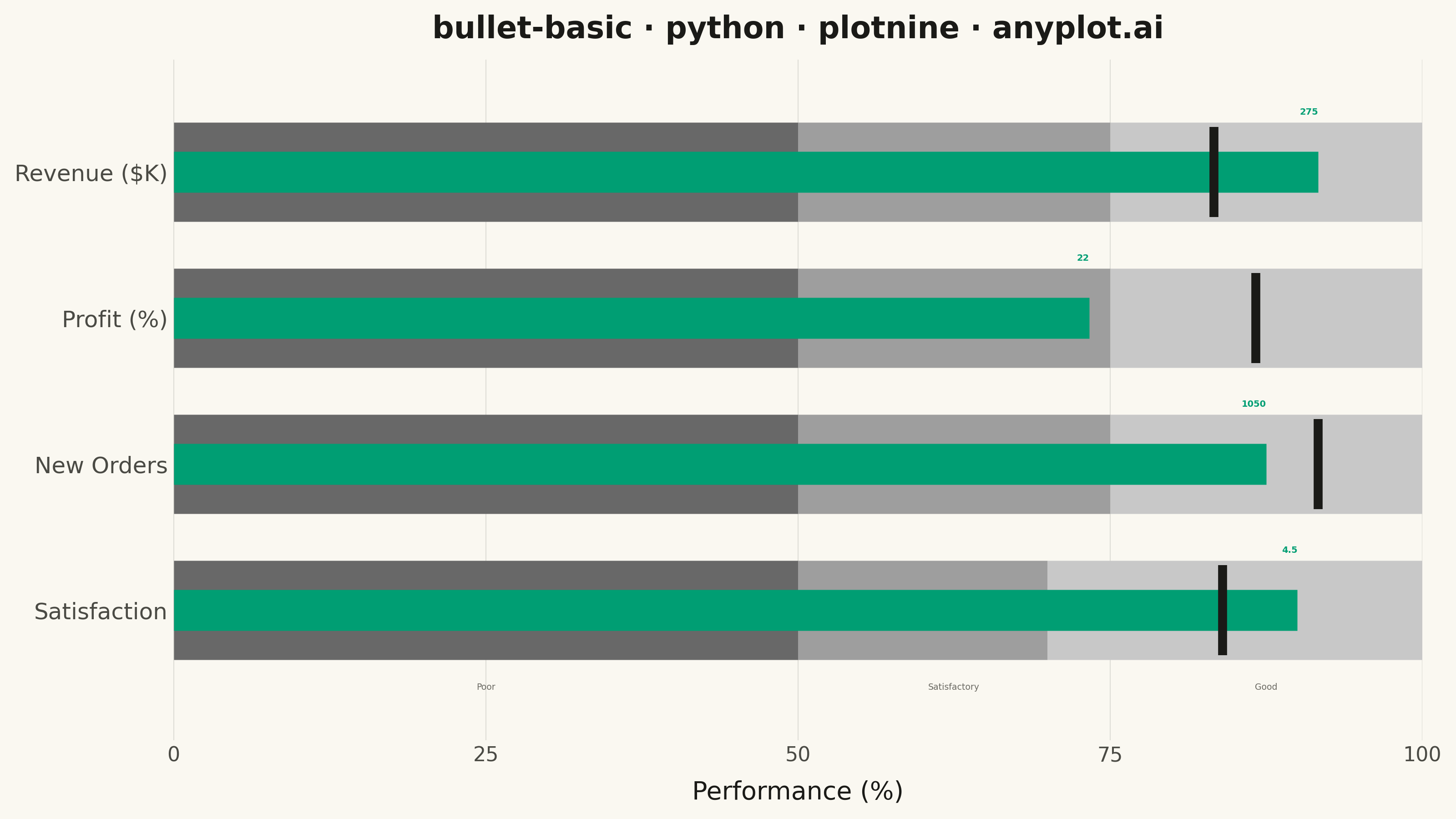
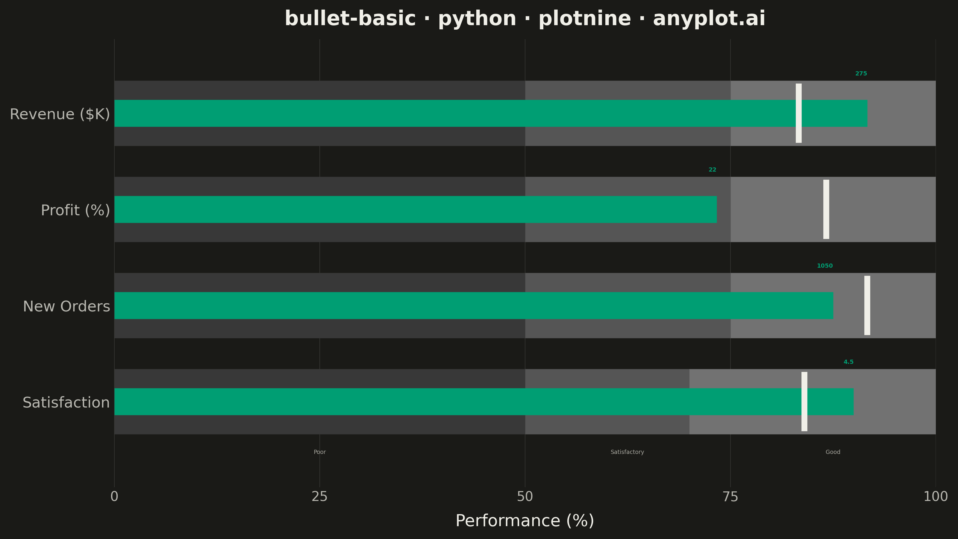
A bullet chart displays a single measure against qualitative ranges and a target marker, designed by Stephen Few as a space-efficient alternative to gauge charts. The linear format shows actual performance as a bar, a target as a vertical marker, and background bands representing qualitative ranges (poor/satisfactory/good). Its compact design allows multiple bullet charts to fit on a single dashboard for easy comparison across metrics.
""" anyplot.ai
bullet-basic: Basic Bullet Chart
Library: plotnine 0.15.4 | Python 3.13.13
Quality: 88/100 | Updated: 2026-05-29
"""

import os

import pandas as pd
from plotnine import (
    aes,
    annotate,
    element_blank,
    element_line,
    element_rect,
    element_text,
    geom_rect,
    geom_segment,
    geom_text,
    geom_tile,
    ggplot,
    guides,
    labs,
    scale_fill_manual,
    scale_x_continuous,
    scale_y_continuous,
    theme,
    theme_minimal,
)


# Theme-adaptive chrome tokens
THEME = os.getenv("ANYPLOT_THEME", "light")
PAGE_BG = "#FAF8F1" if THEME == "light" else "#1A1A17"
ELEVATED_BG = "#FFFDF6" if THEME == "light" else "#242420"
INK = "#1A1A17" if THEME == "light" else "#F0EFE8"
INK_SOFT = "#4A4A44" if THEME == "light" else "#B8B7B0"
INK_MUTED = "#6B6A63" if THEME == "light" else "#A8A79F"

# Imprint palette — brand green is always first series
IMPRINT_PALETTE = ["#009E73", "#C475FD", "#4467A3", "#BD8233", "#AE3030", "#2ABCCD", "#954477", "#99B314"]
BRAND = IMPRINT_PALETTE[0]  # #009E73 — actual value bar

# Grayscale bands: darker = worse performance zone (theme-adaptive for readability)
if THEME == "light":
    band_colors = {"Poor": "#686868", "Satisfactory": "#9E9E9E", "Good": "#C8C8C8"}
else:
    band_colors = {"Poor": "#383838", "Satisfactory": "#555555", "Good": "#727272"}

# Data — four business KPIs with mixed above/below-target performance
metrics = [
    {"label": "Revenue ($K)", "actual": 275, "target": 250, "ranges": [150, 225, 300]},
    {"label": "Profit (%)", "actual": 22, "target": 26, "ranges": [15, 22.5, 30]},
    {"label": "New Orders", "actual": 1050, "target": 1100, "ranges": [600, 900, 1200]},
    {"label": "Satisfaction", "actual": 4.5, "target": 4.2, "ranges": [2.5, 3.5, 5.0]},
]

# Build dataframes — all values normalized to 0–100 scale for aligned x-axis
tile_data = []
actual_data = []
target_data = []

range_height = 0.68
actual_height = 0.28

for i, m in enumerate(metrics):
    y_pos = len(metrics) - 1 - i  # first metric at top
    max_val = m["ranges"][-1]

    band_bounds = [0, (m["ranges"][0] / max_val) * 100, (m["ranges"][1] / max_val) * 100, 100]
    band_names = ["Poor", "Satisfactory", "Good"]
    for j, band in enumerate(band_names):
        x_center = (band_bounds[j] + band_bounds[j + 1]) / 2
        width = band_bounds[j + 1] - band_bounds[j]
        tile_data.append({"y": y_pos, "x": x_center, "width": width, "band": band})

    actual_pct = (m["actual"] / max_val) * 100
    val = m["actual"]
    val_str = str(int(val)) if val == int(val) else str(val)
    actual_data.append(
        {
            "y": y_pos,
            "xmin": 0,
            "xmax": actual_pct,
            "ymin": y_pos - actual_height / 2,
            "ymax": y_pos + actual_height / 2,
            "label": m["label"],
            "actual": val_str,
            "label_y": y_pos + range_height / 2 + 0.04,
        }
    )

    target_pct = (m["target"] / max_val) * 100
    target_data.append(
        {
            "y": y_pos,
            "target": target_pct,
            "seg_ymin": y_pos - range_height / 2.2,
            "seg_ymax": y_pos + range_height / 2.2,
        }
    )

df_tiles = pd.DataFrame(tile_data)
df_actual = pd.DataFrame(actual_data)
df_target = pd.DataFrame(target_data)

# Band label x positions: 3 of 4 metrics share 50%/75% band boundaries
poor_mid = 25.0
satis_mid = 62.5
good_mid = 87.5

plot = (
    ggplot()
    # Qualitative range bands
    + geom_tile(df_tiles, aes(x="x", y="y", width="width", fill="band"), height=range_height, color="none")
    + scale_fill_manual(values=band_colors, limits=["Good", "Satisfactory", "Poor"])
    + guides(fill=False)
    # Actual value bar
    + geom_rect(df_actual, aes(xmin="xmin", xmax="xmax", ymin="ymin", ymax="ymax"), fill=BRAND, color="none")
    # Target marker — thin contrasting line perpendicular to the bar
    + geom_segment(df_target, aes(x="target", xend="target", y="seg_ymin", yend="seg_ymax"), color=INK, size=2.0)
    # Actual value labels (geom_text size in mm; ~3.5 ≈ 10pt at 400dpi)
    + geom_text(
        df_actual,
        aes(x="xmax", y="label_y", label="actual"),
        ha="right",
        va="bottom",
        size=3.5,
        color=BRAND,
        fontweight="bold",
    )
    # Band zone labels below the bottom metric
    + annotate("text", x=poor_mid, y=-0.5, label="Poor", size=3.4, color=INK_MUTED, va="top")
    + annotate("text", x=satis_mid, y=-0.5, label="Satisfactory", size=3.4, color=INK_MUTED, va="top")
    + annotate("text", x=good_mid, y=-0.5, label="Good", size=3.4, color=INK_MUTED, va="top")
    # Scales
    + scale_x_continuous(limits=(0, 100), breaks=[0, 25, 50, 75, 100], expand=(0, 0.02))
    + scale_y_continuous(
        breaks=list(range(len(metrics))), labels=[m["label"] for m in reversed(metrics)], expand=(0.08, 0.08)
    )
    + labs(title="bullet-basic · python · plotnine · anyplot.ai", x="Performance (%)", y="")
    + theme_minimal()
    + theme(
        figure_size=(8, 4.5),
        plot_title=element_text(size=12, ha="center", weight="bold", color=INK),
        axis_title_x=element_text(size=10, color=INK),
        axis_title_y=element_blank(),
        axis_text_x=element_text(size=8, color=INK_SOFT),
        axis_text_y=element_text(size=9, ha="right", color=INK_SOFT),
        panel_grid_major_y=element_blank(),
        panel_grid_minor=element_blank(),
        panel_grid_major_x=element_line(color=INK, size=0.3, alpha=0.15),
        plot_background=element_rect(fill=PAGE_BG, color=PAGE_BG),
        panel_background=element_rect(fill=PAGE_BG, color="none"),
        legend_background=element_rect(fill=ELEVATED_BG, color=INK_SOFT),
        legend_text=element_text(color=INK_SOFT),
    )
)

plot.save(f"plot-{THEME}.png", dpi=400, width=8, height=4.5, units="in", verbose=False)
Runnable source as JSON, for any HTTP client: https://api.anyplot.ai/specs/bullet-basic/plotnine/code. Any spec id and library id listed in llms-full.txt fit the same URL shape; every URL below is complete and callable.
{
  "spec_id": "bullet-basic",
  "language": "python",
  "library": "plotnine",
  "page": "https://anyplot.ai/bullet-basic/python/plotnine",
  "hub": "https://anyplot.ai/bullet-basic",
  "code_json": "https://api.anyplot.ai/specs/bullet-basic/plotnine/code",
  "spec_json": "https://api.anyplot.ai/specs/bullet-basic",
  "render_light_png": "https://storage.googleapis.com/anyplot-images/plots/bullet-basic/python/plotnine/plot-light.png",
  "render_dark_png": "https://storage.googleapis.com/anyplot-images/plots/bullet-basic/python/plotnine/plot-dark.png",
  "quality_score": 88.0,
  "license": "MIT",
  "guide": "https://anyplot.ai/llms.txt"
}
Part of Basic Bullet Chart on anyplot.ai.