The same plot in 14 other libraries — JavaScript: Chart.js, D3.js, Apache ECharts, MUI X Charts; Python: Altair, Bokeh, lets-plot, Matplotlib, Plotly, plotnine, Pygal, Seaborn; R: ggplot2; Julia: Makie.jl. Compare all 15 side by side: Basic Bullet Chart in Python, R, Julia and JavaScript.
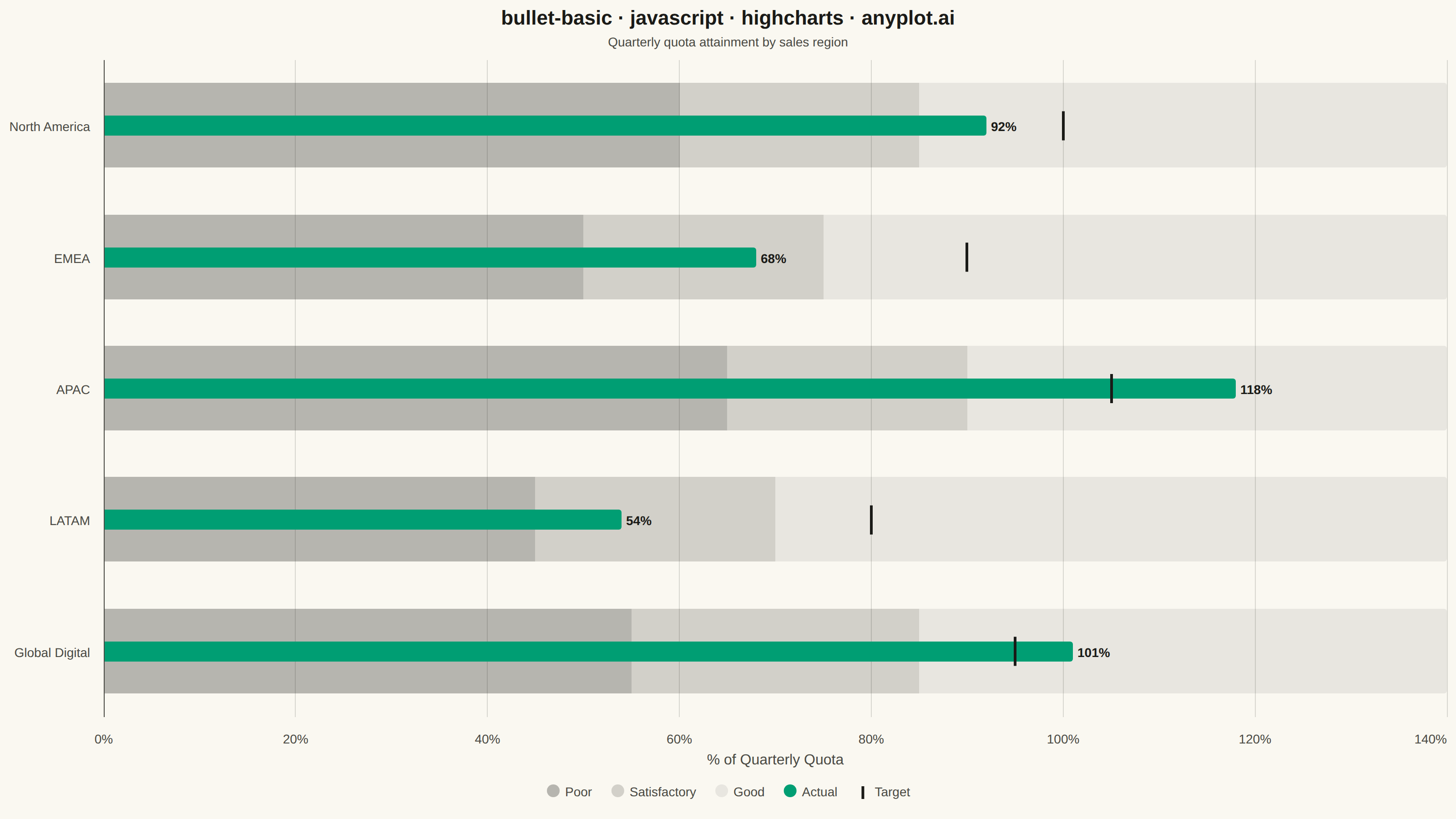
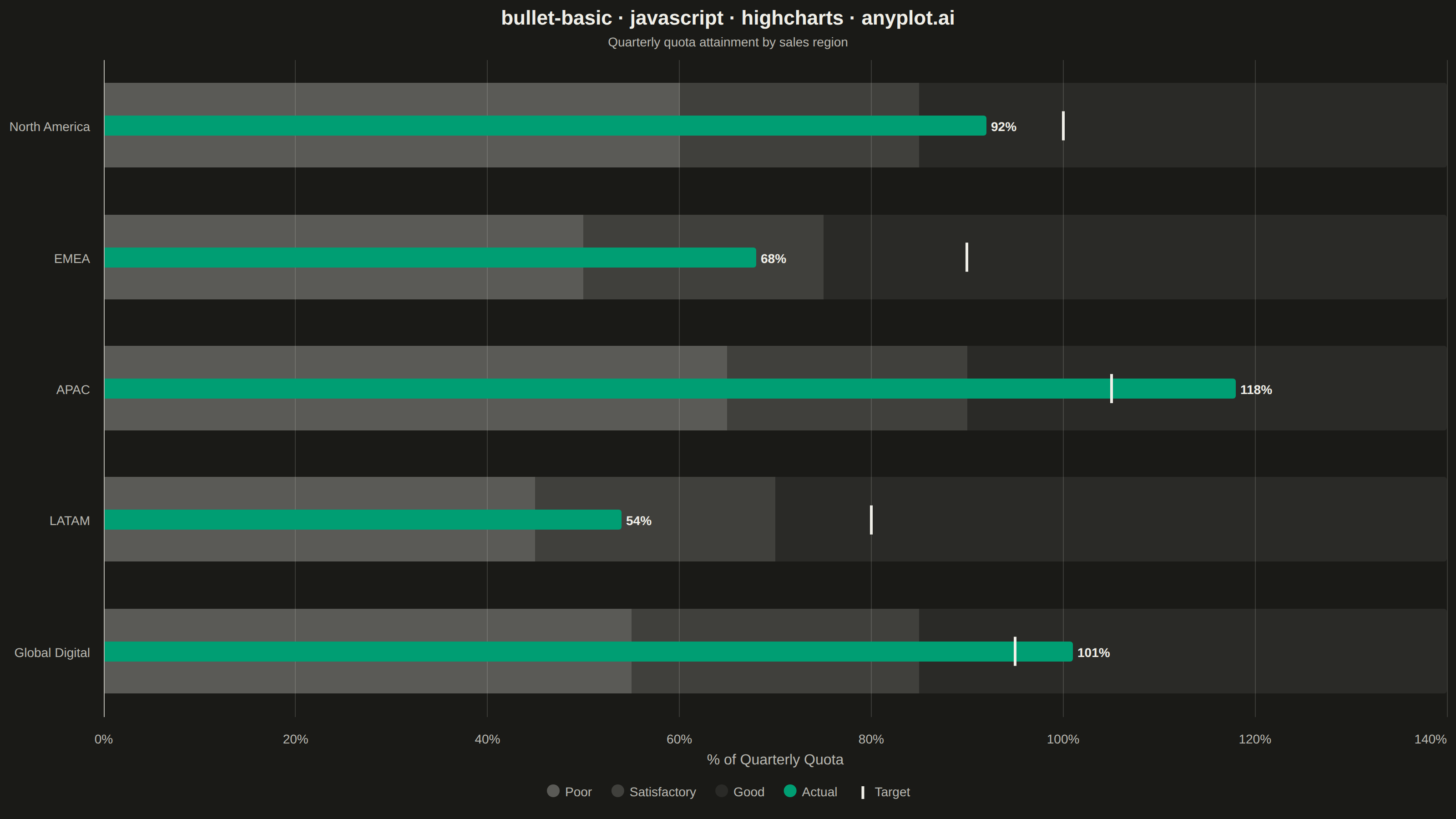
A bullet chart displays a single measure against qualitative ranges and a target marker, designed by Stephen Few as a space-efficient alternative to gauge charts. The linear format shows actual performance as a bar, a target as a vertical marker, and background bands representing qualitative ranges (poor/satisfactory/good). Its compact design allows multiple bullet charts to fit on a single dashboard for easy comparison across metrics.
// anyplot.ai
// bullet-basic: Basic Bullet Chart
// Library: highcharts 12.6.0 | JavaScript 22.23.2
// Quality: 86/100 | Created: 2026-08-24

const t = window.ANYPLOT_TOKENS;

// --- Data (in-memory, deterministic) ----------------------------------------
// Quarterly quota attainment (% of quota) across sales regions. Each region
// carries its own target and qualitative range thresholds — the shared 0-140
// value axis keeps the rows comparable at a glance.
const rows = [
  { label: "North America", actual: 92, target: 100, ranges: [60, 85, 140] },
  { label: "EMEA", actual: 68, target: 90, ranges: [50, 75, 140] },
  { label: "APAC", actual: 118, target: 105, ranges: [65, 90, 140] },
  { label: "LATAM", actual: 54, target: 80, ranges: [45, 70, 140] },
  { label: "Global Digital", actual: 101, target: 95, ranges: [55, 85, 140] },
];

// Grayscale range-band shading (Stephen Few convention): darkest for the
// "poor" zone, lightening toward "good" so the actual bar and target marker
// stay the visual focus.
const bandColors = [
  Highcharts.color(t.ink).setOpacity(0.3).get("rgba"),
  Highcharts.color(t.ink).setOpacity(0.18).get("rgba"),
  Highcharts.color(t.ink).setOpacity(0.08).get("rgba"),
];

// Stacked range-band segment widths, derived from the cumulative thresholds.
const poorData = rows.map((r) => r.ranges[0]);
const satisfactoryData = rows.map((r) => r.ranges[1] - r.ranges[0]);
const goodData = rows.map((r) => r.ranges[2] - r.ranges[1]);
const actualData = rows.map((r) => r.actual);
const targetData = rows.map((r, i) => ({ x: i, y: r.target }));

// Custom symbol: a thin vertical tick, perpendicular to the horizontal bars,
// marking the target — built from core Highcharts primitives (no add-on
// module needed for a bullet-chart target marker).
Highcharts.SVGRenderer.prototype.symbols.targettick = function (x, y, w, h) {
  const cx = x + w / 2;
  return ["M", cx, y, "L", cx, y + h, "Z"];
};

// --- Chart -------------------------------------------------------------------
Highcharts.chart("container", {
  chart: {
    type: "bar",
    backgroundColor: "transparent",
    animation: false,
    style: { fontFamily: "inherit" },
  },
  credits: { enabled: false },
  title: {
    text: "bullet-basic · javascript · highcharts · anyplot.ai",
    style: { color: t.ink, fontSize: "22px", fontWeight: "600" },
  },
  subtitle: {
    text: "Quarterly quota attainment by sales region",
    style: { color: t.inkSoft, fontSize: "14px" },
  },
  xAxis: {
    categories: rows.map((r) => r.label),
    reversed: true,
    lineColor: t.inkSoft,
    tickColor: t.inkSoft,
    labels: { style: { color: t.inkSoft, fontSize: "14px" } },
  },
  yAxis: {
    min: 0,
    max: 140,
    tickInterval: 20,
    reversedStacks: false,
    title: {
      text: "% of Quarterly Quota",
      style: { color: t.inkSoft, fontSize: "16px" },
    },
    gridLineColor: t.grid,
    labels: {
      style: { color: t.inkSoft, fontSize: "14px" },
      format: "{value}%",
    },
  },
  legend: {
    itemStyle: { color: t.inkSoft, fontSize: "14px" },
    itemHoverStyle: { color: t.ink },
  },
  plotOptions: {
    series: { animation: false, pointPadding: 0.08, groupPadding: 0.12 },
    bar: { borderWidth: 0 },
  },
  series: [
    {
      name: "Poor",
      data: poorData,
      color: bandColors[0],
      stacking: "normal",
      showInLegend: true,
    },
    {
      name: "Satisfactory",
      data: satisfactoryData,
      color: bandColors[1],
      stacking: "normal",
      showInLegend: true,
    },
    {
      name: "Good",
      data: goodData,
      color: bandColors[2],
      stacking: "normal",
      showInLegend: true,
    },
    {
      name: "Actual",
      type: "bar",
      data: actualData,
      color: t.palette[0],
      pointWidth: 22,
      grouping: false,
      showInLegend: true,
      dataLabels: {
        enabled: true,
        format: "{y}%",
        style: {
          color: t.ink,
          fontSize: "14px",
          fontWeight: "600",
          textOutline: "none",
        },
      },
    },
    {
      name: "Target",
      type: "scatter",
      data: targetData,
      showInLegend: true,
      marker: {
        symbol: "targettick",
        radius: 16,
        fillColor: "transparent",
        lineColor: t.ink,
        lineWidth: 3,
      },
    },
  ],
});
Runnable source as JSON, for any HTTP client: https://api.anyplot.ai/specs/bullet-basic/highcharts/code. Any spec id and library id listed in llms-full.txt fit the same URL shape; every URL below is complete and callable.
{
  "spec_id": "bullet-basic",
  "language": "javascript",
  "library": "highcharts",
  "page": "https://anyplot.ai/bullet-basic/javascript/highcharts",
  "hub": "https://anyplot.ai/bullet-basic",
  "code_json": "https://api.anyplot.ai/specs/bullet-basic/highcharts/code",
  "spec_json": "https://api.anyplot.ai/specs/bullet-basic",
  "render_light_png": "https://storage.googleapis.com/anyplot-images/plots/bullet-basic/javascript/highcharts/plot-light.png",
  "render_dark_png": "https://storage.googleapis.com/anyplot-images/plots/bullet-basic/javascript/highcharts/plot-dark.png",
  "interactive_light_html": "https://storage.googleapis.com/anyplot-images/plots/bullet-basic/javascript/highcharts/plot-light.html",
  "interactive_dark_html": "https://storage.googleapis.com/anyplot-images/plots/bullet-basic/javascript/highcharts/plot-dark.html",
  "quality_score": 86.0,
  "license": "MIT",
  "guide": "https://anyplot.ai/llms.txt"
}
Part of Basic Bullet Chart on anyplot.ai.