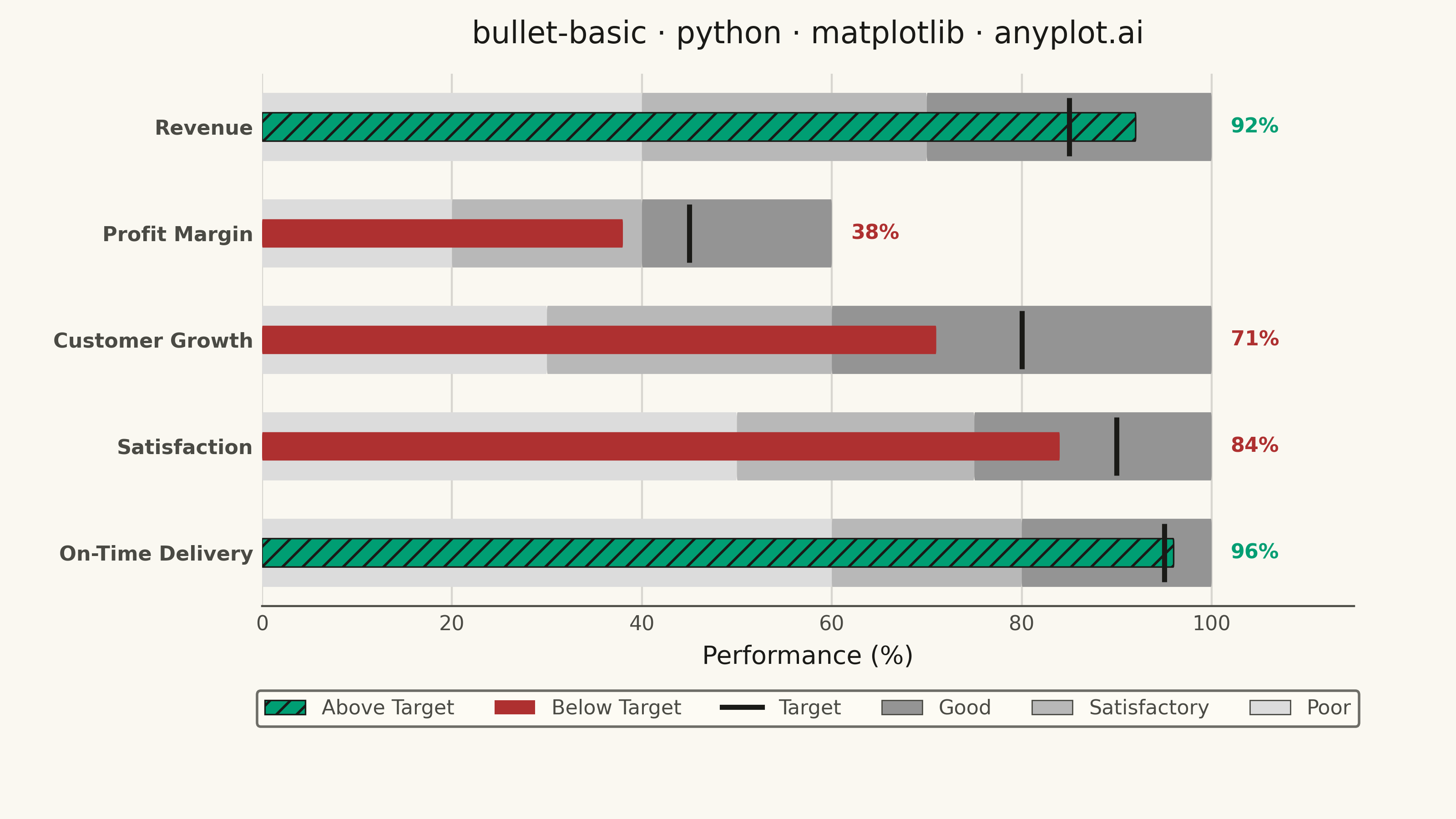
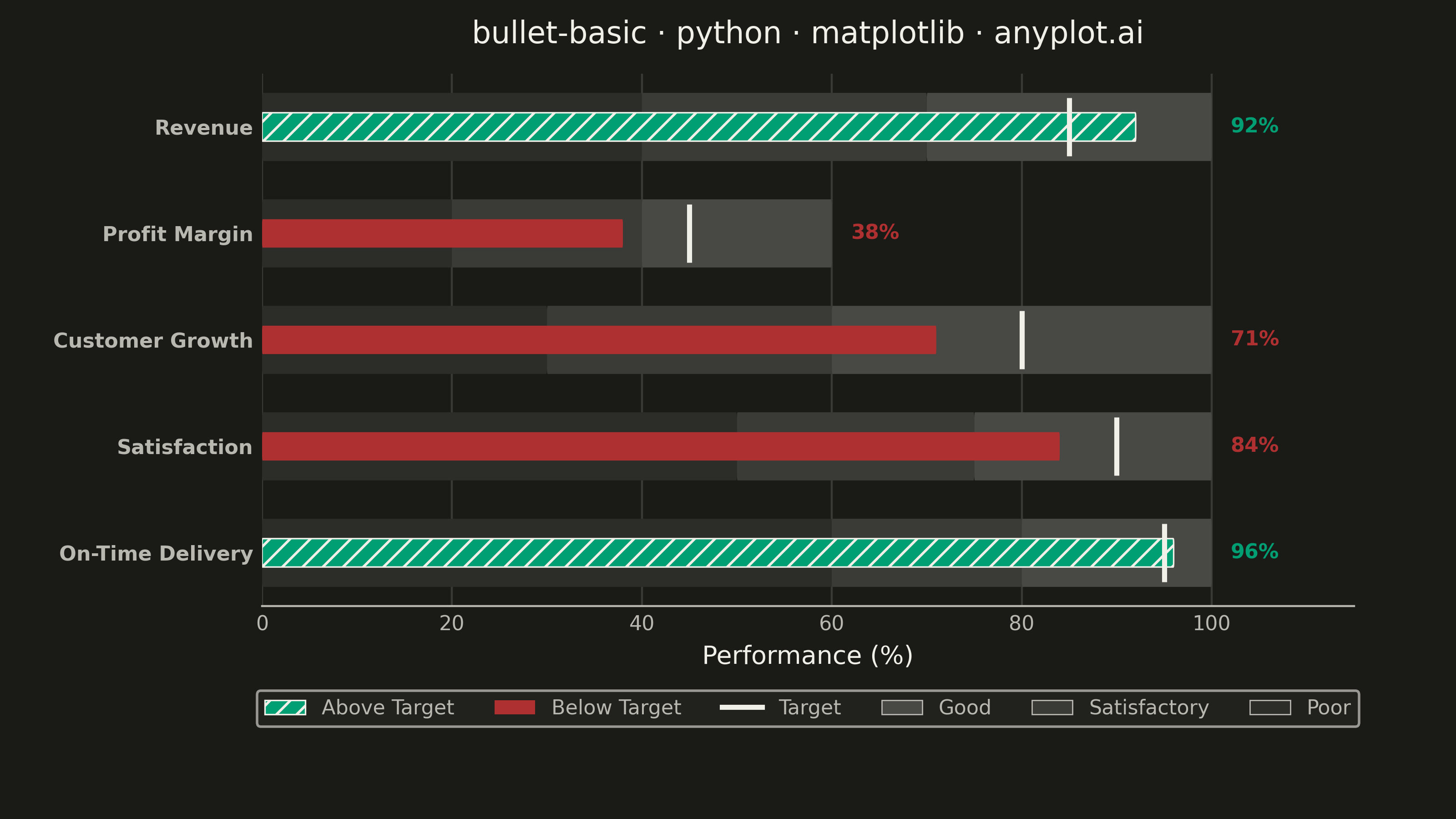
A bullet chart displays a single measure against qualitative ranges and a target marker, designed by Stephen Few as a space-efficient alternative to gauge charts. The linear format shows actual performance as a bar, a target as a vertical marker, and background bands representing qualitative ranges (poor/satisfactory/good). Its compact design allows multiple bullet charts to fit on a single dashboard for easy comparison across metrics.
""" anyplot.ai
bullet-basic: Basic Bullet Chart
Library: matplotlib 3.10.9 | Python 3.13.13
Quality: 88/100 | Updated: 2026-05-29
"""

import os

import matplotlib.pyplot as plt
from matplotlib.lines import Line2D
from matplotlib.patches import FancyBboxPatch, Patch


THEME = os.getenv("ANYPLOT_THEME", "light")

# Theme-adaptive chrome — Imprint palette
PAGE_BG = "#FAF8F1" if THEME == "light" else "#1A1A17"
ELEVATED_BG = "#FFFDF6" if THEME == "light" else "#242420"
INK = "#1A1A17" if THEME == "light" else "#F0EFE8"
INK_SOFT = "#4A4A44" if THEME == "light" else "#B8B7B0"
INK_MUTED = "#6B6A63" if THEME == "light" else "#A8A79F"

# Imprint palette — semantic: green = above target (good/pass), red = below target (bad/fail)
COLOR_ABOVE = "#009E73"  # Imprint brand green
COLOR_BELOW = "#AE3030"  # Imprint matte red

# Qualitative range band shading — neutral grayscale, theme-adaptive
if THEME == "light":
    band_colors = ["#dcdcdc", "#b8b8b8", "#949494"]  # lighter = poor, darker = good
else:
    band_colors = ["#2C2C29", "#3A3A37", "#484845"]  # slightly lighter than bg = poor -> good

# Data: Quarterly KPI dashboard with percentage-based metrics
metrics = [
    {"label": "Revenue", "actual": 92, "target": 85, "ranges": [40, 70, 100]},
    {"label": "Profit Margin", "actual": 38, "target": 45, "ranges": [20, 40, 60]},
    {"label": "Customer Growth", "actual": 71, "target": 80, "ranges": [30, 60, 100]},
    {"label": "Satisfaction", "actual": 84, "target": 90, "ranges": [50, 75, 100]},
    {"label": "On-Time Delivery", "actual": 96, "target": 95, "ranges": [60, 80, 100]},
]

fig, ax = plt.subplots(figsize=(8, 4.5), dpi=400, facecolor=PAGE_BG)
ax.set_facecolor(PAGE_BG)

bar_height = 0.32
band_height = bar_height * 2.4
spacing = 1.2
y_positions = [i * spacing for i in range(len(metrics))]

for i, metric in enumerate(metrics):
    y = y_positions[i]
    ranges = metric["ranges"]

    # Qualitative range bands with rounded corners
    band_starts = [0] + ranges[:-1]
    for j, (start, end) in enumerate(zip(band_starts, ranges, strict=True)):
        width = end - start
        box = FancyBboxPatch(
            (start, y - band_height / 2),
            width,
            band_height,
            boxstyle="round,pad=0,rounding_size=0.08",
            facecolor=band_colors[j],
            edgecolor="none",
            zorder=1,
        )
        ax.add_patch(box)

    above_target = metric["actual"] >= metric["target"]
    bar_color = COLOR_ABOVE if above_target else COLOR_BELOW

    # Actual value bar with rounded corners; hatch on above-target bars = redundant CVD-safe encoding
    actual_bar = FancyBboxPatch(
        (0, y - bar_height / 2),
        metric["actual"],
        bar_height,
        boxstyle="round,pad=0,rounding_size=0.06",
        facecolor=bar_color,
        edgecolor=INK if above_target else "none",
        linewidth=0.6,
        hatch="///" if above_target else None,
        zorder=2,
    )
    ax.add_patch(actual_bar)

    # Target marker: thin vertical line perpendicular to bar
    ax.vlines(
        metric["target"], y - band_height / 2 * 0.85, y + band_height / 2 * 0.85, colors=INK, linewidth=2.0, zorder=3
    )

    # Value label to the right of the max range
    ax.text(
        ranges[-1] + 2,
        y,
        f"{metric['actual']}%",
        va="center",
        ha="left",
        fontsize=8,
        fontweight="bold",
        color=bar_color,
        zorder=4,
    )

# Y-axis: metric name labels
ax.set_yticks(y_positions)
ax.set_yticklabels([m["label"] for m in metrics], fontsize=8, fontweight="bold")
ax.tick_params(axis="y", length=0, colors=INK_SOFT, labelcolor=INK_SOFT)

# X-axis
ax.set_xlabel("Performance (%)", fontsize=10, color=INK)
ax.tick_params(axis="x", labelsize=8, colors=INK_SOFT, labelcolor=INK_SOFT, length=0)

# Title — language token required
title = "bullet-basic · python · matplotlib · anyplot.ai"
title_len = len(title)
title_fontsize = max(8, round(12 * 67 / title_len)) if title_len > 67 else 12
ax.set_title(title, fontsize=title_fontsize, fontweight="medium", pad=12, color=INK)

# Subtle x-axis grid
ax.xaxis.grid(True, alpha=0.15, linewidth=0.8, color=INK, zorder=0)
ax.set_axisbelow(True)

# Spines — keep bottom only for clean look
for spine in ["top", "right", "left"]:
    ax.spines[spine].set_visible(False)
ax.spines["bottom"].set_color(INK_SOFT)

# Axis limits
ax.set_xlim(left=0, right=115)
ax.set_ylim(-spacing * 0.5, y_positions[-1] + spacing * 0.5)
ax.invert_yaxis()

# Legend
legend_elements = [
    Patch(facecolor=COLOR_ABOVE, edgecolor=INK, linewidth=0.6, hatch="///", label="Above Target"),
    Patch(facecolor=COLOR_BELOW, edgecolor="none", label="Below Target"),
    Line2D([0], [0], color=INK, linewidth=2.0, label="Target"),
    Patch(facecolor=band_colors[2], edgecolor=INK_SOFT, linewidth=0.5, label="Good"),
    Patch(facecolor=band_colors[1], edgecolor=INK_SOFT, linewidth=0.5, label="Satisfactory"),
    Patch(facecolor=band_colors[0], edgecolor=INK_SOFT, linewidth=0.5, label="Poor"),
]
leg = ax.legend(
    handles=legend_elements, loc="upper center", bbox_to_anchor=(0.5, -0.14), ncol=6, fontsize=8, frameon=True
)
leg.get_frame().set_facecolor(ELEVATED_BG)
leg.get_frame().set_edgecolor(INK_SOFT)
plt.setp(leg.get_texts(), color=INK_SOFT)

# Explicit padding — do NOT use bbox_inches="tight" on savefig (trims canvas)
fig.subplots_adjust(left=0.18, right=0.93, top=0.91, bottom=0.26)
plt.savefig(f"plot-{THEME}.png", dpi=400)
Runnable source as JSON, for any HTTP client: https://api.anyplot.ai/specs/bullet-basic/matplotlib/code. Any spec id and library id listed in llms-full.txt fit the same URL shape; every URL below is complete and callable.
{
  "spec_id": "bullet-basic",
  "language": "python",
  "library": "matplotlib",
  "page": "https://anyplot.ai/bullet-basic/python/matplotlib",
  "hub": "https://anyplot.ai/bullet-basic",
  "code_json": "https://api.anyplot.ai/specs/bullet-basic/matplotlib/code",
  "spec_json": "https://api.anyplot.ai/specs/bullet-basic",
  "render_light_png": "https://storage.googleapis.com/anyplot-images/plots/bullet-basic/python/matplotlib/plot-light.png",
  "render_dark_png": "https://storage.googleapis.com/anyplot-images/plots/bullet-basic/python/matplotlib/plot-dark.png",
  "quality_score": 88.0,
  "license": "MIT",
  "guide": "https://anyplot.ai/llms.txt"
}
Part of Basic Bullet Chart on anyplot.ai.