The same plot in 14 other libraries — JavaScript: Chart.js, D3.js, Apache ECharts, MUI X Charts; Python: Altair, Bokeh, lets-plot, Matplotlib, Plotly, plotnine, Pygal, Seaborn; R: ggplot2; Julia: Makie.jl. Compare all 15 side by side: Calibration Curve in Python, R, Julia and JavaScript.
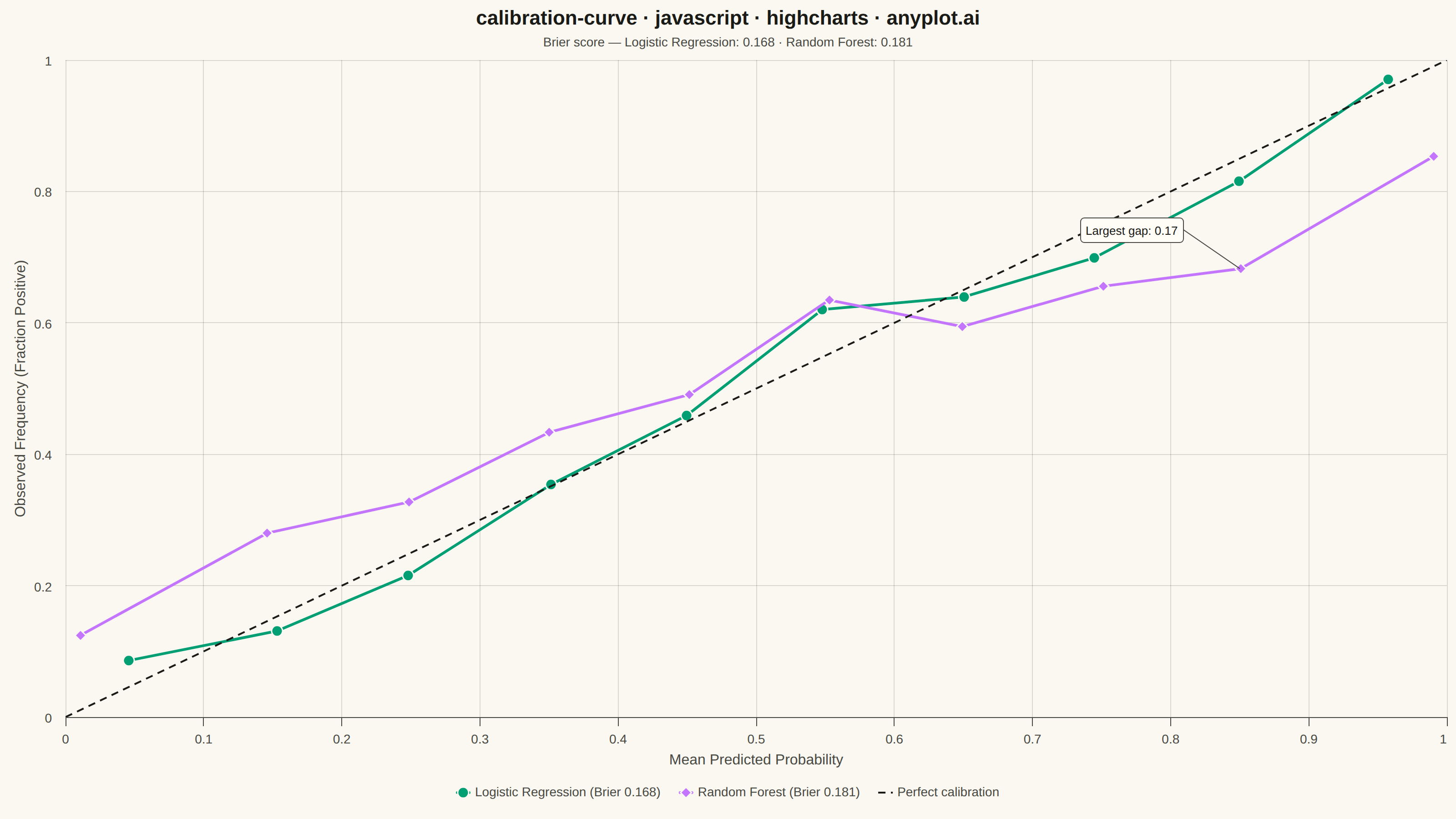
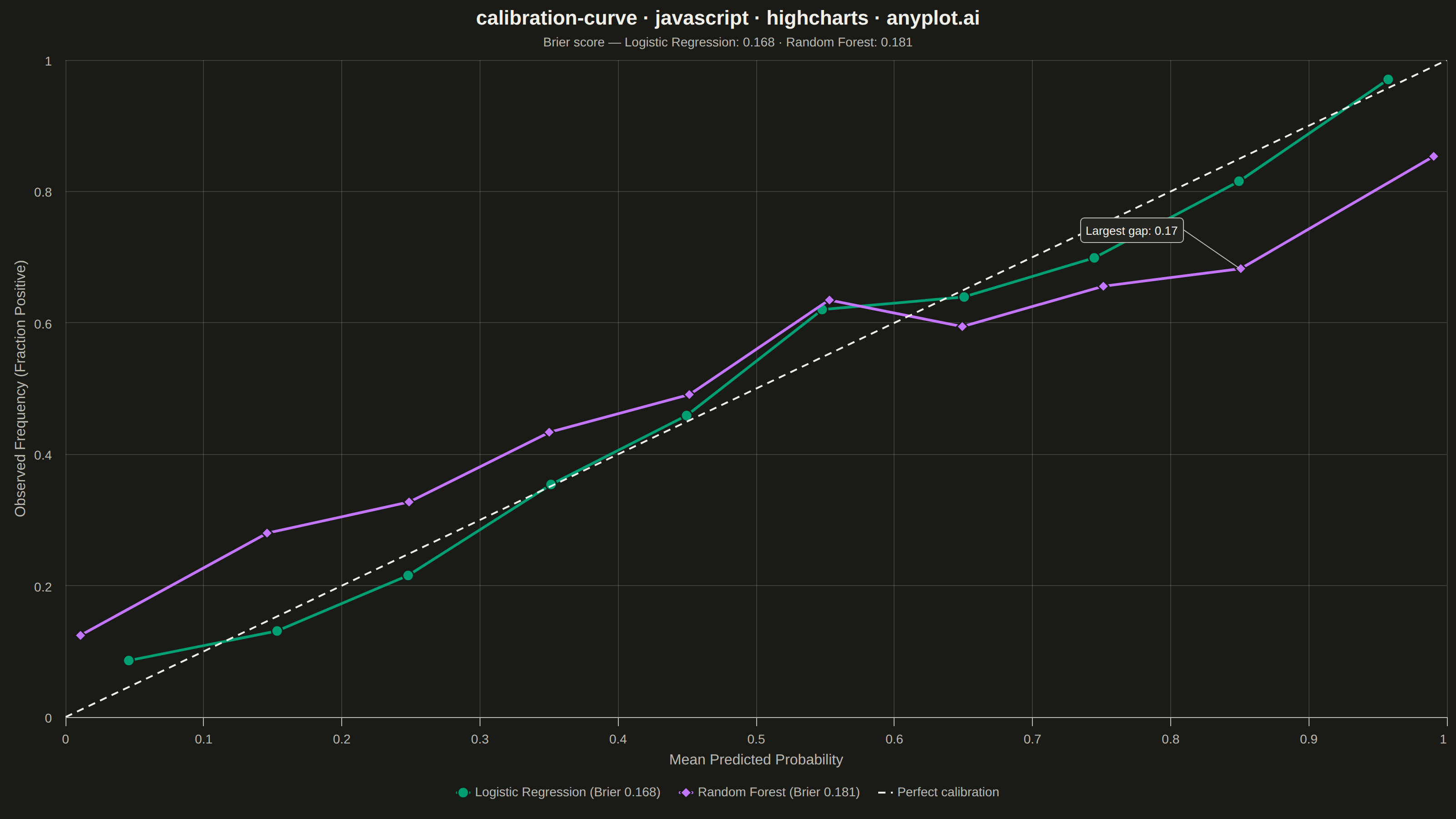
A calibration curve (reliability diagram) visualizes how well the predicted probabilities of a binary classifier match actual outcomes. By plotting the fraction of positives against mean predicted probability in binned intervals, it reveals whether a model is well-calibrated, overconfident, or underconfident. A perfectly calibrated model follows the diagonal line where predicted probability equals observed frequency.
// anyplot.ai
// calibration-curve: Calibration Curve
// Library: highcharts 12.6.0 | JavaScript 22.23.2
// Quality: 91/100 | Created: 2026-09-02

const t = window.ANYPLOT_TOKENS;

// --- Data (in-memory, deterministic) ----------------------------------------
// 2,000 simulated diagnostic screenings: a latent true disease risk drives the
// binary outcome, and two classifiers predict probabilities from it — one
// well-calibrated (logistic regression), one overconfident (random forest).
function lcg(seed) {
  let state = seed >>> 0;
  return () => {
    state = (1664525 * state + 1013904223) >>> 0;
    return state / 4294967296;
  };
}
const rand = lcg(20260225);

function randNormal() {
  const u1 = Math.max(rand(), 1e-9);
  const u2 = rand();
  return Math.sqrt(-2 * Math.log(u1)) * Math.cos(2 * Math.PI * u2);
}

const patientCount = 2000;
const actualOutcome = [];
const probLogReg = [];
const probRandForest = [];

for (let i = 0; i < patientCount; i++) {
  const trueRisk = rand();
  actualOutcome.push(rand() < trueRisk ? 1 : 0);
  const calibratedNoise = randNormal() * 0.05;
  probLogReg.push(Math.min(1, Math.max(0, trueRisk + calibratedNoise)));
  const sharpenedRisk = 0.5 + (trueRisk - 0.5) * 1.7;
  const overconfidentNoise = randNormal() * 0.04;
  probRandForest.push(Math.min(1, Math.max(0, sharpenedRisk + overconfidentNoise)));
}

function binCalibration(yTrue, yProb, binCount) {
  const bins = Array.from({ length: binCount }, () => ({ sumProb: 0, sumOutcome: 0, count: 0 }));
  for (let i = 0; i < yProb.length; i++) {
    const idx = Math.min(binCount - 1, Math.floor(yProb[i] * binCount));
    bins[idx].sumProb += yProb[i];
    bins[idx].sumOutcome += yTrue[i];
    bins[idx].count += 1;
  }
  return bins.filter((b) => b.count > 0).map((b) => [b.sumProb / b.count, b.sumOutcome / b.count]);
}

function brierScore(yTrue, yProb) {
  let sum = 0;
  for (let i = 0; i < yProb.length; i++) sum += (yProb[i] - yTrue[i]) ** 2;
  return sum / yProb.length;
}

const calibrationLogReg = binCalibration(actualOutcome, probLogReg, 10);
const calibrationRandForest = binCalibration(actualOutcome, probRandForest, 10);
const brierLogReg = brierScore(actualOutcome, probLogReg);
const brierRandForest = brierScore(actualOutcome, probRandForest);

// Locate the Random Forest bin with the largest predicted-vs-observed gap so
// the chart can call out exactly where the overconfidence is worst.
let maxGapIndex = 0;
let maxGap = 0;
calibrationRandForest.forEach(([predicted, observed], i) => {
  const gap = Math.abs(predicted - observed);
  if (gap > maxGap) {
    maxGap = gap;
    maxGapIndex = i;
  }
});
const [maxGapX, maxGapY] = calibrationRandForest[maxGapIndex];

// --- Chart -------------------------------------------------------------------
Highcharts.chart("container", {
  chart: {
    type: "line",
    backgroundColor: "transparent",
    animation: false,
    style: { fontFamily: "inherit" },
    events: {
      // Highcharts-specific: draw a native SVG callout (renderer.label with the
      // built-in "callout" symbol) anchored to a data point via axis-pixel
      // conversion — not a portable Chart.js/ECharts pattern.
      load() {
        const chart = this;
        const xAxis = chart.xAxis[0];
        const yAxis = chart.yAxis[0];
        const anchorX = xAxis.toPixels(maxGapX);
        const anchorY = yAxis.toPixels(maxGapY);
        const labelX = anchorX + (maxGapX < 0.5 ? 16 : -176);
        const labelY = anchorY + (maxGapY > 0.5 ? -56 : 24);
        chart.renderer
          .label(`Largest gap: ${maxGap.toFixed(2)}`, labelX, labelY, "callout", anchorX, anchorY)
          .attr({
            fill: t.elevatedBg,
            stroke: t.inkSoft,
            "stroke-width": 1,
            r: 4,
            padding: 6,
            zIndex: 8,
          })
          .css({ color: t.ink, fontSize: "13px" })
          .add();
      },
    },
  },
  credits: { enabled: false },
  colors: t.palette,
  title: {
    text: "calibration-curve · javascript · highcharts · anyplot.ai",
    style: { color: t.ink, fontSize: "22px", fontWeight: "600" },
  },
  subtitle: {
    text: `Brier score — Logistic Regression: ${brierLogReg.toFixed(3)} · Random Forest: ${brierRandForest.toFixed(3)}`,
    style: { color: t.inkSoft, fontSize: "14px" },
  },
  xAxis: {
    title: { text: "Mean Predicted Probability", style: { color: t.inkSoft, fontSize: "16px" } },
    min: 0,
    max: 1,
    tickInterval: 0.1,
    lineColor: t.inkSoft,
    tickColor: t.inkSoft,
    gridLineColor: t.grid,
    gridLineWidth: 1,
    labels: { style: { color: t.inkSoft, fontSize: "14px" } },
  },
  yAxis: {
    title: { text: "Observed Frequency (Fraction Positive)", style: { color: t.inkSoft, fontSize: "16px" } },
    min: 0,
    max: 1,
    tickInterval: 0.2,
    lineColor: t.inkSoft,
    tickColor: t.inkSoft,
    gridLineColor: t.grid,
    gridLineWidth: 1,
    labels: { style: { color: t.inkSoft, fontSize: "14px" } },
  },
  legend: {
    itemStyle: { color: t.inkSoft, fontSize: "14px" },
    itemHoverStyle: { color: t.ink },
  },
  tooltip: {
    enabled: true,
    backgroundColor: t.elevatedBg,
    borderColor: t.inkSoft,
    style: { color: t.ink, fontSize: "13px" },
    valueDecimals: 3,
  },
  plotOptions: {
    series: { animation: false },
    line: { lineWidth: 3, marker: { enabled: true, radius: 6, lineWidth: 1.5, lineColor: t.pageBg } },
  },
  series: [
    {
      name: `Logistic Regression (Brier ${brierLogReg.toFixed(3)})`,
      data: calibrationLogReg,
    },
    {
      name: `Random Forest (Brier ${brierRandForest.toFixed(3)})`,
      data: calibrationRandForest,
    },
    {
      name: "Perfect calibration",
      data: [
        [0, 0],
        [1, 1],
      ],
      color: t.ink,
      dashStyle: "Dash",
      lineWidth: 2,
      marker: { enabled: false },
      enableMouseTracking: false,
    },
  ],
});
Runnable source as JSON, for any HTTP client: https://api.anyplot.ai/specs/calibration-curve/highcharts/code. Any spec id and library id listed in llms-full.txt fit the same URL shape; every URL below is complete and callable.
{
  "spec_id": "calibration-curve",
  "language": "javascript",
  "library": "highcharts",
  "page": "https://anyplot.ai/calibration-curve/javascript/highcharts",
  "hub": "https://anyplot.ai/calibration-curve",
  "code_json": "https://api.anyplot.ai/specs/calibration-curve/highcharts/code",
  "spec_json": "https://api.anyplot.ai/specs/calibration-curve",
  "render_light_png": "https://storage.googleapis.com/anyplot-images/plots/calibration-curve/javascript/highcharts/plot-light.png",
  "render_dark_png": "https://storage.googleapis.com/anyplot-images/plots/calibration-curve/javascript/highcharts/plot-dark.png",
  "interactive_light_html": "https://storage.googleapis.com/anyplot-images/plots/calibration-curve/javascript/highcharts/plot-light.html",
  "interactive_dark_html": "https://storage.googleapis.com/anyplot-images/plots/calibration-curve/javascript/highcharts/plot-dark.html",
  "quality_score": 91.0,
  "license": "MIT",
  "guide": "https://anyplot.ai/llms.txt"
}
Part of Calibration Curve on anyplot.ai.