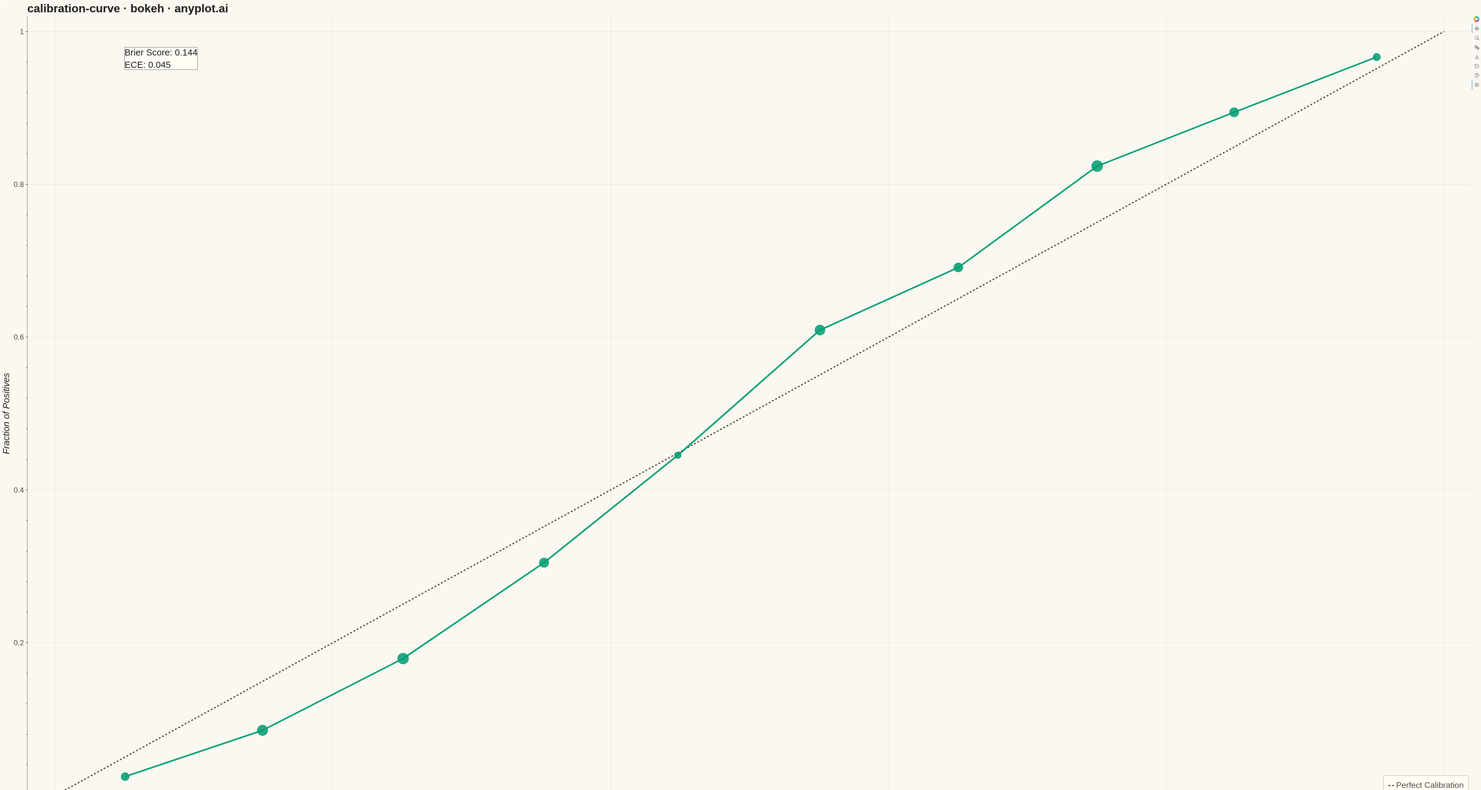
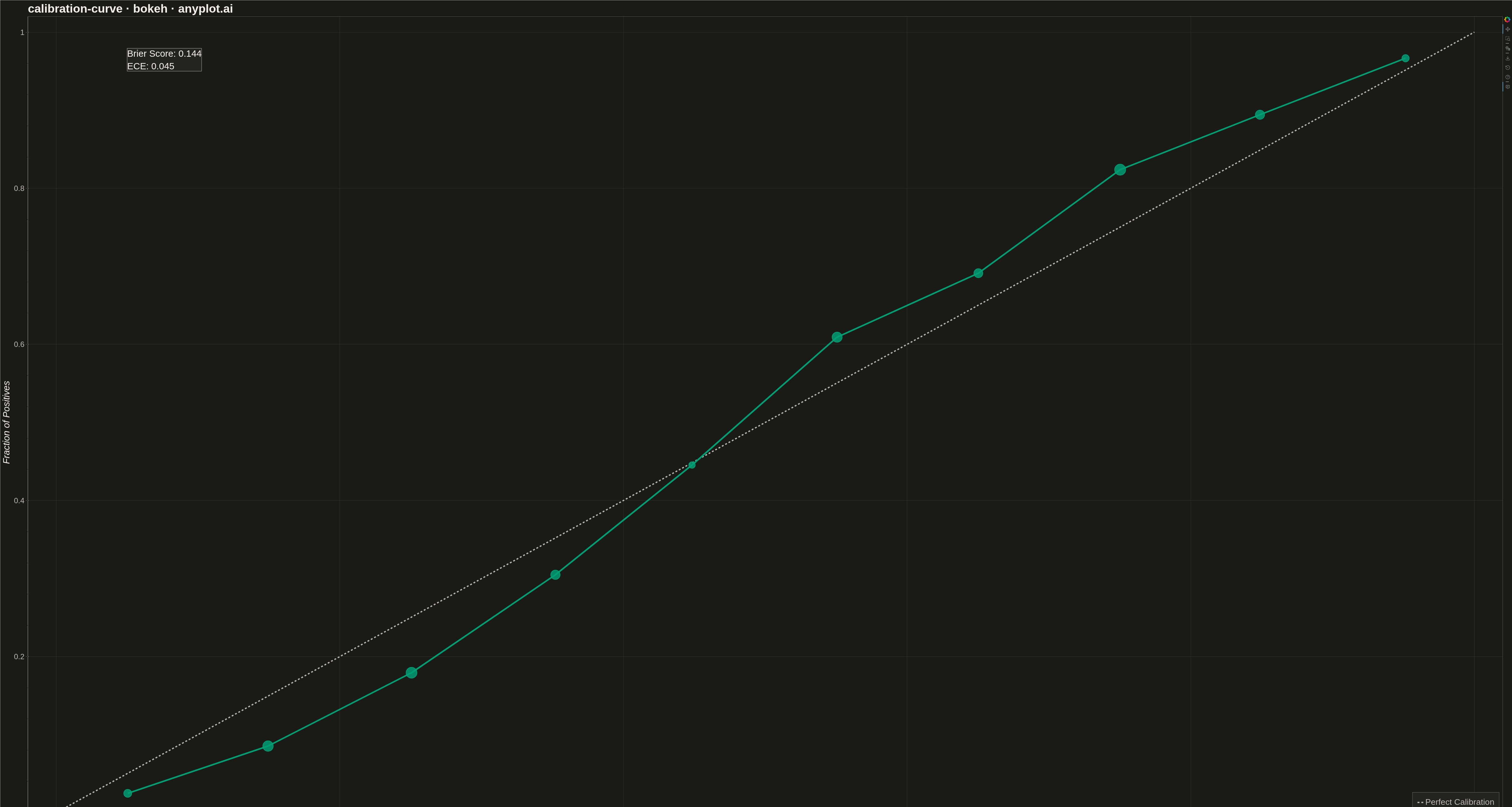
A calibration curve (reliability diagram) visualizes how well the predicted probabilities of a binary classifier match actual outcomes. By plotting the fraction of positives against mean predicted probability in binned intervals, it reveals whether a model is well-calibrated, overconfident, or underconfident. A perfectly calibrated model follows the diagonal line where predicted probability equals observed frequency.
""" anyplot.ai
calibration-curve: Calibration Curve
Library: bokeh 3.9.0 | Python 3.13.13
Quality: 91/100 | Updated: 2026-05-10
"""

import os
import sys
import time
from pathlib import Path

import numpy as np
from bokeh.io import output_file, save
from bokeh.models import ColumnDataSource, HoverTool, Label
from bokeh.plotting import figure
from selenium import webdriver
from selenium.webdriver.chrome.options import Options

THEME = os.getenv("ANYPLOT_THEME", "light")
PAGE_BG = "#FAF8F1" if THEME == "light" else "#1A1A17"
ELEVATED_BG = "#FFFDF6" if THEME == "light" else "#242420"
INK = "#1A1A17" if THEME == "light" else "#F0EFE8"
INK_SOFT = "#4A4A44" if THEME == "light" else "#B8B7B0"
BRAND = "#009E73"
NEUTRAL = "#1A1A1A" if THEME == "light" else "#E8E8E0"

# Data - Simulate binary classification predictions
np.random.seed(42)
n_samples = 5000

y_prob = np.random.uniform(0, 1, n_samples)

calibration_factor = 1.3
adjusted_prob = 1 / (
    1 + np.exp(-calibration_factor * (np.log(y_prob / (1 - y_prob + 1e-10))))
)
adjusted_prob = np.clip(adjusted_prob, 0.01, 0.99)
y_true = (np.random.uniform(0, 1, n_samples) < adjusted_prob).astype(int)

# Calculate calibration curve (binned)
n_bins = 10
bin_edges = np.linspace(0, 1, n_bins + 1)

fraction_of_positives = []
mean_predicted_value = []
bin_counts = []

for i in range(n_bins):
    mask = (y_prob >= bin_edges[i]) & (y_prob < bin_edges[i + 1])
    if i == n_bins - 1:
        mask = (y_prob >= bin_edges[i]) & (y_prob <= bin_edges[i + 1])

    if mask.sum() > 0:
        fraction_of_positives.append(y_true[mask].mean())
        mean_predicted_value.append(y_prob[mask].mean())
        bin_counts.append(mask.sum())
    else:
        fraction_of_positives.append(np.nan)
        mean_predicted_value.append(
            bin_edges[i] + (bin_edges[i + 1] - bin_edges[i]) / 2
        )
        bin_counts.append(0)

valid_mask = np.array(bin_counts) > 0
mean_pred_valid = np.array(mean_predicted_value)[valid_mask]
frac_pos_valid = np.array(fraction_of_positives)[valid_mask]
counts_valid = np.array(bin_counts)[valid_mask]

# Calculate Brier score and ECE
brier_score = np.mean((y_prob - y_true) ** 2)

ece = 0
total_samples = sum(bin_counts)
for i in range(len(bin_counts)):
    if bin_counts[i] > 0:
        ece += (bin_counts[i] / total_samples) * abs(
            fraction_of_positives[i] - mean_predicted_value[i]
        )

# Create calibration plot
p = figure(
    width=4800,
    height=2700,
    title="calibration-curve · bokeh · anyplot.ai",
    x_axis_label="Mean Predicted Probability",
    y_axis_label="Fraction of Positives",
    x_range=(-0.02, 1.02),
    y_range=(-0.02, 1.02),
)

# Add diagonal reference line (perfect calibration)
p.line(
    [0, 1],
    [0, 1],
    line_color=INK_SOFT,
    line_dash="dashed",
    line_width=4,
    legend_label="Perfect Calibration",
)

# Create source for calibration curve
source = ColumnDataSource(
    data={"x": mean_pred_valid, "y": frac_pos_valid, "count": counts_valid}
)

# Add HoverTool for interactivity
hover = HoverTool(
    tooltips=[
        ("Predicted", "@x{0.00}"),
        ("Observed", "@y{0.00}"),
        ("Count", "@count"),
    ]
)
p.add_tools(hover)

# Plot calibration curve with markers
p.line("x", "y", source=source, line_color=BRAND, line_width=5, legend_label="Classifier")
p.scatter(
    "x",
    "y",
    source=source,
    size=25,
    color=BRAND,
    fill_alpha=0.9,
    line_color=BRAND,
    line_width=2,
)

# Add metrics annotation
metrics_text = f"Brier Score: {brier_score:.3f}\nECE: {ece:.3f}"
metrics_label = Label(
    x=0.05,
    y=0.95,
    x_units="data",
    y_units="data",
    text=metrics_text,
    text_font_size="22pt",
    text_color=INK,
    background_fill_color=ELEVATED_BG,
    background_fill_alpha=0.95,
    border_line_color=INK_SOFT,
    border_line_width=1,
)
p.add_layout(metrics_label)

# Style the plot
p.title.text_font_size = "28pt"
p.title.text_color = INK
p.xaxis.axis_label_text_font_size = "22pt"
p.yaxis.axis_label_text_font_size = "22pt"
p.xaxis.axis_label_text_color = INK
p.yaxis.axis_label_text_color = INK
p.xaxis.major_label_text_font_size = "18pt"
p.yaxis.major_label_text_font_size = "18pt"
p.xaxis.major_label_text_color = INK_SOFT
p.yaxis.major_label_text_color = INK_SOFT

# Grid styling
p.xgrid.grid_line_color = INK
p.ygrid.grid_line_color = INK
p.xgrid.grid_line_alpha = 0.10
p.ygrid.grid_line_alpha = 0.10

# Legend styling
if p.legend:
    p.legend.label_text_font_size = "20pt"
    p.legend.label_text_color = INK_SOFT
    p.legend.location = "bottom_right"
    p.legend.background_fill_color = ELEVATED_BG
    p.legend.background_fill_alpha = 0.95
    p.legend.border_line_color = INK_SOFT
    p.legend.border_line_width = 1
    p.legend.padding = 15
    p.legend.spacing = 10

# Axis styling
p.xaxis.axis_line_color = INK_SOFT
p.yaxis.axis_line_color = INK_SOFT
p.xaxis.axis_line_width = 1
p.yaxis.axis_line_width = 1
p.xaxis.major_tick_line_color = INK_SOFT
p.yaxis.major_tick_line_color = INK_SOFT
p.xaxis.major_tick_line_width = 1
p.yaxis.major_tick_line_width = 1

# Background
p.background_fill_color = PAGE_BG
p.border_fill_color = PAGE_BG
p.outline_line_color = INK_SOFT
p.outline_line_width = 1

# Save HTML
output_file(f"plot-{THEME}.html")
save(p)

# Screenshot with headless Chrome
W, H = 4800, 2700
opts = Options()
for arg in (
    "--headless=new",
    "--no-sandbox",
    "--disable-dev-shm-usage",
    "--disable-gpu",
    f"--window-size={W},{H}",
    "--hide-scrollbars",
):
    opts.add_argument(arg)
driver = webdriver.Chrome(options=opts)
driver.set_window_size(W, H)
driver.get(f"file://{Path(f'plot-{THEME}.html').resolve()}")
time.sleep(3)
driver.save_screenshot(f"plot-{THEME}.png")
driver.quit()
Runnable source as JSON, for any HTTP client: https://api.anyplot.ai/specs/calibration-curve/bokeh/code. Any spec id and library id listed in llms-full.txt fit the same URL shape; every URL below is complete and callable.
{
  "spec_id": "calibration-curve",
  "language": "python",
  "library": "bokeh",
  "page": "https://anyplot.ai/calibration-curve/python/bokeh",
  "hub": "https://anyplot.ai/calibration-curve",
  "code_json": "https://api.anyplot.ai/specs/calibration-curve/bokeh/code",
  "spec_json": "https://api.anyplot.ai/specs/calibration-curve",
  "render_light_png": "https://storage.googleapis.com/anyplot-images/plots/calibration-curve/python/bokeh/plot-light.png",
  "render_dark_png": "https://storage.googleapis.com/anyplot-images/plots/calibration-curve/python/bokeh/plot-dark.png",
  "interactive_light_html": "https://storage.googleapis.com/anyplot-images/plots/calibration-curve/python/bokeh/plot-light.html",
  "interactive_dark_html": "https://storage.googleapis.com/anyplot-images/plots/calibration-curve/python/bokeh/plot-dark.html",
  "quality_score": 91.0,
  "license": "MIT",
  "guide": "https://anyplot.ai/llms.txt"
}
Part of Calibration Curve on anyplot.ai.