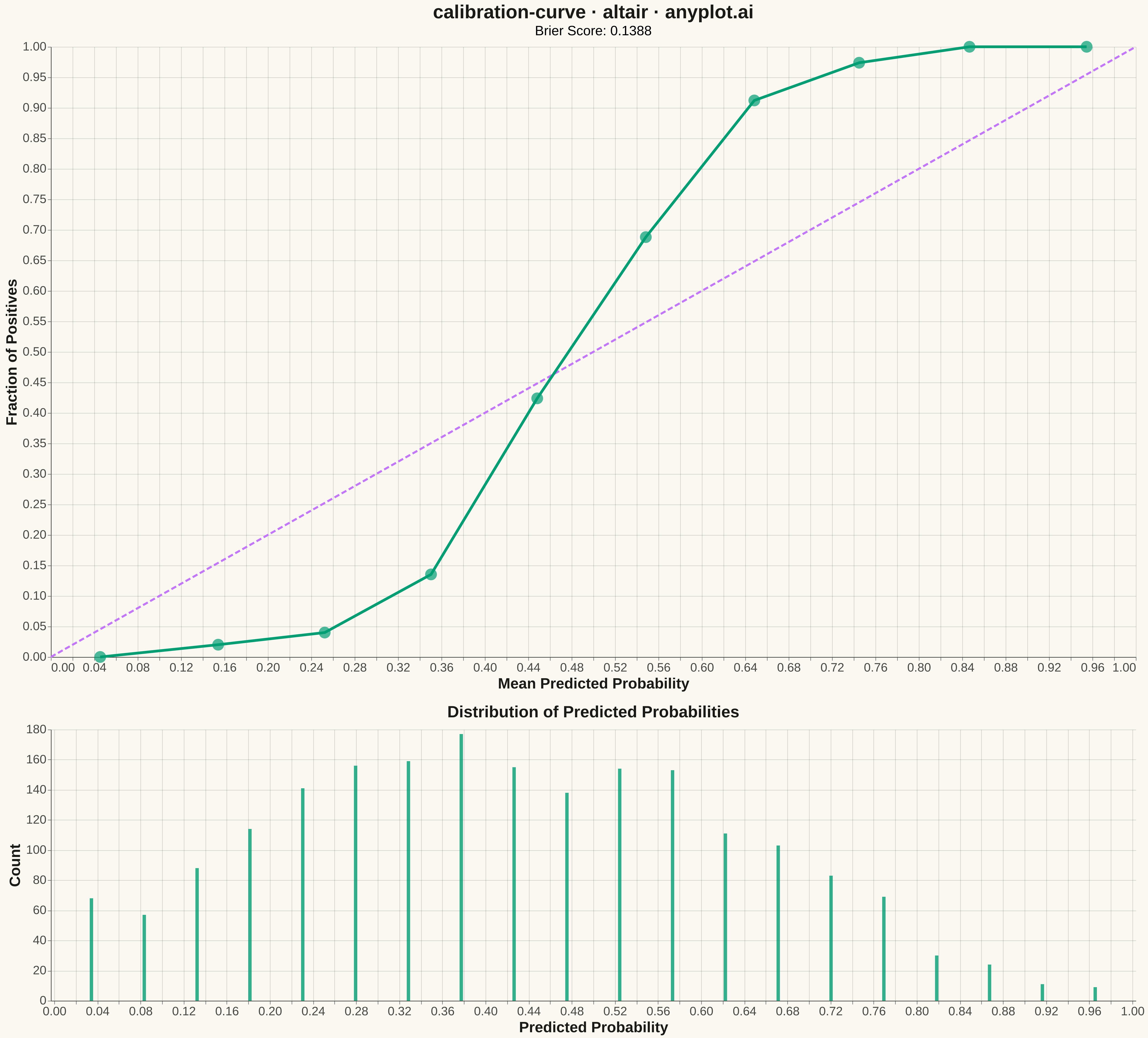
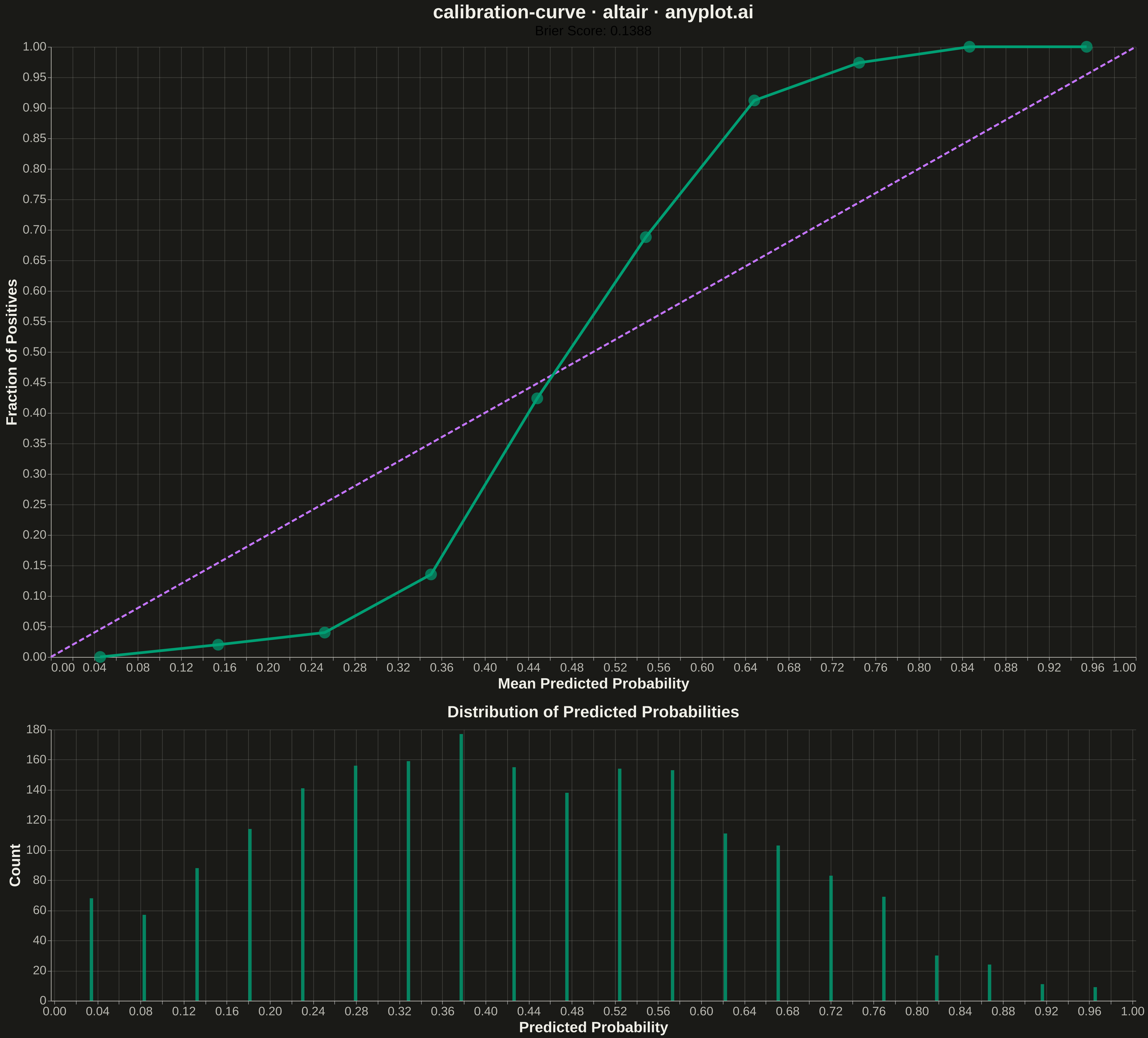
A calibration curve (reliability diagram) visualizes how well the predicted probabilities of a binary classifier match actual outcomes. By plotting the fraction of positives against mean predicted probability in binned intervals, it reveals whether a model is well-calibrated, overconfident, or underconfident. A perfectly calibrated model follows the diagonal line where predicted probability equals observed frequency.
""" anyplot.ai
calibration-curve: Calibration Curve
Library: altair 6.1.0 | Python 3.13.13
Quality: 94/100 | Updated: 2026-05-10
"""

import os

import altair as alt
import numpy as np
import pandas as pd


# Theme tokens
THEME = os.getenv("ANYPLOT_THEME", "light")
PAGE_BG = "#FAF8F1" if THEME == "light" else "#1A1A17"
ELEVATED_BG = "#FFFDF6" if THEME == "light" else "#242420"
INK = "#1A1A17" if THEME == "light" else "#F0EFE8"
INK_SOFT = "#4A4A44" if THEME == "light" else "#B8B7B0"

BRAND = "#009E73"  # Okabe-Ito position 1
ACCENT = "#C475FD"  # Okabe-Ito position 2

# Data - Generate synthetic classification predictions
np.random.seed(42)
n_samples = 2000

# Simulate predictions from a slightly overconfident classifier
y_true = np.random.binomial(1, 0.4, n_samples)
# Create predictions correlated with true labels but with some noise
base_prob = y_true * 0.6 + (1 - y_true) * 0.3
noise = np.random.normal(0, 0.15, n_samples)
y_prob = np.clip(base_prob + noise, 0.01, 0.99)

# Calculate calibration curve manually (10 bins)
n_bins = 10
bin_edges = np.linspace(0, 1, n_bins + 1)
prob_true = []
prob_pred = []

for i in range(n_bins):
    mask = (y_prob >= bin_edges[i]) & (y_prob < bin_edges[i + 1])
    if mask.sum() > 0:
        prob_pred.append(y_prob[mask].mean())
        prob_true.append(y_true[mask].mean())

# Create calibration data
calibration_df = pd.DataFrame({"Mean Predicted Probability": prob_pred, "Fraction of Positives": prob_true})

# Calculate Brier score
brier_score = np.mean((y_prob - y_true) ** 2)

# Create histogram data for predicted probabilities
hist, bin_edges_hist = np.histogram(y_prob, bins=20)
hist_df = pd.DataFrame({"Probability": (bin_edges_hist[:-1] + bin_edges_hist[1:]) / 2, "Count": hist})

# Perfect calibration line
perfect_df = pd.DataFrame({"x": [0, 1], "y": [0, 1]})

# Calibration curve chart
calibration_line = (
    alt.Chart(calibration_df)
    .mark_line(color=BRAND, strokeWidth=4)
    .encode(
        x=alt.X("Mean Predicted Probability:Q", scale=alt.Scale(domain=[0, 1]), title="Mean Predicted Probability"),
        y=alt.Y("Fraction of Positives:Q", scale=alt.Scale(domain=[0, 1]), title="Fraction of Positives"),
    )
)

calibration_points = (
    alt.Chart(calibration_df)
    .mark_point(color=BRAND, size=300, filled=True)
    .encode(
        x=alt.X("Mean Predicted Probability:Q"),
        y=alt.Y("Fraction of Positives:Q"),
        tooltip=["Mean Predicted Probability:Q", "Fraction of Positives:Q"],
    )
)

# Perfect calibration diagonal line
perfect_line = (
    alt.Chart(perfect_df)
    .mark_line(color=ACCENT, strokeWidth=3, strokeDash=[8, 4])
    .encode(x=alt.X("x:Q"), y=alt.Y("y:Q"))
)

# Main calibration chart with grid
calibration_chart = alt.layer(perfect_line, calibration_line, calibration_points).properties(
    width=1600,
    height=900,
    title=alt.Title(
        "calibration-curve · altair · anyplot.ai",
        subtitle=f"Brier Score: {brier_score:.4f}",
        fontSize=28,
        subtitleFontSize=20,
        color=INK,
    ),
)

# Histogram chart (below)
histogram_chart = (
    alt.Chart(hist_df)
    .mark_bar(color=BRAND, opacity=0.8)
    .encode(
        x=alt.X("Probability:Q", scale=alt.Scale(domain=[0, 1]), title="Predicted Probability"),
        y=alt.Y("Count:Q", title="Count"),
    )
    .properties(
        width=1600, height=400, title=alt.Title("Distribution of Predicted Probabilities", fontSize=24, color=INK)
    )
)

# Combine charts vertically with shared configuration
combined_chart = (
    alt.vconcat(calibration_chart, histogram_chart)
    .resolve_scale(color="independent")
    .properties(background=PAGE_BG)
    .configure_axis(
        labelFontSize=18,
        titleFontSize=22,
        labelColor=INK_SOFT,
        titleColor=INK,
        domainColor=INK_SOFT,
        gridColor=INK,
        gridOpacity=0.15,
    )
    .configure_view(strokeWidth=0, fill=PAGE_BG)
    .configure_title(color=INK)
)

# Save as PNG and HTML
combined_chart.save(f"plot-{THEME}.png", scale_factor=3.0)
combined_chart.save(f"plot-{THEME}.html")
Runnable source as JSON, for any HTTP client: https://api.anyplot.ai/specs/calibration-curve/altair/code. Any spec id and library id listed in llms-full.txt fit the same URL shape; every URL below is complete and callable.
{
  "spec_id": "calibration-curve",
  "language": "python",
  "library": "altair",
  "page": "https://anyplot.ai/calibration-curve/python/altair",
  "hub": "https://anyplot.ai/calibration-curve",
  "code_json": "https://api.anyplot.ai/specs/calibration-curve/altair/code",
  "spec_json": "https://api.anyplot.ai/specs/calibration-curve",
  "render_light_png": "https://storage.googleapis.com/anyplot-images/plots/calibration-curve/python/altair/plot-light.png",
  "render_dark_png": "https://storage.googleapis.com/anyplot-images/plots/calibration-curve/python/altair/plot-dark.png",
  "interactive_light_html": "https://storage.googleapis.com/anyplot-images/plots/calibration-curve/python/altair/plot-light.html",
  "interactive_dark_html": "https://storage.googleapis.com/anyplot-images/plots/calibration-curve/python/altair/plot-dark.html",
  "quality_score": 94.0,
  "license": "MIT",
  "guide": "https://anyplot.ai/llms.txt"
}
Part of Calibration Curve on anyplot.ai.