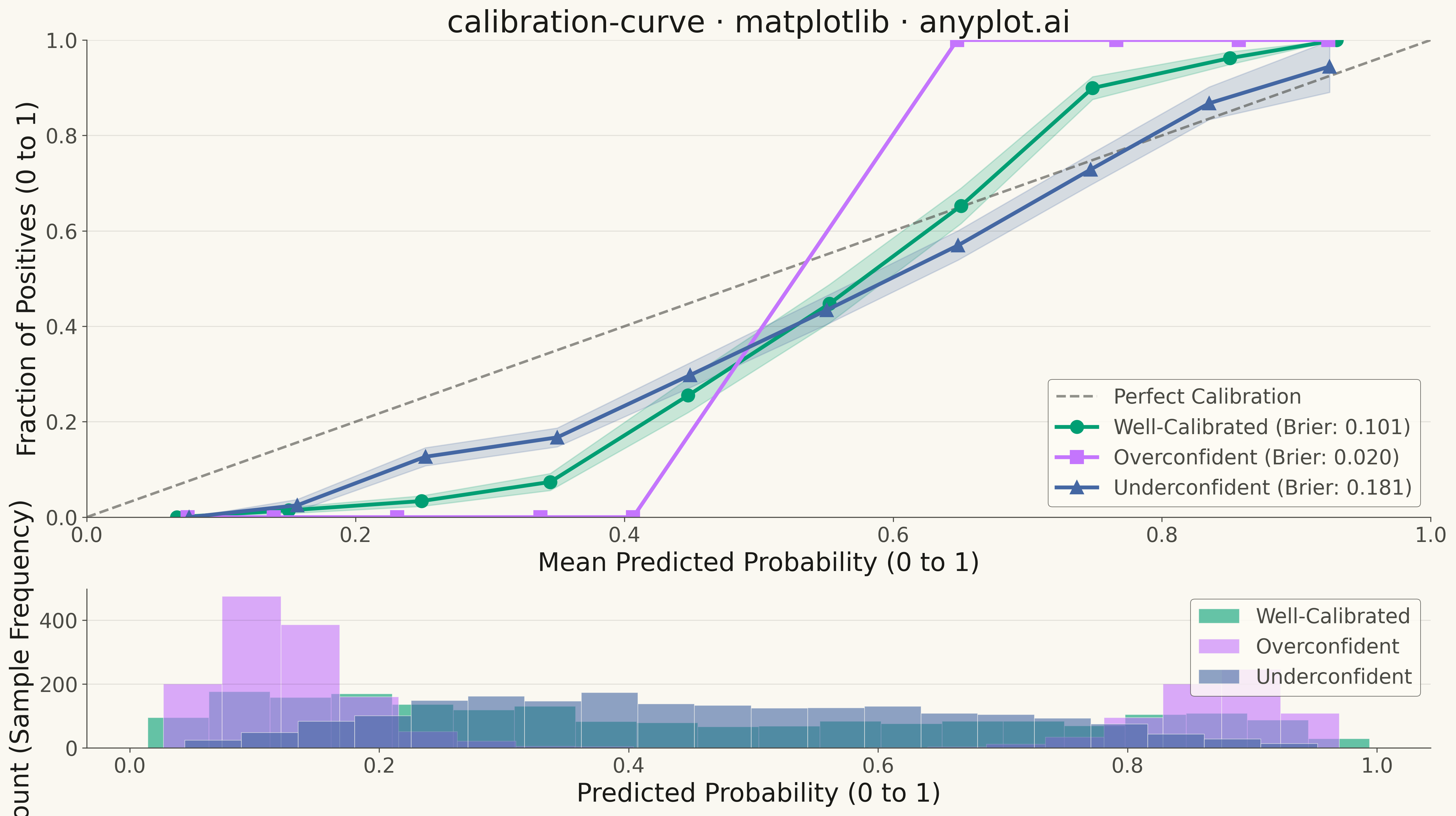
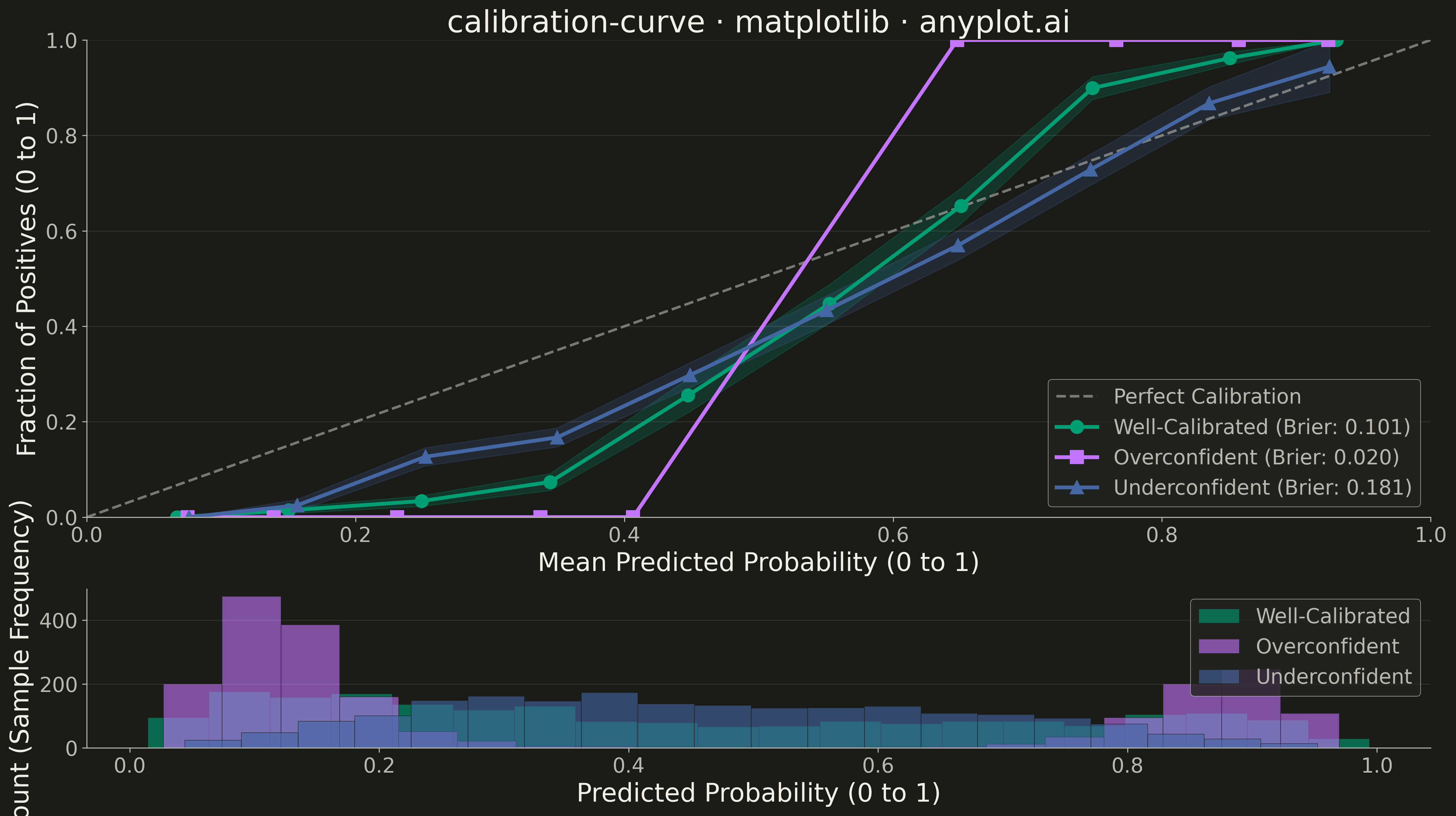
A calibration curve (reliability diagram) visualizes how well the predicted probabilities of a binary classifier match actual outcomes. By plotting the fraction of positives against mean predicted probability in binned intervals, it reveals whether a model is well-calibrated, overconfident, or underconfident. A perfectly calibrated model follows the diagonal line where predicted probability equals observed frequency.
""" anyplot.ai
calibration-curve: Calibration Curve
Library: matplotlib 3.10.9 | Python 3.13.13
Quality: 93/100 | Updated: 2026-05-10
"""

import os

import matplotlib.pyplot as plt
import numpy as np


# Theme tokens
THEME = os.getenv("ANYPLOT_THEME", "light")
PAGE_BG = "#FAF8F1" if THEME == "light" else "#1A1A17"
ELEVATED_BG = "#FFFDF6" if THEME == "light" else "#242420"
INK = "#1A1A17" if THEME == "light" else "#F0EFE8"
INK_SOFT = "#4A4A44" if THEME == "light" else "#B8B7B0"

# Okabe-Ito palette - canonical order
IMPRINT = ["#009E73", "#C475FD", "#4467A3", "#BD8233"]
BRAND = IMPRINT[0]  # #009E73

# Data
np.random.seed(42)
n_samples = 2000
n_bins = 10

y_true = np.random.binomial(1, 0.35, n_samples)

logits_calibrated = 1.2 * (y_true * 2 - 1) + np.random.normal(0, 1.0, n_samples)
y_prob_calibrated = 1 / (1 + np.exp(-logits_calibrated))

logits_over = 2.0 * (y_true * 2 - 1) + np.random.normal(0, 0.5, n_samples)
y_prob_overconfident = 1 / (1 + np.exp(-logits_over))

logits_under = 0.5 * (y_true * 2 - 1) + np.random.normal(0, 0.8, n_samples)
y_prob_underconfident = 1 / (1 + np.exp(-logits_under))

bin_edges = np.linspace(0, 1, n_bins + 1)

# Calculate calibration curves - well-calibrated
bin_idx_cal = np.digitize(y_prob_calibrated, bin_edges[1:-1])
prob_true_cal = np.array([np.mean(y_true[bin_idx_cal == i]) for i in range(n_bins) if np.sum(bin_idx_cal == i) > 0])
prob_pred_cal = np.array(
    [np.mean(y_prob_calibrated[bin_idx_cal == i]) for i in range(n_bins) if np.sum(bin_idx_cal == i) > 0]
)
prob_std_cal = np.array(
    [
        np.std(y_true[bin_idx_cal == i]) / np.sqrt(np.sum(bin_idx_cal == i))
        for i in range(n_bins)
        if np.sum(bin_idx_cal == i) > 0
    ]
)

# Calculate calibration curves - overconfident
bin_idx_over = np.digitize(y_prob_overconfident, bin_edges[1:-1])
prob_true_over = np.array([np.mean(y_true[bin_idx_over == i]) for i in range(n_bins) if np.sum(bin_idx_over == i) > 0])
prob_pred_over = np.array(
    [np.mean(y_prob_overconfident[bin_idx_over == i]) for i in range(n_bins) if np.sum(bin_idx_over == i) > 0]
)
prob_std_over = np.array(
    [
        np.std(y_true[bin_idx_over == i]) / np.sqrt(np.sum(bin_idx_over == i))
        for i in range(n_bins)
        if np.sum(bin_idx_over == i) > 0
    ]
)

# Calculate calibration curves - underconfident
bin_idx_under = np.digitize(y_prob_underconfident, bin_edges[1:-1])
prob_true_under = np.array(
    [np.mean(y_true[bin_idx_under == i]) for i in range(n_bins) if np.sum(bin_idx_under == i) > 0]
)
prob_pred_under = np.array(
    [np.mean(y_prob_underconfident[bin_idx_under == i]) for i in range(n_bins) if np.sum(bin_idx_under == i) > 0]
)
prob_std_under = np.array(
    [
        np.std(y_true[bin_idx_under == i]) / np.sqrt(np.sum(bin_idx_under == i))
        for i in range(n_bins)
        if np.sum(bin_idx_under == i) > 0
    ]
)

brier_cal = np.mean((y_prob_calibrated - y_true) ** 2)
brier_over = np.mean((y_prob_overconfident - y_true) ** 2)
brier_under = np.mean((y_prob_underconfident - y_true) ** 2)

# Plot
fig, (ax1, ax2) = plt.subplots(2, 1, figsize=(16, 9), gridspec_kw={"height_ratios": [3, 1]}, facecolor=PAGE_BG)
ax1.set_facecolor(PAGE_BG)
ax2.set_facecolor(PAGE_BG)

# Calibration curves with confidence bands
ax1.plot([0, 1], [0, 1], "--", linewidth=2, color=INK_SOFT, label="Perfect Calibration", alpha=0.6)

# Well-calibrated
ax1.fill_between(
    prob_pred_cal, prob_true_cal - prob_std_cal, prob_true_cal + prob_std_cal, alpha=0.2, color=IMPRINT[0]
)
ax1.plot(
    prob_pred_cal,
    prob_true_cal,
    "o-",
    color=IMPRINT[0],
    linewidth=3,
    markersize=10,
    label=f"Well-Calibrated (Brier: {brier_cal:.3f})",
)

# Overconfident
ax1.fill_between(
    prob_pred_over, prob_true_over - prob_std_over, prob_true_over + prob_std_over, alpha=0.2, color=IMPRINT[1]
)
ax1.plot(
    prob_pred_over,
    prob_true_over,
    "s-",
    color=IMPRINT[1],
    linewidth=3,
    markersize=10,
    label=f"Overconfident (Brier: {brier_over:.3f})",
)

# Underconfident
ax1.fill_between(
    prob_pred_under, prob_true_under - prob_std_under, prob_true_under + prob_std_under, alpha=0.2, color=IMPRINT[2]
)
ax1.plot(
    prob_pred_under,
    prob_true_under,
    "^-",
    color=IMPRINT[2],
    linewidth=3,
    markersize=10,
    label=f"Underconfident (Brier: {brier_under:.3f})",
)

ax1.set_xlabel("Mean Predicted Probability (0 to 1)", fontsize=20, color=INK)
ax1.set_ylabel("Fraction of Positives (0 to 1)", fontsize=20, color=INK)
ax1.set_title("calibration-curve · matplotlib · anyplot.ai", fontsize=24, fontweight="medium", color=INK)
ax1.tick_params(axis="both", labelsize=16, colors=INK_SOFT)
ax1.set_xlim(0, 1)
ax1.set_ylim(0, 1)

leg1 = ax1.legend(fontsize=16, loc="lower right")
leg1.get_frame().set_facecolor(ELEVATED_BG)
leg1.get_frame().set_edgecolor(INK_SOFT)
leg1.get_frame().set_linewidth(0.5)
for text in leg1.get_texts():
    text.set_color(INK_SOFT)

ax1.yaxis.grid(True, alpha=0.1, linewidth=0.8, color=INK)
ax1.spines["top"].set_visible(False)
ax1.spines["right"].set_visible(False)
for s in ("left", "bottom"):
    ax1.spines[s].set_color(INK_SOFT)

# Histogram
ax2.hist(
    y_prob_calibrated, bins=20, alpha=0.6, color=IMPRINT[0], label="Well-Calibrated", edgecolor=PAGE_BG, linewidth=0.5
)
ax2.hist(
    y_prob_overconfident,
    bins=20,
    alpha=0.6,
    color=IMPRINT[1],
    label="Overconfident",
    edgecolor=PAGE_BG,
    linewidth=0.5,
)
ax2.hist(
    y_prob_underconfident,
    bins=20,
    alpha=0.6,
    color=IMPRINT[2],
    label="Underconfident",
    edgecolor=PAGE_BG,
    linewidth=0.5,
)

ax2.set_xlabel("Predicted Probability (0 to 1)", fontsize=20, color=INK)
ax2.set_ylabel("Count (Sample Frequency)", fontsize=20, color=INK)
ax2.tick_params(axis="both", labelsize=16, colors=INK_SOFT)

leg2 = ax2.legend(fontsize=16, loc="upper right")
leg2.get_frame().set_facecolor(ELEVATED_BG)
leg2.get_frame().set_edgecolor(INK_SOFT)
leg2.get_frame().set_linewidth(0.5)
for text in leg2.get_texts():
    text.set_color(INK_SOFT)

ax2.yaxis.grid(True, alpha=0.1, linewidth=0.8, color=INK)
ax2.spines["top"].set_visible(False)
ax2.spines["right"].set_visible(False)
for s in ("left", "bottom"):
    ax2.spines[s].set_color(INK_SOFT)

plt.tight_layout()
plt.savefig(f"plot-{THEME}.png", dpi=300, bbox_inches="tight", facecolor=PAGE_BG)
Runnable source as JSON, for any HTTP client: https://api.anyplot.ai/specs/calibration-curve/matplotlib/code. Any spec id and library id listed in llms-full.txt fit the same URL shape; every URL below is complete and callable.
{
  "spec_id": "calibration-curve",
  "language": "python",
  "library": "matplotlib",
  "page": "https://anyplot.ai/calibration-curve/python/matplotlib",
  "hub": "https://anyplot.ai/calibration-curve",
  "code_json": "https://api.anyplot.ai/specs/calibration-curve/matplotlib/code",
  "spec_json": "https://api.anyplot.ai/specs/calibration-curve",
  "render_light_png": "https://storage.googleapis.com/anyplot-images/plots/calibration-curve/python/matplotlib/plot-light.png",
  "render_dark_png": "https://storage.googleapis.com/anyplot-images/plots/calibration-curve/python/matplotlib/plot-dark.png",
  "quality_score": 93.0,
  "license": "MIT",
  "guide": "https://anyplot.ai/llms.txt"
}
Part of Calibration Curve on anyplot.ai.