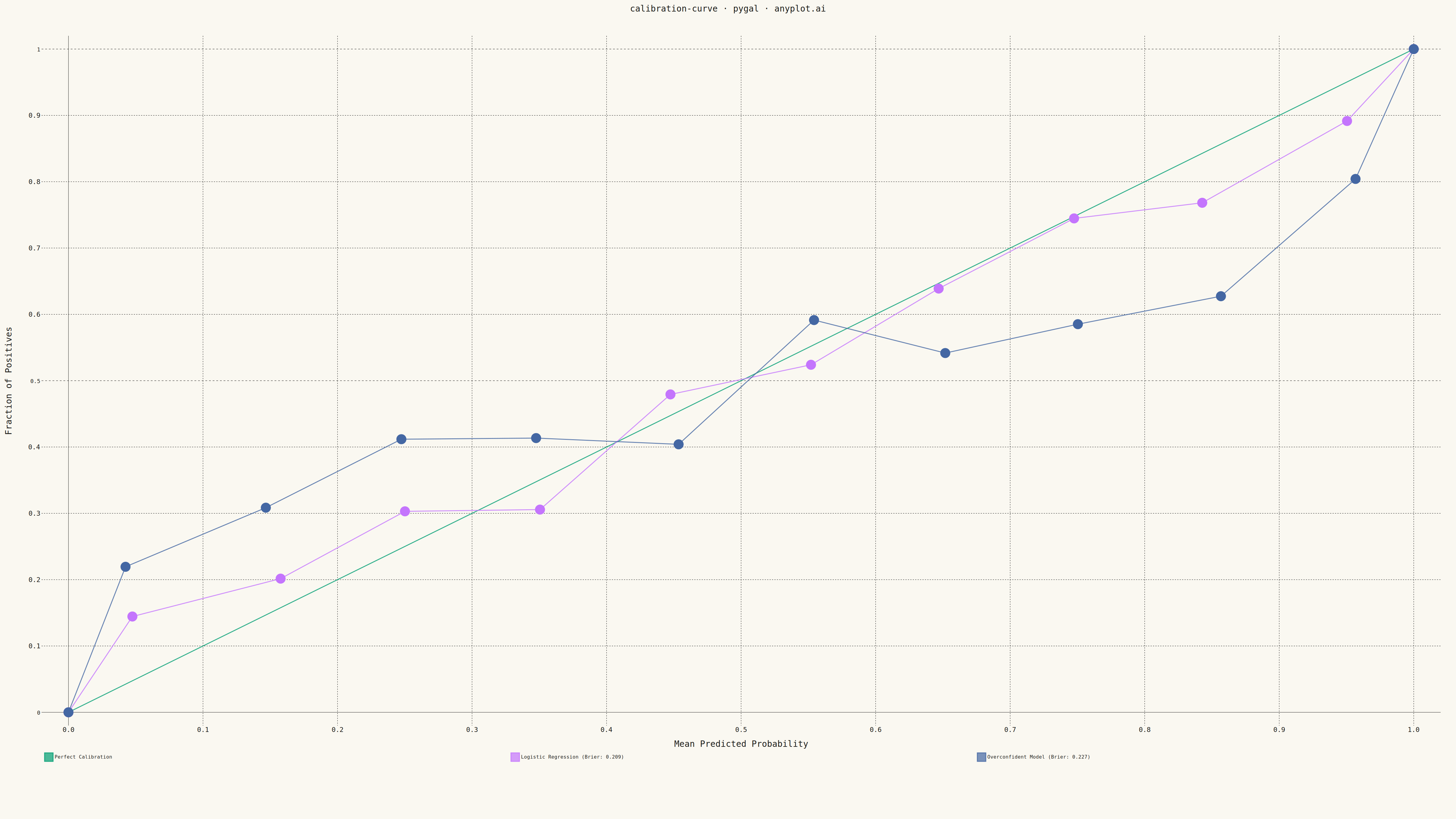
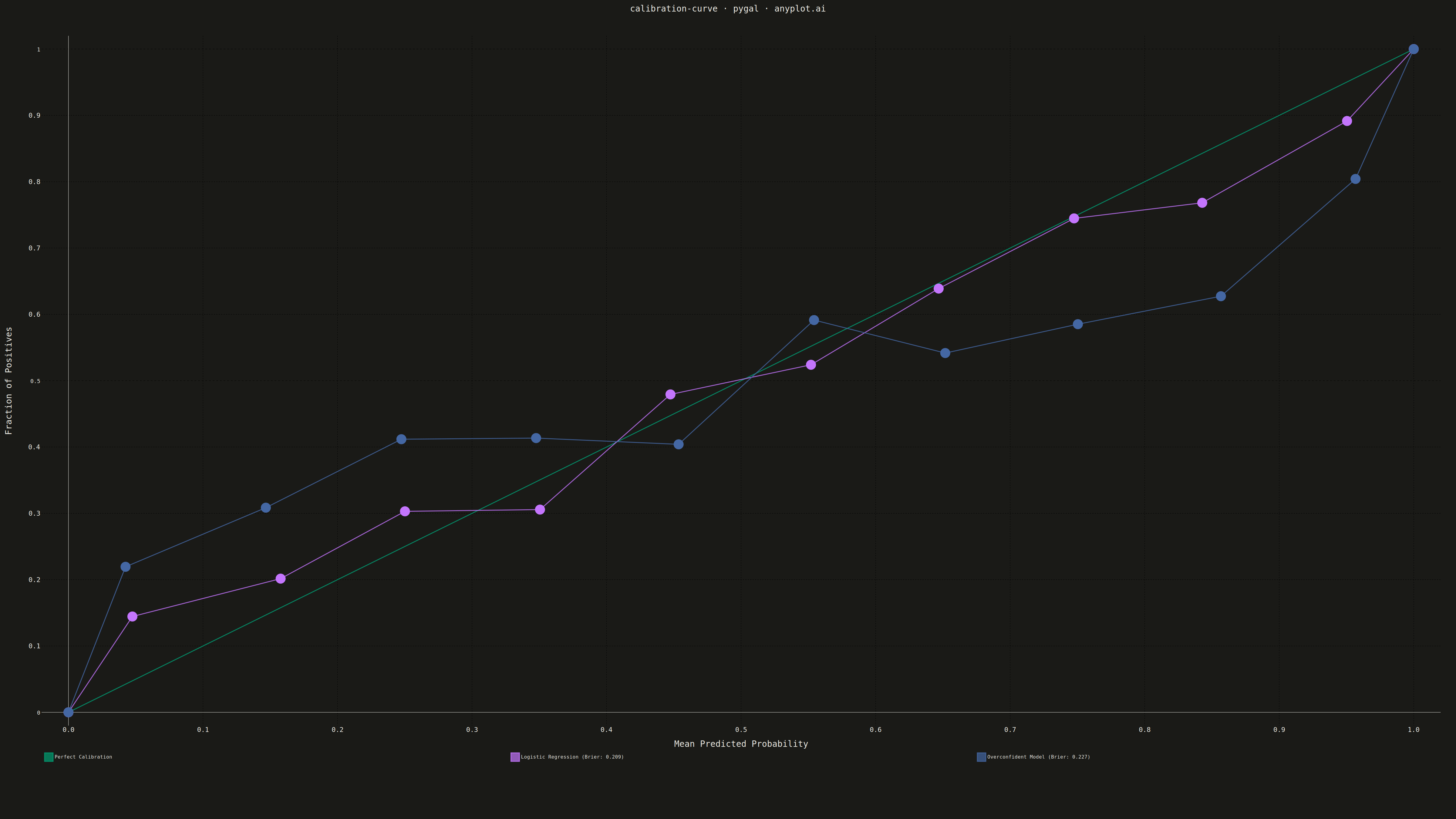
A calibration curve (reliability diagram) visualizes how well the predicted probabilities of a binary classifier match actual outcomes. By plotting the fraction of positives against mean predicted probability in binned intervals, it reveals whether a model is well-calibrated, overconfident, or underconfident. A perfectly calibrated model follows the diagonal line where predicted probability equals observed frequency.
""" anyplot.ai
calibration-curve: Calibration Curve
Library: pygal 3.1.0 | Python 3.13.13
Quality: 90/100 | Updated: 2026-05-10
"""

import os

import numpy as np
import pygal
from pygal.style import Style


# Theme tokens
THEME = os.getenv("ANYPLOT_THEME", "light")
PAGE_BG = "#FAF8F1" if THEME == "light" else "#1A1A17"
INK = "#1A1A17" if THEME == "light" else "#F0EFE8"
INK_MUTED = "#6B6A63" if THEME == "light" else "#A8A79F"

IMPRINT = ("#009E73", "#C475FD", "#4467A3", "#BD8233", "#AE3030", "#2ABCCD", "#954477")

# Data: Generate synthetic binary classification with realistic calibration
np.random.seed(42)
n_samples = 2000
n_bins = 10

# Generate true probabilities spread across 0-1 range
true_prob = np.random.beta(2, 2, n_samples)
y_true = (np.random.random(n_samples) < true_prob).astype(int)

# Model 1: Well-calibrated model (Logistic Regression style)
noise1 = np.random.randn(n_samples) * 0.08
y_prob_model1 = np.clip(true_prob + noise1, 0.01, 0.99)

# Model 2: Overconfident model (Random Forest / Neural Network style)
y_prob_model2 = 1 / (1 + np.exp(-12 * (true_prob - 0.5)))
y_prob_model2 = np.clip(y_prob_model2 + np.random.randn(n_samples) * 0.02, 0.02, 0.98)

# Compute calibration data inline
bin_edges = np.linspace(0, 1, n_bins + 1)

# Model 1 calibration
bin_indices1 = np.digitize(y_prob_model1, bin_edges[1:-1])
mean_pred1 = []
frac_pos1 = []
for i in range(n_bins):
    mask = bin_indices1 == i
    if mask.sum() > 0:
        mean_pred1.append(np.mean(y_prob_model1[mask]))
        frac_pos1.append(np.mean(y_true[mask]))

# Model 2 calibration
bin_indices2 = np.digitize(y_prob_model2, bin_edges[1:-1])
mean_pred2 = []
frac_pos2 = []
for i in range(n_bins):
    mask = bin_indices2 == i
    if mask.sum() > 0:
        mean_pred2.append(np.mean(y_prob_model2[mask]))
        frac_pos2.append(np.mean(y_true[mask]))

# Compute Brier scores
brier1 = np.mean((y_prob_model1 - y_true) ** 2)
brier2 = np.mean((y_prob_model2 - y_true) ** 2)

# Custom style with theme-adaptive colors
custom_style = Style(
    background=PAGE_BG,
    plot_background=PAGE_BG,
    foreground=INK,
    foreground_strong=INK,
    foreground_subtle=INK_MUTED,
    colors=IMPRINT,
    title_font_size=28,
    label_font_size=22,
    major_label_font_size=18,
    legend_font_size=16,
    value_font_size=14,
    stroke_width=3,
)

# Create XY chart for calibration curve
chart = pygal.XY(
    style=custom_style,
    width=4800,
    height=2700,
    title="calibration-curve · pygal · anyplot.ai",
    x_title="Mean Predicted Probability",
    y_title="Fraction of Positives",
    show_dots=True,
    dots_size=16,
    stroke_style={"width": 5},
    show_x_guides=True,
    show_y_guides=True,
    x_value_formatter=lambda x: f"{x:.1f}",
    range=(0, 1),
    xrange=(0, 1),
    legend_at_bottom=True,
    legend_at_bottom_columns=3,
    legend_box_size=28,
    truncate_legend=-1,
    margin=50,
    margin_top=80,
    margin_bottom=200,
)

# Perfect calibration line (diagonal reference)
perfect_calibration = [
    {"value": (0, 0), "label": "Perfect calibration reference"},
    {"value": (0.25, 0.25), "label": "Predicted = Observed"},
    {"value": (0.5, 0.5), "label": "Ideal: 50% predicted → 50% positive"},
    {"value": (0.75, 0.75), "label": "Predicted = Observed"},
    {"value": (1.0, 1.0), "label": "Perfect calibration reference"},
]
chart.add("Perfect Calibration", perfect_calibration, stroke_dasharray="15,8", dots_size=0, stroke_style={"width": 4})

# Model 1 calibration curve - well-calibrated
model1_points = [{"value": (0.0, 0.0), "label": "Curve start"}]
model1_points.extend(
    [
        {"value": (pred, obs), "label": f"Bin: {pred:.2f} pred → {obs:.2f} actual ({int(obs * 100)}% positive)"}
        for pred, obs in zip(mean_pred1, frac_pos1, strict=False)
    ]
)
model1_points.append({"value": (1.0, 1.0), "label": "Curve end"})
chart.add(f"Logistic Regression (Brier: {brier1:.3f})", model1_points)

# Model 2 calibration curve - overconfident
model2_points = [{"value": (0.0, 0.0), "label": "Curve start"}]
model2_points.extend(
    [
        {"value": (pred, obs), "label": f"Bin: {pred:.2f} pred → {obs:.2f} actual (Δ={pred - obs:+.2f})"}
        for pred, obs in zip(mean_pred2, frac_pos2, strict=False)
    ]
)
model2_points.append({"value": (1.0, 1.0), "label": "Curve end"})
chart.add(f"Overconfident Model (Brier: {brier2:.3f})", model2_points)

# Save output files
output_dir = os.path.dirname(os.path.abspath(__file__))
chart.render_to_png(os.path.join(output_dir, f"plot-{THEME}.png"))
chart.render_to_file(os.path.join(output_dir, f"plot-{THEME}.html"))
Runnable source as JSON, for any HTTP client: https://api.anyplot.ai/specs/calibration-curve/pygal/code. Any spec id and library id listed in llms-full.txt fit the same URL shape; every URL below is complete and callable.
{
  "spec_id": "calibration-curve",
  "language": "python",
  "library": "pygal",
  "page": "https://anyplot.ai/calibration-curve/python/pygal",
  "hub": "https://anyplot.ai/calibration-curve",
  "code_json": "https://api.anyplot.ai/specs/calibration-curve/pygal/code",
  "spec_json": "https://api.anyplot.ai/specs/calibration-curve",
  "render_light_png": "https://storage.googleapis.com/anyplot-images/plots/calibration-curve/python/pygal/plot-light.png",
  "render_dark_png": "https://storage.googleapis.com/anyplot-images/plots/calibration-curve/python/pygal/plot-dark.png",
  "interactive_light_html": "https://storage.googleapis.com/anyplot-images/plots/calibration-curve/python/pygal/plot-light.html",
  "interactive_dark_html": "https://storage.googleapis.com/anyplot-images/plots/calibration-curve/python/pygal/plot-dark.html",
  "quality_score": 90.0,
  "license": "MIT",
  "guide": "https://anyplot.ai/llms.txt"
}
Part of Calibration Curve on anyplot.ai.